• Type:
  • Genre:
  • Duration:
  • Average Rating:

Acoustical Design

Great Video Wall Sound–Another Solution
Great Video Wall Sound--Another Solution

Great Video Wall Sound—Another Solution

Famed acoustical designer Anthony Grimani offers his unique approach to solving the problem of where to put the center speaker in a video-wall home theater

by Dennis Burger
February 23, 2023

The problem of how to design sound systems to support massive LED video walls is one that continues to motivate audio professionals working in the luxury home entertainment space. We’ve previously discussed the root of the problem as well as one potential solution, but the fact is this is such a custom domain that it’s hard to imagine a one-size-fits-all panacea that provides optimal sound for every wall in every installation.

I recently spoke with Anthony Grimani, president of Performance Media Industries, Ltd. and co-founder of Grimani Systems, to get his  take on how to best design a sound system to accompany a video wall. Before we dug into his patent-pending solution, though, I asked him to reiterate for me why this is a problem to begin with.

“When we’re looking at images on the screen, we want the voices of the characters to come out of the middle of the screen,” he says. “And the way we do that traditionally is we put three speakers behind an acoustically transparent projection screen. But what happens when you replace that acoustically transparent screen with a big, thick screen that won’t let sound through?”

One alternative Grimani has employed is what he refers to as “Phantom+”—essentially using speakers on either side of the screen to create a phantom center speaker where no speaker actually exists. “The typical problem with a phantom center, though,” he says, “is that if your seat is off to one side of the room, the voices move with you. The character in the center of the screen now sounds like they’re coming from the left side of the screen.”

“But we’ve found that by using speakers with really good sound power—like ours, but also ones like Paradigm, KEF, JBL, and a few others companies that go through the effort of distributing the sound nice and wide and constant—that phantom center doesn’t move as hard and as much as with very directional speakers.” Add a bit of EQ to account for the way the listener’s head changes the sound arriving at their ears and this isn’t a bad solution, says Grimani. But it’s not ideal.

Another option—one that doesn’t share the same downsides as the Phantom+ configuration but has its own quirks—is a single speaker above or below the screen. “You might think it would sound like it’s imaging above the characters’ heads, because that’s where the speaker is. And if the speaker has a very focused directivity like a lot of people think you have to have, you’re dominated by the direct sound and you’re going to hear it as up  above the image. But because of the wide directivity of our speakers—because what you’re hearing is some direct sound and then a lot of really broad sound-power energy reflecting off the lateral surfaces, there’s enough energy flowing around that it fools your sensation of imaging and you hear the sound centered not above the screen but toward the top third of the screen. You still hear the sound coming from the screen, just higher than perhaps it should.”

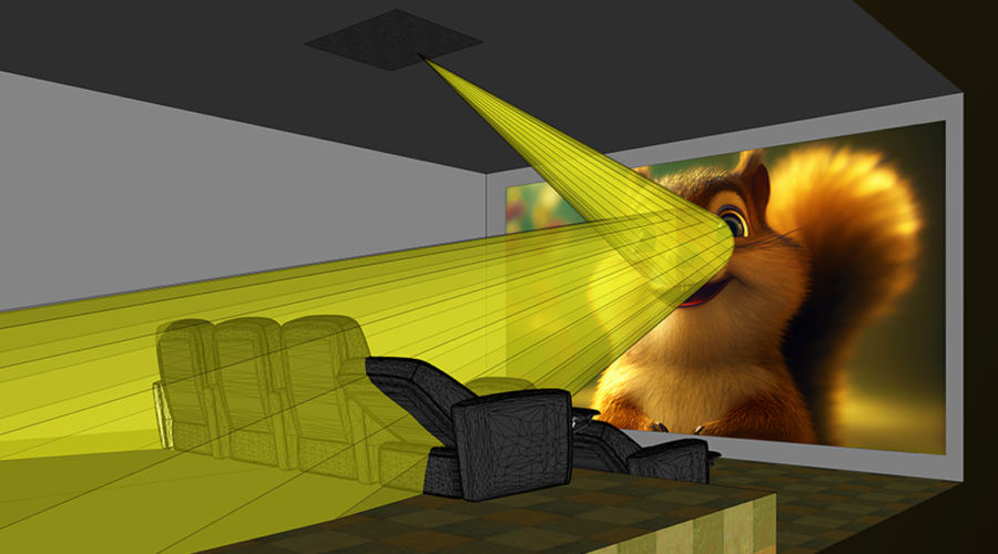
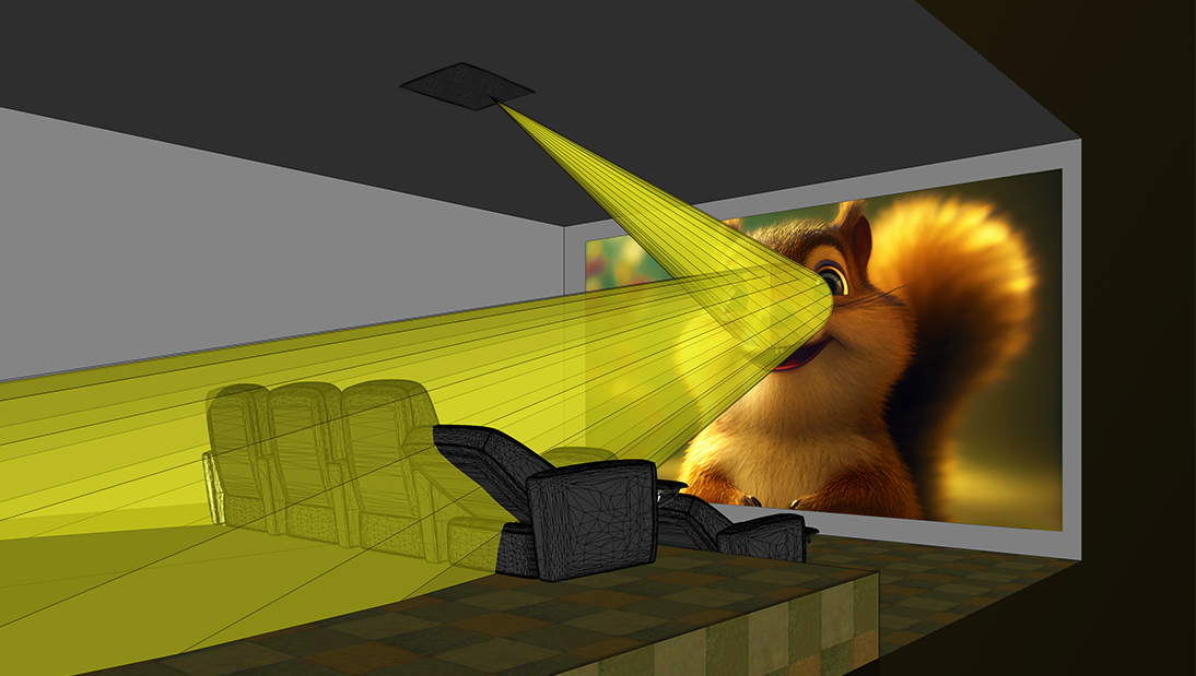
Then again, that really only works if there’s room above the screen for a speaker. And given that modular LED video walls are often installed floor-to-ceiling, sometime there simply isn’t room. And that’s where Grimani’s new solution comes in. In short, it works by splitting the sound going to the center channel into two parts: The lower-frequency sounds are sent to the speakers on either side of the screen, whereas the higher frequencies—the ones you can really point to and say “That sound is coming from right there”—are sent to a speaker above the listeners’ heads and aimed at the video wall, so they bounce off and seem to come from close to the middle of the screen.

That’s the simple explanation. For a more in-depth look that explains why and how this all works, we’re going to need to get a bit more technical. What follows is a transcript of my conversation with Grimani about the subject, edit for clarity and brevity.

So, with this two-piece solution, how do you keep the listener from feeling like the sound is coming from two different directions?

The idea is to use a directional waveguide placed generally over your head, and if there’s no spillover of direct sound from the waveguide to your head, you can create the illusion of sound coming directly from the center of the screen. If there’s any amount of direct sound that goes to your head from that overhead speaker, though, you will localize that because it’s the first sound to arrive at your head. It’s only three or four feet away from you. So it’s really important that there not be any leakage.

Now, the waveguide needs to be a pretty good size. Laws of physics are what they are. You can’t cheat that. If we want the crossover point at around 800 Hz, the waveguide is about 12 inches tall. But you can bury that into the rafters in between joists.

With the phantom-center information below 800Hz, you do have to time-align everything really carefully because the path from the speaker to the screen and back to your head is longer than the path coming directly to your head from the left and right speakers. So you have to delay the other speakers so everything arrives at your head at the right time, and that’s all done really easily in the digital domain.

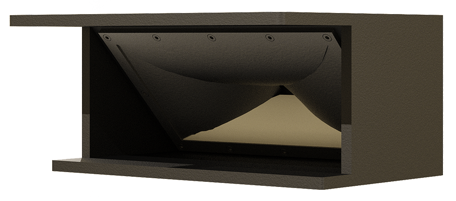
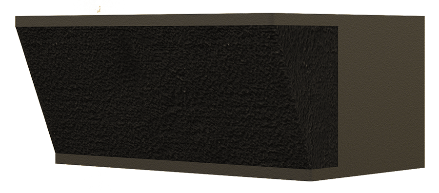
In terms of the overhead speaker, we happen to be using our Conic Section Array waveguide because it works well, but any other waveguide that produces good vertical pattern control with no off-axis lobes and wide-enough coverage works.

Full disclosure: If you sit right in the middle of the room, the image is slightly above the middle of the screen because that speaker bouncing off the screen is creating a mirror image, so it’s sort of like the speaker exists in a mirror-image position behind the screen. If it’s 12 feet from the speaker to the screen, it’s sort of like the sound is coming from 12 feet behind the screen, but in the ceiling. And if you move off-axis, that speaker does move with you a little bit. Imagine having a speaker shooting through an acoustically transparent

Since speakers can’t be placed behind a video wall as they can with a projection screen, the higher-frequency sounds are instead bounced off the screen and back to the listeners.

Great Video Wall Sound--Another Solution

Anthony Grimani

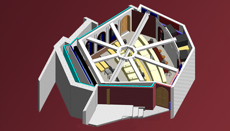
Anthony Grimani’s solution splits the sound going to the center channel, with the lower frequencies being fed to speakers on either side of the screen and the higher frequencies going to a speaker above the listeners’ heads and aimed at the video wall, so they bounce off and seem to come from close to the middle of the screen
Great Video Wall Sound--Another Solution

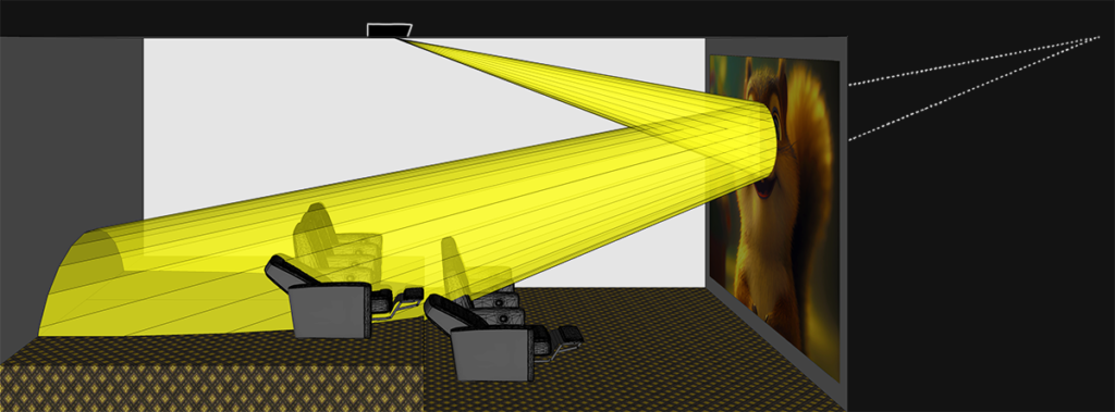
Renderings of the Conic Section Array waveguide, shown with and without a speaker grille. The waveguide is positioned in the ceiling to aim the higher-frequency sounds at the video wall, to then be bounced back to the listening positions in the theater. 

Sign up for our monthly newsletter to stay up to date on Cineluxe

screen but instead of right behind the screen, it’s 10 or 12 feet behind the screen. If a speaker is right at the screen, you can move back and forth and the speaker doesn’t appear to move. If the speaker is 10 feet behind the screen and you move off-axis—

There’s a little parallax.

Exactly. So the image of the character speaking onscreen does move with you, but just a little—just to be perfectly clear. I believe in telling the whole story. But I think it’s an acceptable compromise. None of this is as perfect as a speaker behind an acoustically transparent screen. Every alternative has its compromises. It’s about finding the right solution with the fewest compromises. And a lot of times, that’s going to be room-dependent.

Are you installing this solution yet or are you waiting for the patent to be approved?

We have it installed in our demo room. In the world of patents, you have to show you’ve reduced the invention to practice. A patent can be shown to be invalid if the only thing you’ve filed in the patent is an idea you’ve never tested. So don’t patent ideas—patent advancements of the state of the art that you’ve proven to yourself or others works. So we have it working here, and I’m working with an integrator in the Los Angeles area to install it on their big LED wall.

So, you said you’re high-pass filtering the signal going to the ceiling center speaker at 800Hz and sending everything below that to the front speakers. Why 800Hz? That’s not a number I hear people reference when they’re talking about directionality of sound.

Yeah, human hearing has very good localization from about 500 or 600Hz up to about 3kHz. That’s sort of the peak of frequencies you can localize, that you can point at and say, “That sound is coming from right there.”

Below 500Hz, the wavelengths get longer and longer, and your interaural gain—the thing that allows you to localize a sound in 3D space even though we only have two ears—gets fooled because the wavelengths get bigger. You know, a 500Hz wavelength is a little over two feet wide. So, your head is, what, 7 or 8 inches? And when a wave is so much bigger, it’s harder to compare the wavefronts coming from one direction versus another. And as you go down in frequency, it gets harder and harder to point to where a sound is coming from.

In the upper frequencies, a 3kHz signal has a wavelength of just a few inches, maybe half the size of your head, so as you go higher and higher in frequency and the wavelength gets shorter and shorter, the obviousness of correlation between the patterns hitting your left or right ear gets more scrambled because it’s smaller portions of what you’re hearing. And so, above 3kHz or 4kHz, your ability to point toward the source of a sound is also increasingly diminished.

The peak of directionality is from around 500Hz to 3kHz, so if you can take the waveguide down to 500Hz and phantom-image everything else, no problem. But that would be a waveguide that’s much bigger, if you really want good pattern control. It’s just not as practical.

So you go, “What if I try 600? 700? 800?” Somewhere around 800 or 900 is sort of this tipping point where the waveguide is practical and you’re definitely starting to hear more in terms of directionality. That’s not to say it’s the best frequency, it’s just a good compromise between practicality and effectiveness.

We have played with 1000Hz, and if the filters are steep enough and things are controlled enough in the room, you can make it work. And that’s a waveguide that’s about six inches, which is really easy to conceal in a ceiling above the sheetrock in the rafters.

At any rate, if the horn or waveguide is designed correctly, you’re not going to hear any direct energy from straight overhead. Mind you, we’ve seen solutions that involve PA speakers laid on their side, shoved way up close to the screen, and they bounce it off the screen from just a few feet away. That’s just too far forward, because if you look at the specular reflection, that bounce is way too high. It misses the screen most of the time. Also, that speaker playing full-range has a lot of off-axis spill starting at around 1kHz or even a little higher, so you’re hearing the sound directly from that cabinet before you hear the reflection.

I’ve talked to Steve Haas about his experience with such systems. In fact, he wrote an article about it for Cineluxe.

It doesn’t work. It just sounds fuzzy and the dialogue isn’t clear, and it clearly doesn’t sound like it’s coming from the screen, which is the entire point.

Basically, the rule is: With a waveguide or horn—or directional beam-steering array, because that’s also in the patent—there’s a frequency at which you need to roll off and go to a speaker that’s at the front of the screen, otherwise your brain goes, “Oh! I hear it coming from up there.” And you know what? It doesn’t necessarily have to be front left/right phantoms. In the patent, we talk about the fact that it could be just a woofer below the center of the screen, right in the middle. The reason we use the left and rights is because they’re there. Why not use them?

Let’s say you’re doing the sound system in a room for which you’re not the designer and you’re having to work with someone who isn’t willing to budge on aesthetics—what considerations come into play then with a setup like this?

The nice thing about this is that it doesn’t occupy any space at the proscenium. It occupies space somewhere in the ceiling, where we need an acoustically transparent boundary of some sort. And so in the beginning of the design phase, we need to say, “There’s a space up there were we either need a grille or some kind of structure that has fabric and wood and whatever, or a printed fabric that replicates the surrounding materials.” It’s a good way to tackle the aesthetic thing because it’s concealed in the ceiling and functionally invisible. As long as you’ve got the space in the ceiling, it doesn’t have to be a box hanging down like an old projector. In a home theater, more often than not you don’t want a thing hanging up there. That’s ugly.

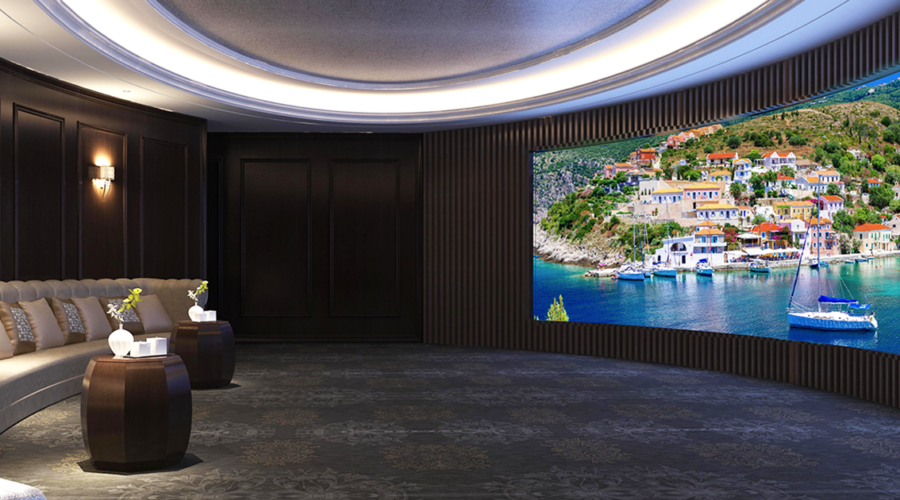
Bouncing sound off a video wall from a ceiling-mounted speaker creates the impression the sound is originating from a point behind the screen equal to the distance from the speaker to the screen.

“The nice thing about this solution is that it doesn’t occupy any space in a home theater’s proscenium. The waveguide occupies space somewhere in the ceiling instead.”

Dennis Burger is an avid Star Wars scholar, Tolkien fanatic, and Corvette enthusiast who somehow also manages to find time for technological passions including high-end audio, home automation, and video gaming. He lives in the armpit of Alabama with his wife Bethany and their four-legged child Bruno, a 75-pound American Staffordshire Terrier who thinks he’s a Pomeranian.

Generic selectors
Exact matches only
Search in title
Search in content
Post Type Selectors

© 2023 Cineluxe LLC
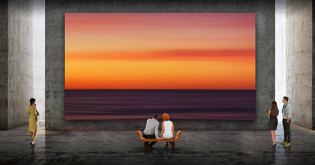
Great Video Wall Sound Is Here

Great Video Wall Sound Is Here

“Using the TPI controller, I was able to place the sonic image in the exact vertical position where my traditional center speaker
is located”

An opportunity to audition a center-channel solution in his own home theater showed the author you can have a micro LED wall without compromising the sound

by Steve Haas
January 19, 2023

Last June, in “Million-Dollar Wall, Hundred-Dollar Sound,” I talked about how difficult it can be to achieve acceptable sound when using a video wall in a home theater since the front speakers can’t be placed behind the screen as they can when using a projection screen. I mentioned that almost all of the solutions I had encountered resulted in significant compromises but that TPI’s Movement System showed promise, mainly because it includes a controller that uses digital signal processing (DSP) to allow you to adjust the height of the sonic image created by the front speakers.

I recently had a chance to audition the Movement System in my own home theater and was extremely happy with the results. This system uses speakers placed both above and below the video wall to create a phantom sonic image (similar to the horizontal imaging of stereo speakers except done vertically) to match the effect of a traditional center-channel speaker mounted at ear level. And it can accomplish this without the use of additional DSP and without having to employ the services of a professional calibrator (although both are still necessary to achieve optimal performance). Based on my hands-on experience with the TPI system, I have every reason to believe that this solution, along with others based on the same concept, will significantly accelerate the use of video walls in home theaters in place of projection systems.


from theory to reality

I know from my work with solid video screens in museum and commercial environments that effectively placing the sonic image vertically is both achievable and worth the effort. Some people contend that our brains can’t comprehend a vertical image shift as readily as a horizontal one. While there is some truth to that, A/B comparisons of vertical placement show that it can allow the sound of dialogue to be placed where we expect to hear it emanate from when watching a movie or a TV show, which is between half and two-thirds of the way up from the bottom of the screen. 

I had been eager to evaluate the TPI system because of its potential to create precise vertical positioning in a home theater environment—particularly since I will soon be calibrating a very large residential project in Florida that uses the Movement speakers.

TPI sent me the two speakers and controller necessary to create a virtual center channel. While I could have requested additional speakers for the left and right front channels as well, I decided to use just the center so I could focus on dialogue. If the system could do dialogue well, I knew it would also be able to handle the left and right positions.

above | Quantum Media Systems‘ Cinematic LED Wall

related article

click on the image to enlarge

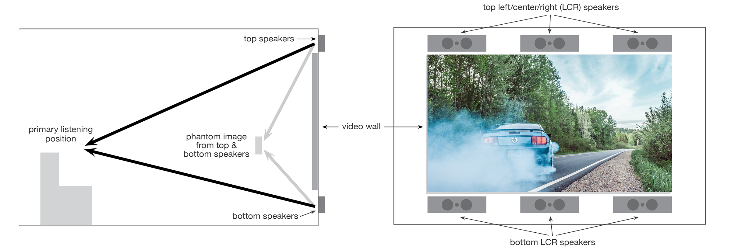
TPI’s Movement System uses speakers placed both above and below a video wall for the left, center, and right front positions. A controller is used to adjust the vertical position of the sound coming from each top/bottom pair, to create the same effect as if the speakers had been placed behind the screen.  

also on cineluxe

Sign up for our monthly newsletter
to stay up to date on Cineluxe

I set the system up in my home theater, which uses a traditional left-center-right (LCR) speaker array positioned behind an acoustically transparent Stewart projection screen. I then used both objective measurements done with pink noise and subjective listening with program material that contained a lot of dialogue to position the phantom sonic image by way of the controller. I also employed Symetrix DSP to assist with the A/B comparisons of the top/bottom vs. behind-the-screen imaging, as well as with top-only, bottom-only, and top/bottom image comparisons.

Using the TPI controller, I was able to place the sonic image in the exact vertical position where my traditional center speaker is located. I then used the Symetrix DSP to tonally optimize the system so the sound from the top and bottom speakers closely matched that of my existing center speaker, even though they are from two different brands.

What was especially interesting is that the top and bottom pair exhibited a unique fullness of sound that wasn’t due to any type of distortion or phasing but that only added to their presence. Even though I had set the sound from the speakers to arrive at the listening location at exactly the same time, this presence took on an immersive quality because the sound was coming from two different directions, even though it created a solid sonic image in one specific location.

problem solved

The combination of objective measurements and extensive listening has convinced me the top-and-bottom-speaker solution will work. And it has significant advantages over the other existing approaches. By using direct-radiating sound as opposed to reflecting—or bouncing—sound off the video-wall screen, it avoids problems with the reflected sound from the screen becoming mixed with direct sound from the speakers, which creates distortion. Also, having large speakers mounted on the ceiling and aimed at the screen can be both unattractive and distracting. The top-and-bottom approach is especially effective with larger video walls where it can be difficult, if not impossible, to place the center-channel image at an acceptable height using LCR speakers mounted either above or below the screen.

Another advantage is that sound can be optimized for positions in addition to the traditional sweet spot in a theater, which isn’t possible with a single speaker no matter how well it has been calibrated. The type of system considered here would allow for the creation of presets to shift the sweet spot if the homeowners, for instance, wanted to sit in the front row instead of the center row because of the type of programming they were watching.

Also, the shallow height and depth of the Movement speaker cabinets allows them to be easily placed in the relatively small areas available above and below large video walls and allows for flexible placement within those areas. Admittedly, they can’t be used if a client wants an LED screen to fill the whole wall, but doing so would also create basic, non-audio-related problems with things like sight lines. It would be possible, though, to incorporate the speakers into a angled proscenium that would allow them to be positioned forward of the screen, an arrangement that could accommodate any desired screen size.

To have a speaker system that can be optimized without compromise, allowing you to place a pure, strong sonic image exactly where you want it, is going to be a game-changer for creating high-quality sound to go with LED video walls. Given the potential of what I experienced with this system in my own theater, I am looking forward to calibrating the system in the Florida installation next month, which will allow me to take the Movement System from an experimental situation into a real-world home theater environment.

Steve Haas is the Principal Consultant of SH Acoustics, with offices in the NYC & LA areas. Steve has been a leading acoustic and audio design & calibration expert for over 25 years in high-end spaces ranging from home theaters, studios, and live music rooms to major museums and performance venues.

Million-Dollar Wall, Hundred-Dollar Sound

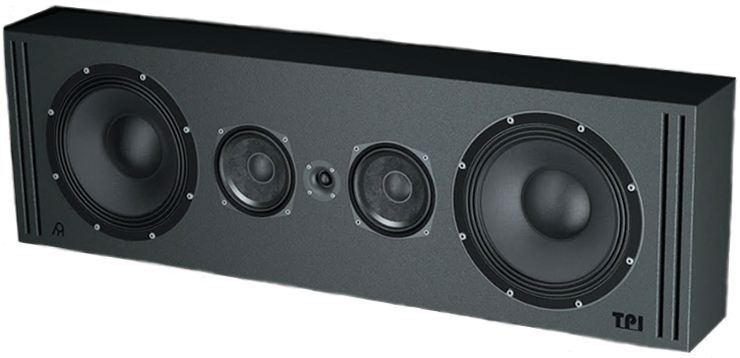
a rendering of TPI’s Movement L center speaker

Generic selectors
Exact matches only
Search in title
Search in content
Post Type Selectors

© 2023 Cineluxe LLC

Hidden Treasure

Hidden Treasure

hidden
treasure

getting the private cinema profiled in spanish treasure to sound its best meant digging deep into the tricks of the acoustic trade 

BY DENNIS BURGER

November 30, 2022

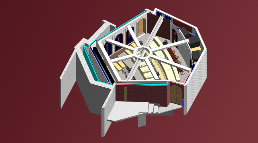
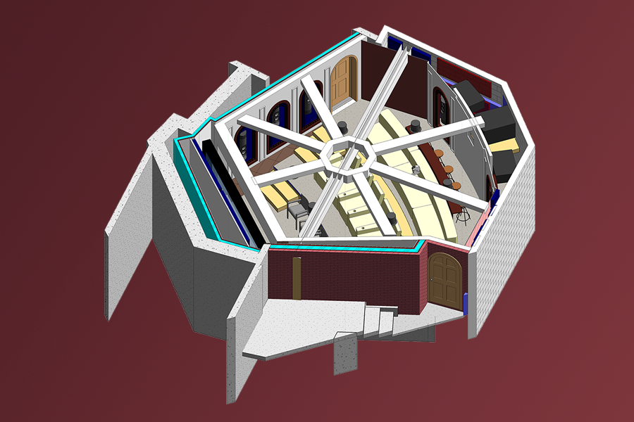
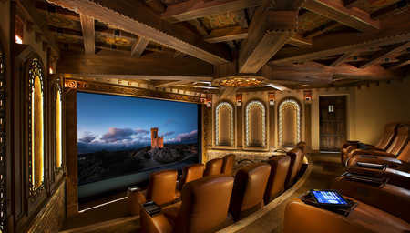
“The eye doesn’t always tell you the flavor of the room,” says Anthony Grimani, former director of technology for THX and founder of Performance Media Industries, who was responsible for making this gorgeous private cinema sound the way it sounds. 

This was in response to a pretty simple but open-ended question from me: “How?”

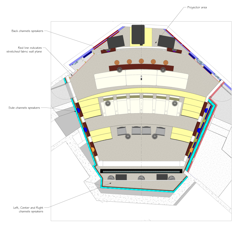
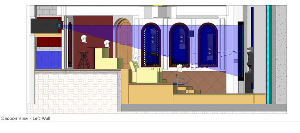
How, for example, does this space feature a complete Dolby Atmos sound system with six overhead speakers—not to mention 11 ear-level speakers and four powerful subwoofers—when a quick glance at the ceiling reveals not merely a complete lack of obvious speaker grilles but rows upon rows of hand-painted and antiqued wooden panels adorned with crests instead? 

How does the tryptic back wall, with a shape not unlike the outfield wall of a baseball stadium, not reflect and concentrate sound back toward the seating area like a satellite dish? How, for that matter, do all the plaster and brick walls not create the sort of echoey and reverberant sound you’d typically hear in a room with so many hard surfaces? Look around and you’ll see none of the heavily draperied walls or acoustical treatments typically found all over private cinema spaces.

related article

project team

acoustical designer

custom integrator

architect

Wylie Carter Architects

theater designer

Lisa Slayman
Slayman Cinema

contractor

“The surfaces in this room are not what they appear to be,” Grimani says. Starting from the top, he tells me that a number of the wooden crests in the ceiling were “knocked out, photographed, printed with dye sublimation onto an acoustically transparent fabric, then repositioned. Some of those panels hid speakers. Some of them hid acoustical treatments. So, half the ceiling is wood and the other half is fake, but you can’t tell. You walk in the room and the printing is so well-executed that it just looks real. To the naked eye, there’s just no way to know.”

In a sense, all of this makes this room a truly apt metaphor for cinema at its best. Like movies themselves, this private screening room relies on visual trickery and a lot of technical wizardry—special effects, if you will. And as with cinema, the best visual effects are the ones you don’t even realize are visual effects. They’re the ones you take for granted. 

Take the matter of acoustical treatments around the room as another example. Any good screening room needs the right balance of two types of treatment, referred to as “absorption” and “diffusion.” In practice, it’s a lot more complicated than that, but if you understand those two concepts, you’re at least conversant in the fundamentals of what makes some rooms sound good and others sound less good, at least for the purposes of watching films. 

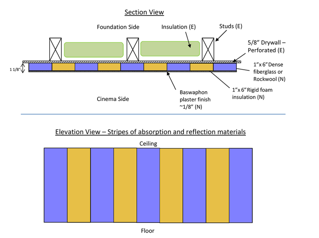
Acoustical plaster gives the impression of being a typical stucco surface but actually allows sound to pass through to materials meant absorb and reflect sound, located beneath 

Without enough absorption, a room will sound like a basketball court, more so the more reflective surfaces it has. Too much absorption, though, and it starts to sound dead and lifeless—perhaps even a bit unnerving. 

And not only is finding the right amount of absorption important; you also need to distribute your absorptive sound treatments evenly around the room. Absorb too much sound in the front or rear, Grimani says, and “your ear/brain senses that as a black hole of sound energy; your attention is drawn to it. It doesn’t match our auditory radar. So it’s better to have a layout where the absorption is consistently distributed all the way around the room.”

You also want to create some diffusion—or scattering—of the sound that would otherwise reflect directly off the hard surfaces of the room. The placement of these diffusive treatments is equally important. “Some diffusion on the lateral surfaces on the side walls is good,” Grimani says, “since it gives you a sensation that the room is bigger than it really is.” Too much diffusion in the wrong places, though, and it “confuses the hell out of your senses.”

As for the physical makeup of these treatments, there’s a range of materials used to create absorption and diffusion—but nowhere on that list will you find plaster or brick. So where did they hide the treatments in this room? Behind the plaster. Behind the brick. And no, that didn’t involve dye-sub printing fabric panels to look like plaster and brick.

“The magic we used here was something called Baswa Phon acoustical plaster,” Grimani says. “The idea is that you lay up a few inches of relatively dense fiberglass or rockwool, then you trowel on this porous plaster, which lets the sound through. So while your eyes see plaster, the sound waves pass right through it and get soaked up by the fibrous material. So that’s part of the trickery.” 

Sign up for our monthly newsletter to stay up to date on Cineluxe

The brick walls along the sides and rear also hide secrets—in the back of the room specifically, two large subwoofers positioned and calibrated to complement another two subs behind the screen at the front. “You can’t tell from the pictures but the grout between the bricks was selected for its porousness,” Grimani says. “We also have fiberglass put right behind the grout. The area between the bricks is actually absorptive, so while this all looks like hard surfaces that would be a giant amplifying echo box—a parabola focusing all these reflections back at you—the room actually has a very natural acoustic character.” 

The other key to making this room sound the way it does was reliance on Grimani Systems’ own powered speakers, which he convinced integrator Bradford Wells to use after a private audition. (In fact, it was Wells who brought Grimani into this project and handled all of the client interaction.) The speakers were engineered with spaces like this in mind. Due to their design, Grimani has precise control over how each driver in each speaker interacts with the other, which gives him more control over how each speaker delivers sound into the room. The goal is to make sure that whether you’re listening to the speaker from directly in front of it or off to the side, it doesn’t sound radically different. 

This means that any sound that does bounce off the walls, ceiling, and floor has the same character as the sound reaching your ears directly. “What’s more important than focusing on the Grimani Systems label on these speakers,” he tells me, “is to state the importance of having a speaker with even sound power. That will help ensure good sonic results”

The state-of-the-art speaker system, the room tuning, the hidden acoustics, the climate control vents engineered to keep air velocity low to minimize the noise therefrom—all of it adds up to just one piece of the puzzle that makes this room work. Probably the most important piece is the collaborative effort of all the trades involved in the project.

“All successful theaters have to exist as the perfect combination of beautiful architecture, gorgeous design, and meticulous engineering,” Grimani says, “so that the picture and sound are all reference quality—meaning that a film director and sound mixer could come in and say, ‘Yep! That’s the picture and sound as I created them.’ The room also has to be carefully built to follow the rules set forth by the engineering and design and architecture. The team has to work together as a group to make that happen. Pull all that off and you end up with a crazy-happy client.”

So was the client crazy-happy? I couldn’t help but ask. 

“It’s funny,” Grimani replies. “He said he originally thought he’d use the room once or twice a month but he’s down there every night.” 

Dennis Burger is an avid Star Wars scholar, Tolkien fanatic, and Corvette enthusiast who somehow also manages to find time for technological passions including high-end audio, home automation, and video gaming. He lives in the armpit of Alabama with his wife Bethany and their four-legged child Bruno, a 75-pound American Staffordshire Terrier who thinks he’s a Pomeranian.

related article

“All successful theaters have to exist as the perfect combination of beautiful architecture, gorgeous design, and meticulous engineering.”

Generic selectors
Exact matches only
Search in title
Search in content
Post Type Selectors

© 2023 Cineluxe LLC
Bringing the Gallery Home

Bringing the Gallery Home

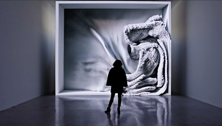
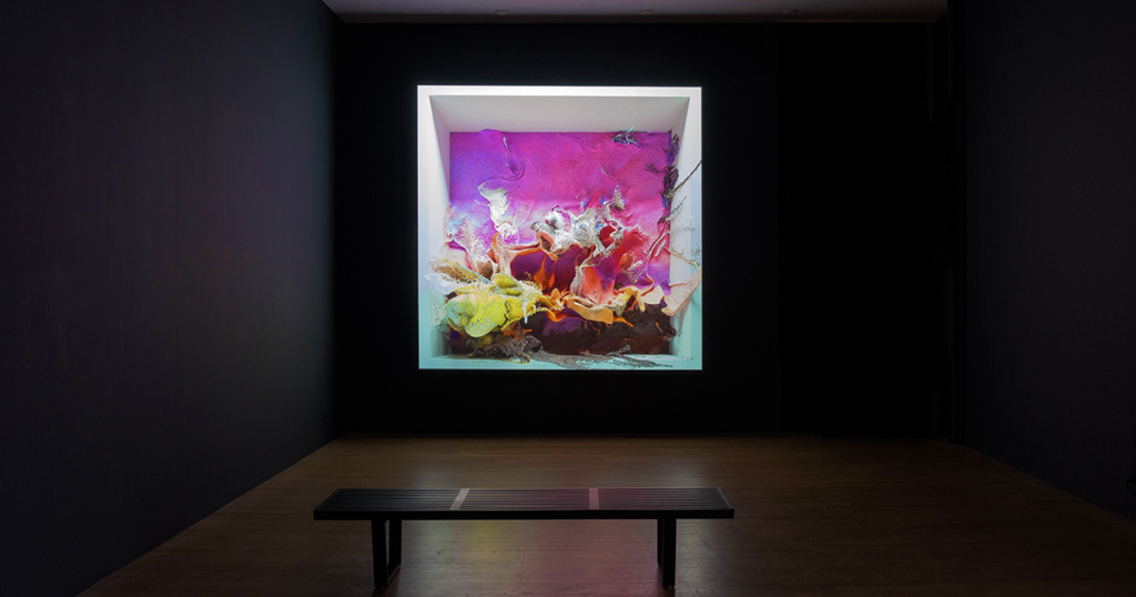
video | Refik Anadol, Melting Memories

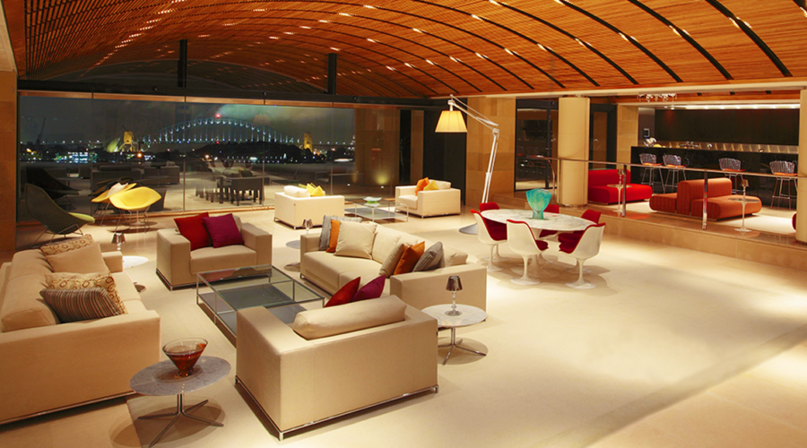
Museums and galleries have a lot to teach about the best ways to display digital canvases in home environments

by Kirsten Nelson
November 22, 2022

You know that feeling you get when you walk into a room and see a bouquet of flowers? There’s a brief moment of surprise. Those aren’t usually there! It’s a new element in your roomscape, and it brings a quiet thrill. 

Maybe it’s not flowers. Maybe it’s a new book, or a new bottle of Scotch, or a new arrangement of throw pillows. Something that you added, that you love, that’s a delight to contemplate, and it wasn’t there just the day before. 

Now imagine that feeling amplified spectacularly in the most refined way possible. I’m not talking about fireworks or a parade. I’m talking about something that awakens the senses while also magically blending into your home in a way that makes each moment better. It combines the novelty of seeing something new with the soothing harmony we try to cultivate in our home.

That is what it’s like to add one of these new attention-grabbing digital canvases to your home. It’s an ambiance changer. It’s a scene-setter. And it’s dynamic, capable of constantly changing, so it will always feel new.

The phrase “digital canvas” is being thrown around a bit haphazardly these days. Anything that can help display digital art or the exotic works in your NFT collection is called a canvas. But in what seems like a limited interpretation of the possibilities presented by these new speculative realms of art—some of the works being generative, constantly changing in response to data inputs, movement, and the environment surrounding them—we seem to be hung up on

Kirsten Nelson, “Your Home is Your Canvas

(2/11/22)
a look at how emerging technology is going beyond just making homes smart to making them expressive

video | Refik Anadol, Melting Memories

(8/19/22)
Barco Residential’s Managing Director on how artist Akiko Yamashita’s comments in “Natural Wonder” show that the creative community is beginning to embrace the potential of digital canvases

photo | Refik Anadol, Quantum Memories (Bitforms Gallery)

rectangles. As in, we’re still hanging up the same old 16:9 panels and wondering why it feels like we’re only watching TV when in fact we’re looking at expensive works of art.

What is it about looking at fine art, anyway? Why does it create a moment of pause instead of merely lulling you into a soporific state? We probably can’t answer that question in this brief piece of writing, but we can address how fine art is typically displayed in galleries. And we can examine how we might make sure these new digital works get the same treatment as the other “static” pieces of art in our homes.

The Shape of Art to Come

To do that, first we need to get beyond the rectangle. How many oil paintings actually adhere to a 16:9 aspect ratio? And what about sculptures? Many of these new digital works have more in common with sculptures. They might be rendered in 3D, or in many cases their interactive elements make them feel more like an art installation than a print on a wall. That being the case, do we really want to lock them into the same tight frame we wrap around commercials and sports? 

The makers of video technology see a future beyond the rectangle. Tim Sinnaeve, Managing Director of Barco Residential, is a passionate advocate of discovering new forms and means for displaying digital art in the home. “The whole idea of a 16:9 aspect ratio is very limiting when you’re talking about art,” he said. “And it’s a limitation that actually also negatively impacts the art world, and most importantly artistic freedom, because you get this self-fulfilling prophecy where the artist feels like they have to create their work in 16:9 because that will fit the screen it ends up on. Then on the other side, the thinking goes, ‘All the art that’s available is 16:9, so that’s why I’m using a 16:9 display or a TV.’” 

If we want to get to a near future where we see more creative additions of these multi-faceted, multi-sensory works into our living spaces, we need to consider the experience you have in an art gallery. What elements help to elevate artwork? How can we ensure that a piece is displayed in a manner equivalent to its value?

The answer may vary, with options that include direct-view LED video walls or projection setups, but ultimately what we’re talking about is that suddenly ubiquitous “digital canvas.” It’s the surface that will determine whether an artwork looks like it was worth the investment. 

“The canvas actually becomes part of the value, because it determines how the art looks, and how you experience it,” Sinnaeve said. “If you’re a serious collector, you need to work with professionals to make sure that the right digital canvas is selected.”

Once you’ve seen a major digital work on a proper LED screen or lighting up a wall with high-end video projection, there’s no going back. “Going from that level of depth and quality to seeing it on an 84-inch OLED TV is just night and day,” Sinnaeve said. “It’s between something that moves you and that you really would like to be a part of your life, compared to something that just doesn’t do it. And technically the work is the same.”

More than just a video technology decision, “it’s really about looking at it from an architectural and design perspective and considering where and how you want your digital canvas to create an experience,” Sinnaeve said. “The way you approach that shouldn’t be that different for digital art

(6/24/22)
Video walls have become a big status thing—and an even bigger investment—but getting them to sound good isn’t as easy as you might think

Bringing the Gallery Home

Touch displays like the ones already being used in museums will up open an unexplored world of educational and entertainment experiences for domestic settings

Sign up for our monthly newsletter
to stay up to date on Cineluxe

versus ‘traditional’ art, at least from a philosophical perspective. There are the fundamentals of displaying the work and then there are factors related to how the artist intended it to be seen as well.”

That’s where we get to the curator role that many custom residential technology integrators may soon be adding to their skillsets. Savvy installers will be able to work with artists to realize the artist’s vision while also presenting clients with a beautiful experience of digital fine art at home.

Setting the Scene

We need to also think about the environment surrounding these works. Start with the lighting. Just as you would think about properly lighting a physical work of art, work with a professional integrator who knows how to ensure your digital art is depicted in a manner befitting its merits rather than receding into the background because it just looks like a TV.

Many digital artworks also have a sonic element, and some of them are actually entirely audio-based. But even for visual-only pieces, it’s important to consider acoustics and sound as part of the experience. To get some insight into these invisible-but-essential factors, I spoke with Steve Haas, CEO and Principal Consultant with SH Acoustics.

Especially because digital art might be installed in large open spaces in homes, you should be sure there’s not a lot of cacophony created by reverberant reflections. Think about the enveloping hush of a gallery and how that adds a luxuriously contemplative level to the viewing experience. The addition of some properly designed acoustic control can help to deliver that effect at home. Also, if there is a sound component, you might want to acoustically isolate the room to prevent the creation of—or distractions from—disturbances elsewhere in the home. 

You might consider using some of the high-tech directional speakers that can precisely aim where sound is traveling—the kind they’re using at compelling new immersive-experience emporiums like the Illuminarium in Atlanta and Las Vegas. These spaces go beyond the usual multi-surface video projection into full-scale aural choreography, which together will make you forget all about the outside world.

“Having rooms like that, filled with unique content that updates regularly, I could really see that happening,” Haas said. His work in museum experience design and in high-end residential media and acoustic design have combined to give Haas a unique vision for how we might reimagine our homes. 

“I see having these elements that are interspersed throughout the house in a very purposeful, creative way that introduce video and soundscapes and all the other elements that make that experience fully immersive,” Haas said. “And sometimes, if it makes sense, potentially adding informative or educational content, which can also change, of course.”

Going beyond home theaters or media rooms, you might add dynamic digital artworks to corridors, atriums (direct-view LED walls are bright enough to handle high-brightness areas), foyers, great rooms, or anywhere you want to experience additional levels of engagement. In recreational spaces, there’s even more possibility, with full-scale video, sound, and lighting activations in personal nightclubs, bowling alleys, patios, pools, and more. 

From there, Haas takes it one step further, returning to the idea of immersive exhibits found in museums. “Think about having custom-produced media from any of the top museum content producers,” he suggested.

“How can you create this hybrid, totally unique world in somebody’s home that might even have didactic meaning, historical content, or educational content for their kids or anyone else?” Haas asked. “Each of these thematic experiences can represent something important to the family’s lives, the same way a museum presents media or physical content that’s important to the institution’s mission.”

That might also address the “these kids today and their phones” challenge—though it’s hardly just the kids. Every generation is now compulsively interacting with screens and content on a regular basis. What if the home was similarly compelling with ever-changing atmospheric elements? Maybe then we could get more people to look up from their screens and enjoy living together. 

Steve Haas’s firm, SH Acoustics, did the acoustic and audio design work for the Statue of Liberty Museum, which features the kinds of video displays and interactive technologies that could be creatively deployed in a home environment

Kirsten Nelson is a Brooklyn-based writer, speaker, event content producer, and podcast host who writes frequently for technology brands, integration firms, and experience design agencies. She was the editor of SCN magazine, and before that, co-launched Residential Systems. Kirsten is also a co-founder, editor, and writerly salon host of CreativeStack, a newsletter for the experience design community.

Generic selectors
Exact matches only
Search in title
Search in content
Post Type Selectors

© 2023 Cineluxe LLC
Rooms for Improvement

Rooms for Improvement

Rooms for Improvement

Rooms for Improvement

the entertainment spaces in this Australian home are undeniably spectacular—but after a decade in use, they were ready for a major sonic makeover

the entertainment spaces in this Australian home are undeniably spectacular—but after a decade in use, they were ready for a major sonic makeover

by Michael Gaughn

by Michael Gaughn

October 31, 2022

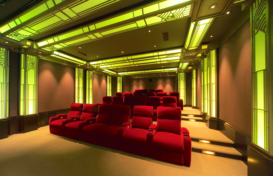
This story could have easily just been about the Theo Kalomirakis-designed Art Deco home cinema. Or it could have focused instead on the jawdropping one-of-a-kind entertainment area, with its discreet stage, ability to accommodate 250 guests, and epic views of Sydney Harbor. But there turned out to be an even bigger—though not quite as showy and obvious—story to be told, about how these kinds of high-end spaces have become so elaborate and flexible and the trends and technologies influencing and supporting them are evolving so quickly, that we’re now being presented with an unprecedented array of opportunities—but also the continual challenge of staying ahead of the curve. 

Every home cinema is a completely custom and unique machine. And the open-floorplan multi-use entertainment areas that are beginning to supplant dedicated theater rooms (like the one profiled in “Achieving Serenity”) are even larger and more complex machines that have to be able to handle a wider and wider variety of tasks. You don’t need to be a techie or have any interest in what’s going on under the hood to realize that creating something like that and keeping it functioning optimally means relying on massive processing power. The key thing to remember is that these systems are basically one-off computers and subject to all the thousand shocks and upgrades our digital brethren are heir to.  

Because of that, this is also a story about not the visible but the invisible. As spectacular as these rooms are, they’re literally useless unless someone keeps a constant and careful eye on all manner of things that are never seen by their users. Acoustical designer Steve Haas has developed a reputation as a master of that unseen realm, one of a you-can-count-‘em-on-the-fingers-of-one-handful of people who know how to not just tame but maximize these intricate, individually crafted mechanisms so they can achieve and maintain peak performance. The portfolio of his company, SH Acoustics, extends well beyond private residences to museum and commercial venues as well, and Haas found himself having to draw extensively on that broader pool of knowledge in order to make this Australian homeowner’s exceptional mandate a reality.

A VERSATILE PERFORMER

The seven levels that constitute this 55,000-square-foot residence—let’s call it the Sydney Home—rest terraced in a rock face overlooking the harbor, with the iconic bridge and opera house prominent in the dioramic views from its primary living spaces and numerous terraces. It shouldn’t be a surprise to hear that a home of this caliber would hold a theater from a premier designer like Kalomirakis, nor that Haas, who has collaborated on some of Theo’s most ambitious efforts (including the legendary Paradiso) should have been called in to handle the acoustic and audio chores. 

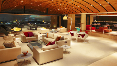
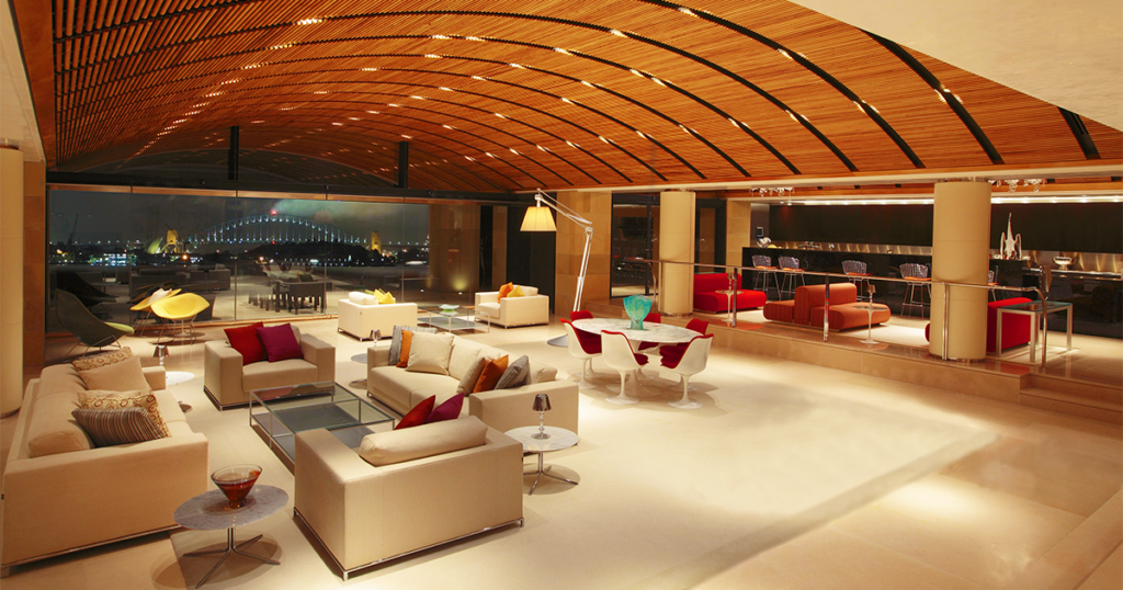
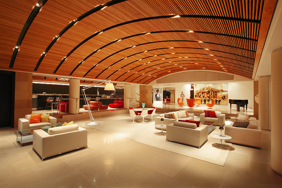
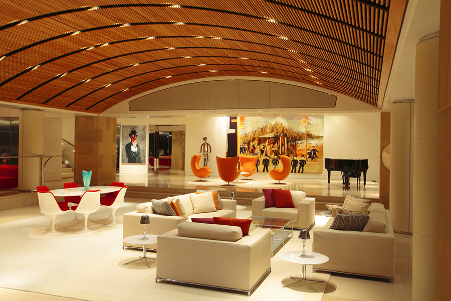
The entertainment area, with its  spacious bar & lounge area and terrace with epic views of Sydney Harbor, can comfortably accommodate 250 guests

The stage area, with the main speakers hidden behind the fabric at the top of the proscenium. Steve Haas took the client to the Steinway showroom in New York to help him select the Model B grand piano.

The home has seen performances by numerous A-list artists, including Sting, Michael Bolton, and Australian native Delta Goodrem (above)

“Once I had some dialogue with the client, we realized there was a need to have me consult on other keys areas of the home,” says Haas, “especially what they call the Level 1 entertainment space.” It’s not unusual for a home of this size to have a place for holding parties, hosting events, and staging live performances, but you’d be hardpressed to come across another similar space as well realized or as chameleon-like as the one here. 

The room gives few clues to its other capabilities when they’re not in use, feeling causal, comfortable, and domestic. Furniture groupings and large canvases help disguise the stage’s true identity, with the main speakers for performances hidden behind fabric panels in the soffit above the proscenium, and with a dropdown projection screen and monitor speakers tucked into the ceiling of the stage area. 

The client’s desire to have the room provide exceptional sound for parties, fundraisers, and other large events as well as for both movies and live entertainment created a unique challenge for Haas since each use had its own set of not necessarily cross-compatible needs. The music for parties had to be able extend into the bar area, out onto the various terraces, and into other parts of the home as well, while the stereo sound for performances needed to match what you would expect to hear in a high-end nightclub, and the movie system had to supply satisfying surround for groups as large as you’d find in a commercial cinema—all in a wide-open room filled with glass, wood, and other structural and decorative enemies of quality sonic reproduction.  

Haas was especially concerned about architect Alec Tzannes’s design for the ceiling, which used suspended elongated 3/4″ rectangular slats to create a barrel vault that would conceal the multitude of speakers, subwoofers, lighting cans, and ducts. “The client actually flew me over to Sydney to make the case,” says Haas, “because he had consulted with a local acoustic expert who had said there would be no problem. And I looked at it and said, no. This is absolutely wrong.” His solution was to use round dowels instead. “After we did our calculations and I created a physical mockup of the dowel system, we saw that the sound would bend around them in a way that would have a negligible effect.”

The curve of the ceiling was also a problem since it would tend to reflect and focus the sound from the speakers instead of spreading it evenly throughout the room. To help address that, and all the many reflective surfaces, Haas took advantage of the space above the dowels to apply extensive sound absorption.

Not only have the homeowners and their guests been impressed with the result, so have the numerous A-list artists who have sung there—Sting, Michael Bolton, and Australia’s Delta Goodrem among them. “Michael Bolton said it was one of the best-sounding places he’s ever performed in,” says Haas. 

MIXED SIGNALS

Cut to a decade later. The homeowner tells Haas he’s concerned the digital signal processors (DSPs) tasked with handling all the various audio responsibilities are beginning to fail. It’s not that the gear is faulty—it’s just at the end of its lifespan. “It’s not uncommon to see DSPs fail after 10 years,” says Haas. “They’re essentially computers, of course”—which means they’re just as likely to start crapping out as any laptop or desktop PC. And they’re subject to the same rapid technological advancements, with all their inevitable upgrades. Staying a step ahead of the upkeep is just a fact of life with anything this diverse and complex.

Rooms for Improvement

The 7.1-channel surround sound system in this Theo Kalomirakis-designed home theater was recently upgraded to Atmos via the addition of eight Wisdom Audio ceiling speakers 

PROJECT TEAM

acoustical designer

Steve Haas
SH Acoustics

theater designer

Theo Kalomirakis
TK Theaters

custom integrators
Datascene

architect
Alec Tzannes

Haas saw the task as not a chore but an opportunity to bring all the various types of DSP currently in the house under one brand and system. And while he was at it, why not upgrade the private cinema to Atmos as well?

With its 7.1-channel California Audio Technology speaker array, the cinema had been serving the homeowners well since its inception in the early ‘00s. But, having been impressed by Wisdom Audio’s ceiling speakers, Haas felt that adding eight of them to the room to create an Atmos configuration would significantly enhance the movie-watching experience. And the speakers were compact enough that he could have them installed without having to engage in a massive do-over.

Not that the upgrade wasn’t a challenge. Because they couldn’t dismantle the whole ceiling, Haas wasn’t sure what he, the contractors, and the custom integrators from Sydney-based Datascene would find when they attempted to tap into the preferred speaker locations. So they adopted a surgical approach, working their way carefully around the duct work and other impediments. And because there are bedrooms just above the theater, a tremendous effort had been made during the original construction to ensure none of the sound would bleed through the ceiling. Honoring this, they kept as much of the existing treatments in place as possible as they added the new speakers, also providing sound-isolation caps in each of the speaker locations. 

Premium theaters like this one often rely on a tip-top-of-the-line sound processor from a company like Storm Audio or Trinnov. But Haas went with a Marantz AV8805 instead because it provided the desired sound quality without all the additional bells and whistles of the higher-end models and would more readily work in tandem with the QSC Q-Sys pro-audio DSP he was deploying throughout the other key areas of the home.

It was also time to replace the projector—and rebuild the projection booth, which, located near the cliff face, had been infiltrated by moisture. Haas helped the client pick the new projector, consulting with Barco and coming back with a recommendation for its Wodan model. But this required an acoustical makeover for the booth since the new projector was significantly louder than the previous one and the noise would have been distracting, especially for anyone sitting in the last row, which rests up against the booth wall.

Acoustical designer Steve Haas calibrating the sound for the Level 1 entertainment area.

Rooms for Improvement

Acoustical designer Steve Haas calibrating the sound for the Level 1 entertainment area.

Sign up for our monthly newsletter
to stay up to date on Cineluxe

At 38 feet, the room is unusually deep for a private theater. “In a room like that,” says Haas, “you can get so sonically disconnected from the front that by the time you get to the rear seats, it feels like you’re in a different space.” To address this, he used acoustical treatments to disperse the sound so that the experience would be the same no matter where someone is sitting. 

For all the defining trends the Sydney Home represents, maybe the most significant is its extensive blending of consumer and pro gear. As high-end homes incorporate more elaborate entertainment areas like dance floors and live-performance spaces, they need to be able to provide sound on par with what artists expect in professional venues—along with the ability for DJs, sound mixers, and others to be able to jack in their gear.

Also, a multiform multipurpose system as flexible and complex as the one here can quickly exhaust the abilities of the hardware available on the consumer side of things. It often takes robust, function-specific professional gear to rise to these emerging challenges.

Haas, who is just as comfortable working on recording studios, concert halls, and galleries as he is on domestic environments, turned out to be the ideal fit for a project this ambitious. As a member in good standing of that previously mentioned acoustical elite, he was able to bring the necessary combination of expertise and experience to bear. Relying on someone whose knowledge is limited to the residential world to master something like this is a sure-fire recipe for disaster. Since entertainment areas are only going to get bigger, more versatile, and exponentially more complex, better to place them in the hands of people like Haas who not only think, but perform, well outside the home theater box.

Michael Gaughn—The Absolute Sound, The Perfect Vision, Wideband, Stereo Review, Sound & Vision, The Rayva Roundtablemarketing, product design, some theater designs, a couple TV shows, some commercials, and now this.

Generic selectors
Exact matches only
Search in title
Search in content
Post Type Selectors

© 2023 Cineluxe LLC
Deschamps on Design: Better Sound Through Design

Deschamps on Design: Better Sound Through Design

Deschamps on Design |
Better Sound Through Design

Acoustic panels, imaginatively deployed, can be the difference between a great- and terrible-sounding room

by Maria Deschamps
July 26, 2022

About the only people who really get excited about discussing acoustic treatments are acousticians. With clients, treatments are way down at the bottom of the list, below deciding what type of pad to use under the carpet. But treatments make a huge difference in the sound quality of a room—and, while they have a reputation for being unsightly, that really doesn’t matter because they can be inconspicuous when properly designed.

Given that, why oh why are luxury theater designers just installing acoustic panels on top of their drywall? I have seen far too many installs of 24 x 48-inch panels directly on a wall or ceiling, either in a theater or music studio—and they are uggg-ly! As a consequence, a lot of my new clients say to me “Do we have to have acoustic panels?” and my response is “Yes, you do, but we can make them part of the design, either by hiding them completely or by dressing them up so you’ll never know they’re acoustic panels.”

Certainly, hiding the panels by installing them behind a stretch-fabric system is a much better and cleaner alternative. In that case, all of the panels are hidden—no one sees them so you don’t have to worry about what they look like. Because of that, it doesn’t matter what color or texture they are. A stretch fabric is indeed the preferred solution for acousticians since they can install as many panels or baffles as they need and put them wherever they want. The speakers are also hidden behind the fabric, and the nice thing is that the result is a clean, flat surface. 

Stretch fabric systems aren’t for everyone, however, and it’s not as easy as you would think to find a fabric that meets all the technical criteria acousticians require, like elasticity, acoustic transparency, breathability, and opacity. Imagine, we must start with these requirements and then make sure the acoustically transparent fabric also meets the design concept and color criteria that satisfy the designer and client. 

This Maria-designed home theater uses custom-designed round acoustic panels accented by LED strip lighting

CLICK ON THE IMAGES TO ENLARGE

Sign up for our monthly newsletter to stay up to date on Cineluxe

One thing is for certain: Acoustic panels are a must in a home theater. They reduce reverberation and minimize noise pollution. They play a major roll in increasing sound quality—not to be confused with sound isolation, which is what keeps the sound inside from traveling outside of your theater and vice versa. When designing a theater, we need to specify and design surfaces that reflect and surfaces that absorb sound. Acoustic panels absorb sound. They are made mostly of fiberglass and come in several thicknesses. 

What I love about these panels is that they’re easily customizable. Although they still need to be covered with an acoustically transparent fabric, we can use another finish—like a sexy wall covering—next to them. Using different finishes gives us more possibilities to create an interesting concept. We can make them any size or shape and we can place a long run of several panels side by side with an inconspicuous joint. Once the exact locations of the surround speakers are determined, we can design the panels to hide the speakers behind them. We can also layer panels on top of each other to increase the density and functionality as well as create design interest. Finally, we can carve out recesses on the edges of panels to hide LED strip lights—and you know how much I love indirect lighting!

My take is that creativity is paramount in a private theater, so the space should be distinctive and authentic. Technical elements like acoustic panels shouldn’t inhibit design creativity, and by customizing them they can really be part of the “Wow!” factor. So please, no more 24 x 48-inch wall panels—design something magnificent! 

Maria Deschamps is a certified Interior Designer, IDC, NCIDQ, APDIQ and has been designing home theaters and media rooms since the year 2000. She also designs high-end residential, restaurant, and commercial spaces, and is a partner at TKG, the Theo Kalomirakis Group. 

For this media room, Maria used custom-made acoustic panels with an organic curve along the top with indirect LED strip lighting behind

Generic selectors
Exact matches only
Search in title
Search in content
Post Type Selectors

© 2023 Cineluxe LLC
Million-Dollar Wall, Hundred-Dollar Sound

Million-Dollar Wall, Hundred-Dollar Sound

Million-Dollar Wall, Hundred-Dollar Sound

“The subjective result of bouncing sound off the screen is a very profound distortion. The sound isn’t crisp and tight and clear. It’s smeared in time.”

Video walls have become a big status thing—and an even bigger investment—but getting them to sound good isn’t as easy as you might think

by Steve Haas
June 24, 2022

While most companies don’t yet heavily promote that they sell their video walls for residential use, you’d be hardpressed to find a luxury integrator who isn’t installing them in high-end homes. But they present an interesting challenge. They can often take up an entire wall, but you don’t have the option of putting speakers behind them like you do with a projection screen. Acoustician Steve Haas of SH Acoustics has checked out many of the existing audio solutions for LED walls and found them all wanting. But realizing that video walls are quickly becoming the likely future of viewing in premium home entertainment spaces, he’s been more than motivated to try to determine who has the best approach and how it can be optimized. 

—ed.

The question of how to achieve good sound with a video wall isn’t a new one but the latest version of the problem of what to do with sound when you’re dealing with any kind of solid screen. While many projection screens are created with holes that allow the sound to come through when speakers are placed behind them, many are not, in order to maximize light gain and other aspects of video reproduction.

LED and Micro-Tile video walls have existed in commercial spaces like museums for quite some time. Between our work with those and with multimedia theaters with solid screens, we’ve had to design plenty of workarounds to match the quality of the ideal “speaker behind acoustically transparent screen” approach. When the video contains dialogue with talking heads, we’ve achieved decent success by placing the speakers above and below and then using vertical panning techniques for the audio. If there’s no dialogue, we have a lot more liberty to simply deliver sound from above or below, or even reflect it off the screen. But these approaches definitely result in some degree of compromise. So when a leading speaker manufacturer developed a system for reflecting the sound from speakers mounted to the ceiling off the LED wall, we had a good understanding of the challenges involved in making that work efficiently.

We have several issues with this approach that stem from the fact that speakers radiate sound off the sides and rear of their cabinets differently at different frequencies. Higher frequencies will be directed right at the LED wall, but lower frequencies will reflect from most speakers boxes and combine with the same frequencies that are also projecting from the front of the speaker. In museum installations, we often have the room to put big barrier clouds below the speakers so the sound coming off their cabinets isn’t audible over the sound of what’s being reflected.

Steve Haas

Having a solid screen in this exhibition area at the Kennedy Space Center Exploration Space gallery meant speakers couldn’t be placed behind the screen but had to be positioned above and below it instead.

photo | BRC Imagination Arts

Even if you can ignore having three large speakers hanging from the ceiling shrouded in multiple layers of plywood sandwiched with other damping materials, the listener can still hear those lower frequencies coming from the backs of the speakers before they bounce off the screen along with the upper midrange and treble. The subjective result is a very profound distortion of the sound. It’s not crisp and tight and clear. It’s smeared in time.

A number of speaker manufacturers are developing reformatted speakers that fit into a tight space below or above a video wall, and Wisdom Audio, Ascendo, and others have come out with completely new products that are meant to address the LED wall market. The issue is: Do you place those speakers above the screen, below the screen—or both?

There are times when a bottom placement would work, mainly in a media room with a couch and no second row. Then there are times when top placement could work by itself, if the speakers aren’t jammed up against a hard ceiling and creating strange reflections that cause comb filtering and other distortion if not properly treated. In either case, it’s difficult with only one set of speakers to optimally localize the sound at the proper image height without employing processing techniques developed by the manufacturers. We’re still evaluating the effectiveness of those techniques.

CLICK ON THE IMAGE TO ENLARGE

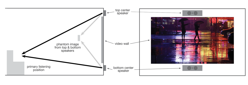
In this proposed solution, the sound is directed at the primary listening position from speakers placed above and below the video wall and then blended to create a phantom sonic image

Sign up for our monthly newsletter
to stay up to date on Cineluxe

The UK-based company TPI offers a variation of the above systems, called the Movement system, which uses speakers designed to fit within very tight boundaries below and above the video wall—something like 8 inches of height for each of them in their smallest configuration. That approach is similar to what other companies are doing, but TPI has also developed a black box that allows you to sit in the primary listening position and change the combination of level and time delay between each pair of top and bottom speakers so you can adjust the height of the sonic image. 

This approach—which is much easier than doing the hard calculations of time delay and relative levels between top and bottom speakers—is appealing even to us at SHA, who specialize in that sort of thing. It just takes away one task in an already complicated calibration, and there aren’t too many variables you can mess up.

Our role is to minimize the compromises, and that’s true whether you’re using a projector and screen or an LED wall. It’s really a matter of everybody involved—the display manufacturers, the speaker manufacturers, the dealers, the installers, the calibrators—working together to find an optimal solution. You can’t have a movie without picture and sound, and the picture and sound need to work together. So we have to make them work together and not have either element be an afterthought. 

No matter which approach one entertains for delivering audio with a direct-view wall, the experience at all seats in a theater or media room won’t be the same without being able to locate the sound sources directly in line with the image. Fortunately, some variation of sound/image localization can be accepted if all other aspects of the room and system are designed effectively. Advanced calibration of each of the audio system types mentioned above can at least ensure that the row with the primary listening seat(s) will be optimized with the exact sonic image height, while the other rows in front and behind will have as little deviation as possible.

We look forward to continuing this exploration and seeing the variety of manufacturers work to perfect their offerings.

Steve Haas is the Principal Consultant of SH Acoustics, with offices in the NYC & LA areas. Steve has been a leading acoustic and audio design & calibration expert for over 25 years in high-end spaces ranging from home theaters, studios, and live music rooms to major museums and performance venues.

Million-Dollar Wall, Hundred-Dollar Sound

a rendering of the Movement L center speaker, part of the TPI Movement system designed specfically for video wall installations

Generic selectors
Exact matches only
Search in title
Search in content
Post Type Selectors

© 2023 Cineluxe LLC

Scroll to top

sign up for our newsletter

receive a monthly recap of everything that’s new on Cineluxe