• Type:
  • Genre:
  • Duration:
  • Average Rating:

Design

Integrators, Trust, and the Trades, Pt. 2

Integrators, Trust & the Trades, Pt. 2

Integrators, Trust, and the Trades, Pt. 2

related articles

“We want the other trades to see HTA Design Partner integrators as designer/consultants and not as just another contractor”

Sign up for our monthly newsletter to stay up to date on Cineluxe

The HTA has introduced two programs meant to dramatically change the working relationship between integrators and architects, builders, and designers

by Josh Christian
March 29, 2023

The Home Technology Association (HTA) has recently taken a big step in bridging the gap between custom integrators and architects, designers, and builders by introducing two different designations—the HTA Design Partner and the complementary HTA Technology Partner. The Design Partner is the next evolution in how the association is helping integrators get invited to projects earlier. 

We interviewed architects, designers, and builders to find out what keeps them from bringing integrators onto their projects at the earliest stage—what in architectural speak is called the schematic design phase. One of the biggest reasons is that they didn’t know there are integrators that can be hired as a technology consultant. Trade partners need consultants and designers for certain aspects of the home, so they’re happy to learn that there are design-centric integrators who create drawings that can be made part of the spec for the project. And they appreciate the fact that design-centric integrators will seek out their opinion on the visible technology items. Knowing that qualified integrators offer this encourages the trade partners to see the integrator as a consultant/designer instead of as just another contractor, which is a big distinction in their eyes. It took me years to grasp this, and only fully set in when I was a pure technology consultant and designer with Axiom Design for 18 months.

Almost every HTA Certified integrator does design and engineering, though their trade partners are often not aware of this because most integrators don’t bring it to the forefront in their marketing. So we encourage them to get the word out. Architects and designers love this because it’s easier to get a client to say yes to a small initial design fee than to an $800,000 proposal. And it gives the integrator a chance to use the discovery phase to get to know the client, understand how they live, and educate them about their options and show they aren’t just there to push products.

We’re encouraging integrators to get paid for their design work, which too many of them give away for free. Architects and designers know that other professionals they may bring to their projects, such as lighting designers, MEP, civil engineers, and electrical engineers, charge for their design work. So should integrators! If they give their design work away for free, how will these professionals value what they’re providing? They’re cheapening their value in the mistaken belief that they must do free design work. Anyone leery of doing this can offer to credit back all or a part of their design and consultation fees if the client hires them for the rest of the job. The great news is that the close ratio on these projects is typically 90% or greater, as the integrator will have created a relationship with the client at this point. And if they’re good at what they do, the client will see that the integrator has their best interests in mind.

One of the big goals of the HTA Design Partner designation is to change the perception that all integrators are just there to push an agenda. Architects, builders, and designers tend to think of integrators as being pushy, trying to sell the client on things they don’t necessarily need. So we asked them what they would need to see from an integrator before they could recommend them, and then we came up with what we call our Rules of Engagement or Code of Conduct—11 things members of the Design Partner program need to follow when interacting with clients and the trades. Some of it is common sense—things like telling them how to work with the trades collaboratively and showing the kinds of drawings they should provide. And we tell them that instead of assuming what the finish is going to be or what keypad style someone might like, they should make sure to show these things to the architect or designer or whoever is referring them to the project and get their input.

Nearly 60% of our members have opted into the Design Partner program since we rolled it out mid January. But the program also has a flip side—the HTA Technology Partner designation—because there are things architects, designers, and builders do that can make it difficult for integrators to do their job. The Technology Partner designation teaches them how to work with integrators in the most productive way possible. We show them that bringing an integrator into a project early can help avoid things like change orders, project delays, wall acne, and other potentially costly problems and aesthetic compromises. And we explain how an integrator can benefit each of the trades, because of course each has different needs and they might not understand what an integrator can do to help them.

We want the other trades to see HTA Design Partner integrators as designer/consultants and not as just another contractor. We tell the trades that if we bring them integrators who can perform at this higher level, those integrators need to be treated on par with their own trade. For instance, an integrator needs to be able to present their proposal directly to the client, not through the other trades, and payments need to be above-board, not under the table. In other words, the partners need to address the things integrators have told us the other trades do that can make their job more difficult. We’ve told the trade partners that if they’re willing to work this way with integrators, we will provide them with integrators who are qualified to collaborate effectively with them.

The HTA Technology Partner is a free program any architect, designer, or builder can choose to opt into once they’ve reviewed and agreed to the five points. Participating in it shows their clients and the other trades that these partners are in a position to help address all of the client’s technology needs instead of just burying their heads as if technology doesn’t exist. Architects, designers, and builders get shopped just like integrators do, and seeing that someone is a HTA Technology Partner can be the thing that gets a client to go with them instead of someone else.

We’re really proud of having created this framework for building a properly respectful collaborative relationship between all the trades, which will help our members get hired in the earliest phases of a project. And we’re looking to establish ourselves as the leader in helping up-and-coming integrators learn how to portray themselves to architects, designers, and builders, which will go a long way toward changing the perception of the industry in general and help integrators be seen as professionals on par with the other major trades.

A technology enthusiast since he was a child, Josh Christian entered the home technology industry in 1995, soon joining a firm that he helped grow into one of the largest custom integration companies in the industry. In 2017, co-founded the Home Technology Association and became its CEO, bringing his years of experience as an integrator, marketer, and consultant to fulfilling the Association’s goals of identifying the top home technology installation firms and bringing them the recognition they deserve.

“One of the big goals of the HTA Design Partner designation is to change the perception that all integrators are just there to push an agenda”

Integrators, Trust & the Trades, Pt. 2
Generic selectors
Exact matches only
Search in title
Search in content
Post Type Selectors

© 2023 Cineluxe LLC

Integrators, Trust, and the Trades

Integrators, Trust & the Trades

Integrators, Trust, and the Trades, Pt. 1

related articles

“Once a client learns there’s a standard for whatever it is they’re purchasing, they tend to seek out that standard if they care about quality”

Sign up for our monthly newsletter to stay up to date on Cineluxe

On how HTA Certification encourages architects, designers, and builders to make qualified integrators part of the design team from a project’s inception

by Josh Christian
March 27, 2023

One of the biggest goals for the Home Technology Association (HTA) since its founding in 2017 has been to bridge the gap between integrators and architects, interior designers, and builders. The first way we did this was to build the HTA certification standard so integrators who meet it have a legitimate way to differentiate and elevate themselves from ones who shouldn’t even be allowed to bid on bigger projects because they don’t have the experience or are just all about the quick buck.

HTA certification has already served as a great way for an integrator to quickly establish a trust relationship with trade partners like designers, architects, and builders. When I began my career as an integrator in the late 1990s, the trade partners tended to bring integrators into a project at the very last minute, so it took me a long time to create enough trust for them to refer me on a project. I would sometimes have to be at it for two, three, even four years. Now, with HTA certification, an integrator can point to the certification standard on our website and it builds credibility.

I didn’t realize back then that the trade partners’ mistrust was often well-founded. In my naivety, I thought a decent number of integrators were good—maybe 50 percent good and 50 percent not so good. And I was shocked later in my career to discover that it’s more like 10 percent are top-performers and 90 percent so-so or worse. It took a while for architects, designers, and builders to hire my firm because they were lumping me in with all the bad integrators by default. Their assumption of integrators often was “guilty until proven innocent.” I worked hard to earn their trust. So when my company would win awards or was published in a magazine, I’d show off our work and build trust that way.

The HTA certification standard helps the best integrators build that trust and credibility much quicker. Since only about 10 percent of integration firms will meet the HTA standard, our members can leverage the fact that they’ve been certified to tell their trade partners, “Hey, you don’t have to trust me that we’re a good firm—we’re HTA Certified.” The integrator will then share the HTA Certification standard with them, and this has proven to build trust and credibility. We help our dealers with a powerful elevator pitch that works. Some of them have even been able to convince their architect, builder, and designer partners to require HTA Certified integrators on their projects.

All integrators have experienced this situation: The client seems to be OK with their price, and everything is going really well. But at the 11th hour, the client goes out and gets another proposal that’s significantly cheaper because they went to someone who’s not qualified for the project. Of course the low-ball proposal is a different scope, it’s inferior product—all the usual suspects. The integrator is left defending their legitimate proposal against one that shouldn’t even be considered, which creates a terrible situation because the builder/architect/designer doesn’t know what to say to the client except, “I know this industry’s got some problems, but please trust me and use my guy.” But they typically defend their integrator of choice up to a point and then relent to the client. If the integrator leads with the fact that they’re HTA Certified, shares the elevator pitch, and points the client to the HTA standard, though, clients tend to shop around much less, especially when the integrator uses the HTA technology budget estimator to share realistic installed costs first. The chance of losing a deal to a low-baller goes down drastically. And if they do lose that client, it’s one they don’t want anyway. It’s better to spend time with clients who appreciate quality workmanship and customer service, not ones who are pennywise and pound foolish. Those clients always turn out to be nightmares.

HTA certification gives the architect, designer, and builder ammunition to hold firm and say, “Hey, I only work with HTA Certified integrators.” They can send the client to the HTA website to learn what certification means—which then makes the client wonder, “If this other company is so good, why aren’t they certified?” Educating trade partners about the HTA certification standard really works. The smart integrators understand this and use it to their advantage.

Think about how standards affect us in our everyday lives. We expect to have a great dining experience if we select a Michelin star-rated restaurant. We expect our vehicle to be safe if it receives a five-star safety rating. And we expect a mechanic to be competent if they’re ASE certified. We pay more for GIA or EGL-rated diamonds as their value has been determined by a defined standard and rated by professionals. That is what HTA certification is doing for the CI industry.

Some integrators believe the Home Technology Association and the HTA certification standard need to be household names for them to have any value, which is absolutely not true. Once a client learns there’s a standard for whatever it is they’re purchasing, they tend to seek out that standard if they care about quality. Don’t believe me? For those of you who don’t know what the GIA or EGL diamond rating standard is (in my estimation, about 40% of men don’t know), stop by a jeweler and tell them you’re looking for a quality diamond for your wife or girlfriend. Very early in the jeweler’s qualifying questions, you’ll be told about GIA or EGL, or both. Once you hear the pitch, I’m about 99% sure you’ll be sold on it and will most likely choose the rated diamond, even though it costs more. Clients will do the same for HTA Certified dealers. Let that sink in for a moment . . .

In Part Two, Josh discusses the HTA Design Partner and Technology Partner programs, which are meant to make integrators more credible for clients and help strengthen the relationships between integrators and their trade partners.

A technology enthusiast since he was a child, Josh Christian entered the home technology industry in 1995, soon joining a firm that he helped grow into one of the largest custom integration companies in the industry. In 2017, co-founded the Home Technology Association and became its CEO, bringing his years of experience as an integrator, marketer, and consultant to fulfilling the Association’s goals of identifying the top home technology installation firms and bringing them the recognition they deserve.

The Home Technology Association website

“It’s better to spend time with clients who appreciate quality workmanship and customer service, not ones who are pennywise and pound foolish. Those clients always turn out to be nightmares.”

Generic selectors
Exact matches only
Search in title
Search in content
Post Type Selectors

© 2023 Cineluxe LLC
People First, Then the Gear

People First, Then the Gear

People First,
Then the Gear

By finding out all about their clients’ lives and needs well before they get around to talking about the tech, Britain’s Equippd sets an example other high-end integrators should follow 

by Michael Gaughn

left | Equippd co-founder & director Matthew McCourt (at right) consults with a client at a job site

RELATED ARTICLE

January 31, 2023

Custom integrators—the folks who come up with the gear for watching movies, running your lights and shades, cobbling together your security system, and so on—justifiably worry about just being seen as the tech guys, a stigma that leads to not being taken as seriously as architects and designers, which in turn often means they’re the last ones called in on a job. Some integrators have started to make an effort to show they understand lifestyle and design but the exercise often comes across as forced and insincere because most really are just tech guys at heart.

Consider the websites of the leading luxury integrators in the NYC market. They all look different but the messaging is all pretty much the same—not “we understand you” but “look at how great we are.” And the focus tends to be on brand names and on awards won, sometimes accompanied by a single image of a contemporary but sterile and depopulated room. Even the newer firms, which ought to be more attuned to design, usually display more attitude than empathy.

They could all afford to learn a thing or two from Britain’s Equippd. Everything about this  Surrey-based high-end integration firm—from their website to their portfolio to how they engage their clients—shows they don’t just pay lip-service to but genuinely get design. Every page of their site speaks to lifestyle well before it broaches technology, and does so in a natural and disarming way that just can’t be faked.

I initially became aware of Equippd while wading though scores of photos of media rooms and private cinemas from a broad cross-section of luxury integration firms. Only one space stood out—the whimsical little theater tucked away behind a bookcase profiled in “Secret Cinema.” Everything about that room felt right. It not only looked comfortable and conducive to movie watching but evinced a deft ingenuity without ever being showy. Most striking of all was its apt sense of design, leagues away from the “we don’t really get how this works but we had to do something” aesthetic that mars most dedicated entertainment spaces.

Interviewing Equippd’s Matthew McCourt for “Secret Cinema” confirmed that the virtues on display in that theater, and in the company’s other projects, are just an organic extension of the well-considered, engaging, reassuring manner of the company’s principals. The brainchild of Matthew and his brother Charlie, Equippd adopts a familial approach that can’t help but put clients and collaborators alike at ease. Wanting to go deeper into why they get it right when so many other integrators don’t get it at all, I recently buttonholed Matthew for another transatlantic chat.

145B Walton Road
East Molesey
Surrey KT8 0DU

+44 (0)20 8191 7887
hello@equippd.uk

“If you hit people with all the brands and specifications very, very quickly, it’s just overwhelming because they don’t have enough time to digest any part of it, so they just shut down”

Your website does a nice job of showing clients how Equippd determines their needs, but could you walk me through the process a little?

It’s all about finding out how people live in their homes. Once you understand that, you can then put forward different types of technology that are going to enhance those areas or make certain things easier for them rather than going in and saying, “Yeah, this is Lutron! and Crestron! and this and that,” which will cause the client to go, “Well, what is that? Do we need that sort of stuff?”

Equippd co-founders Charlie and Matthew McCourt describe their process for determining a client’s needs

Equippd co-founders Charlie and Matthew McCourt describe their process for determining a client’s needs

The Artechouse NYC show The Life of a Neuron incorporates the work of a number of artists to tell the story of neurons

“The desire to find the optimum solution for every project is what helps to get me up in the morning, along with knowing we’re going to be trying to understand a new customer and how they want to develop their house”

Before we dig down into different types of brands and things like that, there’s a bit of a journey we have to take people along because there are a lot of different things we do when we’re integrating into a home. We’re involved in the lighting, the heating, the shading, the entertainment spaces, the multiroom audio, their garden, their shed, their attic, the security. If you hit people with all the brands and specifications very, very quickly, it’s just overwhelming because they don’t have enough time to digest any part of it, so they just shut down. But If you instead try to understand how they live and show how you can improve that while making sure the space looks good—i.e., not see the tech at all or just see the bare minimum—we find that works well.

While there has been some effort to improve the look of the things people interact with, there’s still a long way to go.

Touchscreens are ugly. All of these things don’t look good, really. And alarm panels—terrible, terrible. Everything looks like it was from the ‘80s.

So what do you do to make all of that a little more palatable?

Whether it’s interior design, system design, schematics, elevations of how walls are going to look, how keypads and touchpanels are going to sit, what else is on that wall, we’re always thinking in terms of what can we remove, how can we clean up that space. Our sole drive is, how can we simplify this? Because we’ve seen panels everywhere before in properties and light switches just everywhere. And it’s like, why? We’ve walked into houses before where even we can’t operate the light switch.

When it comes to new construction versus retrofit, how do your projects tend to skew?

New build and renovation form 90% of our work, with the last 10% being retrofit, which we tend not to do too much because we’re not geared that way.

What distinguishes renovation from retrofit?

You’ve got a lot of London residences where pretty much the whole home apart from the facade is getting knocked back, stripped out, and then completely remodeled from the ground up. We classify those as a full renovation because we’re still keeping the existing fabric or four walls of the structure.

That kind of new construction and renovation can often mean open-floorplan spaces with a mandate to include as many types of entertainment as possible but without compromising the picture or sound.

We love those challenges because design plays so much into that, looking at the space, understanding, “OK, how can we do this to be able to give them this multifaceted kind of functionality for the room but make it look good?” In an open space like that, you can’t just have what looks like a media room tucked away in one corner. It’s just not going to fit in.

Renderings of a multi-use entertainment space. The section of the paneled wall above the TV conceals a dropdown projection screen. For movie viewing, the wall section comes forward and the screen descends in front of the TV.

Sign up for our monthly newsletter to stay up to date on Cineluxe

Have you had much call yet for video walls?

Not really. We did have one guy who wanted one as the splash-back in the kitchen. Where the hob and other stuff is would have basically been a massive TV. We quoted him but the project didn’t go anywhere.

Would it be fair to say that the living spaces themselves hold more interest for you than the technology you put in them?

Absolutely. The desire to find the optimum solution for every project is what helps to get me up in the morning, along with knowing that we’re going to be looking at something new, that we’re going to be trying to understand a new customer and how they want to develop their house, how that house is going to flow, how they’re going to use it.

Given all the things you can offer in a home, it seems almost inevitable you’d form as deep a bond with the client as the architect or interior designer does.

All the other trades do their work and then most often move on, but we’re there right at the start and then we’re also there right at the end. While the family are moving in, we’re meeting them, we’re meeting their kids, we meet their dog. And there’s a relationship that goes on after that, with any sort of tweaks and changes they want, or looking after systems and servicing them as well. I’ve always found that quite enjoyable, getting to know the people behind the home. That’s the part of the business I think is so important.

Michael Gaughn—The Absolute Sound, The Perfect Vision, Wideband, Stereo Review, Sound & Vision, The Rayva Roundtablemarketing, product design, some theater designs, a couple TV shows, some commercials, and now this.

Generic selectors
Exact matches only
Search in title
Search in content
Post Type Selectors

© 2023 Cineluxe LLC

Rooms for Improvement

Rooms for Improvement

Rooms for Improvement

Rooms for Improvement

the entertainment spaces in this Australian home are undeniably spectacular—but after a decade in use, they were ready for a major sonic makeover

the entertainment spaces in this Australian home are undeniably spectacular—but after a decade in use, they were ready for a major sonic makeover

by Michael Gaughn

by Michael Gaughn

October 31, 2022

This story could have easily just been about the Theo Kalomirakis-designed Art Deco home cinema. Or it could have focused instead on the jawdropping one-of-a-kind entertainment area, with its discreet stage, ability to accommodate 250 guests, and epic views of Sydney Harbor. But there turned out to be an even bigger—though not quite as showy and obvious—story to be told, about how these kinds of high-end spaces have become so elaborate and flexible and the trends and technologies influencing and supporting them are evolving so quickly, that we’re now being presented with an unprecedented array of opportunities—but also the continual challenge of staying ahead of the curve. 

Every home cinema is a completely custom and unique machine. And the open-floorplan multi-use entertainment areas that are beginning to supplant dedicated theater rooms (like the one profiled in “Achieving Serenity”) are even larger and more complex machines that have to be able to handle a wider and wider variety of tasks. You don’t need to be a techie or have any interest in what’s going on under the hood to realize that creating something like that and keeping it functioning optimally means relying on massive processing power. The key thing to remember is that these systems are basically one-off computers and subject to all the thousand shocks and upgrades our digital brethren are heir to.  

Because of that, this is also a story about not the visible but the invisible. As spectacular as these rooms are, they’re literally useless unless someone keeps a constant and careful eye on all manner of things that are never seen by their users. Acoustical designer Steve Haas has developed a reputation as a master of that unseen realm, one of a you-can-count-‘em-on-the-fingers-of-one-handful of people who know how to not just tame but maximize these intricate, individually crafted mechanisms so they can achieve and maintain peak performance. The portfolio of his company, SH Acoustics, extends well beyond private residences to museum and commercial venues as well, and Haas found himself having to draw extensively on that broader pool of knowledge in order to make this Australian homeowner’s exceptional mandate a reality.

A VERSATILE PERFORMER

The seven levels that constitute this 55,000-square-foot residence—let’s call it the Sydney Home—rest terraced in a rock face overlooking the harbor, with the iconic bridge and opera house prominent in the dioramic views from its primary living spaces and numerous terraces. It shouldn’t be a surprise to hear that a home of this caliber would hold a theater from a premier designer like Kalomirakis, nor that Haas, who has collaborated on some of Theo’s most ambitious efforts (including the legendary Paradiso) should have been called in to handle the acoustic and audio chores. 

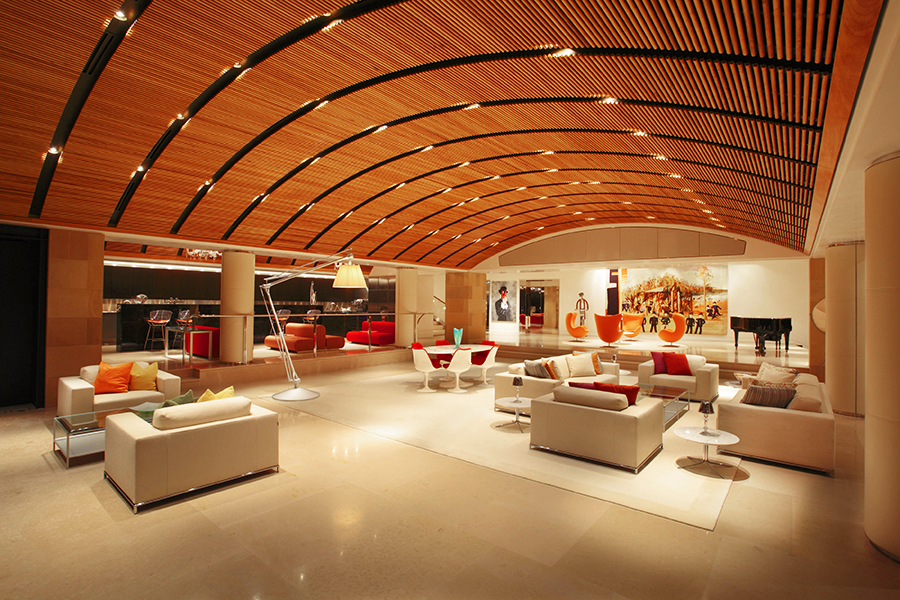
The entertainment area, with its  spacious bar & lounge area and terrace with epic views of Sydney Harbor, can comfortably accommodate 250 guests

The stage area, with the main speakers hidden behind the fabric at the top of the proscenium. Steve Haas took the client to the Steinway showroom in New York to help him select the Model B grand piano.

The home has seen performances by numerous A-list artists, including Sting, Michael Bolton, and Australian native Delta Goodrem (above)

“Once I had some dialogue with the client, we realized there was a need to have me consult on other keys areas of the home,” says Haas, “especially what they call the Level 1 entertainment space.” It’s not unusual for a home of this size to have a place for holding parties, hosting events, and staging live performances, but you’d be hardpressed to come across another similar space as well realized or as chameleon-like as the one here. 

The room gives few clues to its other capabilities when they’re not in use, feeling causal, comfortable, and domestic. Furniture groupings and large canvases help disguise the stage’s true identity, with the main speakers for performances hidden behind fabric panels in the soffit above the proscenium, and with a dropdown projection screen and monitor speakers tucked into the ceiling of the stage area. 

The client’s desire to have the room provide exceptional sound for parties, fundraisers, and other large events as well as for both movies and live entertainment created a unique challenge for Haas since each use had its own set of not necessarily cross-compatible needs. The music for parties had to be able extend into the bar area, out onto the various terraces, and into other parts of the home as well, while the stereo sound for performances needed to match what you would expect to hear in a high-end nightclub, and the movie system had to supply satisfying surround for groups as large as you’d find in a commercial cinema—all in a wide-open room filled with glass, wood, and other structural and decorative enemies of quality sonic reproduction.  

Haas was especially concerned about architect Alec Tzannes’s design for the ceiling, which used suspended elongated 3/4″ rectangular slats to create a barrel vault that would conceal the multitude of speakers, subwoofers, lighting cans, and ducts. “The client actually flew me over to Sydney to make the case,” says Haas, “because he had consulted with a local acoustic expert who had said there would be no problem. And I looked at it and said, no. This is absolutely wrong.” His solution was to use round dowels instead. “After we did our calculations and I created a physical mockup of the dowel system, we saw that the sound would bend around them in a way that would have a negligible effect.”

The curve of the ceiling was also a problem since it would tend to reflect and focus the sound from the speakers instead of spreading it evenly throughout the room. To help address that, and all the many reflective surfaces, Haas took advantage of the space above the dowels to apply extensive sound absorption.

Not only have the homeowners and their guests been impressed with the result, so have the numerous A-list artists who have sung there—Sting, Michael Bolton, and Australia’s Delta Goodrem among them. “Michael Bolton said it was one of the best-sounding places he’s ever performed in,” says Haas. 

MIXED SIGNALS

Cut to a decade later. The homeowner tells Haas he’s concerned the digital signal processors (DSPs) tasked with handling all the various audio responsibilities are beginning to fail. It’s not that the gear is faulty—it’s just at the end of its lifespan. “It’s not uncommon to see DSPs fail after 10 years,” says Haas. “They’re essentially computers, of course”—which means they’re just as likely to start crapping out as any laptop or desktop PC. And they’re subject to the same rapid technological advancements, with all their inevitable upgrades. Staying a step ahead of the upkeep is just a fact of life with anything this diverse and complex.

Rooms for Improvement

The 7.1-channel surround sound system in this Theo Kalomirakis-designed home theater was recently upgraded to Atmos via the addition of eight Wisdom Audio ceiling speakers 

PROJECT TEAM

acoustical designer

Steve Haas
SH Acoustics

theater designer

Theo Kalomirakis
TK Theaters

custom integrators
Datascene

architect
Alec Tzannes

Haas saw the task as not a chore but an opportunity to bring all the various types of DSP currently in the house under one brand and system. And while he was at it, why not upgrade the private cinema to Atmos as well?

With its 7.1-channel California Audio Technology speaker array, the cinema had been serving the homeowners well since its inception in the early ‘00s. But, having been impressed by Wisdom Audio’s ceiling speakers, Haas felt that adding eight of them to the room to create an Atmos configuration would significantly enhance the movie-watching experience. And the speakers were compact enough that he could have them installed without having to engage in a massive do-over.

Not that the upgrade wasn’t a challenge. Because they couldn’t dismantle the whole ceiling, Haas wasn’t sure what he, the contractors, and the custom integrators from Sydney-based Datascene would find when they attempted to tap into the preferred speaker locations. So they adopted a surgical approach, working their way carefully around the duct work and other impediments. And because there are bedrooms just above the theater, a tremendous effort had been made during the original construction to ensure none of the sound would bleed through the ceiling. Honoring this, they kept as much of the existing treatments in place as possible as they added the new speakers, also providing sound-isolation caps in each of the speaker locations. 

Premium theaters like this one often rely on a tip-top-of-the-line sound processor from a company like Storm Audio or Trinnov. But Haas went with a Marantz AV8805 instead because it provided the desired sound quality without all the additional bells and whistles of the higher-end models and would more readily work in tandem with the QSC Q-Sys pro-audio DSP he was deploying throughout the other key areas of the home.

It was also time to replace the projector—and rebuild the projection booth, which, located near the cliff face, had been infiltrated by moisture. Haas helped the client pick the new projector, consulting with Barco and coming back with a recommendation for its Wodan model. But this required an acoustical makeover for the booth since the new projector was significantly louder than the previous one and the noise would have been distracting, especially for anyone sitting in the last row, which rests up against the booth wall.

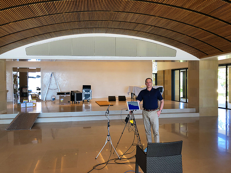
Acoustical designer Steve Haas calibrating the sound for the Level 1 entertainment area.

Rooms for Improvement

Acoustical designer Steve Haas calibrating the sound for the Level 1 entertainment area.

Sign up for our monthly newsletter
to stay up to date on Cineluxe

At 38 feet, the room is unusually deep for a private theater. “In a room like that,” says Haas, “you can get so sonically disconnected from the front that by the time you get to the rear seats, it feels like you’re in a different space.” To address this, he used acoustical treatments to disperse the sound so that the experience would be the same no matter where someone is sitting. 

For all the defining trends the Sydney Home represents, maybe the most significant is its extensive blending of consumer and pro gear. As high-end homes incorporate more elaborate entertainment areas like dance floors and live-performance spaces, they need to be able to provide sound on par with what artists expect in professional venues—along with the ability for DJs, sound mixers, and others to be able to jack in their gear.

Also, a multiform multipurpose system as flexible and complex as the one here can quickly exhaust the abilities of the hardware available on the consumer side of things. It often takes robust, function-specific professional gear to rise to these emerging challenges.

Haas, who is just as comfortable working on recording studios, concert halls, and galleries as he is on domestic environments, turned out to be the ideal fit for a project this ambitious. As a member in good standing of that previously mentioned acoustical elite, he was able to bring the necessary combination of expertise and experience to bear. Relying on someone whose knowledge is limited to the residential world to master something like this is a sure-fire recipe for disaster. Since entertainment areas are only going to get bigger, more versatile, and exponentially more complex, better to place them in the hands of people like Haas who not only think, but perform, well outside the home theater box.

Michael Gaughn—The Absolute Sound, The Perfect Vision, Wideband, Stereo Review, Sound & Vision, The Rayva Roundtablemarketing, product design, some theater designs, a couple TV shows, some commercials, and now this.

Generic selectors
Exact matches only
Search in title
Search in content
Post Type Selectors

© 2023 Cineluxe LLC
Flipping Quentin’s Vista

Flipping Quentin's Vista

Flipping Quentin’s Vista

Flipping Quentin’s Vista

theater photos courtesy Lance Alspaugh,
the Vista Theatre

EXCLUSIVE | Legendary filmmaker Quentin Tarantino and private-cinema maestro Theo Kalomirakis join up to transform a neighborhood hangout into an international film-lover’s destination

by Michael Gaughn
July 29, 2022

Building a movie theater on the dirt lot where D.W. Griffith shot the massive Walls of Babylon sets for his once revered now reviled silent-movie epic Intolerance is kind of like building on an old Indian burial ground. And yet that’s where LA’s Vista Theatre rests, and it’s hard not to

Flipping Quentin's Vista

sense the presence of silent movies past—and of a whole alternative, and slightly unsavory, history of Hollywood—emanating from it like a wraith.

The Vista has been through a lot. Originally christened the Lou Bard Playhouse and offering both live performances and movies, its premiere screening in 1923 featured the biggest child star of the day, the now forgotten Baby Peggy. Assuming its current name
c. 1930, the theater became something of a changeling, for a while showing first-run films, then second-run, foreign, and classic, during the ‘60s dabbling in some very adult burlesque, and, for an extended stretch, soft then hardcore porn.

After a brief stint as a revival house, the

The Vista has been through a lot. Originally christened the Lou Bard Playhouse and offering both live performances and movies, its premiere screening in 1923 featured the biggest child star of the day, the now forgotten Baby Peggy. Assuming its current name c. 1930, the theater became something of a changeling, for a while showing first-run films, then second-run, foreign, and classic, during the ‘60s dabbling in some very adult burlesque, and, for an extended stretch, soft then hardcore porn.

Vista transitioned back to first-run in the mid ‘80s, but thanks to midnight screenings, a steady flow of special events and premieres, cameos in films like True Romance and The Swinger, and the lingering reputation of its shapeshifter past, it’s become a magnet for independent, cult, and B movies and other manifestations of alt. The sidewalk beneath its marquee is pitted with celebrity handprints à la Grauman’s Chinese. You won’t find any Cary Grants or Steve McQueens there, though, but Bud Cort, Kenneth Anger,

After a brief stint as a revival house, it transitioned back to first-run in the mid ‘80s, but thanks to midnight screenings, a steady flow of special events and premieres, cameos in films like True Romance and The Swinger, and the lingering reputation of its shapeshifter past, it’s become a magnet for independent, cult, and B movies and other manifestations of alt. The sidewalk beneath its marquee is pitted with celebrity handprints à la Grauman’s Chinese. You won’t find any Cary Grants or Steve McQueens there, though, but Roger Corman, Bud Cort, Ray Harryhausen, Kenneth Anger, and the cast of Dark Shadows instead.

So it’s not hard to see why the Vista might catch Quentin Tarantino’s eye. A patron for years, Tarantino came to resonate so strongly with the theater’s vibe that he decided to snatch it up, freshen it up a bit, and see if he couldn’t turn it into a must-see destination for rabid film nerds like himself.

Ray Harryhausen, and the cast of Dark Shadows instead.

So it’s not hard to see why the Vista might catch Quentin Tarantino’s eye. A patron for years, Tarantino came to resonate so strongly with the theater’s vibe that he decided to snatch it up, freshen it up a bit, and see if he couldn’t turn it into a must-see destination for rabid film nerds like himself. 

His affection for the Vista seems to

spring as much from what it’s not as from what it is. It’s not an opulent movie palace like Disney’s flagship El Capitan 11 miles down the road but a kind of mini palace with a neighborhood-hangout feel. And it’s not located in the heart of Hollywood, like the El Capitan, Grauman’s, Pantages, or Cinerama Dome, but in a nebulous no-man’s land tucked between Los Feliz, Silver Lake, and, just down Sunset Blvd., Little Armenia. It might be wry but not wrong to think of the Vista as the brick & mortar equivalent of the defiant outsider, the unbowed survivor.

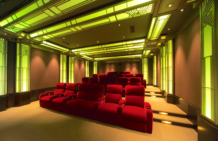
It’s a little harder to understand the theater’s attraction for designer Theo Kalomirakis, whose reputation rests largely on bringing exuberant flair, tempered by tasteful restraint, to creating private cinemas, a category of design that too easily and often descends into excess and kitsch in the hands of others. But much of the Vista, from its iron-maiden-like box office to its well-intended stabs at hieroglyphics to its looming Nile-Delta-by-way-of-Topeka pharaohs, is pretty much an altar to kitsch.

His affection for the Vista seems to spring as much from what it’s not as from what it is. It’s not an opulent movie palace like Disney’s flagship El Capitan 11 miles down the road but a kind of mini palace with a neighborhood-hangout feel. And it’s not located in the heart of Hollywood, like the El Capitan, Grauman’s, Pantages, or Cinerama Dome, but in a nebulous no-man’s land tucked between Los Feliz, Silver Lake, and, just down Sunset Blvd., Little Armenia. It might be wry but not wrong to think of the Vista as the brick & mortar equivalent of the defiant outsider, the unbowed survivor.

It’s a little harder to understand the theater’s attraction for designer Theo Kalomirakis, whose reputation rests largely on bringing exuberant flair, tempered by tasteful restraint, to creating private cinemas, a category of design that too easily and often descends into excess and kitsch in the hands of others. But much of the Vista, from its iron-maiden-like box office to its well-intended stabs at hieroglyphics to its looming Nile-Delta-by-way-of-Topeka pharaohs, is pretty much an altar to kitsch.

above | the auditorium, designed in an Egyptian style meant to reflect the Vista’s Intolerance roots, will be kept pretty much as is

It’s not like Kalomirakis even knew the Vista existed before he took on the assignment of translating Tarantino’s wishes into a satisfying reality. His involvement is due mainly to some deft but determined bird-dogging by the previous owner, Lance Alspaugh, who’s been retained to manage the theater and shepherd the renovation. A devotee of Kalomirakis’ work, Alspaugh slipped a copy of Private Theaters, the sumptuous coffeetable-book presentation of the designer’s early efforts, in front of Tarantino at a planning meeting. 

As Tarantino flipped through the book, Alspaugh started making the case for retaining Kalomirakis but quickly realized he could save his breath. It was clear from Tarantino’s expression he was hooked. “We don’t really need to talk about this anymore,” he said. “This is obviously the guy.”

Kalomirakis politely declined the first time Alspaugh called—and the second, and the third. Content with the life he’s carved out for himself since moving back to Greece, Kalomirakis was taking on few new projects; plus, his experience with commercial theaters is limited. But, adopting the same tactics he deployed to convince famed designer Joseph Musil, who had renovated the El Capitan, to flip Coronado’s Village theater, Alspaugh quietly persisted, with his gentle persuasion eventually winning Kalomirakis over.

The Theo/Quentin honeymoon proved short-lived, though. Having been told the plan was to leave the Vista’s auditorium pretty much as is, Kalomirakis assumed his mandate was to do the rest of the theater in the same Egyptian Deco style. And although Tarantino liked Kalomirakis’ initial design, he ultimately deemed it too elegant, coming back with suggestions for faux cinderblock walls and an outsized RC Cola 

It’s not like Kalomirakis even knew the Vista existed before he took on the assignment of translating Tarantino’s wishes into a satisfying reality. His involvement is due mainly to some deft but determined bird-dogging by the previous owner, Lance Alspaugh, who’s been retained to manage the theater and shepherd the renovation. A devotee of Kalomirakis’ work, Alspaugh slipped a copy of Private Theaters, the sumptuous coffeetable-book presentation of the designer’s early efforts, in front of Tarantino at a planning meeting. 

As Tarantino flipped through the book, Alspaugh started making the case for retaining Kalomirakis but quickly realized he could save his breath. It was clear from Tarantino’s expression he was hooked. “We don’t really need to talk about this anymore,” he said. “This is obviously the guy.”

Kalomirakis politely declined the first time Alspaugh called—and the second, and the third. Content with the life he’s carved out for himself since moving back to Greece, Kalomirakis was taking on few new projects; plus, his experience with commercial theaters is limited. But, adopting the same tactics he deployed to convince famed designer Joseph Musil, who had renovated the El Capitan, to flip Coronado’s Village theater, Alspaugh quietly persisted, with his gentle persuasion eventually winning Kalomirakis over.

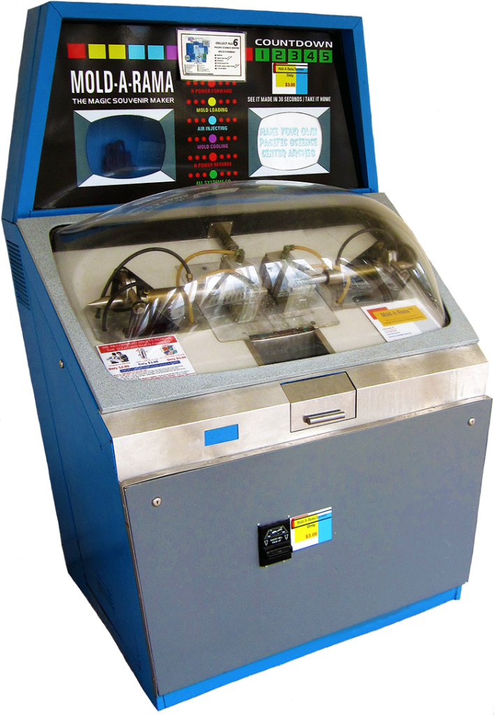
The Theo/Quentin honeymoon ended up being brief, though. Having been told the plan was to leave the Vista’s auditorium pretty much as is, Kalomirakis assumed his mandate was to do the rest of the theater in the same Egyptian Deco style. And although Tarantino liked Kalomirakis’ initial design, he ultimately deemed it too elegant, coming back with suggestions for faux cinderblock walls and an outsized RC Cola dispenser that would overwhelm what Kalomirakis had in mind for the concession stand. (There’s even talk of a Mold-a-Rama.)

It wasn’t until Kalomirakis heard about the decidedly casual grunge-ish look planned for the coffeeshop and gaming arcade that will occupy the storefronts to either side of the Vista that he got where Tarantino’s trying to go. Not wanting the theater to feel so exclusive that anyone hesitates to enter, Tarantino instead wants to create an everyman’s retreat that evokes his own early experiences of going to the movies.

dispenser that would overwhelm what Kalomirakis had in mind for the concession stand. (There’s even talk of a Mold-a-Rama.)

It wasn’t until Kalomirakis heard about the decidedly casual grunge-ish look planned for the coffeeshop and gaming arcade that will occupy the storefronts to either side of the Vista that he got where Tarantino’s trying to go. Not wanting the theater to feel so exclusive that anyone hesitates to enter, Tarantino instead wants to create an everyman’s retreat that evokes his own early experiences of going to the movies.

That realization was a revelation for Kalomirakis. The common bond between him and Tarantino, it turns out, is exactly that intense love, born in childhood, for the whole experience of watching movies—a shared origin story that runs so deep it’s been the inspiration, and constant source of sustenance, for both of their careers. Seeing that Tarantino was more interested in staying true to his emotional roots than to the bones of the Vista gave Kalomirakis a new and more potent source of inspiration to draw on.

Embracing that come-one-come-all, come-as-you-are dynamic, Kalomirakis quickly created a new design that Tarantino just as 

Flipping Quentin's Vista

Sign up for our monthly newsletter
to stay up to date on Cineluxe

quickly blessed—which is a good thing since the renovation is already well under way, with the lobby already gutted. Early, likely optimistic, estimates pointed toward a December reopening; early to mid 2023 is looking more realistic.

But there’s a whole other layer to this story, one that’s been all but lost in all the attention paid to the acquisition and renovation. That Tarantino is having the projection booth rebuilt to accommodate his personal dual-format 35mm/70mm projectors isn’t too surprising given his well-known preference for film over digital. But what might get the savvy to sit up and take note are his plans to show first-run movies on film, having prints struck even for titles pegged for digital-only release—which is of course damn near everything. 

To that end, Tarantino has formed a kind of cabal with other movies-on-film fans like Christopher Nolan, Paul Thomas Anderson, and Judd Apatow, with this formidable band of insiders pooling its resources to get prints made and help put the Vista firmly on the radar of the film-forever crowd. Since probably no one but Tarantino has the necessary sway and determination to pull something like this off, it seems likely the Vista reborn will be—and remain—one of a kind.

It’s obvious Tarantino’s Vista isn’t going to be just some neighborhood haunt or famous filmmaker’s vanity project but, in its unassuming way, a mecca, an off-the-beaten-path everyone’s-invited celebration of the movies, a unique night out for anyone seeking a new old way to see the latest fare on film. 

Michael Gaughn—The Absolute Sound, The Perfect Vision, Wideband, Stereo Review, Sound & Vision, The Rayva Roundtablemarketing, product design, some theater designs, a couple TV shows, some commercials, and now this.

Generic selectors
Exact matches only
Search in title
Search in content
Post Type Selectors

© 2023 Cineluxe LLC
Scroll to top

sign up for our newsletter

receive a monthly recap of everything that’s new on Cineluxe