• Type:
  • Genre:
  • Duration:
  • Average Rating:

Design

A Tribeca Trendsetter

showcase

ACHIEVING SERENITY

INSIDE THE ULTIMATE HOME ENTERTAINMENT SPACE

LUXURY MADE EASY

A Tribeca Trendsetter

The desire for a casual movie-watching space in this apartment’s main living area led to the creation of a high-performance hideaway theater

by Michael Gaughn
November 29, 2018

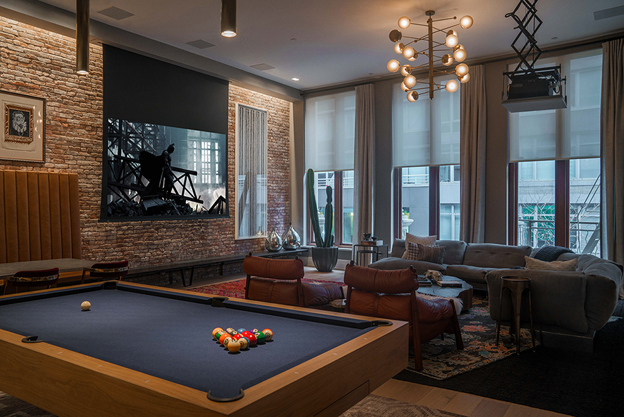
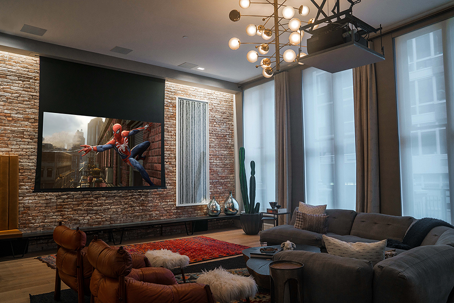
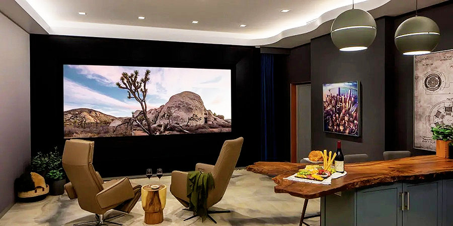
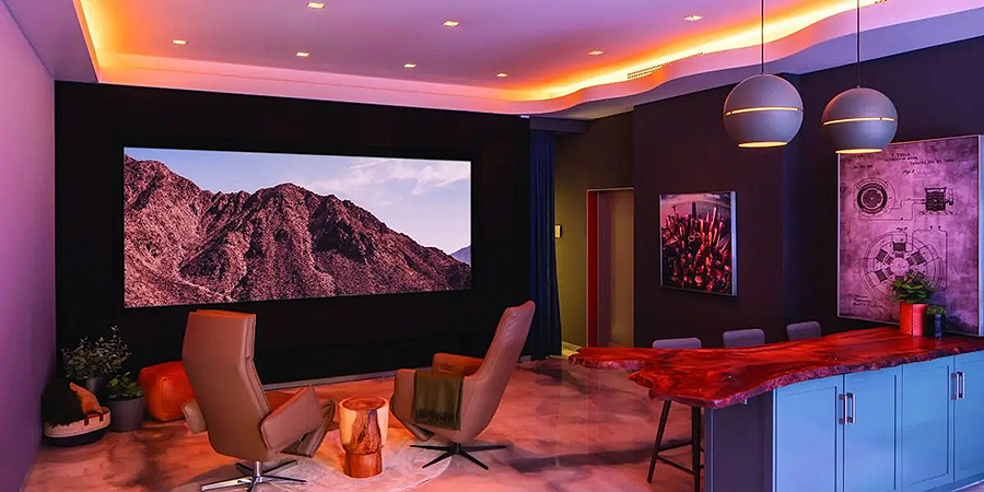
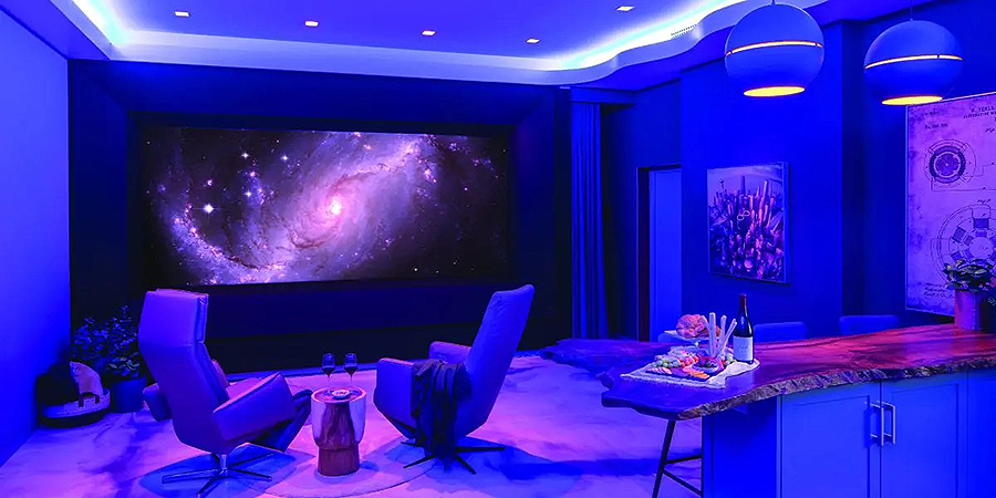
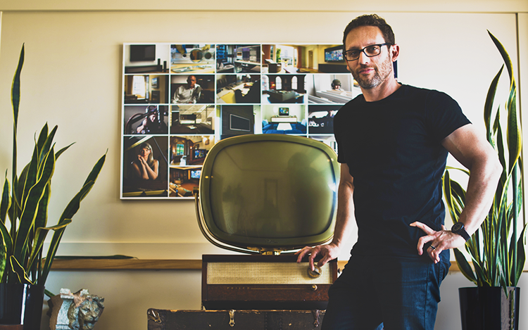
Ed Gilmore casually bringing some shots of a project he’d done in Tribeca up on his computer monitor was a major “a-ha” moment for me. The first shot showed a stylish, obviously comfortable living area that also served as a billiards room, dining room, and kitchen. The second showed the same room transformed into a home entertainment space a lot of people would die for. That, a completely intuitive part of me screamed, perfectly represents the new paradigm.

Others apparently agree with that conclusion because people just won’t leave Ed alone about the Tribeca space. Ironically, even he admits it’s not perfect—but it’s getting there, as the client invests more and more in turning what was initially a whim into a room that can blow a typical movie theater out of the water.

Having since had a chance to actually visit the space, and to shoot some video there, I recently circled back around with Ed to talk about all things Tribeca.

People seem to love that installation because it says that almost any room can now be transformed into a legitimate entertainment space.

I think what we did was to, in a minimally invasive way, create a home theater experience in a room that, if you looked at it from any angle, you would immediately say it couldn’t be done there. There was just no way.

Aesthetically, the room had already been designed before you came into the picture. How were you able to navigate those waters?

We just needed to be open and try to find really unique solutions that would both satisfy a high-end level of performance as well as maintain a certain aesthetic value the client wanted us to maintain, and be true to the bones of that room. I don’t think that’s any rare talent. The issue was that he had interviewed a lot of other AV guys who told him right off the bat, “No, we won’t do that.” And that wasn’t the answer he wanted to hear. So we were lucky enough to be able to convince him that we could do it, and it could be compelling.

Tribeca video | Alyssa Neece
photos & Sound Advice video | John Frattasi

“We needed to be open and try to find unique solutions that would both satisfy a high-end level of performance as well as maintain a certain aesthetic value the client wanted us to maintain, and be true to the bones of that room.”

—Ed Gilmore
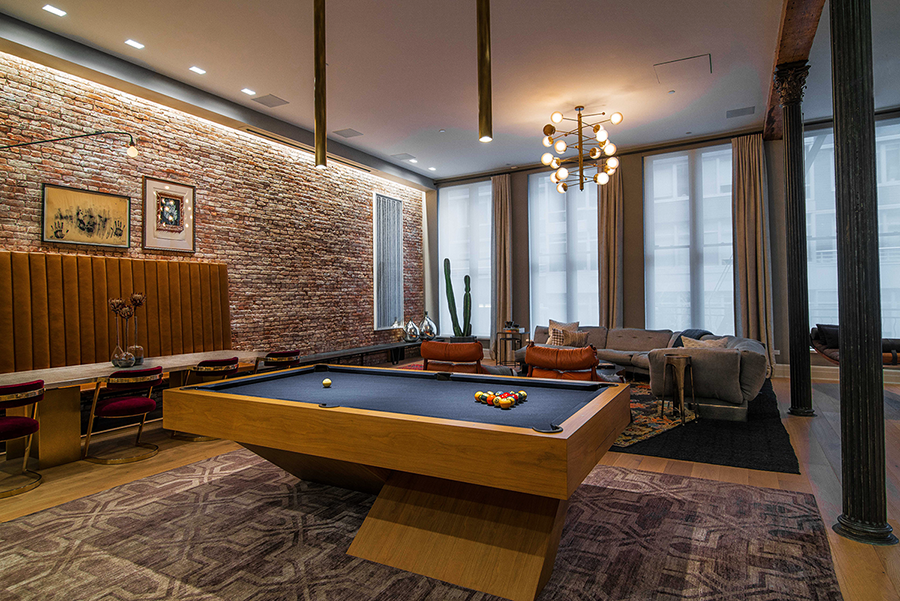
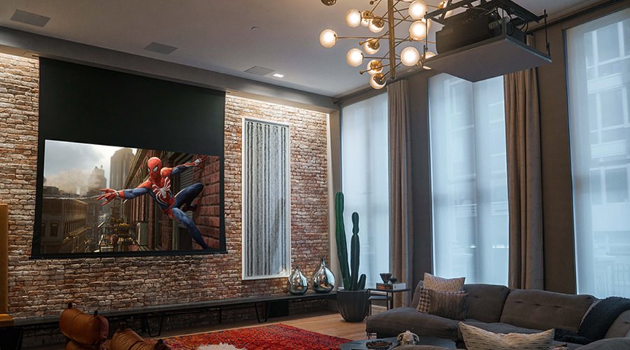
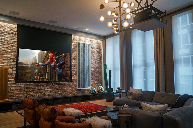
a retractable screen, ceiling speakers, and a projector on a lift allow the apartment’s main living area to be transformed into a better-than-movie-theater entertainment space

related articles

Sign up for our monthly newsletter
to stay up to date on Cineluxe

That communal area wasn’t supposed to be the main entertainment space, right?

Right. The den is the room where he really sits and watches most of his TV. That was the room he wanted to spend some money on. This other room was kind of an experiment for him.

But as he saw it implemented, immediately he thought, “I’m going to sink some more money into this room.” And that’s exactly what he did. That’s what he did with the Kaleidescape Strato, that’s what he did with the Steinway Lyngdorf, and what he’s about to do with projection, by upgrading the projector there as well.

Are people fascinated by that room because it’s a kind of outlier or because it represents a trend?

I think it’s a little bit of both. It’s tapping into a trend, that trend being that people aren’t interested in having dedicated rooms for specific purposes like a theater, or even a dedicated music room.

There’s also an aspirational aspect to it as well. It resonates with people because it’s well done. I mean, it’s a really beautiful space. And it’s well thought out. And that goes back to the developer, who did a really nice job on that building. The dimensions of the room are great, and it has this wonderful warm feeling to it without really needing much in terms of other types of interior design. 

But these particular clients do have taste, and they’ve been around the block a few times in terms of renovations. He is a serial renovator. And so their choice of artwork, their choice of furnishings—those little details that they have there are great. And I think that resonates with a lot of people, too. 

If luxury is really about details—about somebody caring enough to make sure every last thing is done right—Tribeca would seem to qualify.

I think you and I agree on this, right? Attention to detail is really what matters in a luxury space. People have asked me about what luxury is, and I typically say that it needs to be inspirational. But that doesn’t mean it really needs to be noticeable. It’s something that kind of unfolds. And by the time you realize what’s happening, you’re kind of taken by surprise by it. And it’s organic—it feels like it was always part of what was meant to be there. 

Michael Gaughn—The Absolute Sound, The Perfect Vision, Wideband, Stereo Review, Sound & Vision, The Rayva Roundtablemarketing, product design, some theater designs, a couple TV shows, some commercials, and now this.

about Gilmore’s Sound Advice

Since 1991, Ed Gilmore and Gilmore’s Sound Advice, Inc. have been designing, deploying, and servicing hundreds of integrated systems by strictly adhering to a word-of-mouth recommendation policy. Typical systems consist of audio & video distribution, home theater, lighting & shading systems, enterprise-level network/WiFi & telephony, along with HVAC & security systems integration. In 2016, Sound Advice created one of the most unique showroom & event spaces in New York City. 

Generic selectors
Exact matches only
Search in title
Search in content
Post Type Selectors

© 2023 Cineluxe LLC
Deschamps on Design: Star Gazing

Deschamps on Design: Star Gazing

Deschamps on Design | Star Gazing

“Design your own universe and control everything from brightness to color to timing within a millisecond with the flick of an app”

more Deschamps on Design

Generic selectors
Exact matches only
Search in title
Search in content
Post Type Selectors

Star ceilings have evolved from being the epitome of home theater kitsch to highly sophisticated, customizable, and tasteful additions to premium private viewing spaces

by Maria Deschamps
June 7, 2022

Fiber-optic ceilings were once so pervasive that they came to be seen as a tacky clichè and have long been out of favor in high-end home theaters. Overused and often just slapped on, they were, as home theater expert Theo Kalomirakis says, “the lazy man’s solution to ceiling design.” But star ceilings are coming back into favor with interior designers, thanks mainly to tremendous changes in the technology behind them. 

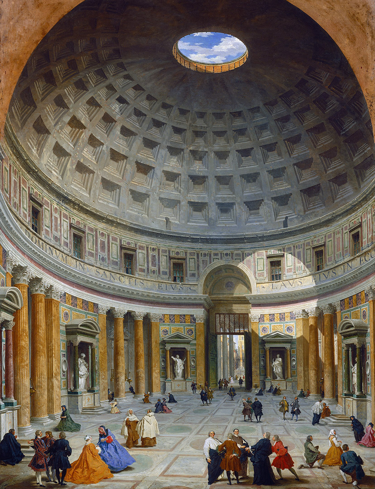
Speaking from my own experience, most people planning a dedicated home theater now request a star ceiling. Perhaps it’s to counteract the claustrophobia of the COVID lockdown or maybe it’s because of the renewed interest in space travel. In any case, star gazing has always been cathartic. I think back to my first visit to Greece and seeing all the outdoor theaters, which took my breath away. According to Theo, people in Greece attend outdoor entertainments not so much because of the movie or spectacle that’s playing but because of the environment it’s being played in. Similarly, I often reminisce about my visit to the Pantheon in Rome and looking up into the beauty and majesty of its iconic dome with its open aperture at the top that looks directly out at the sky above.

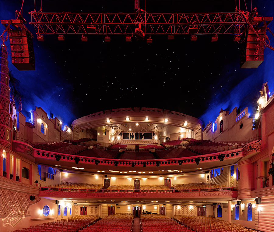
When architect John Eberson started designing atmospheric movie palaces in the early 1920s, his concept was to bring the outdoors in. He started by simply painting clouds and stars on domed ceilings, which evolved into making the stars twinkle and using projection to give the impression the clouds were moving. It was entertaining just to be in his theaters and gaze up. 

Star panels are the contemporary equivalent of that experience, consisting of thin strands of fiber-optic cable that carry light to each tiny star. The size, shape, and intensity of the light points determine the number of strands needed—anywhere from a few hundred to a few thousand.

As for what’s new in star ceilings, customizable panel sizes and shapes are just the beginning. No more being limited to fixed options, no more big control boxes (which were huge compared to the small, sleek 3.5″ x 5.5″ ones today), no more heat, and no more noise. How about showing your horoscope signs, your favorite planets, 

The star ceiling in the Great Hall of the Grand Rex theater, Paris, designed by John Eberson

shooting stars, or the entire Milky Way? Place each item where you want and decide what color you want it to be. Design your own universe, and control everything from brightness to color to timing within a millisecond with the flick of an app. 

Speaking with Epixsky, a leading producer of fiber-optic star panels, I discovered their business has expanded tremendously—partly because they now design ceilings for the medical sector as a way to calm patients during medical or dental procedures. Their latest development is airbrushing custom designs onto panels. In a luxury private cinema, adding something like a contemporary family crest could help make the ceiling design exclusive. 

The latest star ceilings are functional as well as decorative. Not only do they house and support the strands that carry the light, they can also act as an acoustic panel to absorb sound—which is perfect for a home theater ceiling! The panels can also be customized to fit additional recessed lights or ceiling speakers. The fabric used to cover them is acoustically transparent so the sound of speakers hidden behind them can be clear and concise, and you can choose fabric from a variety of colors and textures. 

You can’t just tack one of these panels onto your ceiling, though, and expect it look integrated into the design of the room. The details around the panels need to be meticulously attended to. Framing the ceiling with coves of indirect lights is one approach. Creating outlines with moldings or linear LED strip lights is another. Adding movement to the design—a twinkle here and a shooting star there—can be a really subtle touch, while at the same time ensuring that the ceiling remains decorative and not a distraction or the focus of attention.

Authenticity in design is very important to me. I prefer to use items made by artisan craftsmen, natural materials, and original art instead of mass-produced synthetic materials and lazy trompe l’oeils. But since it would be prohibitive at best to have an indoor theater where you can actually look up at the night sky or that recreates the Pantheon’s oculus, opting for a sophisticated, customized star ceiling can take you almost all the way there, lighting up your home cinema with your own private universe.

Maria Deschamps is a certified Interior Designer, IDC, NCIDQ, APDIQ and has been designing home theaters and media rooms since the year 2000. She also designs high-end residential, restaurant, and commercial spaces, and is a partner at TKG, the Theo Kalomirakis Group. 

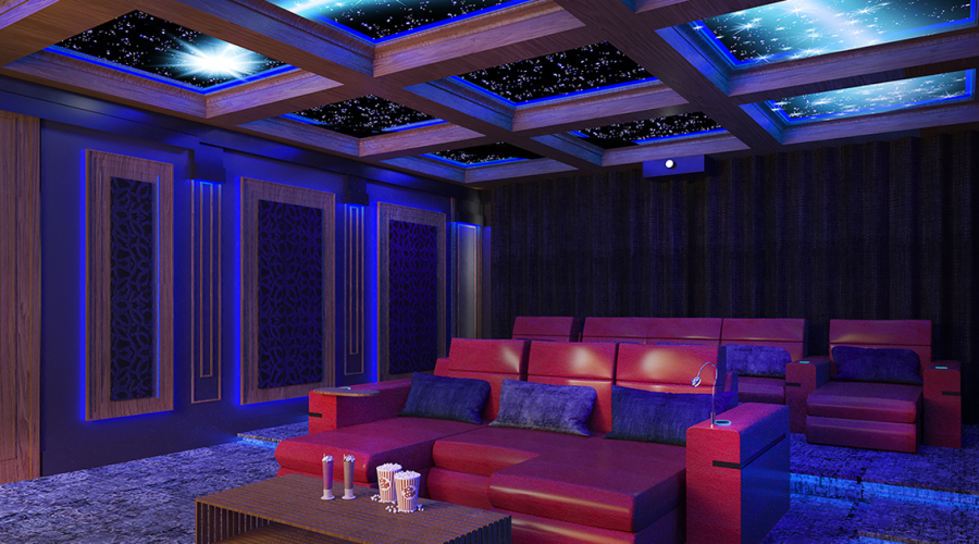
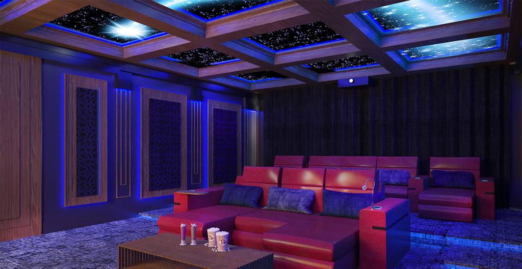
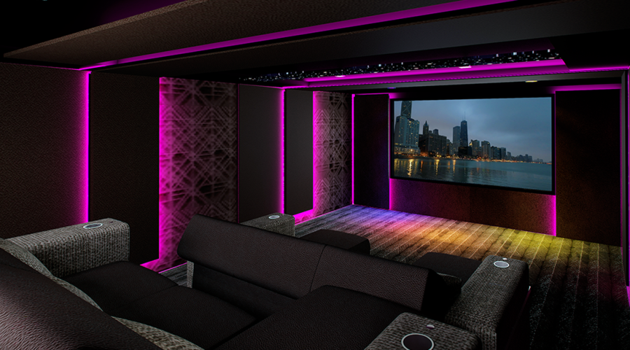
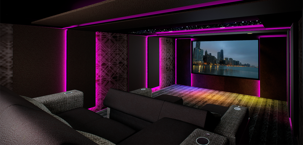
This rendering of one of Maria’s recent home theater designs features a fiber-optic ceiling with animated shooting stars

CLICK ON THE IMAGES TO ENLARGE

The oculus at the crest of the dome of the Roman Pantheon, shown in an 18th century painting

Sign up for our monthly newsletter to stay up to date on Cineluxe

© 2023 Cineluxe LLC
Achieving Serenity: A Closer Look

Achieving Serenity | A Closer Look

Making this impossible theater possible took a lot of engineering, a lot of customization, and a little magic

by the Cineluxe staff
May 20, 2022

Technology is catching up with the growing desire for spaces that deliver the high-quality picture and sound of a dedicated home theater while offering the multi-use flexibility of a media room, but there is no one-size-fits-all plug & play solution if you’re looking for a truly premium experience. So an entertainment room like the one in Serenity required many teams of people working on the various technical tasks, often having to regroup, to pull this space off. Below, we provide high-level, jargon-free explanations of how they make these key contributions happen.

the speaker system

The tech team faced every imaginable hurdle installing a 35-speaker Atmos system in the theater but still achieved stellar results

“The home theater is Serenity’s audio video crown jewel but it offered by far the most significant design and installation challenges. ‘It wasn’t as if the theater could have been redesigned with walls or with better acoustical speaker placement. It just wasn’t possible,’ integrator Jeff Williams stated. So, it was a big challenge, especially with the number of speakers required for Dolby Atmos. From the get-go, Williams knew he was going to need expert help, and he went to Triad Speakers and its design team to see what was possible. “They were really the ones that spearheaded that entire design, which was really nice for us.”

the sound processing

As important as all the other contributions were, it was some processing magic that took the Serenity theater over the top from impossible to real

“My initial impressions of the Serenity theater were based on a handful of images emailed to me by Mike Gaughn with a simple question: ‘Is there any way this room could sound good? Given the layout of the speakers, the material construction of the space, the variable of moving walls, etc., I thought about it and said, ‘I could make it sound really good . . . but only with Trinnov.’ So I wasn’t surprised to find out that’s exactly the audio processing employed in this room. The story of how Trinnov came to be involved is almost as interesting as the room itself.”

the home automation

This sprawling, entertainment-oriented home put such big demands on its control system the company had to design new gear just to handle the load

“The heart of every smart home is the automation system but when you’re talking about a home the size of Serenity, with this many sub-systems being managed and controlled, not just any control system will do. The homeowner specifically wanted to use Control4, which was how integrator Jeff Williams was brought into the job. ‘Someone the owner knew had Control4 and loved it,’ Williams said, ‘and when we started the project, he said to us, “If it can be on Control4, I want it on that system. Period.”‘ That went on to include not just control over the reference home theater system but hundreds of circuits of lighting, 28 zones of HVAC, pool systems like fountains and pumps, more than 20 distributed audio video zones, and motorized drapery.”

SIGN UP FOR OUR NEWSLETTER

Generic selectors
Exact matches only
Search in title
Search in content
Post Type Selectors

© 2023 Cineluxe LLC

Achieving Serenity

ACHIEVING SERENITY

How an impossible private cinema came to bloom in the Palm Springs desert

by Michael Gaughn
updated April 24, 2023

Serenity is a freshly minted 22,000 sq. ft. home nuzzling a golf course in Indian Wells, CA. Done in the kind of Mies-gone-wild style that’s become a signature look in expansive post-millennium west coast homes, it features a wide-open floorplan that’s as much about outdoors as indoors, and hinges its effect on a seamless flow between those two worlds.

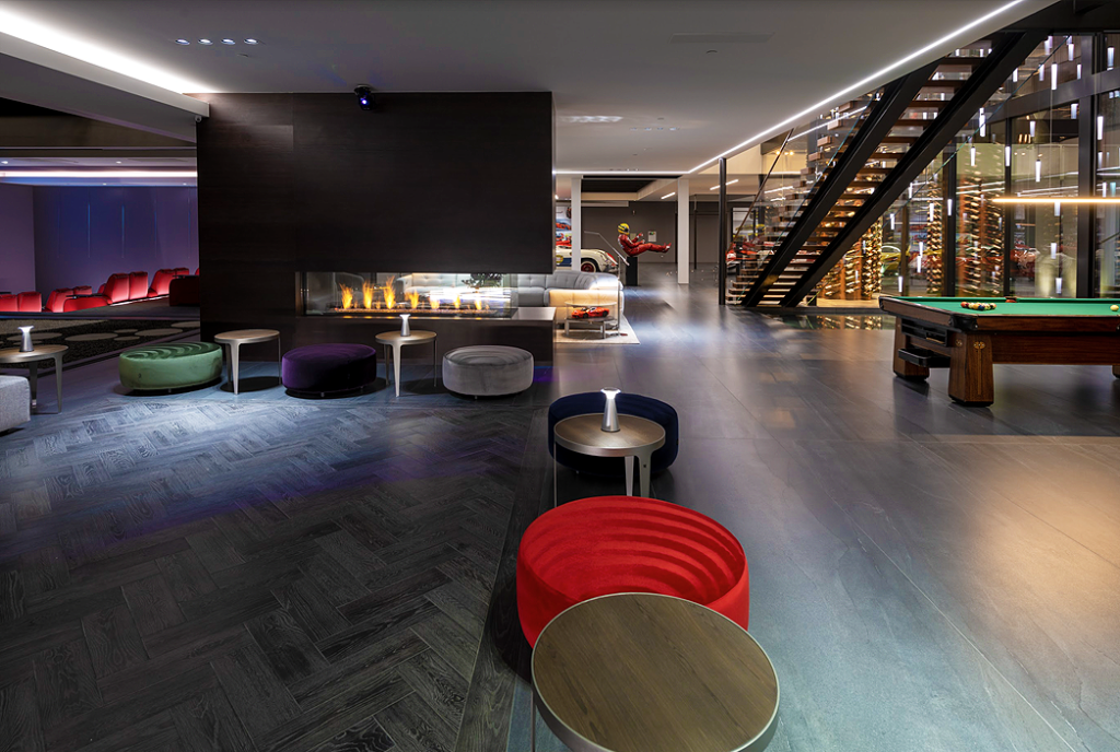
The whole is infused with a very contemporary sense of play, best evinced on the lower level, which gives off a distinctive carnival vibe, with guests free to stroll from the sports-car collection past a two-story rotating wine tower and onto an elaborate dance floor, then pass a Zen garden on their way to the private cinema—a cinema, by the way, that really shouldn’t exist. And yet there it is.

Everything about Serenity, from broad strokes to light touches, is an effective extension and expression of the somewhat diametric dispositions of its owners—he a businessman with an engineering background, she an artist. And that melding of creativity and ingenuity, of art and technology, may be best realized in the theater, a space brimming with know-how, but all of it invisible, and all in the service of entertaining and being entertained.

photos | William MacCollum
video | Geoff Franklin, Be Film Inc.

CINELUXE SHOWCASE

Achieving Serenity

right rear | the car collection & wine tower
foreground | the dance floor
left rear | the cinema

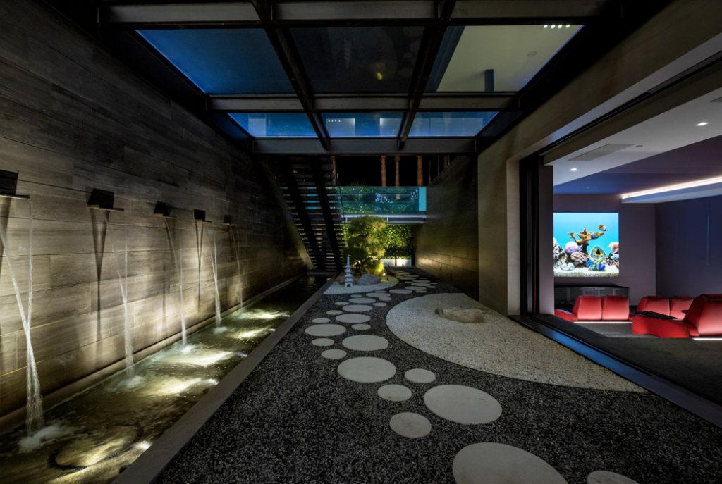
The couples’ expectations for the space were all reasonable enough—but seriously stretched the limits of what current tech can do. They wanted a theater with exceptional picture and sound where they could watch movies without distractions but that didn’t disrupt the no-boundaries flow of the rest of the home, allowing guests to dip in and out freely. They also wanted it to offer a rather generous view of the adjacent Zen garden so the room wouldn’t feel like an outlier in the home’s defining indoor/outdoor gestalt.

Most of the above goes well against the grain of the widely accepted criteria for creating a home cinema, dicta chiseled in stone, sacrosanct and inviolable:

The room must be sealed off, admitting no light or sound. Reflective hard surfaces like glass and metal are forbidden. There must be generous, unimpeded wall space for the placing of speakers for surround sound. Strict symmetry is king. And no Zen gardens.

left | the subterranean Zen garden with a glass-floor walkway on the main level, above, and an open-air courtyard glimpsed at the far end 
right | the cinema

Achieving Serenity

left | the subterranean Zen garden with an open-air courtyard glimpsed at the far end, and with a glass-floor walkway on the main level, above
right | the cinema

The Serenity theater checks none of those boxes. In fact, it seems to thumb its nose at the age-old practices. It’s not that the owners were deliberately trying to transgress—they just wanted what they wanted. And what they wanted meant breaking almost all the rules.

walls & bridges

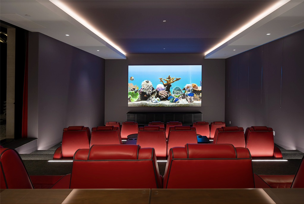
The hardest request to honor was the seemingly contradictory desire to have a movie theater-quality experience while also keeping the room open to everything around it. While it is possible to create a wide-open space that can deliver decent enough picture and sound, the light and noise from beyond its perimeter will inevitably compromise performance. The solution was to employ two retractable curtain walls, which allow the space to function both as a dedicated theater and as a more casual media room that readily welcomes strolling passersby.

Those walls also helped address another significant problem. The gated community where Serenity rests only allows for single-story dwellings, but the owners wanted their entertainment spaces to exist separate from their living area on the main floor, so they dug down instead. But to fend off subterranean gloom, large courtyards were placed fore and aft of the surface level to provide generous sunshine. 

That sunshine, as well as the artificial light from outside the theater, would easily wash out the image on the theater screen—an issue mostly resolved by closing the curtain walls. But what about being able to watch something when everything’s open, which was a big part of the ask? The traditional go-to would have been a projector/screen combo but, as Serenity integrator Jeff Williams relates, they would have needed a projector “the size of a small Volkswagen” to generate a picture bright enough to be seen in all that light. The answer was a 185-inch Samsung video wall, which creates a cinema-sized image viewable under just about any conditions.

Serenity is just one instance of the growing demand for flexible entertainment spaces that can achieve the picture and sound quality of a dedicated theater room while fitting into the more open flow of contemporary homes

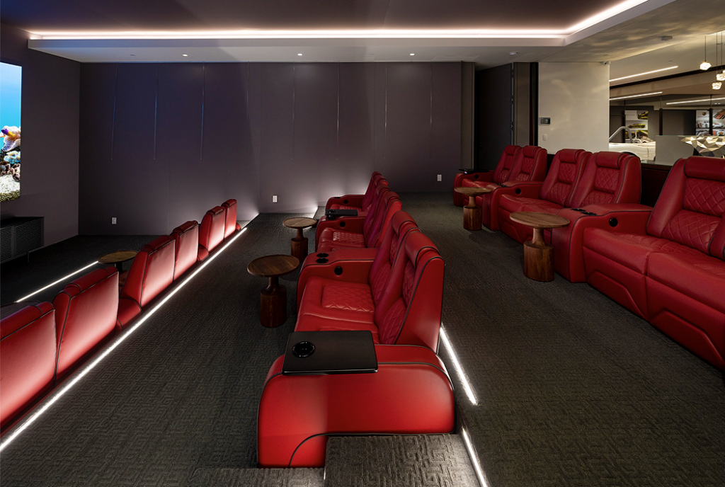
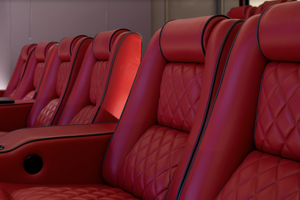
design touches in the theater include dramatic uplighting between the seat rows, a bar area in the back, and custom-made Elite HTS love seats in red Valentino leather to match the color of the husband’s favorite Ferrari 

PROJECT TEAM

architect | Mark Whipple AIA

project manager | Ty Harrison
Whipple Russell Architects

integrator | Jeff Williams
Jeff Williams Inc. 

audio consultant | Robert Melendez
Triad Speakers

audio calibration | Chuck Back
Trinnov Audio

Sign up for our monthly newsletter
to stay up to date on Cineluxe

A bigger challenge was how to get a full-blown 41-channel Dolby Atmos surround system to achieve peak performance in a theater where almost all the wall space was off limits to speakers—and where two of the walls are just curtains. Sure, there was enough room to accommodate everything up in the soffits and ceiling—just. But for the Atmos experience to work, a decent number of the speakers need to be down at ear level. It took some deft high-tech sleight of hand to make that happen.

Of the 35 Triad speakers deployed, 19 were designated for ear-level listening—a statement that sounds counterintuitive as hell given the conditions. But the Trinnov Altitude processor tasked with juggling the theater’s sound includes a function that can create the impression of a speaker being heard from somewhere other than its physical location. It’s similar to the illusion of stereo, where sounds seem to come from an area between the speakers. Here, the sound, run through the Altitude, can be rejiggered to create a convincing sense of being at ear height.

And this was all accomplished without leaving any clues that almost the whole of the soffit and ceiling is crawling with gear. As project manager Ty Harrison relates, “The designer obviously knows, and the homeowner knows, but people coming in for the first time would never know that.”

The Altitude also gets most of the credit for the room being able to have impressive sound whether the walls are open or closed. The processor creates detailed profiles of the space in both sonic configurations and then uses them to compensate for any of the various gremlins that could compromise performance. The theater changes automatically to the appropriate soundscape whenever someone triggers the wall.

testify

The execution of the Serenity theater is unique, but the impulse behind it isn’t. Serenity is just one instance of the growing demand for flexible entertainment spaces that can achieve the picture and sound quality of a dedicated theater room while fitting into the more open flow of contemporary homes. That wasn’t possible until recently, and this room would have to rank as one of the best executions to date.

And it is was all done without making it look like a science project but instead a very organic part of a very ambitious and elaborate but still, in its way, minimalist design. “It was really important,” says Harrison, “to focus the visual on just the video wall and the atmosphere of the room rather than walking into, you know, Speaker Central.”

The room apparently serves its purpose well. The owners make it a point to do all their viewing there. According to Harrison, “They don’t even have a TV in their master bedroom. At the end of the day, they instead like to come down and unwind and watch a movie. That’s when they spend their most time together.”

The husband has made it part of another daily ritual as well. “At lunchtime,” says Williams, “he goes downstairs, makes a toasted cheese sandwich, and sits and watches The Golf Channel and one news broadcast. Religiously.”   

As for whether Serenity measures up as a “true” home theater, Williams relates the time a fellow integrator drove from Scottsdale, four hours away, to show the room to a client: “The integrator, who does extremely high-end homes, said it was the best theater he had ever sat in.”

Taking all of the above into account leads to a simple and obvious conclusion: It’s now possible to dream big dreams confident they can be realized, completely and without compromise. The recently impossible is now very much possible.

Is Serenity the future? No—it’s the here and now.

photos | William MacCollum
video | Geoff Franklin, Be Film Inc.

Michael Gaughn—The Absolute Sound, The Perfect Vision, Wideband, Stereo Review, Sound & Vision, The Rayva Roundtablemarketing, product design, some theater designs, a couple TV shows, some commercials, and now this.

a closer look

the speaker system

THE SOUND PROCESSING

THE HOME AUTOMATION

Generic selectors
Exact matches only
Search in title
Search in content
Post Type Selectors

© 2023 Cineluxe LLC

Noah Kaplan–Bringing Entertainment & Design Together Again

Noah Kaplan Interview--Complete

Noah Kaplan—Bringing Entertainment & Design Together Again

A deep dive into how Kaplan and his company are at the forefront of the effort to make entertainment tech not just attractive but major statements in design

by Michael Gaughn
April 22, 2022

As much an artist as an entrepreneur, as much musician and music lover as speaker maker, Noah Kaplan has seen his business—Leon Speakers—grow rapidly, as both a presence and an influence, exactly because it’s the antithesis of an electronics behemoth. A creativity-driven craft operation that’s as much local as international, Leon is the speaker-company equivalent of a microbrewery. (No big surprise to learn, then, that Kaplan shepherds one of those as well).

But there’s little point in providing deep background in this intro since a lot about Leon emerges in the interview that follows. Just know that the artistic impulses that define and drive its efforts have synced up nicely with the larger movement to bring design back to home entertainment, making Leon one of the most significant forces in the push to make components not just visible but forms of expression, and, ideally, works of art.

PART 1

The Leon Speakers founder is a leading force in the movement to reintroduce a long lost sense of style into luxury home entertainment

“For decades, the prime directive when it comes to luxury home entertainment has been ‘hide it all away’—an edict that’s caused all the various gear purveyors to find ingenious ways to make everything from speakers to electronics to projectors virtually disappear. Problem is, it has also often led to unfortunate compromises in performance (although you’d never know it to look at the marketing). Maybe even more unfortunate, it’s resulted in some huge lost opportunities for making innovative design statements in the home.”    read more

PART 2

The man behind Leon talks about the other companies helping to drive the movement to make entertainment tech fashionable again

PART 2

“In our previous conversation, Leon Speakers’ founder Noah Kaplan described how his efforts are grounded in the work of innovative mid-century industrial designers like Dieter Rams, who found ways to turn pieces of entertainment technology into compelling design statements. Picking up the ball again below, he discusses the contemporary companies that share his don’t-hide-the-gear approach to not just integrating but showcasing technology in the décor of design-conscious homes.”    read more

PART 3

On translating the desire to bring design flare back to entertainment tech into real-world product

PART 3

“Having, in Part 1, discussed the movement to free entertainment technology from its anonymity by transforming it into distinctive design statements and, in Part 2, limning some of the companies that are helping propel that effort, Leon’s guiding spirit and tech-design evangelist here talks about his own contributions to the cause, citing examples of how he’s put his theories—and inspiration—into practice.”    read more

PART 4

The interview concludes with a glimpse of a time to come when entertainment tech will once again fully embrace innovative design

“As we wrap things up, Leon Speakers‘ Noah Kaplan neatly brings things full circle, weaving together all the threads he laid out in the previous three installments. The focus here is primarily on the future—not just of Leon but of home entertainment in general as it continues to spread out, in increasingly sophisticated forms, throughout the home, and thanks to more nuanced and responsive technology and design, evolves from an often awkward add-on to an integral and stylish part of the domestic environment.'”    read more

SIGN UP FOR OUR NEWSLETTER

Generic selectors
Exact matches only
Search in title
Search in content
Post Type Selectors

© 2023 Cineluxe LLC

Noah Kaplan–Bringing Entertainment & Design Together Again, Pt. 4

Noah Kaplan Pt. 4

Noah Kaplan—Bringing
Entertainment & Design
Together Again, Pt. 4

by Michael Gaughn

capturing the spirit of the ’70s, without the kitsch, at Muscle Shoals Sound Studio

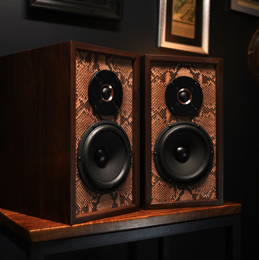
a custom python-skin design for Wu-Tang Clan’s Raekwon “The Chef”

“We’ve got to show that technology companies today are as interested in how things look, how they’re sourced, how they make you feel,
and how they’re end-of-lifed”

The interview concludes with a glimpse of a time to come when entertainment tech will once again fully embrace innovative design

April 21, 2022

As we wrap things up, Leon Speakers‘ Noah Kaplan neatly brings things full circle, weaving together all the threads he laid out in the previous three installments. The focus here is primarily on the future—not just of Leon but of home entertainment in general as it continues to spread out, in increasingly sophisticated forms, throughout the home, and thanks to more nuanced and responsive technology and design, evolves from an often awkward add-on to an integral and stylish part of the domestic environment. 

—M.G.

You mentioned that the mandate with Muscle Shoals was do to a ‘70s-based design. That era’s kind of dangerous because no matter how you approach it, it can quickly descend into kitsch. How do you avoid that when you’re approaching a style like that or something similar?

That’s where subtlety plays in. We always call it a drip. We don’t ever want to go into full IV mode. I’m super conscious of that when we’re designing. Our designers are working on stuff usually five to ten years, so we’re always designing for ten years on. We have some super crazy concepts, but we’re making sure it’s a very slow progression. So first let’s add new materials, then a color choice or a fabric choice. And then let’s add design options, like trim options. But in most cases still, especially in American design, we’re working with very subtle and simple styles. 

Now, we do make sound sculptures that are full-scale expressions of ourselves. And the customer who wants a sound sculpture is somebody who loves art, so they want that piece to pop. Another customer might want a product that makes them feel something at the same time that it fits the right aesthetic of their home design, but they also don’t want it to yell at them. So it’s a tightrope still, giving people what they want while also pushing the boundaries just a little. Because you always know who the customers are who want you to totally trash boundaries and just create. But that’s three or four times a year compared to the ten thousand times a year when we create for the people who need stuff everyday. 

Theo Kalomirakis always reminds me that during the pinnacle of his career, in the ‘90s, he had client after client who just wanted to play. And if he could sympathetically get them on the same wavelength with him, that they were going to be creative and were going to play, that’s when he did his best work. By the 2000s, those people started to go away. Most of his clients just wanted glorified screening rooms and it wasn’t creative anymore.

I like those words “sympathetic” and “play”—two of the things we try to find all the time now. If I get to get on the phone with a customer, which is rare, look out. We’re goin’ there. Like when we just did that thing for Raekwon, who wanted that python skin and so I’m finding that python skin. That’s what we want. That’s a desire. I had a conversation with a customer this week who’s moving to an amazing place in LA but has no idea what to put in there. She showed me with her phone, and she had not one piece of art. And so I’m, like, you wanna play?

So, like Theo, I’m always looking for that one person who wants to go and dig deep. Because I think intrinsically all people do. We’re ready to reconnect with a little bit more of our soul; we want to find something that makes us feel good. And what I really love about what Theo does—he’s creating an escape room, a playhouse. Sometimes we get too serious about stuff. It’s not that serious, and you should be allowed to make mistakes. You should be allowed to build something and then not even like it. We’ve built whole apartments with customers and, not because of us, they didn’t like it when it was done. And, you know what? No worries. Let’s find what you do like.

I feel like we have such a creative industry. All the people we work with are super creatives, and willing and able to start the conversation of, “Hey, I know that’s what you think you might want, but did you know?” Because a lot of people don’t have awareness. And here’s the scary thing: If I asked a hundred people to name five artists, I don’t think they could. Some people might say Van Gogh, but how about one that’s alive? If I asked them to name one architect, I’m not sure they would know. I don’t judge people for that. I just know there’s so much more depth out there than that. So like Theo, I’m always want to play with those thoughts as a way to find someone’s soul. And that’s a really deep, interesting way to design and build stuff for people. That’s what’s cool about architecture and art and design to me.

Let’s talk about the next 3 to 5 years. How do see things playing out, and how would you like to see things play out? What do you think are the trends?

I think the trend actually is going to be in learning—learning like how different trades interact with each other, because as technology infiltrates everything, we’re actually shifting really deeply into IT. And you hear a lot about wellness—about Kelvin lighting and how it affects your health and your mood. That’s a great trend. I want to work in an industry that makes you feel better, not worse. And so I love these multidisciplinary things happening.

I was on a call the other day with an integrator who was saying the usual thing of, “We’re always called in last, so we’ve got to train designers and architects to bring us in early.” And I said, “What have we got to train you on?” We have to start learning more about the terminology of architecture and design, the history of design. Through that, we’ll get to this next zone where design and technology are finally remarried. We’ve got to show that technology companies today are as interested in how things look, how they’re sourced, how they make you feel, and how they’re end-of-lifed. We talk often enough about how this can be a sustainable practice. It doesn’t have to be all about growth and this maniacal big, bigger, bigger.

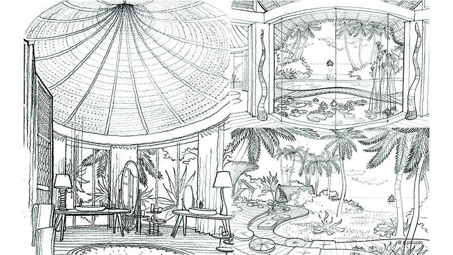
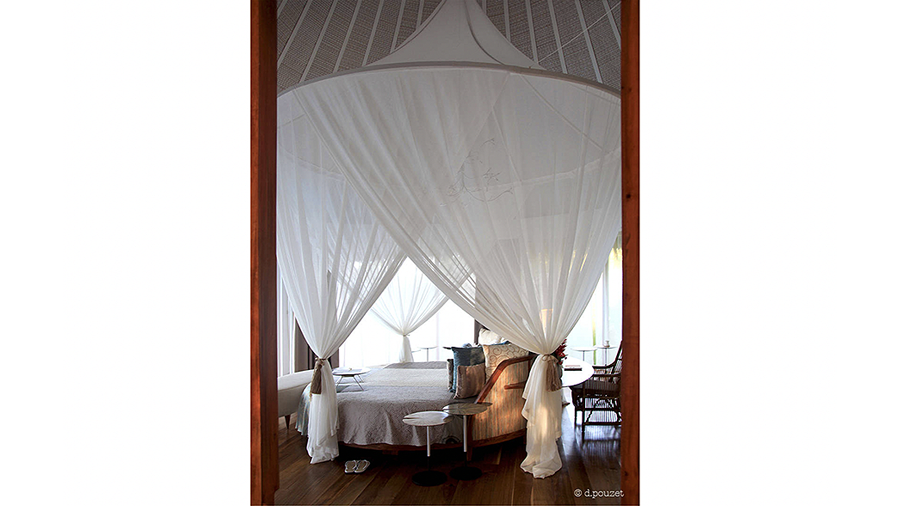
The future will be more about the wellness of an overall space, which is super interesting to me. So I’m working closely with an architect out of Paris, Daniel Pouzet, who’s one of my favorite designers—a very naturalistic designer. And he’s really thinking about what is going to make the client’s life better through design. So I became obsessed with the idea of, if you see an object that makes sense to 

Kaplan introduces a Leon Ente SoundTile speaker system created in collaboration with artist Mike Han

Part 1

Part 2

Part 3

this sound sculpture, custom designed for an Ann Arbor, Michigan cafe, won a BORN award for its combination of functionality and aesthetics

Kaplan with Theo Kalomirakis

related article

a sampling of Daniel Pouzet  left | the Villas at the Nay Palad Hideaway in the Philippines   right | the Nest Rest and the Swing Rest

Sign up for our monthly newsletter
to stay up to date on Cineluxe

you and resonates with you and makes you feel better, it’s going to add to your overall wellness, it’s going to relieve your stress. We can’t overlook how much stress we’ve all been under. And everyone’s spending so much time at home. That trend’s going to continue.

So what are we going to put our energy into? Are we just going to keep buying commodity things off Amazon? Probably for a few more years, but eventually we’re going to let all that stuff go and think about those few things we actually need or desire. So I’m thinking about everything from how the digital landscape is changing, about how we’re going to present NFTs and new art forms all the way to simple things like what materials can we build with that can be additively manufactured—printed on demand. We’re meeting with a company in Ireland to help us with additive manufacturing because I want to create a sustainable business that doesn’t have a giant environmental footprint.

The trend that makes me nervous is when I see conglomeration, which can hurt the spirit of design, because something that was super important to a founder can become unimportant to another group of people. So I hope there’s a move to independent businesses, creative companies flourishing, small, new entrepreneurs coming up—the next person who can inspire us to repropagate ourselves. But in terms of any trend toward one thing, we all know that the trend is moving in the direction of design.

Michael Gaughn—The Absolute Sound, The Perfect Vision, Wideband, Stereo Review, Sound & Vision, The Rayva Roundtablemarketing, product design, some theater designs, a couple TV shows, some commercials, and now this.

Generic selectors
Exact matches only
Search in title
Search in content
Post Type Selectors

© 2023 Cineluxe LLC

Deschamps on Design: Creating with Light

Deschamps on Design: Creating with Light

Deschamps on Design | Creating with Light

“Changing the color of lights changes the look of the room and in consequence can change your mood”

Sign up for our monthly newsletter to stay up to date on Cineluxe

Recent innovations are taking residential lighting well beyond simple illumination, opening up dramatic new avenues for designing entertainment spaces

by Maria Deschamps
April 12, 2022

Lighting isn’t simply about illuminating spaces anymore; today, it’s much more than that. It’s now used as part of the design concept of a space, and the opportunities are endless. This was beautifully illustrated by this year’s Oscars, which brought a lot of attention to the stage at the Dolby Theater and the details of everything around it. As an interior designer, I must pay attention to details, and the lighting really stood out for me.

Designed with 5,000 linear feet of LED strip lights combined with 90,000 Swarovski crystals, the entire space was simply magical. The lighting heightened the impact of everyone and everything that happened on that stage. I have to applaud Jason Sherwood for his design. He certainly astonished me. It’s a TV broadcast I will never forget. 

More and more, we are integrating technology in our homes, and lighting is becoming a big part of that. LED lighting has come a long way, making it easier to obtain a specific color and temperature—an option that didn’t exist just a few years ago. 

There’s something inherently theatrical about these new types of lighting that make them a perfect fit for entertainment spaces, whether we’re talking about a dedicated home theater room or a more open area like a media or great room. Changing the color of lights changes the look of the room and in consequence can change your 

mood. Since colored lighting can be intense, your first encounter can be similar to the feeling that comes over you when you get off an airplane in somewhere like Maui—your entire body is affected, you get a burst of enthusiasm, and you discover a new world.

Using color-changing LEDs is a quick and easy way to change the overall design and atmosphere in a room. In the past, designers used paint to freshen up an interior since it’s not expensive and can make a huge difference. Today, color-changing lighting is the new paint—a non-physical layer with infinite colors that can be changed in a millisecond.

We used  to have to choose a light bulb with a static color temperature but today we can control the color and temperature with the brush of an app. These options open up great creative possibilities. You can change your ceiling color from white to blue, and all of a sudden you’re looking at the midnight sky. If you wash the walls in your gym with a nice green light, instantly you feel like you’re outdoors.

I have used LED strip lighting in every home theater I’ve designed since it was introduced. The excitement and drama projected from these strips arouses your emotions. A home theater is a space where we can afford to venture into new elements, and this new kind of lighting can be a necessary component. Using LED strips behind panels or walls or in a cove are logical locations for indirect lighting because they project a soft glow and can be used as a background or general light.

The options are endless, and exploring them is exciting! I’m currently engaged in renovating a commercial theater where for the first time I’ll be using LED strip lights (all, of course, color-changing) that are surface mounted. I must admit it’s a challenge, but working with experienced professionals has given me the knowledge and confidence to prepare for the project. I’m hoping in the future to be able to integrate Swarovski crystals with LED strips in a private theater and create the kind of dramatic impact I witnessed on the Oscars’ stage.

Maria Deschamps is a certified Interior Designer, IDC, NCIDQ, APDIQ and has been designing home theaters and media rooms since the year 2000. She also designs high-end residential, restaurant, and commercial spaces, and is a partner at TKG, the Theo Kalomirakis Group. 

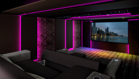
indirect color-changing LED light strips are hidden behind custom-designed acoustic panels to enhance the atmosphere in this private theater

The colors of the indirect LED lighting in the Global Wave Integration showroom in Burbank, California easily transition from natural daylight to very warm tones to cool blues

“You can change your ceiling color from white to blue, and all of a sudden you’re looking at the midnight sky”

Generic selectors
Exact matches only
Search in title
Search in content
Post Type Selectors

© 2023 Cineluxe LLC

Noah Kaplan–Bringing Entertainment & Design Together Again, Pt. 3

Noah Kaplan Pt. 3

Noah Kaplan—Bringing
Entertainment & Design
Together Again, Pt. 3

by Michael Gaughn

“I’m working on product lines right now that will completely change the way we think about screens”

click on the images to enlarge

a sampling of Leon projects shown in a variety of design environments

Sign up for our monthly newsletter
to stay up to date on Cineluxe

On translating the desire to bring design flare back to entertainment tech into real-world product 

April 13, 2022

Having, in Part 1, discussed the movement to free entertainment technology from its anonymity by transforming it into distinctive design statements and, in Part 2, limning some of the companies that are helping propel that effort, Leon’s guiding spirit and tech-design evangelist here talks about his own contributions to the cause, citing examples of how he’s put his theories—and inspiration—into practice.

—M.G.

Until recently, rooms and their functions had been relatively consistent, so interior design could afford to evolve slowly. But digital technology has really flipped that on its head. How do you manage that intersection of traditional design and constantly evolving tech?

The history of design and technology is really short, from about 1850 to 1890—the pre-Edison era to now. So you’re talking about a hundred and fifty years of really intense progress. And incredible technologies keep popping up—I couldn’t have predicted ten years ago that TV screens would be a hundred inches. When I’m talking to a designer, they’ll say, “Hey, the client wants a hundred-inch screen in the living room.” To me, that’s like saying, imagine you wanted a refrigerator in your living room. I’m not going to let you put that in without a cabinetmaker and without trim around it. So we’re trying to create ways where you can have authentic materiality around a product that’s a commodity. A screen is just the content now, whereas a Philco screen from 1950 was a furniture piece. It used to be that both the object and the content were important. The screen has become nothing but a black window, and our job as integrators is to make that thing sing and make it resonate with the space.

This reminds me of conversations I’ve had with Tim Sinnaeve from Barco about how flat panels used to be thought of as something anonymous that just hung on the wall when they’re not on, but how, just given their size, we need to completely rethink what their presence means in a room.

For instance, I design and create NFTs. We’re thinking about, “Where are we going to show them? O, wait, we already have amazing televisions and digital screens all over the house. Perfect. But are they artistic?” More and more, digital is going to become part of the normal vernacular of design, like where a luxury client will have a really broad NFT collection.

I’m working on product lines right now that will completely change the way we think about screens. Screens are a window. They’re an escape, they’re informational, and they have a lot of functionality. But, hell, they need a ton more design. Yves Béhar, who’s one of my favorite designers and creates for Herman Miller and other global brands, designed the Samsung Frame. And his first thing was, “This thing has to look good off.” That’s the job we all have now. And so that’s what’s cool about making parts that are discreet. But I’m imagining like even with an in-wall speaker, what if the fitting looked more beautiful? Or maybe it’s custom painted or made out of woven, braided brass or solid wood—whatever matches the style. I think it will be a slow introduction back to style, but a lot of vendors have to create tools, similar to Lutron, where you can easily show the vast array of styles, to help someone choose.

Is there one product you’ve created that best sums up everything we’ve been talking about?

One of our simplest products we do all this with, which is an everyday one for integrators, is the Edge Media Frame. I always hated hanging TVs on walls. I didn’t like the black screen, I didn’t like seeing down the side, I didn’t like that you could see the differentiation, I didn’t like the materials. Remember when TVs used to be, like, silver? It was painful.

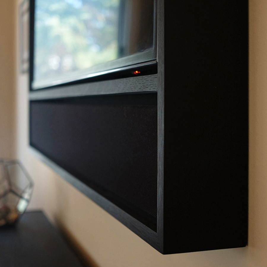
With the Media Frame, we looked back to say, ‘What made a piece like this work with the home in the past?” The Edge is a simple way to frame, stylistically, and say, “Hey, instead of just seeing this black window, let’s put trim around it so you can’t see down the sides. Let’s clean up the edges. Let’s allow the customer to choose custom fabrics.” Instead of just seeing black metal or plastic, all of a sudden you’re seeing an explosion of color. People are using fabric now for the grilles on the soundbars. So they get to choose the fabric and the wood, and then, of course, they get to choose their TV and screen size—and now you can get to choose what’s on the screen. Right now, it’s just the Samsung Frame, but LG and Sony have their versions coming out that will enable the screen to become a player of images or art, of photography or NFTs or whatever you collect. To me that’s beautiful.

So our job as integrators is to paint a picture of a branded product that doesn’t feel store-bought. And now we’re talking about the exact marriage of design and technology, where multiple trades work together to make something seem beautiful and simple, because design, ultimately, is complexity solved. Our job as integrators, with something as complex as a media room, is to make the space feel comfortable and have nothing feel out of place.

Do you tend to design products with a specific style in mind?

Stylistically, I think a lot of people always picture really modern homes, and we’re always shown that most modernist home. But most people are a little more transitional about what they have. And it definitely changes from the Rockies to the coasts. What all our customers have in common is that they know what they love, they know what resonates, so they’re definitely design-conscious. Now, what kind of design? That is not for me to say. We have worked with designs that you would consider farmhouse all the way to super ultra Postmodern. So when I’m thinking about a period or style, what I’m looking at is the soul of the person. Because that’s what interests me about each house. That’s why I love building custom products for individuals, and that’s why we keep adding to these palettes of options. We learn from these people. 

I  was walking a house in Aspen and I was, like, “Whoa! We do not have anything that’s right for this house. We need to rethink everything. Look at how sharp the lines are, look at the contrast.” Right now, contrast is in. You’ll see houses totally clad in black, with warm wood—super-contrasty materials, super-long straight 

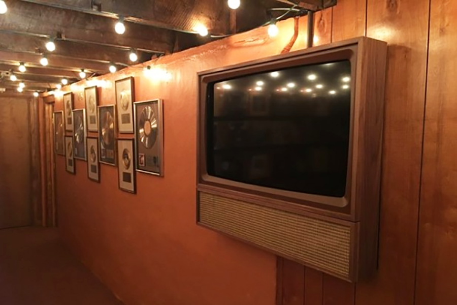
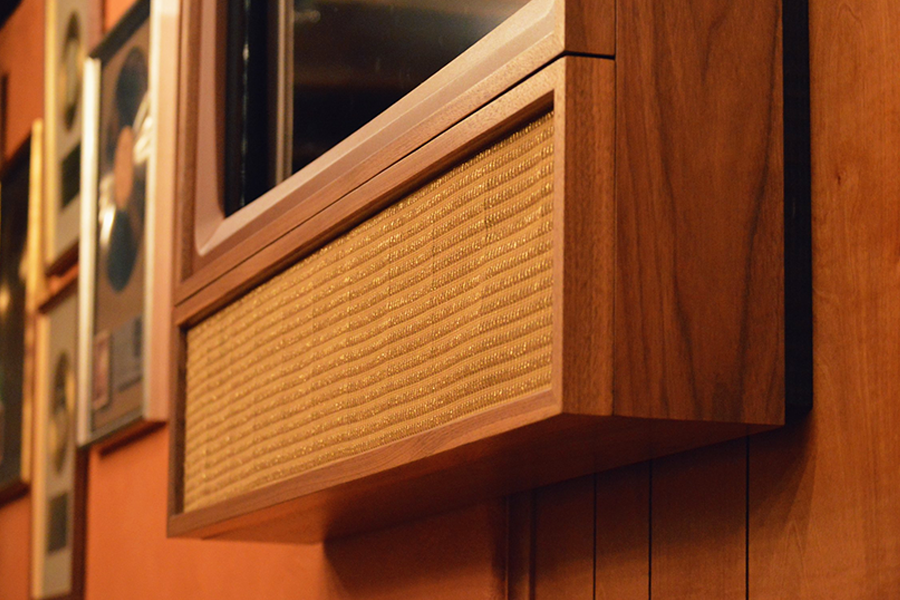
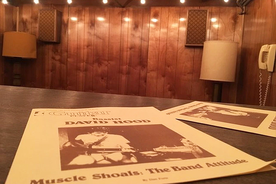
Leon’s designs for the legendary Muscle Shoals recording studio in Sheffield, Alabama use authentic designs and materials from the ’70s to evoke the era

lines, gigantic windows—stuff that makes it really difficult for the designers and integrators to work with. So I look at each style and see how do we fit into that, and how do we create products that have flexible parameters to be able to do that?

Like when we had to design for Muscle Shoals, we had to go back to the ‘70s to help them. They just wanted stuff that was period-centric. So we found cloth from the era. We built out of materials from the times. We tried to make the screen look bent and curved. We made the speakers out of multiple tones of brown, something we would never do today. So you’ve got to keep up on your trends. 

Coming Soon: Part 4—Looking into the near and distant future of designing entertainment tech

Michael Gaughn—The Absolute Sound, The Perfect Vision, Wideband, Stereo Review, Sound & Vision, The Rayva Roundtablemarketing, product design, some theater designs, a couple TV shows, some commercials, and now this.

Noah Kaplan painting his portrait of Marvin Gaye entitled “What’s Going On?”

Part 1

Part 1

Part 2

Part 2

Part 4

the Samsung Frame TV wedded with Leon’s FrameBar soundbar

the Edge Media Frame is meant to overcome the bland anonymity of most video-display designs by creating a custom look that complements, rather than fights, a room’s décor

“What all our customers have in common is that they’re definitely design-conscious. Now, what kind of design? That is not for me to say.”

Leon’s designs for the legendary Muscle Shoals recording studio in Sheffield, Alabama use authentic designs and materials from the ’70s to evoke the era

Generic selectors
Exact matches only
Search in title
Search in content
Post Type Selectors

© 2023 Cineluxe LLC
A Garden of Immersive Delights

Ed Gilmore

A Garden of Immersive Delights

ALSO BY KIRSTEN NELSON

click on the images to enlarge

the Sound Advice space features a diverse collection of digital artwork, shown on Planar video displays and other media

Ed Gilmore’s midtown Manhattan showroom offers a both thrilling and soothing escape for the senses 

by Kirsten Nelson
April 7, 2022

Certain spaces are more memorable because of what they make you forget. Outside, there might be a jumble of noise and visual clutter. But once you step inside, it’s all soft lighting, curated playlists, and video imagery so subtly stunning, it can be a soothing backdrop or a foreground showstopper, depending on the intention. 

That’s how it feels to walk into one of Manhattan’s unforgettable high-end residential-technology hideaways, Gilmore’s Sound Advice. As I stepped into the sensorially refined environment envisioned and built by Ed Gilmore and his team of designers and manufacturer partners, I forgot my crazy commute and instantly remembered why the showroom is the scene of so much great conversation and innovation.

I was there to see a truly exotic specimen in the landscape of residential tech—the finest grade of pixel-perfect Planar LED video wall installed anywhere outside the factory at that exact moment. But there will be more released into the wild soon, especially with the rapid evolution of the trend I was also there to discuss: Video walls and large-scale video surfaces of every kind are moving into homes. 

And it quickly made sense why this is happening. Casually strolling into the home theater room with Gilmore, I immediately felt the mood boost that only the shiniest, most amazing technology can provide. Glowing at only 30% of its brightness capacity, and shyly only displaying a 4K content stream when it could of course handle 8K without drama, the video wall was everything that defines luxury. It’s extremely high-performance, but it’s also extremely rare.  

“It’s a unique type of experience,” Gilmore affirmed, and definitely one that is a generation ahead in terms of technology—and maybe if you want to be crass, also in terms of budget. Sure, it’s out of reach for most. “But for those who can, it’s here now.” 

No motion artifacts to be detected, and “it’s completely impervious to ambient light,” Gilmore pointed out. “It’s non-reflective, unlike flat panels.” In short, you could put this anywhere. Which is what NFT collectors, gamers, sports fans, movie buffs, and even audiophiles (yes, if you like live music documentaries or you’re considering hosting livestreamed concerts in your home, potentially with a Steinway Spirio piano accompanying the scene, talk to Gilmore). 

But this wasn’t a tech demo, this was a conversation in a beautiful room that happened to have a large direct-view LED wall in it, along with some cozy furniture and the perfect glow of carefully calibrated lighting. Also there was a LaserDisc of Pulp Fiction that caught my eye, and a copy of E.B. White’s Here Is New York on the table next to me, which I promptly picked up and obsessed over.

Clearly this was a room designed for people with taste. So we settled in for a fireside chat warmed by the glow of this new technology—which really did put out a little bit of heat if you got close to it, as Gilmore pointed out. Be sure to think about thermal management, he said, not to mention energy management: “There are three 20-amp circuits feeding this thing,” he noted with a wry grin.

At first, we did talk about all of the excitement around the display of massive and/or complex digital artworks on expansive architectural surfaces. Gilmore is installing a couple of those for a collector—one of the displays will be mounted on the ceiling, in fact. And just outside the room we were in, a couple of the other Planar displays in the space were rotating through artistic imagery in a variety of configurations. Digital artwork really is a thing now, and not just as a means of hiding the flat-panel display while it’s in “off” mode. 

But then we got into the good stuff around all of that artwork. The home is now a digital canvas, expressing ideas and reflecting moods through curated blends of sound, video, and lighting—particularly human-centric lighting, which of course we had to talk about as the ultimate “wellness” option for homes. These are the emotional reasons people are looking for something new at home—to be comforted, uplifted, and also dazzled by the immersive possibilities of well-designed technology-enhanced spaces. 

Gilmore talked about the delicate balance his designers and engineers have to strike in creating a home that not only looks good but makes you feel good. “We harness technology to its ultimate expression to provide great experiences for clients,” Gilmore noted. “You can’t commoditize that.” That’s because real human experience has always been the core of residential technology design. And specialists are starting to tap into new ways that the senses can be engaged (or soothed) by technology, to thrilling effect. 

“I’ve never been more excited about our industry than right now—there’s so much potential,” Gilmore said. Because as he knows well, you have to be both an artist and an engineer to make a home resonate with real feeling. 

Kirsten Nelson is a Brooklyn-based writer, speaker, event content producer, and podcast host who writes frequently for technology brands, integration firms, and experience design agencies. She was the editor of SCN magazine, and before that, co-launched Residential Systems. Kirsten is also a co-founder, editor, and writerly salon host of CreativeStack, a newsletter for the experience design community. 

.

a next-generation 136-inch Planar video wall is the center of attention in Sound Advice’s home theater room

showroom photos & video |
John Frattasi, Gusto Multimedia

A Garden of Immersive Delights

Ed Gilmore

“Digital artwork really is a thing now, and not just as a means of hiding the flat-panel display while it’s in ‘off’ mode.”

human-centric lighting transforms the feel of the showroom in the Steinway & Sons’ factory in Astoria, Queens

Generic selectors
Exact matches only
Search in title
Search in content
Post Type Selectors

© 2023 Cineluxe LLC

Deschamps on Design: Origins

Deschamps on Design: Origins

Deschamps on Design | Origins

“I not only loved movies.
I loved the experience of
moviegoing.”

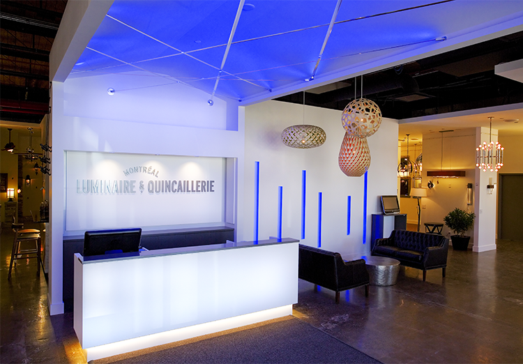
Maria’s retail design work for Montréal Luminaire & Quincaillerie

Sign up for our monthly newsletter to stay up to date on Cineluxe

Maria initiates her column on home entertainment design by tracing the path that led to her decision to specialize in theaters & media rooms

by Maria Deschamps
March 2, 2022

I’m an interior designer who focuses almost exclusively on home theaters and media rooms. Since that’s not a typical career path, I thought I’d begin this series of columns by describing the moments in my life that inspired me to take that journey. Those diverse experiences have given me a unique perspective on entertainment spaces—one I’m eager to share here going forward.

I was 11 when I decided I wanted to be a designer. It was one summer during my first trip to California, a breath of fresh air for an upstate New York girl. 

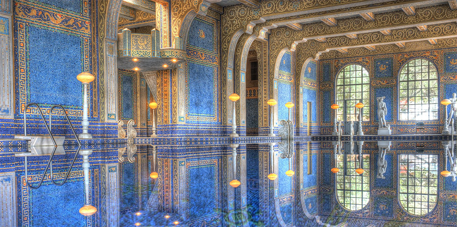
I loved Hollywood and Disneyland, and especially enjoyed the Missions, the Danish town of Solvang, and the famous Madonna Inn. But Hearst Castle was the place where it really hit me. The immense entrance, the high opulent ceilings, the oversized chandeliers, the multiple rooms, the magnificent carpets and prominent artwork—everything was impressive! 

I had so many questions: Who lived here? How much time and money does it take to build a home like this? How do they get the lights to work in that pool? The first thing I did after I returned home was draw a floorplan of my bedroom. I wanted to start designing right away. 

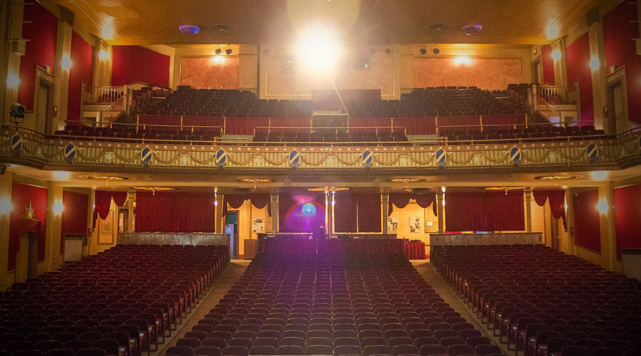
At that time, we lived within walking distance of a movie theater, the Riviera in North Tonawanda, where I spent many Saturday afternoons. We would arrive early and I would absorb the design and architecture with my box of Cracker Jack in hand. I not only loved movies, I loved the experience of moviegoing. 

Ever since that summer, I’ve paid attention to things like detail, lighting, space planning, and strategies for traffic flow. I’ve been inspired by architects throughout the United States and around the world, and have had the chance to travel across the US and to visit Central America, Europe, and Asia, where I’ve experienced some amazing spaces.

My education in San Francisco was an experience in itself. What better city to start building a foundation for a design career? After college at the Fashion Institute of Design & Merchandising, I began my career in Reno, NV but soon followed my heart to Montréal. 

There, I focused on commercial design. I began as a pencil-pusher for a retail design firm, which gave me the basic footing for learning how to customize anything in an interior space. I went on to manage and direct design departments for three major international retailers. This allowed me to understand roll-outs, budgets, branding, and the importance of design impact and the environmental effect on consumers. 

The turning point came when I designed my own dedicated home theater. That theater became my escape room. I was totally immersed in the environment and really appreciated and absorbed whatever I was viewing. I wanted to be able to design that same kind of environment for others. I wanted to design exclusive environments. 

It was while I was submerging myself in home theater design that I discovered Theo Kalomirakis. I became an admirer and followed his work. We met a few years ago at the custom integrators trade show, CEDIA, and soon after decided to establish The Theo Kalomirakis Group (TKG). It’s an honor and pleasure to be part of TKG with both Theo and Steve Haas, who is a master in his specialty of acoustics. This is truly an exciting new venture.

I look forward to offering design insights here on new trends in home entertainment, including things like circadian lighting and video walls, as well as sharing experiences on my projects, which I hope will motivate and inspire your own ventures.

Maria Deschamps is a certified Interior Designer, IDC, NCIDQ, APDIQ and has been designing home theaters and media rooms since the year 2000. She also designs high-end residential, restaurant, and commercial spaces, and is a partner at TKG, the Theo Kalomirakis Group. 

The Riviera Theater in
North Tonawanda, New York

The Roman pool at Hearst Castle

“The turning point came when I designed my own home theater.
That theater became my escape room.”

Generic selectors
Exact matches only
Search in title
Search in content
Post Type Selectors

© 2023 Cineluxe LLC

Scroll to top

sign up for our newsletter

receive a monthly recap of everything that’s new on Cineluxe