• Type:
  • Genre:
  • Duration:
  • Average Rating:

Home Theater

Making Video Walls Better
Making Video Walls Better

making video walls better

“we can create spectacular whites and phenomenally dark blacks simultaneously, so if you’ve downloaded a 4K HDR movie from Kaleidescape, you’ll be getting everything that picture has to deliver”

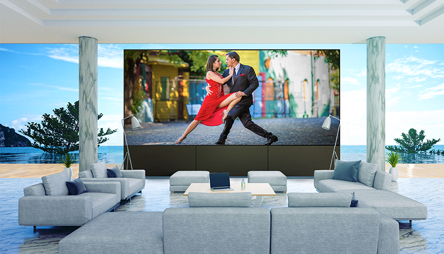
Quantum Media Systems’ Ken Hoffman on what he’s doing to create video walls that live up to the technology’s potential

by Dennis Burger
January 31, 2023

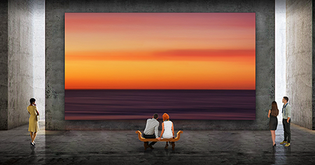
It may seem odd to single out one provider of LED video walls as a luxury-focused solution when the entire category operates in the stratosphere of the high-end entertainment market. But as we speak with integrators installing these solutions about the pros and cons of such gargantuan screens, one name continues to rise above the buzz surrounding any nascent technology. Quantum Media Systems is quickly establishing itself as the go-to provider of video walls that stand out not merely in terms of sheer size but also image quality, reliability, scalability, and—believe it or not—comfort. What follows is a conversation with company CEO Ken Hoffman, an industry veteran with more than two decades of experience creating world-class private screening rooms, luxury commercial cinemas, post-production facilities, and more, about why Quantum created its Cinematic XDR LED video wall.

Since there are quite a few video wall solutions already, why did you feel it necessary to develop your own? What problems was the XDR system intended to address?

For many years, we worked in digital cinema either building or being part of teams that built screening rooms, post-production facilities, color suites, etc. But we decided around 2014 that we wanted to get back into the residential space and work with integrators, particularly on projects where the clients were approved to be on the Bel Air Circuit. That required Digital Cinema projectors, servers, video processors, etc.

Over the years, we’ve looked at using LED walls as opposed to projection, but the technology just wasn’t there yet. It looked good, but it wasn’t the high-end image quality needed in installations at that level.

So, after more than five years of R&D, we took the plunge about three years ago and decided to see if we could come up with our own approach, and instead of just buying somebody else’s wall and trying to make it better, we became an original equipment manufacturer working directly with component manufacturers. We specify the components—which diodes and integrated circuits to use—and create our own control and processing systems, taking the knowledge about image science we’ve accumulated from years of working at the very high end and from the motion-picture industry and applying that to video walls.

Which problems with the existing technology were you most interested in solving and how successful have you been?

One of the major advantages—aside from purity of color—is light output. Most LED walls will give you 600 or 800 nits, tops, in terms of peak brightness. Our newest wall is rated at 1,200 nits, and that’s calibrated. Uncalibrated, it’s more like 1,600 nits. Once you calibrate it for accurate color, you do lose a little brightness but that still enables us to do HDR better than not only other video walls but than many televisions.

Most HDR content has been created with 1,000 nits as the peak brightness target, and we’re able to provide that and typically more. By doing that, we can produce spectacular whites and phenomenally dark blacks simultaneously, so if you’ve downloaded a 4K HDR movie from Kaleidescape, you’ll be getting everything that picture has to deliver.
related article

Making Video Walls Better

also on Cineluxe

Sign up for our monthly newsletter
to stay up to date on Cineluxe

Many integrators are concerned about the intense heat coming off video walls from many of the established manufacturers. People have joked that they feel like they’re going to get radiation burns standing in front of those things. Have you done anything to address that?

It is a big problem. That was part of our motivation for making a better wall. We wanted to make our system much more power-efficient. Simply put, if you get better results while using much less power, you generate less heat. We also use other techniques to dissipate heat better.

Nothing kills electronics quicker than excessive heat. Is that a contributing factor to the reports we’re hearing about reliability issues and longevity concerns with other video-wall solutions?

It could be. I agree with you: Heat is always an enemy. So, by generating a lot less heat and dissipating what little heat we do generate, that’s not as much of an issue for us. But in addition, we’re basically theater guys, and we’re helping our integration partners with theaters and media rooms where comfort is a real issue. With many video walls, you need a lot more air conditioning. If your front row is ten feet away and you’re feeling all this heat radiating off the screen, is that really conducive to enjoying a film? That was also a big consideration for us. You can walk right up to our wall and hardly feel any change in temperature.

You mentioned seating distance, which brings up the issue of screen size. What are the theoretical upper limits for the size of your wall?

Functionally, there are no limits. Our LED walls consist of a multitude individual cabinets, and within our cabinets, we have multiple modules. Each cabinet is basically a building block and we install those together to create a screen as large as the client wants, or as large as the room will accommodate.

The only issue is that as you get a lot bigger, the video processing gets a little more involved and you need more processing power, but we have the ability to do very large walls. If someone wanted a 100-foot wall or greater, no problem. It just takes a lot more processing power.

LED video walls are sort of akin to what OLED was ten years ago. Back then, people were paying $25,000 for a 55-inch OLED TV. Their failure rate was super high and the longevity wasn’t great, even on panels that didn’t fail within a year or so. But we’ve come a long way since then. So what would you say to the tech-savvy luxury homeowner who assumes LED video walls are going to follow the same trajectory?

I think there are some similarities but it’s not one-to-one. You can’t just treat this like a large TV. Some companies are trying to move in that direction. By making the installation of their video walls simpler, they’re trying to create economies of scale, so instead of a 100-inch TV, they can sell you a 120- or 130-inch video wall and treat them functionally interchangeably. It works, and the pricing is coming down, but the quality isn’t there. You’re going to see lines in between the modular elements, for example.

Do you mean the lines between each module or the lines between each row of pixels?

If the cabinets and internal modules aren’t aligned correctly you’ll see those lines. And the closer you get to the wall, the more you’ll see them. We’re spending a lot of time during the installation process so that we’re aligning the modules and cabinets optimally. We’re also spending a lot of time in the calibration process.

Would it be fair to say that what you offer is as much a service as a product?

It’s a combination of the two. It’s a much better LED wall, it’s a dramatically better video processing system—it’s a complete package. And then we provide on-site installation and calibration where we spend not just one or two but many days getting everything installed, aligned, integrated, and calibrated. It’s a turnkey solution. We’re focused on the pinnacle of image quality in cinematic environments.

What else might influence a high-end client to decide between a luxury projection system and a QMS Cinematic XDR video wall system?

Since we have a lot of experience with all different brands of projectors, we can explain that projectors can’t provide uniform light across the screen. When we do calibration on projectors, on a typical screen we look at 25 locations, and we get 25 different brightness values. Sometimes the differences are small, sometimes they’re large, but with the LED wall, it’s one value. The screen is 100 percent uniform.

Another consideration is convergence. Many projectors use different chips for red, green, and blue elements of the image, and you have to align those three chips as best you can. Usually, you can get most of the pixels converged but some of them aren’t. In movie theaters, there can be multiple pixels off on convergence. In the home, you’re so close to screen that you can’t be off that much. With LED walls, there are no convergence issues. Each red, green, and blue element lines up perfectly with its mates.

Another issue is that no matter how good your lens is, with a projection system, you can’t have perfect focus over the entire screen. You’re going to lose some focus, especially toward the edges of the screen. So having uniform focus, uniform convergence, and uniform light are major advantages. Add to that the truly deep blacks no projection system can deliver, along with the enhanced brightness no projector can give you, which helps with things like HDR, it’s just a dramatic advantage over projection.

“the truly deep blacks no projection system can deliver along with the enhanced brightness no projector can give you, give our video wall a dramatic advantage over projection”

Dennis Burger is an avid Star Wars scholar, Tolkien fanatic, and Corvette enthusiast who somehow also manages to find time for technological passions including high-end audio, home automation, and video gaming. He lives in the armpit of Alabama with his wife Bethany and their four-legged child Bruno, a 75-pound American Staffordshire Terrier who thinks he’s a Pomeranian.

Generic selectors
Exact matches only
Search in title
Search in content
Post Type Selectors

© 2023 Cineluxe LLC

Great Video Wall Sound Is Here

Great Video Wall Sound Is Here

“Using the TPI controller, I was able to place the sonic image in the exact vertical position where my traditional center speaker
is located”

An opportunity to audition a center-channel solution in his own home theater showed the author you can have a micro LED wall without compromising the sound

by Steve Haas
January 19, 2023

Last June, in “Million-Dollar Wall, Hundred-Dollar Sound,” I talked about how difficult it can be to achieve acceptable sound when using a video wall in a home theater since the front speakers can’t be placed behind the screen as they can when using a projection screen. I mentioned that almost all of the solutions I had encountered resulted in significant compromises but that TPI’s Movement System showed promise, mainly because it includes a controller that uses digital signal processing (DSP) to allow you to adjust the height of the sonic image created by the front speakers.

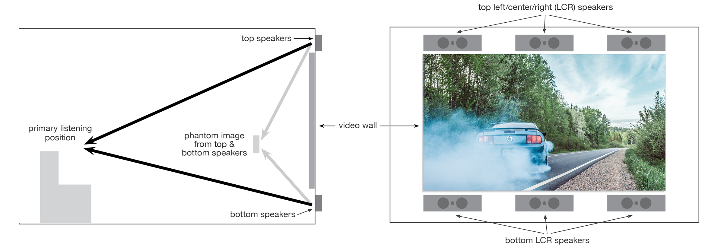
I recently had a chance to audition the Movement System in my own home theater and was extremely happy with the results. This system uses speakers placed both above and below the video wall to create a phantom sonic image (similar to the horizontal imaging of stereo speakers except done vertically) to match the effect of a traditional center-channel speaker mounted at ear level. And it can accomplish this without the use of additional DSP and without having to employ the services of a professional calibrator (although both are still necessary to achieve optimal performance). Based on my hands-on experience with the TPI system, I have every reason to believe that this solution, along with others based on the same concept, will significantly accelerate the use of video walls in home theaters in place of projection systems.


from theory to reality

I know from my work with solid video screens in museum and commercial environments that effectively placing the sonic image vertically is both achievable and worth the effort. Some people contend that our brains can’t comprehend a vertical image shift as readily as a horizontal one. While there is some truth to that, A/B comparisons of vertical placement show that it can allow the sound of dialogue to be placed where we expect to hear it emanate from when watching a movie or a TV show, which is between half and two-thirds of the way up from the bottom of the screen. 

I had been eager to evaluate the TPI system because of its potential to create precise vertical positioning in a home theater environment—particularly since I will soon be calibrating a very large residential project in Florida that uses the Movement speakers.

TPI sent me the two speakers and controller necessary to create a virtual center channel. While I could have requested additional speakers for the left and right front channels as well, I decided to use just the center so I could focus on dialogue. If the system could do dialogue well, I knew it would also be able to handle the left and right positions.

above | Quantum Media Systems‘ Cinematic LED Wall

related article

click on the image to enlarge

TPI’s Movement System uses speakers placed both above and below a video wall for the left, center, and right front positions. A controller is used to adjust the vertical position of the sound coming from each top/bottom pair, to create the same effect as if the speakers had been placed behind the screen.  

also on cineluxe

Sign up for our monthly newsletter
to stay up to date on Cineluxe

I set the system up in my home theater, which uses a traditional left-center-right (LCR) speaker array positioned behind an acoustically transparent Stewart projection screen. I then used both objective measurements done with pink noise and subjective listening with program material that contained a lot of dialogue to position the phantom sonic image by way of the controller. I also employed Symetrix DSP to assist with the A/B comparisons of the top/bottom vs. behind-the-screen imaging, as well as with top-only, bottom-only, and top/bottom image comparisons.

Using the TPI controller, I was able to place the sonic image in the exact vertical position where my traditional center speaker is located. I then used the Symetrix DSP to tonally optimize the system so the sound from the top and bottom speakers closely matched that of my existing center speaker, even though they are from two different brands.

What was especially interesting is that the top and bottom pair exhibited a unique fullness of sound that wasn’t due to any type of distortion or phasing but that only added to their presence. Even though I had set the sound from the speakers to arrive at the listening location at exactly the same time, this presence took on an immersive quality because the sound was coming from two different directions, even though it created a solid sonic image in one specific location.

problem solved

The combination of objective measurements and extensive listening has convinced me the top-and-bottom-speaker solution will work. And it has significant advantages over the other existing approaches. By using direct-radiating sound as opposed to reflecting—or bouncing—sound off the video-wall screen, it avoids problems with the reflected sound from the screen becoming mixed with direct sound from the speakers, which creates distortion. Also, having large speakers mounted on the ceiling and aimed at the screen can be both unattractive and distracting. The top-and-bottom approach is especially effective with larger video walls where it can be difficult, if not impossible, to place the center-channel image at an acceptable height using LCR speakers mounted either above or below the screen.

Another advantage is that sound can be optimized for positions in addition to the traditional sweet spot in a theater, which isn’t possible with a single speaker no matter how well it has been calibrated. The type of system considered here would allow for the creation of presets to shift the sweet spot if the homeowners, for instance, wanted to sit in the front row instead of the center row because of the type of programming they were watching.

Also, the shallow height and depth of the Movement speaker cabinets allows them to be easily placed in the relatively small areas available above and below large video walls and allows for flexible placement within those areas. Admittedly, they can’t be used if a client wants an LED screen to fill the whole wall, but doing so would also create basic, non-audio-related problems with things like sight lines. It would be possible, though, to incorporate the speakers into a angled proscenium that would allow them to be positioned forward of the screen, an arrangement that could accommodate any desired screen size.

To have a speaker system that can be optimized without compromise, allowing you to place a pure, strong sonic image exactly where you want it, is going to be a game-changer for creating high-quality sound to go with LED video walls. Given the potential of what I experienced with this system in my own theater, I am looking forward to calibrating the system in the Florida installation next month, which will allow me to take the Movement System from an experimental situation into a real-world home theater environment.

Steve Haas is the Principal Consultant of SH Acoustics, with offices in the NYC & LA areas. Steve has been a leading acoustic and audio design & calibration expert for over 25 years in high-end spaces ranging from home theaters, studios, and live music rooms to major museums and performance venues.

Million-Dollar Wall, Hundred-Dollar Sound

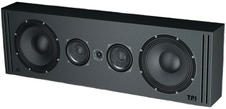
a rendering of TPI’s Movement L center speaker

Generic selectors
Exact matches only
Search in title
Search in content
Post Type Selectors

© 2023 Cineluxe LLC
Theater of Legends

Theater of Legends

photos & video |
Mike Vernazza, MAV Cinema

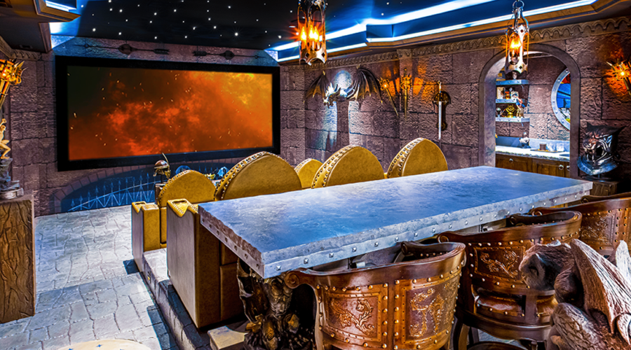
This no-expense-spared castles & dragons fantasy realm is also a no-holds-barred home theater

by Dennis Burger
December 15, 2022

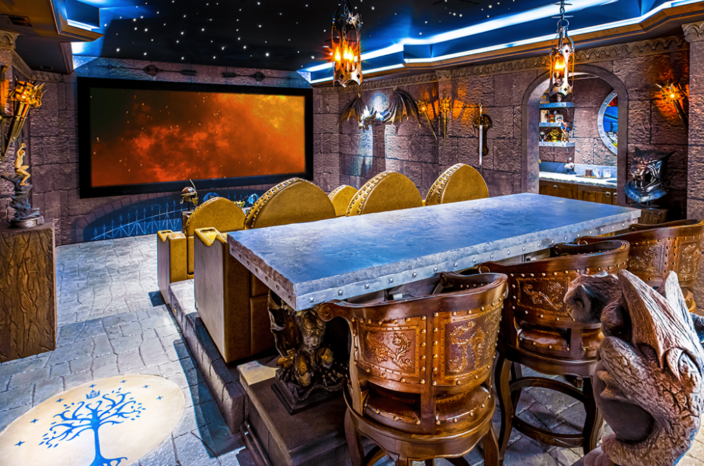
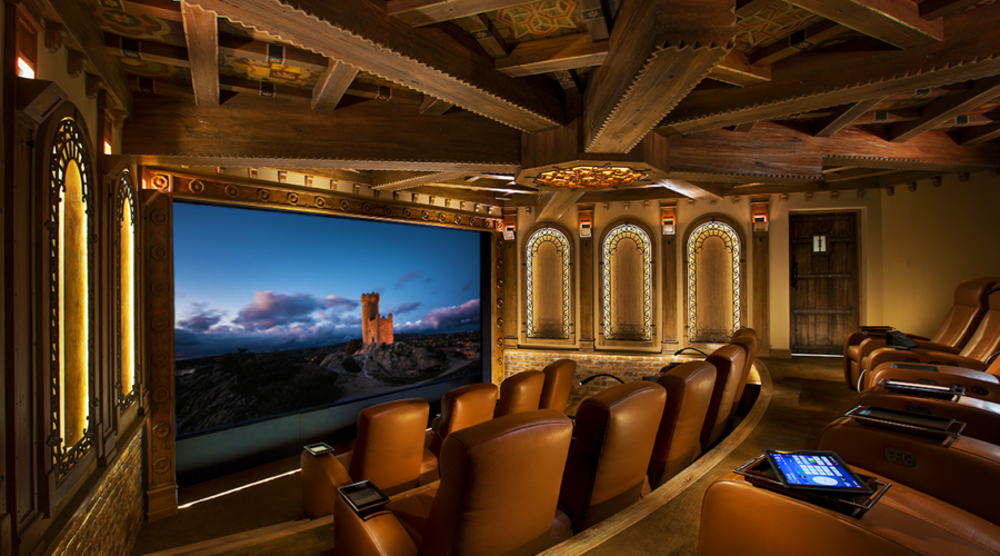
The owner of this fantasy-themed room in the Nashville area had previously made headlines with a home cinema inspired by his love of HBO’s Game of Thrones. Starting from scratch in a new theater for a new home, though, he wanted to try something just a bit different. When he approached Richard Charschan, president and CEO of AcousticSmart Home Theatre Interiors, to begin the discussions that eventually led to this space, he decided he wanted to add elements from another beloved epic, The Lord of the Rings, to the design. But just as importantly, according to Charschan, “He wanted it to be a little Disney-like, akin to the themed lines at Disney World that make you forget where you are and prepare the viewer for a whole new experience.”

photos & video |
Mike Vernazza, MAV Cinema

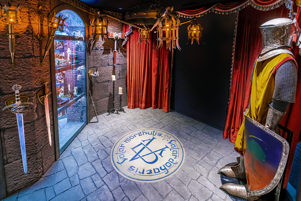
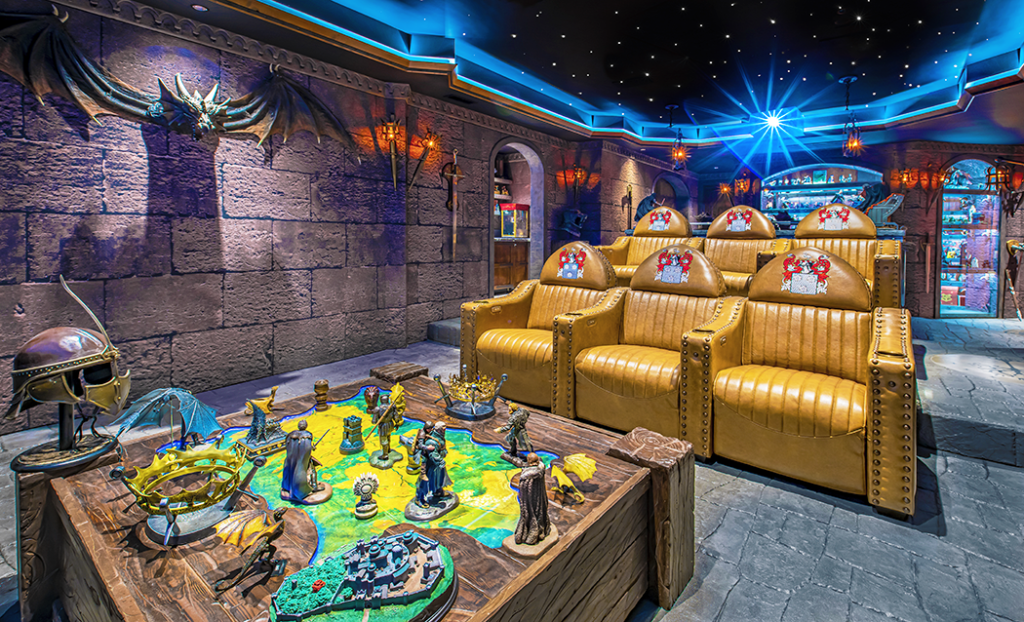
As the room’s design evolved, Charschan and his team also made modifications to account for the homeowner’s vast hoard of collectibles—including converting what was originally conceived as a gym behind the room into a showcase for some of his favorite pieces. 

One of the most distinctive elements, though, is a pair of TVs installed in portrait mode on the side wall to mimic castle windows built into a custom window frame. The real magic comes from a macro that triggers a script on the room’s Kaleidescape movie server so that before a movie starts, the lights dim and dragons appear on the screen, looking like they’re attacking the castle from outside. “The idea was to mimic the end of Game of Thrones, where they’re looking out of the castle and the dragons are blowing everything up,” Charschan said. “He’s big into dragons so we wanted to make it seem like they were really outside. It’s only for a few seconds, just to give you a taste of the entertainment experience to come.”

The literal centerpiece of the room, though, is the two rows of custom seating, three to a row. The owner wanted seating fit for a castle and worked with Charschan on the sketches that would then lead to photorealistic renderings and eventually the final design. Perfecting the design, which also incorporated the owner’s family insignia embroidered on each chair, was no easy task, especially given that the seats feature articulating headrests and a low-profile design that doesn’t block the sound from the surround speakers. “He’s an audiophile,” Charschan said, “so he wouldn’t accept something that interfered with his surround sound.”

related article

But just as important was the comfort of the seating. “Toward the end of the project, he started to express concerns about whether the chairs would be comfortable enough since he’d never had a chance to sit in them beforehand. To ensure the seating exceeded expectations, we hand-selected every different piece of foam and made sure every aspect of his seat was ergonomically perfect for him. That’s the kind of thing you can only get from a custom house like ours.”

Along with amping up the design, the owner also wanted to take the performance of the theater to a new level—literally. While his previous cinema boasted a 7.2-channel speaker system by Pro Audio Technology, with this room he wanted a Dolby Atmos system to extend the surround-sound experience into the height domain. New audio processing by Storm Audio and a new Pro Audio Technology Atmos speaker system—installed by Jacob Abbott of Visual Concepts and tuned by Pro Audio’s Mark Goldman—accomplished this goal. 

The cinema may look like a somewhat compromised acoustical environment what with the castle-themed stone walls and floors. But as it turns out, most of that stone isn’t stone at all. “The walls are made out of acoustically transparent fabric we call Smart Art,” Charschan said. “It looks so real because we loaded the images into 3D Studio Max to upgrade the depth and resolution to get the detail just right. It took us a little over two months to get it perfect. Even when you’re sitting in the room, you don’t realize it’s not real stone.”

Sign up for our monthly newsletter
to stay up to date on Cineluxe

The printed Smart Art fabric also hides a mix of absorptive and diffusive acoustic treatments, which were selected and specified to account for the fact that the floor is made up of hard surfaces featuring a faux stone concept. “We installed stamped concrete that made you feel like you’re really walking into a castle. In the type of environment we were trying to replicate, you wouldn’t have carpeting, so we carved the concrete to look like stone and also incorporated some family insignias into the flooring.”

The more sonically reflective surfaces of the floor were then carefully factored into the acoustical analysis of the space, and the team compensated by adding extra absorption into the walls and ceiling, including heavy draperies. “As long as you take the square footage of the space into account and know how much absorption you need, you can calculate the reverb time correctly with a complicated environment like this,” Charschan said. “The one thing you have to be careful about is going too far the other way. Too much absorption and the room can sound way too dead, even with concrete floors. But this one worked out nicely because luckily the shape  is a nice long rectangular shape with decent height.” 

Dennis Burger is an avid Star Wars scholar, Tolkien fanatic, and Corvette enthusiast who somehow also manages to find time for technological passions including high-end audio, home automation, and video gaming. He lives in the armpit of Alabama with his wife Bethany and their four-legged child Bruno, a 75-pound American Staffordshire Terrier who thinks he’s a Pomeranian.

Generic selectors
Exact matches only
Search in title
Search in content
Post Type Selectors

© 2023 Cineluxe LLC
Deschamps on Design: Proper Planning

Deschamps on Design | Proper Planning

more Deschamps on Design

Sign up for our monthly newsletter to stay up to date on Cineluxe

Taking the right steps at the very beginning of a home theater design will save both time & money and help ensure you get the room you want

by Maria Deschamps
December 14, 2022

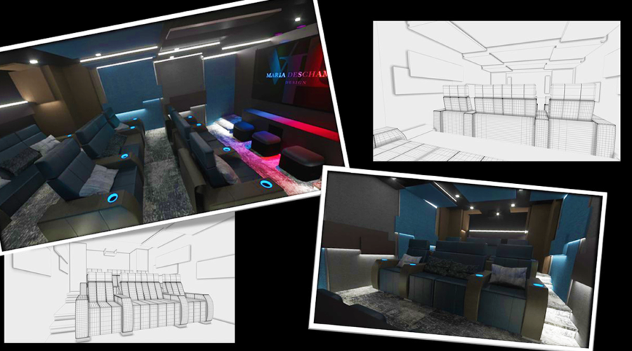
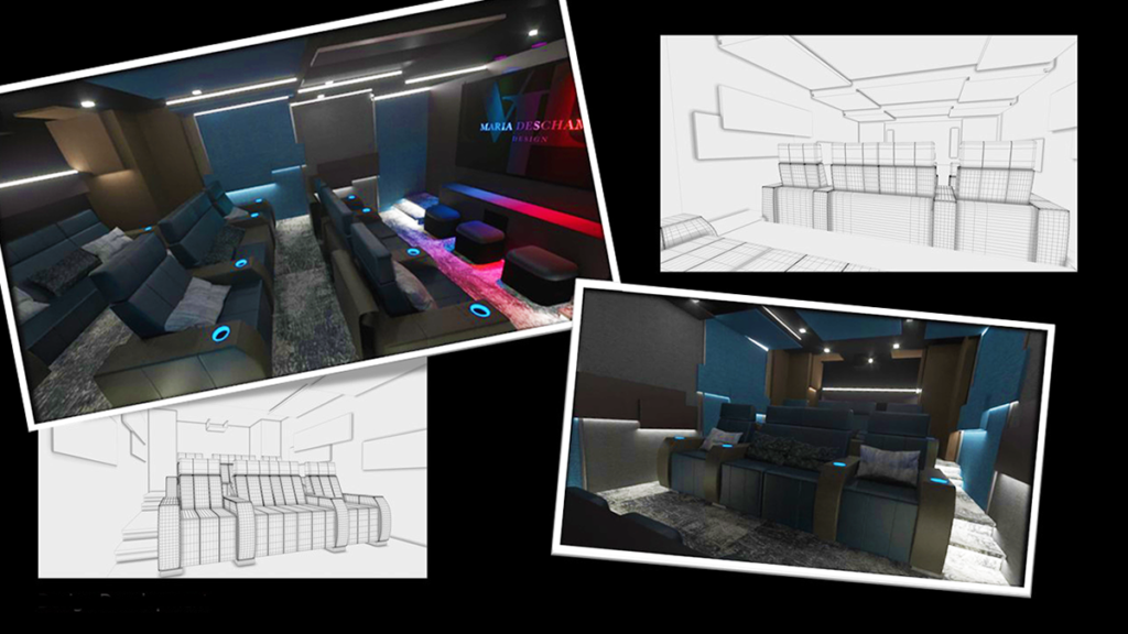
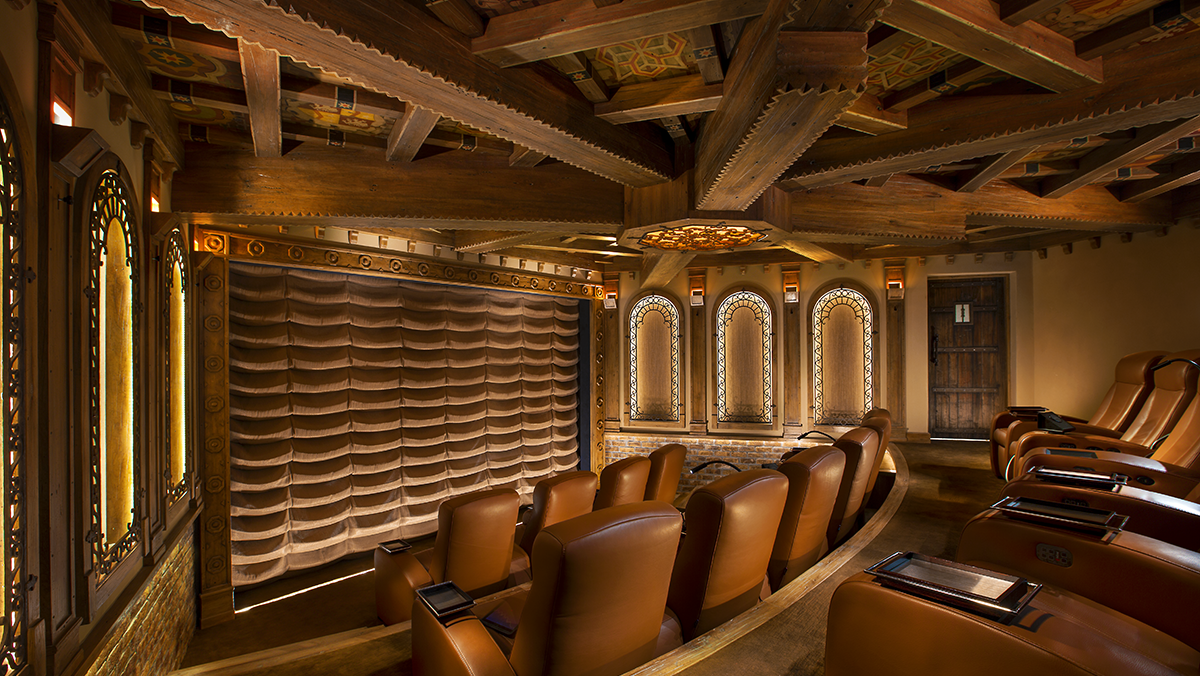
Adequate planning is the key to having an exceptional home theater—and the key to adequate planning is to bring in an interior designer who specializes in home theater design from the very beginning of the project. As a designer who specializes in that area, I find I am often hired after many vital decisions have already been made. But having all the right professionals in place from the start ensures that the process will be both straightforward and cost-efficient. Proper planning also helps to create a more harmonious and pleasant working environment. 

With many of my projects, the home has already been built and the theater design has been left until the end, or I have been hired during construction. About 90% of my new clients retained me because they realized the designer who was doing the rest of their home wasn’t the right person to do the theater. But often, key structural elements are already in place by the time I’m brought in, which means the client has to either accept significant compromises or make major changes to the surrounding spaces.

A designer who specializes in home theaters will have essential knowledge of these rooms that regular interior designers often do not because they’re rarely asked to do spaces like these. A home theater designer will be able to calculate the proper viewing distances so you’ll be able to maximize your screen size. They will also establish the correct angles for placing speakers to create an immersive sound experience. And they will be able to work in tandem with your custom integrator to optimize both. The important point is that things like these should be determined before beginning the interior design concept for the room. 

Also consider retaining an acoustic designer, who can not only determine how to prevent sound from bleeding out of and into the room but also how to make your theater sound its best. Since the placement and incorporation of acoustical treatments can have a big impact on a theater’s design, treatments need to be decided on before I can begin to develop an effective design concept.

In two recent projects, both clients had engaged a non-specialized designer to completely renovate their basements, which included adding a home theater. In each case, I was brought in during construction, after the theater design had been finished. Not only had viewing distances, speaker placement, and acoustic treatments been ignored but insufficient space had been allowed for seating and for placing the projector. Remedying these issues meant tearing down existing walls and redesigning ceiling areas adjacent to the theater. 

These kinds of drastic changes were bad enough, but colleagues have told me about situations where they had to dig out an area 6 feet deeper than the original room in order to achieve the correct ceiling height or needed to move structural columns to create the proper viewing angle. All of this could have been avoided if a home theater designer had been involved before any of the work had begun.

The money that goes into fixing avoidable mistakes could have instead gone into improving the experience of the theater by upgrading the quality of the audio and video gear, buying motorized custom leather seating with heating and massage functions, or even adding a complete bar area to the theater. When I recently bumped into a client and asked him how he liked his theater, he said, “I love it—it’s my favorite room of the house. But I wish we had built that bar you suggested.”

Engaging the right theater designer and custom integrator at the start of a project helps to ensure that everyone wins, resulting in a room that comes with a minimum of headaches and delivers the maximum of pleasure. 

Maria Deschamps is a certified Interior Designer, IDC, NCIDQ, APDIQ and has been designing home theaters and media rooms since the year 2000. She also designs high-end residential, restaurant, and commercial spaces, and is a partner at TKG, the Theo Kalomirakis Group. 

related article

Generic selectors
Exact matches only
Search in title
Search in content
Post Type Selectors

© 2023 Cineluxe LLC
Spanish Treasure

theater designer

Lisa Slayman ASID, IIDA

spanish treasure

An intense collaboration between the homeowners and their designer resulted in a cutting-edge Old World private cinema

by Michael Gaughn       photos | Eric Figge Photography

November 30, 2022

This is the story of a unique theater and of a unique collaboration—about how an all-star team had to muster all its expertise to get the square peg of a room to fit into the round hole of the area they had to work with without having any of the seams show. And about how they were able to turn a daunting number of liabilities into virtues, letting those challenges serve as inspiration to whip up a private cinema that dovetails neatly with the look of the rest of the home while exhibiting an appropriately theatrical flair that makes it a singular and dashing design statement of its own. 

This story is also unusual because the client, a Los Angeles attorney with extensive real-estate experience, was not only willing but eager to share his experiences. He and his wife, a well-known Broadway producer, brought an exceptionally broad knowledge of design, movies, theater, and technology to the endeavor, and were happy to roll up their sleeves and pitch in for the project’s three-year duration. 

The client—let’s call him “Tony R.”—wasn’t new to private cinemas, having had a succession of them in his Mandeville Canyon home. His most recent one had been a smallish room off the pool house, meant mainly for use by his children. But as they grew up and moved out, Tony and his wife decided to do a far more ambitious theater that was not only spacious—able to accommodate 16—but a true digital cinema that could show first-run movies via the Bel-Air Circuit. 

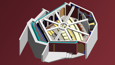
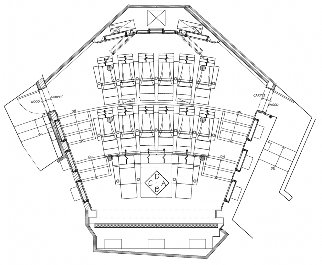
One of Tony’s main requirements was that he didn’t want the usual home theater shoebox. But once the area of the existing theater was excavated to make room for the larger space, it turned out a traditional rectangle probably wouldn’t have worked anyway. After digging down 35 feet, they arrived at an area that was, to put it kindly, not only unusually shaped but literally etched in stone since excavating further would have compromised the foundation of the home. The result mandated a hexagonal, somewhat wedge-shaped room that had to fight to achieve any kind of symmetry.

This theater room carries over the Moorish design style of the rest of the home while adding an abundance of appropriately theatrical touches

cineluxe showcase

Spanish Treasure

Excavating as far as possible beneath the three-story home resulted in what the owner describes as “a really weird-shaped room” that created significant design and acoustical challenges

click on the image to enlarge

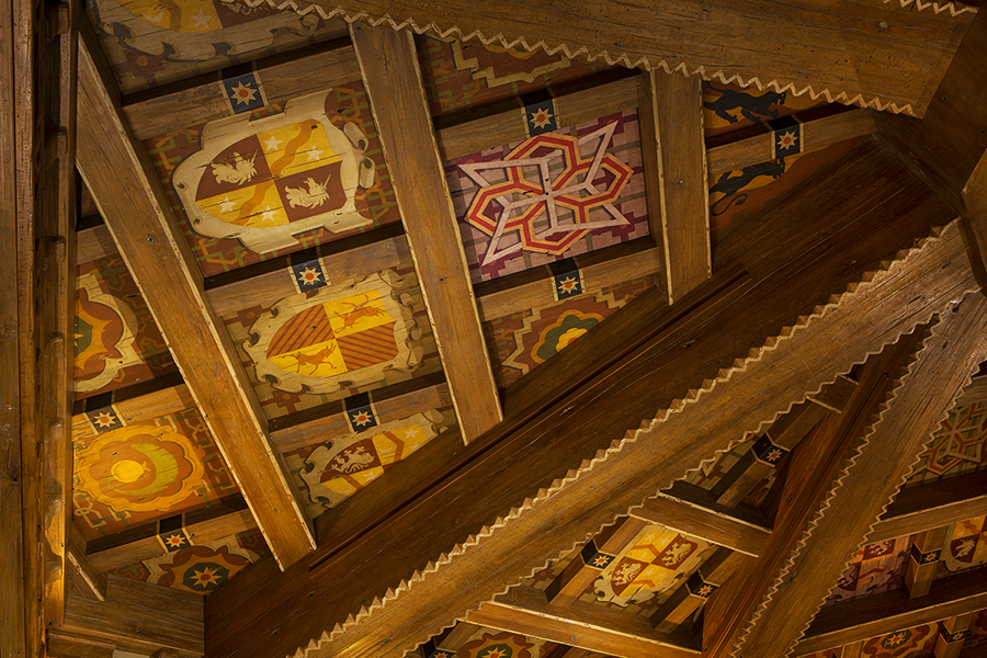
the ceiling of the Monasterio de San Juan de los Reyes, Toldeo Spain

Mudéjar, Briefly

Cribbing from Wikipedia and elsewhere, I can tell you that “Mudéjar” refers to a Late Medieval style of art produced by Muslims who stayed after the Iberian kingdoms had been reclaimed by the Christians but who didn’t convert to Christianity. The term is somewhat derogatory, derived from an Arabic word for “tamed” and was meant to refer to the Christians allowing the Muslims to remain in their lands.

The Mudéjar style is mainly defined by the incorporation of Islamic elements into Christian architecture and art. The style can also involve using building materials like wood not only structurally but decoratively. 

Mudéjar was brought to Spanish regions in the Americas during the 16th century by Christian craftsmen and can be found throughout the former Spanish empire

—M.G.

“If you can start from scratch, you can really pin down what you want the room to be, both design-wise and with the technology for the sound and video,” Tony said. “This room was totally the opposite. There are no parallel walls. The ceiling and floor height needed attention, for lack of a better word. It was just a really weird-shaped room.”

Confronted with this jigsaw-puzzle space, he retained designer Lisa Slayman (ASID, IIDA) who has a storied reputation for creating sumptuous but not garish private cinemas. The room presented Lisa with some formidable challenges, but the biggest, literally, was a 30-foot-long 18-inch-wide I-beam that, supporting a wall above the space, ran right through the middle of the proposed area. Rather than try to minimize the beam’s presence, she decided to embrace it and make it the inspiration for her design.

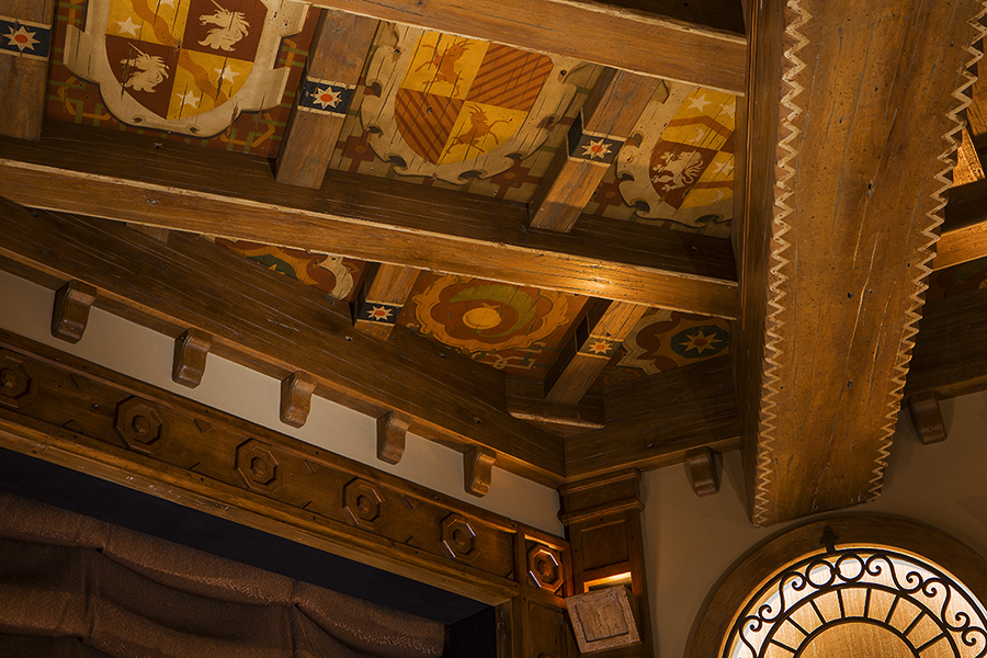
The “A-ha!” moment was when Lisa realized that, by referencing Mudéjar art—an ornate style that emerged in the late Middle Ages in Spain as Islamic influences began to permeate Christian culture—she could both integrate the beam and stay true to the Moorish look of the rest of the home. Creating the kind of intricate decorative ceiling Mudéjar is known for would allow for the introduction of a series of faux beams spoking away from the boxed-in I-beam. And it would allow her to apply crest-like graphics that would not only tie the room in with the style of the home but allow her to personalize the design. 

Lisa then sought out Ojai-based artist Robert Walker to paint all the various symbols, which were chosen in collaboration with the clients, who used them as an opportunity to express their heritage. “He actually hand-painted every panel,” Lisa said. “When you look up at the ceiling, they’re all a tiny bit different. So they really do look authentic.” Everyone was impressed with the result—even the artist. “I said to the gentleman, ‘You have to sign this,’” remembered Tony. “And he said, ‘What are you nuts? Of course I’m going to sign it. I’m not going to let someone else steal my work.’”

The ceiling design also served to conceal the height speakers for the Dolby Atmos surround system. The usual solution would have been to place the speakers in can-type fixtures or hide them behind neutral pieces of cloth, but Lisa took it in a more innovative direction, silk-screening some of the symbols onto fabric that was then integrated into the ceiling in a kind of trompe l’oeil effect. Tony said, “I tell guests, ‘Yeah, there’s speakers in the ceiling. Show me where they are.’ Nine out of 10 can’t find them.”

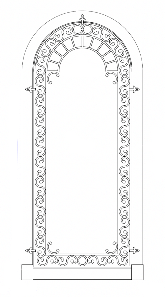
It’s easy to become fixated on the ceiling—which guests to the theater inevitably do—but the room is brimming with other design elements that exhibit just as much inventiveness and discreet panache—like the arched alcoves on the side and back walls that conceal the surround speakers. Rather than go with the usual acoustically transparent fabric, Lisa proposed woven horsehair, a much more expensive solution but one that melded better with the color and texture of the room. And then there are the wrought-iron grilles—another design element carried over from elsewhere in the home, but something you rarely—or never—come across in a private theater.

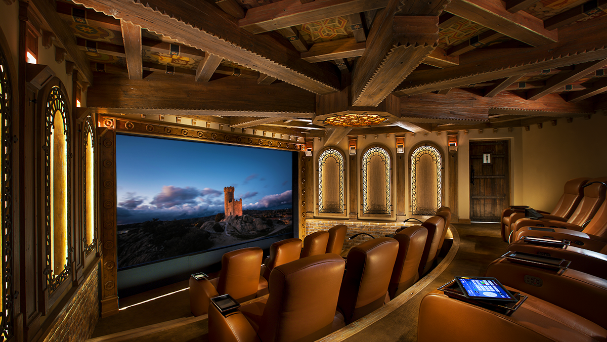
Making a dynamic statement out of a necessity, the theater’s ceiling uses sleight of hand to obscure the presence of a 30-foot structural steel beam, with the ceiling area between the various beams, faux and real, filled with custom, hand-painted emblems inspired by Late Medieval Mudéjar art

Spanish Treasure

Sign up for our monthly newsletter
to stay up to date on Cineluxe

Introducing as much texture as possible was key to creating the desired Old World feel, and you can also see it in things like the ledged brick beneath the alcoves; the distressed thick-plank theater doors with their flat-iron straps; the scalloped Austrian-shade-style silk curtain for the 16-foot projection screen; and the hand-troweled acoustical plaster. “I didn’t want to do a covering all over the walls or a stretching fabric system, like most theaters,” Lisa said. “I wanted the Spanish look of the hard-surface stucco material. The troweled-on plaster gave us that look.”

Because she was proposing so many unusual design solutions, Lisa did mockups so the clients wouldn’t be surprised once everything was in place. “I had them made for everything I picked for that room. But they weren’t tiny little samples—you know, 6 inches big. We would do a wall section or whatever it was, so they could get a feel of seeing it in the space and on the area.”

Having appropriate lighting was also key to maintaining that “maybe we’re in a castle in Spain” effect. “It was really important for me not to have harsh, cold LED lighting because it wouldn’t give it that feeling like you’re in an old space,” Lisa said. “The lighting dials down to 1,200 Kelvin, which is candlelight.” She wanted to keep the fixtures not just unobtrusive but all but invisible. ”If you look in that room, you really don’t see lights because there’s a lot of indirect lighting hidden behind the arches or behind different places. I didn’t want to walk in and see sconces on the wall or downlights—things like that.” The one truly distinctive, but still restrained, lighting touch is the ceiling fixture at the intersection of the beams, with its wrought-iron grille over backlit leaded glass.

Executing a theater this elaborate and intricate inevitably led to tradeoffs between the room’s design and the performance of its audio video system. “Compromises between design and technology almost always favor design,” Tony said, “because to make even an incremental leap in the performance of something like the sound is so expensive. No one other than a seasoned professional is going to notice that tiny improvement. So we always opted in favor of the design as long as the sound achieved an acceptable level, because if we had opted for the sound instead, the design would have taken a major hit, and we weren’t willing to do that.” But he and his wife have no regrets. “Is it the perfect room in terms of design? Yes. Is it perfect in terms of everything? No. But we’re OK with that.”

With a private cinema like this one at his disposal, Tony doesn’t see any reason to patronize commercial theaters. “Certainly the sound is not going to be any better. The comfort is not going to be any better. And the bar’s not going to be any closer.” But he does make one exception. “I’d carve out IMAX because that’s a unique experience.”

Many people would consider having a certified digital cinema with its entrée to the Bel-Air Circuit the ultimate way to watch movies at home, so it was surprising to hear that Tony has become disenchanted with what the Circuit has to offer. “I thought that would be of huge importance to us but in the end it wasn’t. We just don’t need that anymore.” His next big project is to optimize the theater for playback from sources like streaming and Kaleidescape. 

Other than that, Tony and his wife couldn’t be happier with what Lisa created for them. “The conclusion of your article should say, under no circumstances should you hire any designer other than Lisa Slayman to do your project.” 

Michael Gaughn—The Absolute Sound, The Perfect Vision, Wideband, Stereo Review, Sound & Vision, The Rayva Roundtablemarketing, product design, some theater designs, a couple TV shows, some commercials, and now this.

theater designer

Lisa Slayman ASID, IIDA

related article

Generic selectors
Exact matches only
Search in title
Search in content
Post Type Selectors

© 2023 Cineluxe LLC
Rooms for Improvement

Rooms for Improvement

Rooms for Improvement

Rooms for Improvement

the entertainment spaces in this Australian home are undeniably spectacular—but after a decade in use, they were ready for a major sonic makeover

the entertainment spaces in this Australian home are undeniably spectacular—but after a decade in use, they were ready for a major sonic makeover

by Michael Gaughn

by Michael Gaughn

October 31, 2022

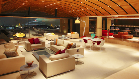
This story could have easily just been about the Theo Kalomirakis-designed Art Deco home cinema. Or it could have focused instead on the jawdropping one-of-a-kind entertainment area, with its discreet stage, ability to accommodate 250 guests, and epic views of Sydney Harbor. But there turned out to be an even bigger—though not quite as showy and obvious—story to be told, about how these kinds of high-end spaces have become so elaborate and flexible and the trends and technologies influencing and supporting them are evolving so quickly, that we’re now being presented with an unprecedented array of opportunities—but also the continual challenge of staying ahead of the curve. 

Every home cinema is a completely custom and unique machine. And the open-floorplan multi-use entertainment areas that are beginning to supplant dedicated theater rooms (like the one profiled in “Achieving Serenity”) are even larger and more complex machines that have to be able to handle a wider and wider variety of tasks. You don’t need to be a techie or have any interest in what’s going on under the hood to realize that creating something like that and keeping it functioning optimally means relying on massive processing power. The key thing to remember is that these systems are basically one-off computers and subject to all the thousand shocks and upgrades our digital brethren are heir to.  

Because of that, this is also a story about not the visible but the invisible. As spectacular as these rooms are, they’re literally useless unless someone keeps a constant and careful eye on all manner of things that are never seen by their users. Acoustical designer Steve Haas has developed a reputation as a master of that unseen realm, one of a you-can-count-‘em-on-the-fingers-of-one-handful of people who know how to not just tame but maximize these intricate, individually crafted mechanisms so they can achieve and maintain peak performance. The portfolio of his company, SH Acoustics, extends well beyond private residences to museum and commercial venues as well, and Haas found himself having to draw extensively on that broader pool of knowledge in order to make this Australian homeowner’s exceptional mandate a reality.

A VERSATILE PERFORMER

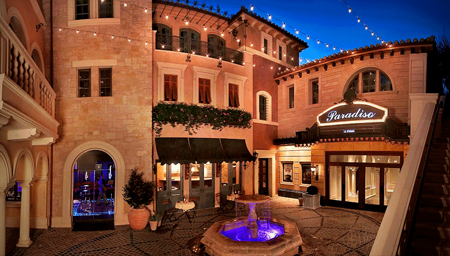
The seven levels that constitute this 55,000-square-foot residence—let’s call it the Sydney Home—rest terraced in a rock face overlooking the harbor, with the iconic bridge and opera house prominent in the dioramic views from its primary living spaces and numerous terraces. It shouldn’t be a surprise to hear that a home of this caliber would hold a theater from a premier designer like Kalomirakis, nor that Haas, who has collaborated on some of Theo’s most ambitious efforts (including the legendary Paradiso) should have been called in to handle the acoustic and audio chores. 

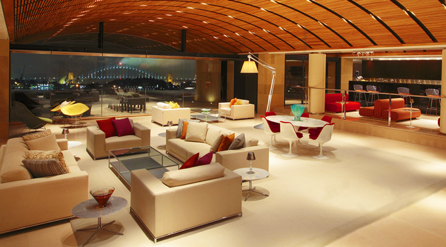
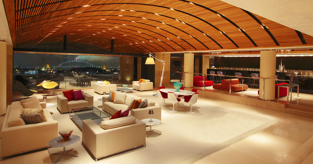
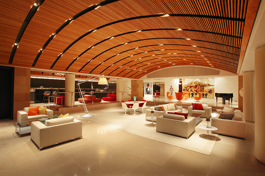
The entertainment area, with its  spacious bar & lounge area and terrace with epic views of Sydney Harbor, can comfortably accommodate 250 guests

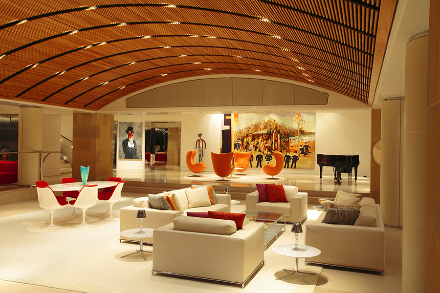
The stage area, with the main speakers hidden behind the fabric at the top of the proscenium. Steve Haas took the client to the Steinway showroom in New York to help him select the Model B grand piano.

The home has seen performances by numerous A-list artists, including Sting, Michael Bolton, and Australian native Delta Goodrem (above)

“Once I had some dialogue with the client, we realized there was a need to have me consult on other keys areas of the home,” says Haas, “especially what they call the Level 1 entertainment space.” It’s not unusual for a home of this size to have a place for holding parties, hosting events, and staging live performances, but you’d be hardpressed to come across another similar space as well realized or as chameleon-like as the one here. 

The room gives few clues to its other capabilities when they’re not in use, feeling causal, comfortable, and domestic. Furniture groupings and large canvases help disguise the stage’s true identity, with the main speakers for performances hidden behind fabric panels in the soffit above the proscenium, and with a dropdown projection screen and monitor speakers tucked into the ceiling of the stage area. 

The client’s desire to have the room provide exceptional sound for parties, fundraisers, and other large events as well as for both movies and live entertainment created a unique challenge for Haas since each use had its own set of not necessarily cross-compatible needs. The music for parties had to be able extend into the bar area, out onto the various terraces, and into other parts of the home as well, while the stereo sound for performances needed to match what you would expect to hear in a high-end nightclub, and the movie system had to supply satisfying surround for groups as large as you’d find in a commercial cinema—all in a wide-open room filled with glass, wood, and other structural and decorative enemies of quality sonic reproduction.  

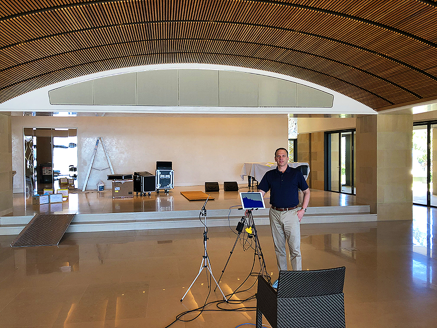
Haas was especially concerned about architect Alec Tzannes’s design for the ceiling, which used suspended elongated 3/4″ rectangular slats to create a barrel vault that would conceal the multitude of speakers, subwoofers, lighting cans, and ducts. “The client actually flew me over to Sydney to make the case,” says Haas, “because he had consulted with a local acoustic expert who had said there would be no problem. And I looked at it and said, no. This is absolutely wrong.” His solution was to use round dowels instead. “After we did our calculations and I created a physical mockup of the dowel system, we saw that the sound would bend around them in a way that would have a negligible effect.”

The curve of the ceiling was also a problem since it would tend to reflect and focus the sound from the speakers instead of spreading it evenly throughout the room. To help address that, and all the many reflective surfaces, Haas took advantage of the space above the dowels to apply extensive sound absorption.

Not only have the homeowners and their guests been impressed with the result, so have the numerous A-list artists who have sung there—Sting, Michael Bolton, and Australia’s Delta Goodrem among them. “Michael Bolton said it was one of the best-sounding places he’s ever performed in,” says Haas. 

MIXED SIGNALS

Cut to a decade later. The homeowner tells Haas he’s concerned the digital signal processors (DSPs) tasked with handling all the various audio responsibilities are beginning to fail. It’s not that the gear is faulty—it’s just at the end of its lifespan. “It’s not uncommon to see DSPs fail after 10 years,” says Haas. “They’re essentially computers, of course”—which means they’re just as likely to start crapping out as any laptop or desktop PC. And they’re subject to the same rapid technological advancements, with all their inevitable upgrades. Staying a step ahead of the upkeep is just a fact of life with anything this diverse and complex.

Rooms for Improvement

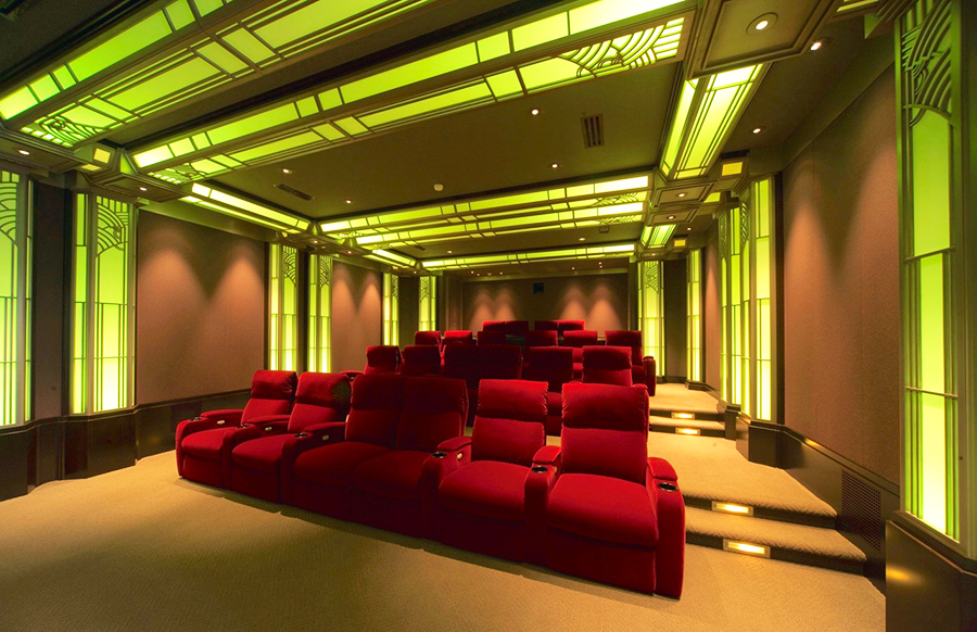
The 7.1-channel surround sound system in this Theo Kalomirakis-designed home theater was recently upgraded to Atmos via the addition of eight Wisdom Audio ceiling speakers 

PROJECT TEAM

acoustical designer

Steve Haas
SH Acoustics

theater designer

Theo Kalomirakis
TK Theaters

custom integrators
Datascene

architect
Alec Tzannes

Haas saw the task as not a chore but an opportunity to bring all the various types of DSP currently in the house under one brand and system. And while he was at it, why not upgrade the private cinema to Atmos as well?

With its 7.1-channel California Audio Technology speaker array, the cinema had been serving the homeowners well since its inception in the early ‘00s. But, having been impressed by Wisdom Audio’s ceiling speakers, Haas felt that adding eight of them to the room to create an Atmos configuration would significantly enhance the movie-watching experience. And the speakers were compact enough that he could have them installed without having to engage in a massive do-over.

Not that the upgrade wasn’t a challenge. Because they couldn’t dismantle the whole ceiling, Haas wasn’t sure what he, the contractors, and the custom integrators from Sydney-based Datascene would find when they attempted to tap into the preferred speaker locations. So they adopted a surgical approach, working their way carefully around the duct work and other impediments. And because there are bedrooms just above the theater, a tremendous effort had been made during the original construction to ensure none of the sound would bleed through the ceiling. Honoring this, they kept as much of the existing treatments in place as possible as they added the new speakers, also providing sound-isolation caps in each of the speaker locations. 

Premium theaters like this one often rely on a tip-top-of-the-line sound processor from a company like Storm Audio or Trinnov. But Haas went with a Marantz AV8805 instead because it provided the desired sound quality without all the additional bells and whistles of the higher-end models and would more readily work in tandem with the QSC Q-Sys pro-audio DSP he was deploying throughout the other key areas of the home.

It was also time to replace the projector—and rebuild the projection booth, which, located near the cliff face, had been infiltrated by moisture. Haas helped the client pick the new projector, consulting with Barco and coming back with a recommendation for its Wodan model. But this required an acoustical makeover for the booth since the new projector was significantly louder than the previous one and the noise would have been distracting, especially for anyone sitting in the last row, which rests up against the booth wall.

Acoustical designer Steve Haas calibrating the sound for the Level 1 entertainment area.

Rooms for Improvement

Acoustical designer Steve Haas calibrating the sound for the Level 1 entertainment area.

Sign up for our monthly newsletter
to stay up to date on Cineluxe

At 38 feet, the room is unusually deep for a private theater. “In a room like that,” says Haas, “you can get so sonically disconnected from the front that by the time you get to the rear seats, it feels like you’re in a different space.” To address this, he used acoustical treatments to disperse the sound so that the experience would be the same no matter where someone is sitting. 

For all the defining trends the Sydney Home represents, maybe the most significant is its extensive blending of consumer and pro gear. As high-end homes incorporate more elaborate entertainment areas like dance floors and live-performance spaces, they need to be able to provide sound on par with what artists expect in professional venues—along with the ability for DJs, sound mixers, and others to be able to jack in their gear.

Also, a multiform multipurpose system as flexible and complex as the one here can quickly exhaust the abilities of the hardware available on the consumer side of things. It often takes robust, function-specific professional gear to rise to these emerging challenges.

Haas, who is just as comfortable working on recording studios, concert halls, and galleries as he is on domestic environments, turned out to be the ideal fit for a project this ambitious. As a member in good standing of that previously mentioned acoustical elite, he was able to bring the necessary combination of expertise and experience to bear. Relying on someone whose knowledge is limited to the residential world to master something like this is a sure-fire recipe for disaster. Since entertainment areas are only going to get bigger, more versatile, and exponentially more complex, better to place them in the hands of people like Haas who not only think, but perform, well outside the home theater box.

Michael Gaughn—The Absolute Sound, The Perfect Vision, Wideband, Stereo Review, Sound & Vision, The Rayva Roundtablemarketing, product design, some theater designs, a couple TV shows, some commercials, and now this.

Generic selectors
Exact matches only
Search in title
Search in content
Post Type Selectors

© 2023 Cineluxe LLC

Survival of the Savviest

Survival of the Savviest

Survival of the Savviest

“I don’t think I need to show any examples of the kinds of rooms I’m talking about. Everyone’s walked one of these crime scenes at some point in their life.”

The responsibility for creating entertainment spaces has traditionally fallen on the person least capable of doing the job—until now

by Michael Gaughn
September 29, 2022

For decades, the person with the most sway over the look of the entertainment spaces in most homes has been the one with the weakest sense of design—or no design sense at all. And I’m not just talking mass-market man caves but high-end home theaters, (the miserably named) media rooms, and other places where people like to enjoy their games, music, movies, and series. 

And by design sense, I’m not talking the ability to make bold statements. An asset elsewhere in the home, those showier traits tend to be a negative in spaces where the room shouldn’t be allowed to overwhelm the experience. I’m just talking about what’s appropriate—what’s judicious and shows taste; what’s apt.

Interior designers are partly to blame for this hegemony. Traditionally tech averse, they far too easily ceded their ground here—which has been especially unfortunate because these spaces, with all their screens and devices and control, are essentially harbingers of what the entire home will soon be. Better to figure out now how to keep them from looking like domestic outliers than to have to tackle them later as a fait accompli.  

So these design chores have too often fallen on the custom integrator instead. But expecting the average AV guy to bring some tact and flair to the proceedings is kind of like letting your lawn crew plan your daughter’s wedding. The parts of the

And by design sense, I’m not talking the ability to make bold statements. An asset elsewhere in the home, those showier traits tend to be a negative in spaces where the room shouldn’t be allowed to overwhelm the experience. I’m just talking about what’s appropriate—what’s judicious and shows taste; what’s apt.

Interior designers are partly to blame for this hegemony. Traditionally tech averse, they far too easily ceded their ground here—which has been especially unfortunate because these spaces, with all their screens and devices and control, are essentially harbingers of what the entire home will soon be. Better to figure out now how to keep them from looking like domestic outliers than to have to tackle them later as a fait accompli.  

So these design chores have too often fallen on the custom integrator instead. But expecting the average AV guy to bring some tact and flair to the proceedings is kind of like letting your lawn crew plan your daughter’s wedding. The parts of the brain needed to run wire, decipher specs, patch together a system, and calibrate a room don’t tend to be on speaking terms with the areas needed to fully grasp a client’s lifestyle or empathize with their more subtle aesthetic needs—essential traits for being able to create a suitable, inviting space that doesn’t feel utterly alien from the rest of the home.

brain needed to run wire, decipher specs, patch together a system, and calibrate a room don’t tend to be on speaking terms with the areas needed to fully grasp a client’s lifestyle or empathize with their more subtle aesthetic needs—essential traits for being able to create a suitable, inviting space that doesn’t feel utterly alien from the rest of the home.

The most positive way to spin all this is to say integrators jumped into the breach because no one else wanted to take on the job, and there’s more than a little truth to that. Less charitably, it could be said that their zeal to pile as much

The Last Days of the Man Cave

gear as possible into a room with little concern for its impact on the experience or the space caused architects and designers who could have helped smooth the waters to throw up their hands and walk away.

I don’t think I need to show any examples of the kinds of rooms I’m talking about. Everyone’s walked one of these crime scenes at some point in their life. The number of atrocities committed in the name of home theater is so massive it warrants a war crimes tribunal.

But this once dire situation is changing for the better—and fast—as a new generation of architects and designers emerges that, having been weaned on

The most positive way to spin all this is to say integrators jumped into the breach because no one else wanted to take on the job, and there’s more than a little truth to that. Less charitably, it could be said that their zeal to pile as much gear as possible into a room with little concern for its impact on the experience or the space caused architects and designers who could have helped smooth the waters to throw up their hands and walk away.

I don’t think I need to show any examples of the kinds of rooms I’m talking about. Everyone’s walked one of these crime scenes at some point in their life. The number of atrocities committed in the name of home theater is so massive it warrants a war crimes tribunal.

But this once dire situation is changing for the better—and fast—as a new generation of architects and designers emerges that, having been weaned on lifestyle tech, no longer views it as the enemy—but also doesn’t stroke it as a fetish—and knows how to make it feel like a not just unintrusive but organic part of the home.

Achieving Serenity

lifestyle tech, no longer views it as the enemy—but also doesn’t stroke it as a fetish—and knows how to make it feel like a not just unintrusive but organic part of the home.

Flexible, innovative private cinemas like the one featured in “Achieving Serenity” show just how fluid this has all become. Architect Ty Harrison also functioned as the lead designer—which, in a home that ambitious, meant also having to have a good grasp of how to integrate sophisticated and elaborate enough entertainment systems to satisfy the client’s needs. He then brought in the right integrator to make all the behind-the-scenes

technical stuff happen, who in turn assembled the right team of specialists to handle things like the acoustics and calibration.

That is how it should be—an architect or interior designer attuned to the client’s lifestyle who can then translate their desires structurally, technically, and aesthetically.

I’m not saying there are no integrators capable of rising to the challenge, just that the hopeless gear-heads among them should never be allowed within striking 

distance of a book of swatches. The exceptions tend to be members of the emerging generation, with some functioning basically as design firms that are also able to handle the tech—like the British outfit Equippd, profiled in “Secret Cinema.” As up on look and feel as they are on gear, they always place the latter clearly in the service of the former.  And because they get design and know how to make it exciting without letting it overwhelm an entertainment space, it’s something they can offer enthusiastically, not grudgingly or ineptly.

Thanks to the ascendance of these tech-savvy architects 

Flexible, innovative private cinemas like the one featured in “Achieving Serenity” show just how fluid this has all become. Architect Ty Harrison also functioned as the lead designer—which, in a home that ambitious, meant also having to have a good grasp of how to integrate sophisticated and elaborate enough entertainment systems to satisfy the client’s needs. He then brought in the right integrator to make all the behind-the-scenes technical stuff happen, who in turn assembled the right team of specialists to handle things like the acoustics and calibration.

That is how it should be—an architect or interior designer attuned to the client’s lifestyle who can then translate their desires structurally, technically, and aesthetically.

I’m not saying there are no integrators capable of rising to the challenge, just that the hopeless gear-heads among them should never be allowed within striking  distance of a book of swatches. The exceptions tend to be members of the emerging generation, with some functioning basically as design firms that are also able to handle the tech—like the British outfit Equippd, profiled in “Secret Cinema.” As up on look and feel as they are on gear, they always place the latter clearly in the service of the former.  And because they get design and know how to make it exciting without letting it overwhelm an entertainment space, it’s something they can offer enthusiastically, not grudgingly or ineptly.

Secret Cinema

Sign up for our monthly newsletter to stay up to date on Cineluxe

Thanks to the ascendance of these tech-savvy architects and designers, and a small but growing coterie of integrators, entertainment spaces are, after far too long, becoming congruent with people’s expectations and how they actually live their lives. We’re far from free of the butt-crack brigade and their zeal for pushing tweaked-out unloved and unlovely rumpus rooms, but the glow of their pocket flashes is waning fast. There will always be a need to have someone run wire—the same way you’ll always need a plumber. But design will never be the AV guy’s strong suit and the coming paradigm shift will not only open up fertile new territory but help finally restore the natural order of things. 

and designers, and a small but growing coterie of integrators, entertainment spaces are, after far too long, becoming congruent with people’s expectations and how they actually live their lives. We’re far from free of the butt-crack brigade and their zeal for pushing tweaked-out unloved and unlovely rumpus rooms, but the glow of their pocket flashes is waning fast. There will always be a need to have someone run wire—the same way you’ll always need a plumber. But design will never be the AV guy’s strong suit and the coming paradigm shift will not only open up fertile new territory but help finally restore the natural order of things. 

Michael Gaughn—The Absolute Sound, The Perfect Vision, Wideband, Stereo Review, Sound & Vision, The Rayva Roundtablemarketing, product design, some theater designs, a couple TV shows, some commercials, and now this.

Generic selectors
Exact matches only
Search in title
Search in content
Post Type Selectors

© 2023 Cineluxe LLC
Nashville Modern

Nashville Modern

photos & video | Mike Vernazza

A radical home theater makeover results in a sleek, minimalist, very of-the-moment entertainment space

by Lisa Montgomery
September 30, 2022

For nearly a decade, the theater occupying the lower level of a luxury Nashville residence entertained its owners with exceptional AV. But much of that theater’s décor and equipment had gone unchanged and eventually untouched as the room aged. 

Still, the bones were solid, the space ideally located, and measuring roughly 800 square feet, bursting with potential. The new owner of the residence had a grand plan to bring the home theater back en vogue and unparalleled. From top to bottom and with the help of professional home theater designers and integrators, he would revive the room, embarking on a dramatic transformation with the goal of creating a sensational, luxuriously appointed space. 

photos & video | Mike Vernazza

Nashville Modern

Out went the traditional furnishings and antiquated AV components and in went a new, contemporary interior and state-of-the-art system. Walls were stripped down to the studs, giving the designers at AcousticSmart Home Theatre Interiors a clean slate upon which to create an ethereal home theater that draws you in with its sleek, modern style and keeps you there with its immersive audio and video performance.

Sure, a larger-than-life screen typically commands the most attention in a home theater but there’s no reason there can’t be other eye candy to admire. Here, wooden columns and a coffered ceiling were replaced with gracefully curved walls and a fiber-optic ceiling infused with twinkling constellations and shooting stars. Traditional incandescent light

Out went the traditional furnishings and antiquated AV components and in went a new, contemporary interior and state-of-the-art system. Walls were stripped down to the studs, giving the designers at AcousticSmart Home Theatre Interiors a clean slate upon which to create an ethereal home theater that draws you in with its sleek, modern style and keeps you there with its immersive audio and video performance.

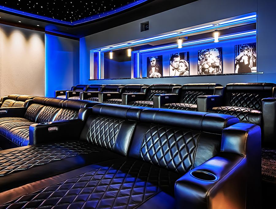
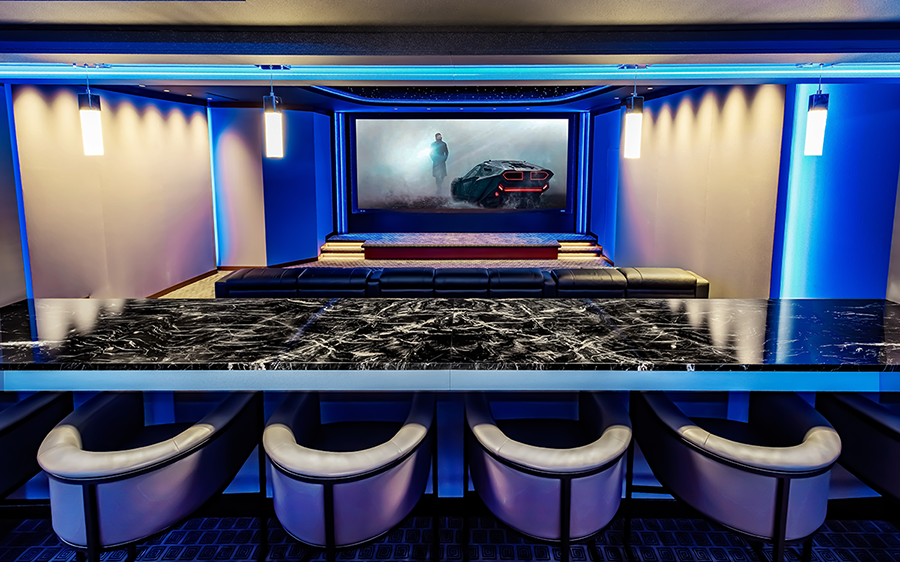
Sure, a larger-than-life screen typically commands the most attention in a home theater but there’s no reason there can’t be other eye candy to admire. Here, wooden columns and a coffered ceiling were replaced with gracefully curved walls and a fiber-optic ceiling infused with twinkling constellations and shooting stars. Traditional incandescent light fixtures made way for adjustable LED colored lighting. Overstuffed, out-of-date seats were traded up for supportive leather Cinemaloungers and motorized chairs. Modern barstools and a granite countertop were added to the back of the room for additional seating, evoking a swank cocktail-lounge vibe.

Nashville Modern

fixtures made way for adjustable LED colored lighting. Overstuffed, out-of-date seats were traded up for supportive leather Cinemaloungers and motorized chairs. Modern barstools and a granite countertop were added to the back of the room for additional seating, evoking a swank cocktail-lounge vibe.

From top to bottom, the theater was realigned, reshaped, and revitalized. “The owner’s mission was to model the room after a project we had posted on Instagram,” says AcousticSmart president and CEO Richard Charschan. “This gave us a great starting point on which to base our design, but we made sure to add several special touches to keep the aesthetic fresh and distinctive.”

From top to bottom, the theater was realigned, reshaped, and revitalized. “The owner’s mission was to model the room after a project we had posted on Instagram,” says AcousticSmart president and CEO Richard Charschan. “This gave us a great starting point on which to base our design, but we made sure to add several special touches to keep the aesthetic fresh and distinctive.”

Nashville Modern

Sign up for our monthly newsletter
to stay up to date on Cineluxe

Complementing the striking cosmetics are a host of installation techniques and cutting-edge technologies applied to channel the owners’ requisite “suspension of disbelief.” For example, it might be hard to believe that speakers tucked behind breathable fabric walls can produce the realistic, three-dimensional audio of a Dolby Atmos surround-sound system. Or that the massive 17-foot diagonal screen can skim the lines of a 10-foot wall, but it does. AcousticSmart and the systems integration team at Professional Audio Video Engineering curated the products, engineered the acoustics, and thoughtfully integrated the right technology to turn some of the best AV components available into seamless facets of the room environment. It all fits together in a clean, minimalist design package that you have to see and hear to believe—just what the owner ordered.

With more than 20 years under her belt covering all things electronic for the home, Lisa Montgomery has developed a knack for knowing what types of products and systems make sense for homeowners looking to update their abodes. When she’s not exploring innovative ways to introduce technology into homes, Lisa breaks away from the electronics world on a bike, kayak, or a towel on the beach.

Generic selectors
Exact matches only
Search in title
Search in content
Post Type Selectors

© 2023 Cineluxe LLC
The Last Days of the Man Cave

The Last Days of the Man Cave

The Last Days of the Man Cave

also on Cineluxe

Sign up for our monthly newsletter to stay up to date on Cineluxe

They were a necessary step in the evolution of private cinemas, but the time has come to leave these primitive ancestors behind

by Michael Gaughn
September 13, 2022

I once consulted on a theater room for a well-known actor. (I can’t give you his name but can tell you his initials were JD, he was known far more for his looks than his acting ability, and he was married to a famous singer.) He had the usual sprawling, status-dripping gleaming-white home far up in the Hollywood Hills, and many decorators had spent many hours making it all look very much up to date and expensive.

He couldn’t wait to show me his existing home theater, which he had put together himself after watching a bunch of YouTube videos and reading a bunch of articles online. The room itself was plenty big enough for a theater, but the projector was a tiny piece of cheap plastic better suited for boardroom presentations sitting on a bare piece of plywood supported by a couple of $5 Home Depot brackets. The opposite wall was indiscriminately slathered in Screen Goo. In between sat three rows of cheap, uncomfortable recliners. He grinned proudly as he fired up the projector but the picture was so dim it was the ghost of anything resembling a real image. I felt ill imagining him eagerly ushering in the Hollywood elite for evenings of butt-twitching washed-out cinema. 

Here’s my point: He built that room, and was proud of it, because that’s what the media had shown him was a legitimate space for watching movies at home. And now the world’s most powerful influencers were filing through there and then going forth, like seed pods dispersed, to reinforce the notion that something that dismal was somehow OK—worse, as good as it gets.

We’ve got the man cave to blame for all that. But thankfully its days are numbered and it’s about to disappear over the horizon like an exiled dictator forced to drift the seas on a makeshift raft.

There’s plenty of blame to go around for the emergence of the cave, but most of it rests on the polo-shirted shoulders of the integrator crowd—although they were, maybe more appropriately, called installers back when this all started. This is an industry built on alarm salesmen, stereo fanatics, and early adopters of surround sound, and they tended to cobble together rooms based on a rudimentary technical knowledge of audio and video but with little sense of the aesthetics of picture and sound. As for the design of the room itself, you could pretty much forget about any tact or taste and would likely end up with the equivalent of Michael Scott’s St. Pauli Girl sign—which is why architects and interior designers tended to shudder whenever the AV guy showed up.

But in a sense the cave served us well. It showed people it was possible to watch movies at home, and eventually showed them they could have an experience that topped anything their local mall cinema could deliver. The problem is that, design-wise, the whole thing ossified early on so that even the highest-end theaters were often little better than glorified rec rooms and rarely kept up with either the technology or the changing ways people live their lives.

So many of these theaters were shoebox-shaped rooms with a bunch of posters on the wall and filled with unsightly furniture that a whole cottage industry emerged for handing out awards to anybody who could come up with something that didn’t look like that. And the systems within them tended to be crafted and tuned for watching demo scenes, not movies, which tended to make them assaultive rather than enticing and has now come to have a pernicious influence on moviemaking itself.

The man cave was aptly named—it’s always been less a space than an attitude born of testosterone. Inevitably, it was the dominant male of the home who lusted for and lorded it over the theater and it was the inevitably male installers who created systems only the male of the home could figure out how to use (if he was lucky). And the fare tended to be stuff only the male of the home would ever want to watch—not because they were great movies but because they gave him a chance to show off.

The result? The other family members would drift away over time, frustrated and minimized, feeling like extras in somebody else’s production, and the room would fall into disuse, eventually sealed off from the rest of the home like an EPA Superfund site.

These rooms still exist of course, with new ones popping up every day—mainly because the personality type that led to their creation is still very much with us. And, it has to be said, because the media has done a piss-poor job of letting people know there are better alternatives. But shifts in both social and family dynamics and some astonishing technological evolution that’s led to the possibility of truly responsive and accommodating systems and spaces are quickly pushing the man cave as far into the past as possible, ushering in a new era of theaters that address the interests and needs of all members of the family, and a wide variety of guests, in rooms that feel organically part of the home—while still providing a chance to step into a realm well beyond the pressures of the world.

So, goodbye man cave. We owe you a modicum of thanks—and a huge good riddance.

Michael Gaughn—The Absolute Sound, The Perfect Vision, Wideband, Stereo Review, Sound & Vision, The Rayva Roundtablemarketing, product design, some theater designs, a couple TV shows, some commercials, and now this.

“In a sense, the man cave served us well. It showed people it was possible to watch movies at home, and eventually showed them they could have an experience that topped anything their local mall cinema could deliver.”

“Inevitably, it was the dominant male of the home who lusted for and lorded it over the theater and it was the inevitably male installers who created systems only the male of the home could figure out how to use.”

Generic selectors
Exact matches only
Search in title
Search in content
Post Type Selectors

© 2023 Cineluxe LLC

Deschamps on Design: Why Not Wallpaper?

Deschamps on Design | Why Not Wallpaper?

Deschamps on Design | Why Not Wallpaper?

more Deschamps on Design

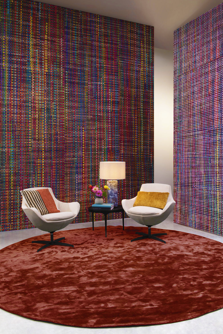
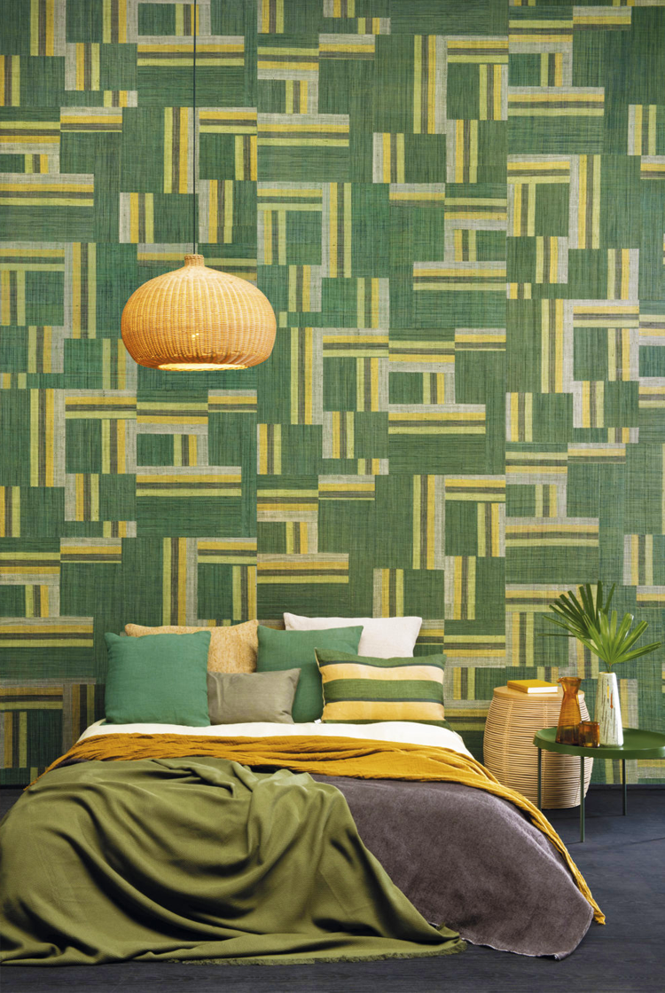
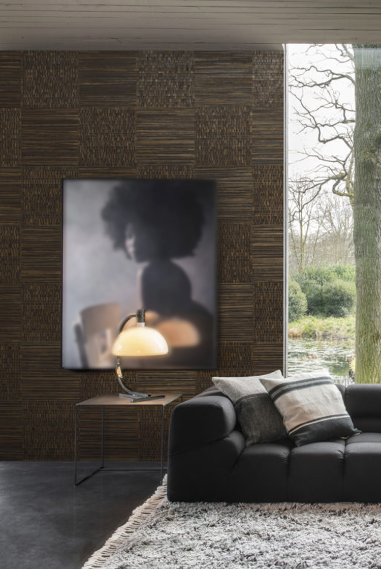
Omexco’s natural, recycled sari silk, handwoven paper strings, and raffia made with artisanal techniques

Sign up for our monthly newsletter to stay up to date on Cineluxe

Wall coverings have evolved so far from their wallpaper past that they now offer a vast, unexplored world in private cinema design

by Maria Deschamps
September 9, 2022

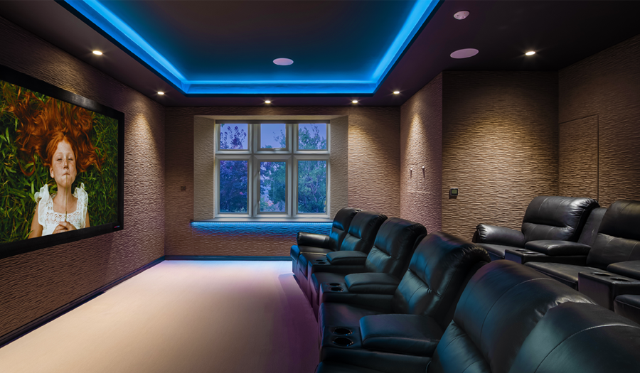
Wallpaper has come a long way since the thin papery material, busy with flowers or paisleys, our grandparents used in their homes. There is now so much more to discover with almost infinite variations, including customization. Most people wouldn’t even consider adding a wallpaper to a home theater but with all the new options, it’s really hard to resist.

The negative connotations of wallpaper are so strong that some of my clients simply cringe when I say the word. But if I say “wall covering” instead, they suddenly become more inquisitive. And when I present samples of textured wall covering, they begin to see that there are possibilities beyond traditional wallpaper and lose their ambivalence. 

I love color, I love pattern, I love texture, and when these elements are combined in the right way, it is the ultimate choice for me. Textured coverings are my favorite. By using a thick velvet, velour, or corduroy, an entertainment space can be transformed into an entirely new atmosphere. These coverings create warmth and intimacy. They also often have acoustic properties that reduce reverberations or echoes—obviously a major consideration when designing a home theater.

Corduroy patterns with wide or narrow lines in dark colors are perfect for a theater room. When used vertically, they give the illusion the ceiling is higher since vertical lines create height. (Conversely, horizontal lines make a room look wider.) Corduroy gives a wall a soft comfy feeling, and when we look at it or touch it, we feel warm and cozy.  

Velour wall coverings now have reliefs and can be found with many different geometrical patterns and shapes. There are even ones that mimic wall panels or wainscoting. These can be used to emphasize an area of a room or a focal point on a wall and give depth. 

Another favorite form of wall covering with amazing acoustic properties are the ones made of cork—yes, cork! This material is not only environmentally friendly, it’s designed with multiple colors and textures, and can even have patterns with sparkle. 

Speaking of wall coverings that sparkle: One of my home theater clients insisted I design a new bedroom for their 11 year old, who was moving from one end of the house to the other and dreaded the relocation. To motivate her to make the move, I had to design something spectacular so I used a magnificent multicolored wall covering full of sparkles and glitter that lit up the wall behind her bed. When she saw the room complete, it made her feel like a real princess, and the room became bright and beautiful, just like her. 

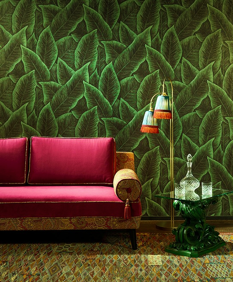
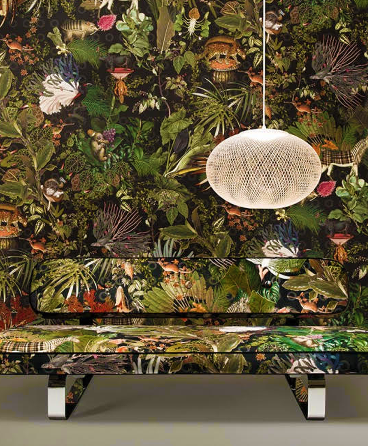
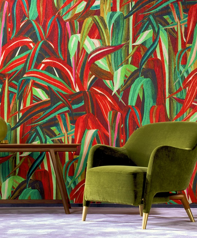
Different patterns are plentiful. One trend is foliage—lots of plants and big leaves. Another is animals, a jungle look with exotic birds. Patterns like these can be an exciting choice to use in an area like a home theater foyer.

Grass cloth has also made a comeback and is now available in many colors and textures. It is even available with metallic accents. Silks are a sexy way to go. Wall coverings with smooth metallic shiny finishes with 3D effects are an amazing complement to a modern space—a perfect choice to give a theater’s rear wall some interest. 

What I love most about wall coverings is that they can just be in the background. They don’t have to have a big pattern that stands out. Using an elegant texture on a wall instead of paint gives dimension and will produce a sophisticated look. 

The options are nearly infinite. For a price, some manufacturers will customize a covering, allowing you to have a personalized color and pattern—the ultimate for exclusive design.

The best way to make a covering work well is to not only select the right one but to also place it on the appropriate wall. Where you enter a room determines which wall is the focal point. Most often, this is the wall I would select to create an impact with wall covering. 

Here’s my take: Think outside of the box and discover the many new options that exist and give wall coverings a chance. You won’t be disappointed! 

Maria Deschamps is a certified Interior Designer, IDC, NCIDQ, APDIQ and has been designing home theaters and media rooms since the year 2000. She also designs high-end residential, restaurant, and commercial spaces, and is a partner at TKG, the Theo Kalomirakis Group. 

above | when the projection screen is raised, a TV is revealed, backed by a cork wall covering with acoustic properties

related article

Belgian manufacturer Omexco offers many options of eco-friendly cork wall coverings with metallic details or printed designs

foliage, a jungle look, exotic birds, animals, and colorful plants are possibilities for a home theater foyer (Arte International)

Generic selectors
Exact matches only
Search in title
Search in content
Post Type Selectors

© 2023 Cineluxe LLC
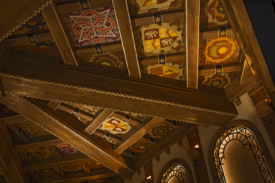
Scroll to top

sign up for our newsletter

receive a monthly recap of everything that’s new on Cineluxe