• Type:
  • Genre:
  • Duration:
  • Average Rating:

Interior Design

All About Digital Canvases

All About Digital Canvases

Our articles on digital canvases and video walls provide a comprehensive guide to the emerging category of digital art in the home

ART

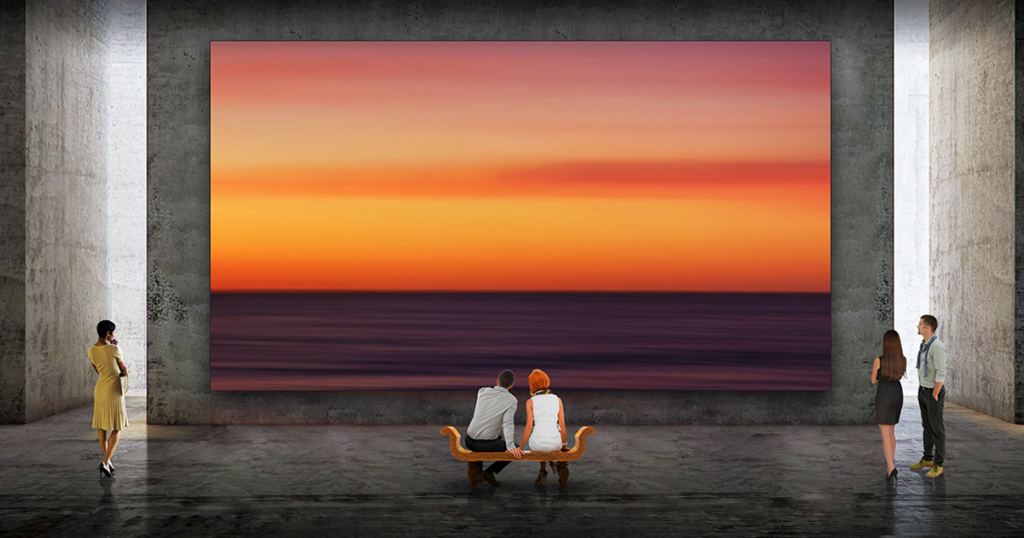
your home is your canvas

emerging technology is going beyond just making homes smart to making them expressive

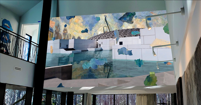
“Everchanging sound and image installations are particularly appealing to those who collect interactive fine art. Modern collections are anything but static. Anyone with a serious NFT collection will attest that they need new ways of displaying artwork. And excitement is just beginning to build around burgeoning artists who work in emerging media, designing original pieces with generative audio and visual elements that constantly change and reflect the dynamic elements of the modern home.”    read more

bringing the gallery home

museums and galleries have a lot to teach about the best ways to display digital canvases in home environments

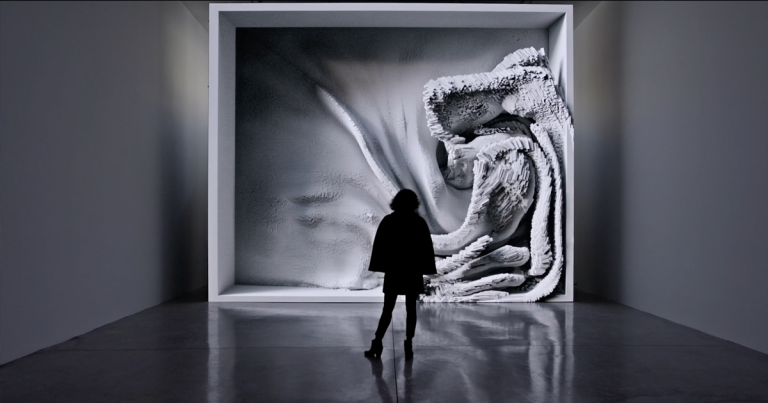
“What is it about looking at fine art that creates a moment of pause instead of merely lulling you into a soporific state? We probably can’t answer that question in this brief piece of writing, but we can address how fine art is typically displayed in galleries. And we can examine how we might make sure these new digital works get the same treatment as the other “static” pieces of art in our homes.”    read more

natural wonder

artist Akiko Yamashita discusses the process of translating her large-scale video works from public exhibition to satisfying display at home

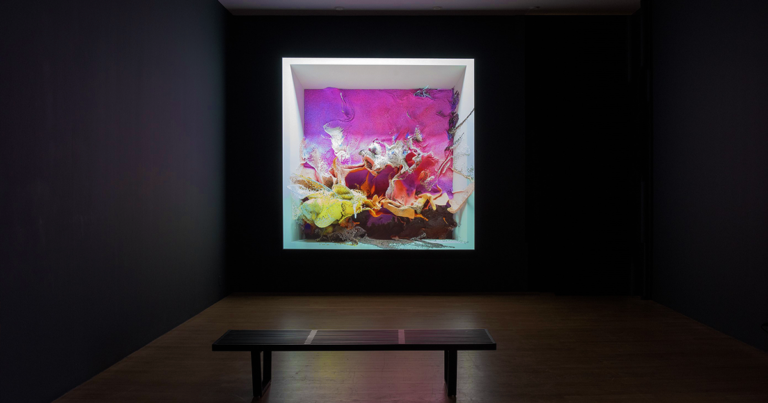
“It wasn’t until I encountered Akiko Yamashita’s artwork that I sensed a new kind of intangible spark that leaps from a creation to the person experiencing it. Her large-scale interactive animations, 3D immersions, and light installations invite people to move and create something more entrancing together. The work is interactive in a way that goes beyond technical wizardry. It’s not just cool, it’s more human.”    read more

enriching the artist’s digital palette

Barco’s Tim Sinnaeve says artist Akiko Yamashita’s recent comments show that the creative community is beginning to embrace the potential of digital canvases

“Knowing that there are specialized integrators who have established themselves as curators of digital canvases and that there is a mechanism to ensure that the artists intentions are honored is something everybody can feel good about. Its very encouraging to see both artists and collectors starting to pick up on this and to see the increasing enthusiasm for digital canvases in the home.”    read more

bringing the gallery home

destinations | artechouse

these tech-meets-art spaces are a must-see (and hear) for anyone eager to experience the leading edge of digital art

“Artechouse is the house that digital art and tech built.  If you’ve heard a lot about digital art but have been so far unimpressed by jokey jpgs and trending crypto disasters, try the these New York, Washington, and Miami-based galleries for a really moving view of the newest fine art.”    read more

a garden of immersive delights

Ed Gilmore’s midtown Manhattan showroom offers a both thrilling and soothing escape for the senses

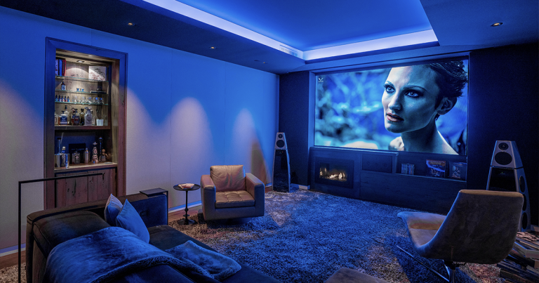
“Certain spaces are more memorable because of what they make you forget. That’s how it feels to walk into one of Manhattan’s unforgettable high-end residential-technology hideaways, Gilmore’s Sound Advice. As I stepped into this sensorially refined environment, I forgot my crazy commute and instantly remembered why the showroom is the scene of so much great conversation and innovation.”    read more

bringing the gallery home

VIDEO WALLS

video walls go boutique

video walls from the mainstream brands remain a big investment, but that doesn’t mean they’ve worked out all the bugs yet

“LED walls will inevitably shed their training wheels and continue to improve as time goes on—although perhaps not as quickly as other residential video-display technologies. In the meantime, companies like Quantum will attempt to bridge the performance and reliability gaps with highly customized premium offerings like the Cinematic XDR.”    read more

great video wall sound is here

an opportunity to audition a center-channel solution in his own home theater showed the author you can have a micro LED wall without compromising the sound

“To have a speaker system that can be optimized without compromise, allowing you to place a pure, strong sonic image exactly where you want it, is going to be a game-changer for creating high-quality sound to go with LED video walls. Given the potential of what I experienced with this system in my own theater, I am looking forward to calibrating the system in the Florida installation next month, which will allow me to take the Movement System from an experimental situation into a real-world home theater environment.”    read more

making video walls better

Quantum Media Systems’ Ken Hoffman on what he’s doing to create video walls that live up to the technology’s potential

“It might seem odd to single out one provider of video walls as a luxury-focused solution when the entire category operates in the stratosphere of the high-end entertainment market. But Quantum Media Systems is quickly establishing itself as the go-to provider of video walls that stand out not merely in terms of sheer size but also image quality, reliability, scalability, and—believe it or not—comfort.”    read more

great video wall sound—another solution

famed acoustical designer Anthony Grimani offers his unique approach to solving the problem of where to put the center speaker in a video-wall home theater

“The problem of how to design sound systems to support massive LED video walls is one that continues to motivate audio professionals working in the luxury home entertainment space. The fact is this is such a custom domain that it’s hard to imagine a one-size-fits-all panacea that provides optimal sound for every wall in every installation.”    read more

million-dollar wall—hundred-dollar sound

video walls have become a big status thing—and an even bigger investment—but getting them to sound good isn’t as easy as you might think

“Video walls can often take up an entire wall but you don’t have the option of putting speakers behind them like you do with a projection screen. SH Acoustics’ Steve Haas has checked out many of the existing audio solutions for LED walls and found them all wanting. But realizing that video walls are quickly becoming the likely future of viewing in premium home entertainment spaces, he’s been more than motivated to try to determine who has the best approach and how it can be optimized.”    read more

SIGN UP FOR OUR NEWSLETTER

Generic selectors
Exact matches only
Search in title
Search in content
Post Type Selectors

© 2023 Cineluxe LLC
The Guys Who Get Design

The Guys Who Get Design

The Guys Who Get Design

related articles

“since everyone is more reliant on technology than ever, clients, architects, designers, and builders don’t fight that conversation as much anymore”

SAV Digital Environments, Bozeman, MT

Sign up for our monthly newsletter to stay up to date on Cineluxe

The HTA’s Josh Christian talks about his efforts to make integrators more design savvy and to get architects & interior designers to bring integrators into the design fold

by Michael Gaughn
February 28, 2023

As technology becomes more and more deeply woven into the fabric of the home environment, the need increases for professionals who can integrate it not just seamlessly but with some flair. But while architects and interior designers will turn to custom integrators to supply the required wire and gear, they tend to cast a wary eye in their direction when it comes to anything involving design, seeing the integrator’s efforts as more a necessary evil than a desired complement to their work. The upshot is that integrators tend to find their involvement in the overall creation of a home minimized, and postponed in the process for as long as possible, which often leads to major changes and delays that can bring construction to a frustrating and expensive halt.

Josh Christian is working to change all that, using his organization, the Home Technology Association (HTA)—which was created to separate the custom integration wheat from the chaff—to not just help integrators become more design savvy but to urge architects, designers, and builders to engage those HTA integrators who have their design act together from the very beginning of the planning of a home. Below, Josh talks about how this effort arose from his own early years as an integrator in the LA market and how he and his organization have made some headway but still have a ways to go.

Is it fair to say that integrators are often left out of the design loop until it’s too late to have any meaningful impact?

Typically speaking, yes, that’s a big problem for integrators. Bringing them in too late leads to all sorts of problems. It means a lot of the client’s technology wishes will be compromised, which often leads to having to do a change order or an expensive retrofit and other delays with the project.

Is there a subset of integrators who have figured out how to ensure they’re in there early, and do they have any strategies that are the equivalent of waving their arms and saying, “You’d be crazy to start without us.”

My guesstimate of all the integrators out there, less than 3% have figured this out in any meaningful way, where it’s a serious goal of theirs to improve their working relationships with architects, designers, and builders. The successful ones are just doing really great marketing business practices. They’ll join the associations for those trades and use them to meet up with the builders, designers, and architects in their community. They’ll also reach out and connect on social media.

That’s what I did when I got into the luxury end of custom integration back in 1998 working with DSI Entertainment Systems. I did a lot of research to find out who were the top architects, designers, and builders—I’m just going to call them “trade partners,” to make it easy—and see if any of them were in magazines like Architectural Digest. I’d pick up the phone and call and and even literally drive by—good old door knocking—and introduce myself as an integrator that understands them.

Where many integrators fail is that they talk all about “me, me, me”—O, we’re the best integrator in town; we do this, we do that; we do home theater, we do home automation—but they don’t talk about their process so much and show that they respect what their trade partners do. Because it’s really important for an integrator to be able to think like the people they work with. Those other people typically aren’t interested in audio, video, or controls, and because of that they think their clients don’t care either. So integrators shouldn’t talk about those techie things when they introduce themselves but should instead present themselves as a solution to their client’s technology needs, because the truth is that there’s going to be technology in every single home their trade partners are working on, even if a client’s not a techie person.

At a minimum, a home needs to be prewired; it’s probably going to have a network and the client is probably going to want robust wi-fi, and they probably want a security system or a surveillance system. So it’s best for an integrator to say, “Hey, I’m a solution provider. No matter how simple or how complex, I’ll help design the client’s technology needs into your plans and make sure everything gets installed in the best, most aesthetically pleasing way possible. And if any of our products will be visible on the structure or in the interior, I’ll get your input so you’re OK with the way they look.” The trade partners love that, because they’re been included in the process.

That’s how it started back in the late ‘90s, just showing empathy. Today, the better integrators have learned to pique the interest of their trade partners by first talking about things most likely to be on the client’s mind—things like wellness, energy management, and motorized shading and lighting. If integrators can position themselves as system designers who know how to integrate these priorities into their trade partners’ plans, they’re seen as a valuable designer and consultant and not just a contractor or sub-contractor who’s only there to install something and leave.

Do you find that there are many integrators who have a strong grasp of design?

The awareness still needs to come up with that quite a bit. When I started with the Home Technology Association, I expected to find that many more integrators are doing this than they are, so we’re providing guidelines to help the ones that aren’t yet performing at that level to show what the architects, designers, and builders want out of them. It’s slowly getting better but it has to happen a lot quicker.

Interior designers used to want nothing to do with technology because they saw it as just gumming up what they were trying to do, which frequently led to tension between them and the integrator. Younger designers and architects seem much more comfortable with the technology and are more willing to accommodate the integrator. But what’s your recent experience been like? Is it still a battle to get designers to accept the tech?

It is a bit of a battle but it is getting better. It’s important to remember that back when I got my start in this, the technology tended to be a lot more obvious, a lot less flexible, a lot more expensive, and wasn’t as central to people’s lives. But now everybody is effected by technology, and since everyone, including the architects, designers, and builders themselves, are more reliant on it than ever, the clients and trade partners don’t fight that conversation as much anymore.

Are you aware of many integrators who have interior designers on staff?

I know very few. I think there are maybe two integrators out there who have one on staff. And I think the reason it’s uncommon is that, if an interior designer knew an integrator had someone who does what they do, they’d be less apt to refer that integrator, thinking the integrator might take that client’s interior design business in the future and create a conflict of interest. Plus, it’s such a different field.

Could you cite any integrators that are particularly good at getting in there early on projects, at bringing the design elements together, and at creating a strong bond with the other trades?

There are a few in our industry that do a really great job of that. But SAV Digital Environments in Montana stands out because they do a phenomenal job of marketing. They do a lot of lunch ’n’ learns for architects and designers, they get their CEU credits, and they do quite a few events at their showroom. There’s also Joe Calise at Sights N Sounds in Seaford, New York. He’s the chapter president of the interior design society chapter there so he’s well known in the interior designer circle in New York, which is phenomenal.

Another one to call out is Jamie Briesemeister from Integration Controls in Missouri. She’s working on a showroom remodel that’s going to be a great place for hosting events for architects, designers, and builders. I’m seeing more integrators instead of moving away from showrooms, building new ones, and they’re building them to be interior designer and architect resources.

That’s a great trend, and I hope it continues, because you can talk about human-centric lighting but when you see it, it really has an impact. That’s especially true with something that’s near and dear to this industry’s heart—a high-performance home theater. Home theater has become such a diluted term. A client sometimes thinks it’s a three-hundred-dollar soundbar system they can find at a big-box store because it says “home theater.” So they think that if that’s three hundred dollars, if they spend five thousand dollars they must be getting something just ridiculously, phenomenally top of the line. But, as you and I know, you can spend multi hundreds of thousands of dollars on a home theater, if not millions. But it has to be done right. It’s not just the components—it’s the design, it’s the acoustics, it’s the space. So I like that high-performance theater is being focused on again, where there are truly wow experiences that can convince even a jaded client. Clients will spend the money when they know what experience is they’re going to get.

The Guys Who Get Design

Josh Christian

“the better integrators have learned to pique the interest of architects, designers, and builders by first talking about things most likely to be on the client’s mind—things like wellness, energy management, and motorized shading and lighting”

Sights N Sounds, Seaford, NY

Integration Controls, Rock Hill, MO

Michael Gaughn—The Absolute Sound, The Perfect Vision, Wideband, Stereo Review, Sound & Vision, The Rayva Roundtablemarketing, product design, some theater designs, a couple TV shows, some commercials, and now this.

Generic selectors
Exact matches only
Search in title
Search in content
Post Type Selectors

© 2023 Cineluxe LLC

People First, Then the Gear

People First, Then the Gear

People First,
Then the Gear

By finding out all about their clients’ lives and needs well before they get around to talking about the tech, Britain’s Equippd sets an example other high-end integrators should follow 

by Michael Gaughn

left | Equippd co-founder & director Matthew McCourt (at right) consults with a client at a job site

RELATED ARTICLE

January 31, 2023

Custom integrators—the folks who come up with the gear for watching movies, running your lights and shades, cobbling together your security system, and so on—justifiably worry about just being seen as the tech guys, a stigma that leads to not being taken as seriously as architects and designers, which in turn often means they’re the last ones called in on a job. Some integrators have started to make an effort to show they understand lifestyle and design but the exercise often comes across as forced and insincere because most really are just tech guys at heart.

Consider the websites of the leading luxury integrators in the NYC market. They all look different but the messaging is all pretty much the same—not “we understand you” but “look at how great we are.” And the focus tends to be on brand names and on awards won, sometimes accompanied by a single image of a contemporary but sterile and depopulated room. Even the newer firms, which ought to be more attuned to design, usually display more attitude than empathy.

They could all afford to learn a thing or two from Britain’s Equippd. Everything about this  Surrey-based high-end integration firm—from their website to their portfolio to how they engage their clients—shows they don’t just pay lip-service to but genuinely get design. Every page of their site speaks to lifestyle well before it broaches technology, and does so in a natural and disarming way that just can’t be faked.

I initially became aware of Equippd while wading though scores of photos of media rooms and private cinemas from a broad cross-section of luxury integration firms. Only one space stood out—the whimsical little theater tucked away behind a bookcase profiled in “Secret Cinema.” Everything about that room felt right. It not only looked comfortable and conducive to movie watching but evinced a deft ingenuity without ever being showy. Most striking of all was its apt sense of design, leagues away from the “we don’t really get how this works but we had to do something” aesthetic that mars most dedicated entertainment spaces.

Interviewing Equippd’s Matthew McCourt for “Secret Cinema” confirmed that the virtues on display in that theater, and in the company’s other projects, are just an organic extension of the well-considered, engaging, reassuring manner of the company’s principals. The brainchild of Matthew and his brother Charlie, Equippd adopts a familial approach that can’t help but put clients and collaborators alike at ease. Wanting to go deeper into why they get it right when so many other integrators don’t get it at all, I recently buttonholed Matthew for another transatlantic chat.

145B Walton Road
East Molesey
Surrey KT8 0DU

+44 (0)20 8191 7887
hello@equippd.uk

“If you hit people with all the brands and specifications very, very quickly, it’s just overwhelming because they don’t have enough time to digest any part of it, so they just shut down”

Your website does a nice job of showing clients how Equippd determines their needs, but could you walk me through the process a little?

It’s all about finding out how people live in their homes. Once you understand that, you can then put forward different types of technology that are going to enhance those areas or make certain things easier for them rather than going in and saying, “Yeah, this is Lutron! and Crestron! and this and that,” which will cause the client to go, “Well, what is that? Do we need that sort of stuff?”

Equippd co-founders Charlie and Matthew McCourt describe their process for determining a client’s needs

Equippd co-founders Charlie and Matthew McCourt describe their process for determining a client’s needs

The Artechouse NYC show The Life of a Neuron incorporates the work of a number of artists to tell the story of neurons

“The desire to find the optimum solution for every project is what helps to get me up in the morning, along with knowing we’re going to be trying to understand a new customer and how they want to develop their house”

Before we dig down into different types of brands and things like that, there’s a bit of a journey we have to take people along because there are a lot of different things we do when we’re integrating into a home. We’re involved in the lighting, the heating, the shading, the entertainment spaces, the multiroom audio, their garden, their shed, their attic, the security. If you hit people with all the brands and specifications very, very quickly, it’s just overwhelming because they don’t have enough time to digest any part of it, so they just shut down. But If you instead try to understand how they live and show how you can improve that while making sure the space looks good—i.e., not see the tech at all or just see the bare minimum—we find that works well.

While there has been some effort to improve the look of the things people interact with, there’s still a long way to go.

Touchscreens are ugly. All of these things don’t look good, really. And alarm panels—terrible, terrible. Everything looks like it was from the ‘80s.

So what do you do to make all of that a little more palatable?

Whether it’s interior design, system design, schematics, elevations of how walls are going to look, how keypads and touchpanels are going to sit, what else is on that wall, we’re always thinking in terms of what can we remove, how can we clean up that space. Our sole drive is, how can we simplify this? Because we’ve seen panels everywhere before in properties and light switches just everywhere. And it’s like, why? We’ve walked into houses before where even we can’t operate the light switch.

When it comes to new construction versus retrofit, how do your projects tend to skew?

New build and renovation form 90% of our work, with the last 10% being retrofit, which we tend not to do too much because we’re not geared that way.

What distinguishes renovation from retrofit?

You’ve got a lot of London residences where pretty much the whole home apart from the facade is getting knocked back, stripped out, and then completely remodeled from the ground up. We classify those as a full renovation because we’re still keeping the existing fabric or four walls of the structure.

That kind of new construction and renovation can often mean open-floorplan spaces with a mandate to include as many types of entertainment as possible but without compromising the picture or sound.

We love those challenges because design plays so much into that, looking at the space, understanding, “OK, how can we do this to be able to give them this multifaceted kind of functionality for the room but make it look good?” In an open space like that, you can’t just have what looks like a media room tucked away in one corner. It’s just not going to fit in.

Renderings of a multi-use entertainment space. The section of the paneled wall above the TV conceals a dropdown projection screen. For movie viewing, the wall section comes forward and the screen descends in front of the TV.

Sign up for our monthly newsletter to stay up to date on Cineluxe

Have you had much call yet for video walls?

Not really. We did have one guy who wanted one as the splash-back in the kitchen. Where the hob and other stuff is would have basically been a massive TV. We quoted him but the project didn’t go anywhere.

Would it be fair to say that the living spaces themselves hold more interest for you than the technology you put in them?

Absolutely. The desire to find the optimum solution for every project is what helps to get me up in the morning, along with knowing that we’re going to be looking at something new, that we’re going to be trying to understand a new customer and how they want to develop their house, how that house is going to flow, how they’re going to use it.

Given all the things you can offer in a home, it seems almost inevitable you’d form as deep a bond with the client as the architect or interior designer does.

All the other trades do their work and then most often move on, but we’re there right at the start and then we’re also there right at the end. While the family are moving in, we’re meeting them, we’re meeting their kids, we meet their dog. And there’s a relationship that goes on after that, with any sort of tweaks and changes they want, or looking after systems and servicing them as well. I’ve always found that quite enjoyable, getting to know the people behind the home. That’s the part of the business I think is so important.

Michael Gaughn—The Absolute Sound, The Perfect Vision, Wideband, Stereo Review, Sound & Vision, The Rayva Roundtablemarketing, product design, some theater designs, a couple TV shows, some commercials, and now this.

Generic selectors
Exact matches only
Search in title
Search in content
Post Type Selectors

© 2023 Cineluxe LLC

Bringing the Gallery Home

Bringing the Gallery Home

video | Refik Anadol, Melting Memories

Museums and galleries have a lot to teach about the best ways to display digital canvases in home environments

by Kirsten Nelson
November 22, 2022

You know that feeling you get when you walk into a room and see a bouquet of flowers? There’s a brief moment of surprise. Those aren’t usually there! It’s a new element in your roomscape, and it brings a quiet thrill. 

Maybe it’s not flowers. Maybe it’s a new book, or a new bottle of Scotch, or a new arrangement of throw pillows. Something that you added, that you love, that’s a delight to contemplate, and it wasn’t there just the day before. 

Now imagine that feeling amplified spectacularly in the most refined way possible. I’m not talking about fireworks or a parade. I’m talking about something that awakens the senses while also magically blending into your home in a way that makes each moment better. It combines the novelty of seeing something new with the soothing harmony we try to cultivate in our home.

That is what it’s like to add one of these new attention-grabbing digital canvases to your home. It’s an ambiance changer. It’s a scene-setter. And it’s dynamic, capable of constantly changing, so it will always feel new.

The phrase “digital canvas” is being thrown around a bit haphazardly these days. Anything that can help display digital art or the exotic works in your NFT collection is called a canvas. But in what seems like a limited interpretation of the possibilities presented by these new speculative realms of art—some of the works being generative, constantly changing in response to data inputs, movement, and the environment surrounding them—we seem to be hung up on

Kirsten Nelson, “Your Home is Your Canvas

(2/11/22)
a look at how emerging technology is going beyond just making homes smart to making them expressive

video | Refik Anadol, Melting Memories

(8/19/22)
Barco Residential’s Managing Director on how artist Akiko Yamashita’s comments in “Natural Wonder” show that the creative community is beginning to embrace the potential of digital canvases

photo | Refik Anadol, Quantum Memories (Bitforms Gallery)

rectangles. As in, we’re still hanging up the same old 16:9 panels and wondering why it feels like we’re only watching TV when in fact we’re looking at expensive works of art.

What is it about looking at fine art, anyway? Why does it create a moment of pause instead of merely lulling you into a soporific state? We probably can’t answer that question in this brief piece of writing, but we can address how fine art is typically displayed in galleries. And we can examine how we might make sure these new digital works get the same treatment as the other “static” pieces of art in our homes.

The Shape of Art to Come

To do that, first we need to get beyond the rectangle. How many oil paintings actually adhere to a 16:9 aspect ratio? And what about sculptures? Many of these new digital works have more in common with sculptures. They might be rendered in 3D, or in many cases their interactive elements make them feel more like an art installation than a print on a wall. That being the case, do we really want to lock them into the same tight frame we wrap around commercials and sports? 

The makers of video technology see a future beyond the rectangle. Tim Sinnaeve, Managing Director of Barco Residential, is a passionate advocate of discovering new forms and means for displaying digital art in the home. “The whole idea of a 16:9 aspect ratio is very limiting when you’re talking about art,” he said. “And it’s a limitation that actually also negatively impacts the art world, and most importantly artistic freedom, because you get this self-fulfilling prophecy where the artist feels like they have to create their work in 16:9 because that will fit the screen it ends up on. Then on the other side, the thinking goes, ‘All the art that’s available is 16:9, so that’s why I’m using a 16:9 display or a TV.’” 

If we want to get to a near future where we see more creative additions of these multi-faceted, multi-sensory works into our living spaces, we need to consider the experience you have in an art gallery. What elements help to elevate artwork? How can we ensure that a piece is displayed in a manner equivalent to its value?

The answer may vary, with options that include direct-view LED video walls or projection setups, but ultimately what we’re talking about is that suddenly ubiquitous “digital canvas.” It’s the surface that will determine whether an artwork looks like it was worth the investment. 

“The canvas actually becomes part of the value, because it determines how the art looks, and how you experience it,” Sinnaeve said. “If you’re a serious collector, you need to work with professionals to make sure that the right digital canvas is selected.”

Once you’ve seen a major digital work on a proper LED screen or lighting up a wall with high-end video projection, there’s no going back. “Going from that level of depth and quality to seeing it on an 84-inch OLED TV is just night and day,” Sinnaeve said. “It’s between something that moves you and that you really would like to be a part of your life, compared to something that just doesn’t do it. And technically the work is the same.”

More than just a video technology decision, “it’s really about looking at it from an architectural and design perspective and considering where and how you want your digital canvas to create an experience,” Sinnaeve said. “The way you approach that shouldn’t be that different for digital art

(6/24/22)
Video walls have become a big status thing—and an even bigger investment—but getting them to sound good isn’t as easy as you might think

Bringing the Gallery Home

Touch displays like the ones already being used in museums will up open an unexplored world of educational and entertainment experiences for domestic settings

Sign up for our monthly newsletter
to stay up to date on Cineluxe

versus ‘traditional’ art, at least from a philosophical perspective. There are the fundamentals of displaying the work and then there are factors related to how the artist intended it to be seen as well.”

That’s where we get to the curator role that many custom residential technology integrators may soon be adding to their skillsets. Savvy installers will be able to work with artists to realize the artist’s vision while also presenting clients with a beautiful experience of digital fine art at home.

Setting the Scene

We need to also think about the environment surrounding these works. Start with the lighting. Just as you would think about properly lighting a physical work of art, work with a professional integrator who knows how to ensure your digital art is depicted in a manner befitting its merits rather than receding into the background because it just looks like a TV.

Many digital artworks also have a sonic element, and some of them are actually entirely audio-based. But even for visual-only pieces, it’s important to consider acoustics and sound as part of the experience. To get some insight into these invisible-but-essential factors, I spoke with Steve Haas, CEO and Principal Consultant with SH Acoustics.

Especially because digital art might be installed in large open spaces in homes, you should be sure there’s not a lot of cacophony created by reverberant reflections. Think about the enveloping hush of a gallery and how that adds a luxuriously contemplative level to the viewing experience. The addition of some properly designed acoustic control can help to deliver that effect at home. Also, if there is a sound component, you might want to acoustically isolate the room to prevent the creation of—or distractions from—disturbances elsewhere in the home. 

You might consider using some of the high-tech directional speakers that can precisely aim where sound is traveling—the kind they’re using at compelling new immersive-experience emporiums like the Illuminarium in Atlanta and Las Vegas. These spaces go beyond the usual multi-surface video projection into full-scale aural choreography, which together will make you forget all about the outside world.

“Having rooms like that, filled with unique content that updates regularly, I could really see that happening,” Haas said. His work in museum experience design and in high-end residential media and acoustic design have combined to give Haas a unique vision for how we might reimagine our homes. 

“I see having these elements that are interspersed throughout the house in a very purposeful, creative way that introduce video and soundscapes and all the other elements that make that experience fully immersive,” Haas said. “And sometimes, if it makes sense, potentially adding informative or educational content, which can also change, of course.”

Going beyond home theaters or media rooms, you might add dynamic digital artworks to corridors, atriums (direct-view LED walls are bright enough to handle high-brightness areas), foyers, great rooms, or anywhere you want to experience additional levels of engagement. In recreational spaces, there’s even more possibility, with full-scale video, sound, and lighting activations in personal nightclubs, bowling alleys, patios, pools, and more. 

From there, Haas takes it one step further, returning to the idea of immersive exhibits found in museums. “Think about having custom-produced media from any of the top museum content producers,” he suggested.

“How can you create this hybrid, totally unique world in somebody’s home that might even have didactic meaning, historical content, or educational content for their kids or anyone else?” Haas asked. “Each of these thematic experiences can represent something important to the family’s lives, the same way a museum presents media or physical content that’s important to the institution’s mission.”

That might also address the “these kids today and their phones” challenge—though it’s hardly just the kids. Every generation is now compulsively interacting with screens and content on a regular basis. What if the home was similarly compelling with ever-changing atmospheric elements? Maybe then we could get more people to look up from their screens and enjoy living together. 

Steve Haas’s firm, SH Acoustics, did the acoustic and audio design work for the Statue of Liberty Museum, which features the kinds of video displays and interactive technologies that could be creatively deployed in a home environment

Kirsten Nelson is a Brooklyn-based writer, speaker, event content producer, and podcast host who writes frequently for technology brands, integration firms, and experience design agencies. She was the editor of SCN magazine, and before that, co-launched Residential Systems. Kirsten is also a co-founder, editor, and writerly salon host of CreativeStack, a newsletter for the experience design community.

Generic selectors
Exact matches only
Search in title
Search in content
Post Type Selectors

© 2023 Cineluxe LLC
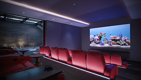
Survival of the Savviest

Survival of the Savviest

Survival of the Savviest

“I don’t think I need to show any examples of the kinds of rooms I’m talking about. Everyone’s walked one of these crime scenes at some point in their life.”

The responsibility for creating entertainment spaces has traditionally fallen on the person least capable of doing the job—until now

by Michael Gaughn
September 29, 2022

For decades, the person with the most sway over the look of the entertainment spaces in most homes has been the one with the weakest sense of design—or no design sense at all. And I’m not just talking mass-market man caves but high-end home theaters, (the miserably named) media rooms, and other places where people like to enjoy their games, music, movies, and series. 

And by design sense, I’m not talking the ability to make bold statements. An asset elsewhere in the home, those showier traits tend to be a negative in spaces where the room shouldn’t be allowed to overwhelm the experience. I’m just talking about what’s appropriate—what’s judicious and shows taste; what’s apt.

Interior designers are partly to blame for this hegemony. Traditionally tech averse, they far too easily ceded their ground here—which has been especially unfortunate because these spaces, with all their screens and devices and control, are essentially harbingers of what the entire home will soon be. Better to figure out now how to keep them from looking like domestic outliers than to have to tackle them later as a fait accompli.  

So these design chores have too often fallen on the custom integrator instead. But expecting the average AV guy to bring some tact and flair to the proceedings is kind of like letting your lawn crew plan your daughter’s wedding. The parts of the

And by design sense, I’m not talking the ability to make bold statements. An asset elsewhere in the home, those showier traits tend to be a negative in spaces where the room shouldn’t be allowed to overwhelm the experience. I’m just talking about what’s appropriate—what’s judicious and shows taste; what’s apt.

Interior designers are partly to blame for this hegemony. Traditionally tech averse, they far too easily ceded their ground here—which has been especially unfortunate because these spaces, with all their screens and devices and control, are essentially harbingers of what the entire home will soon be. Better to figure out now how to keep them from looking like domestic outliers than to have to tackle them later as a fait accompli.  

So these design chores have too often fallen on the custom integrator instead. But expecting the average AV guy to bring some tact and flair to the proceedings is kind of like letting your lawn crew plan your daughter’s wedding. The parts of the brain needed to run wire, decipher specs, patch together a system, and calibrate a room don’t tend to be on speaking terms with the areas needed to fully grasp a client’s lifestyle or empathize with their more subtle aesthetic needs—essential traits for being able to create a suitable, inviting space that doesn’t feel utterly alien from the rest of the home.

brain needed to run wire, decipher specs, patch together a system, and calibrate a room don’t tend to be on speaking terms with the areas needed to fully grasp a client’s lifestyle or empathize with their more subtle aesthetic needs—essential traits for being able to create a suitable, inviting space that doesn’t feel utterly alien from the rest of the home.

The most positive way to spin all this is to say integrators jumped into the breach because no one else wanted to take on the job, and there’s more than a little truth to that. Less charitably, it could be said that their zeal to pile as much

The Last Days of the Man Cave

gear as possible into a room with little concern for its impact on the experience or the space caused architects and designers who could have helped smooth the waters to throw up their hands and walk away.

I don’t think I need to show any examples of the kinds of rooms I’m talking about. Everyone’s walked one of these crime scenes at some point in their life. The number of atrocities committed in the name of home theater is so massive it warrants a war crimes tribunal.

But this once dire situation is changing for the better—and fast—as a new generation of architects and designers emerges that, having been weaned on

The most positive way to spin all this is to say integrators jumped into the breach because no one else wanted to take on the job, and there’s more than a little truth to that. Less charitably, it could be said that their zeal to pile as much gear as possible into a room with little concern for its impact on the experience or the space caused architects and designers who could have helped smooth the waters to throw up their hands and walk away.

I don’t think I need to show any examples of the kinds of rooms I’m talking about. Everyone’s walked one of these crime scenes at some point in their life. The number of atrocities committed in the name of home theater is so massive it warrants a war crimes tribunal.

But this once dire situation is changing for the better—and fast—as a new generation of architects and designers emerges that, having been weaned on lifestyle tech, no longer views it as the enemy—but also doesn’t stroke it as a fetish—and knows how to make it feel like a not just unintrusive but organic part of the home.

Achieving Serenity

lifestyle tech, no longer views it as the enemy—but also doesn’t stroke it as a fetish—and knows how to make it feel like a not just unintrusive but organic part of the home.

Flexible, innovative private cinemas like the one featured in “Achieving Serenity” show just how fluid this has all become. Architect Ty Harrison also functioned as the lead designer—which, in a home that ambitious, meant also having to have a good grasp of how to integrate sophisticated and elaborate enough entertainment systems to satisfy the client’s needs. He then brought in the right integrator to make all the behind-the-scenes

technical stuff happen, who in turn assembled the right team of specialists to handle things like the acoustics and calibration.

That is how it should be—an architect or interior designer attuned to the client’s lifestyle who can then translate their desires structurally, technically, and aesthetically.

I’m not saying there are no integrators capable of rising to the challenge, just that the hopeless gear-heads among them should never be allowed within striking 

distance of a book of swatches. The exceptions tend to be members of the emerging generation, with some functioning basically as design firms that are also able to handle the tech—like the British outfit Equippd, profiled in “Secret Cinema.” As up on look and feel as they are on gear, they always place the latter clearly in the service of the former.  And because they get design and know how to make it exciting without letting it overwhelm an entertainment space, it’s something they can offer enthusiastically, not grudgingly or ineptly.

Thanks to the ascendance of these tech-savvy architects 

Flexible, innovative private cinemas like the one featured in “Achieving Serenity” show just how fluid this has all become. Architect Ty Harrison also functioned as the lead designer—which, in a home that ambitious, meant also having to have a good grasp of how to integrate sophisticated and elaborate enough entertainment systems to satisfy the client’s needs. He then brought in the right integrator to make all the behind-the-scenes technical stuff happen, who in turn assembled the right team of specialists to handle things like the acoustics and calibration.

That is how it should be—an architect or interior designer attuned to the client’s lifestyle who can then translate their desires structurally, technically, and aesthetically.

I’m not saying there are no integrators capable of rising to the challenge, just that the hopeless gear-heads among them should never be allowed within striking  distance of a book of swatches. The exceptions tend to be members of the emerging generation, with some functioning basically as design firms that are also able to handle the tech—like the British outfit Equippd, profiled in “Secret Cinema.” As up on look and feel as they are on gear, they always place the latter clearly in the service of the former.  And because they get design and know how to make it exciting without letting it overwhelm an entertainment space, it’s something they can offer enthusiastically, not grudgingly or ineptly.

Secret Cinema

Sign up for our monthly newsletter to stay up to date on Cineluxe

Thanks to the ascendance of these tech-savvy architects and designers, and a small but growing coterie of integrators, entertainment spaces are, after far too long, becoming congruent with people’s expectations and how they actually live their lives. We’re far from free of the butt-crack brigade and their zeal for pushing tweaked-out unloved and unlovely rumpus rooms, but the glow of their pocket flashes is waning fast. There will always be a need to have someone run wire—the same way you’ll always need a plumber. But design will never be the AV guy’s strong suit and the coming paradigm shift will not only open up fertile new territory but help finally restore the natural order of things. 

and designers, and a small but growing coterie of integrators, entertainment spaces are, after far too long, becoming congruent with people’s expectations and how they actually live their lives. We’re far from free of the butt-crack brigade and their zeal for pushing tweaked-out unloved and unlovely rumpus rooms, but the glow of their pocket flashes is waning fast. There will always be a need to have someone run wire—the same way you’ll always need a plumber. But design will never be the AV guy’s strong suit and the coming paradigm shift will not only open up fertile new territory but help finally restore the natural order of things. 

Michael Gaughn—The Absolute Sound, The Perfect Vision, Wideband, Stereo Review, Sound & Vision, The Rayva Roundtablemarketing, product design, some theater designs, a couple TV shows, some commercials, and now this.

Generic selectors
Exact matches only
Search in title
Search in content
Post Type Selectors

© 2023 Cineluxe LLC
Deschamps on Design: Why Not Wallpaper?

Deschamps on Design | Why Not Wallpaper?

Deschamps on Design | Why Not Wallpaper?

more Deschamps on Design

Omexco’s natural, recycled sari silk, handwoven paper strings, and raffia made with artisanal techniques

Sign up for our monthly newsletter to stay up to date on Cineluxe

Wall coverings have evolved so far from their wallpaper past that they now offer a vast, unexplored world in private cinema design

by Maria Deschamps
September 9, 2022

Wallpaper has come a long way since the thin papery material, busy with flowers or paisleys, our grandparents used in their homes. There is now so much more to discover with almost infinite variations, including customization. Most people wouldn’t even consider adding a wallpaper to a home theater but with all the new options, it’s really hard to resist.

The negative connotations of wallpaper are so strong that some of my clients simply cringe when I say the word. But if I say “wall covering” instead, they suddenly become more inquisitive. And when I present samples of textured wall covering, they begin to see that there are possibilities beyond traditional wallpaper and lose their ambivalence. 

I love color, I love pattern, I love texture, and when these elements are combined in the right way, it is the ultimate choice for me. Textured coverings are my favorite. By using a thick velvet, velour, or corduroy, an entertainment space can be transformed into an entirely new atmosphere. These coverings create warmth and intimacy. They also often have acoustic properties that reduce reverberations or echoes—obviously a major consideration when designing a home theater.

Corduroy patterns with wide or narrow lines in dark colors are perfect for a theater room. When used vertically, they give the illusion the ceiling is higher since vertical lines create height. (Conversely, horizontal lines make a room look wider.) Corduroy gives a wall a soft comfy feeling, and when we look at it or touch it, we feel warm and cozy.  

Velour wall coverings now have reliefs and can be found with many different geometrical patterns and shapes. There are even ones that mimic wall panels or wainscoting. These can be used to emphasize an area of a room or a focal point on a wall and give depth. 

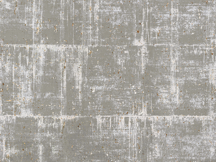
Another favorite form of wall covering with amazing acoustic properties are the ones made of cork—yes, cork! This material is not only environmentally friendly, it’s designed with multiple colors and textures, and can even have patterns with sparkle. 

Speaking of wall coverings that sparkle: One of my home theater clients insisted I design a new bedroom for their 11 year old, who was moving from one end of the house to the other and dreaded the relocation. To motivate her to make the move, I had to design something spectacular so I used a magnificent multicolored wall covering full of sparkles and glitter that lit up the wall behind her bed. When she saw the room complete, it made her feel like a real princess, and the room became bright and beautiful, just like her. 

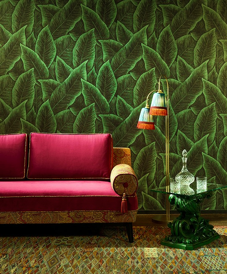
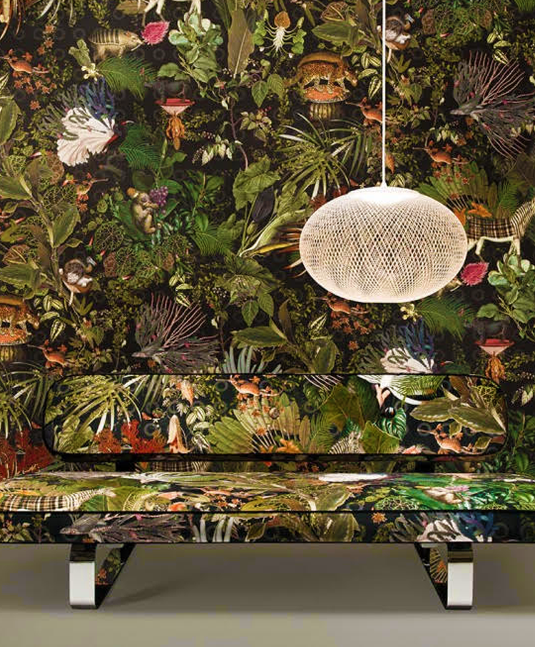
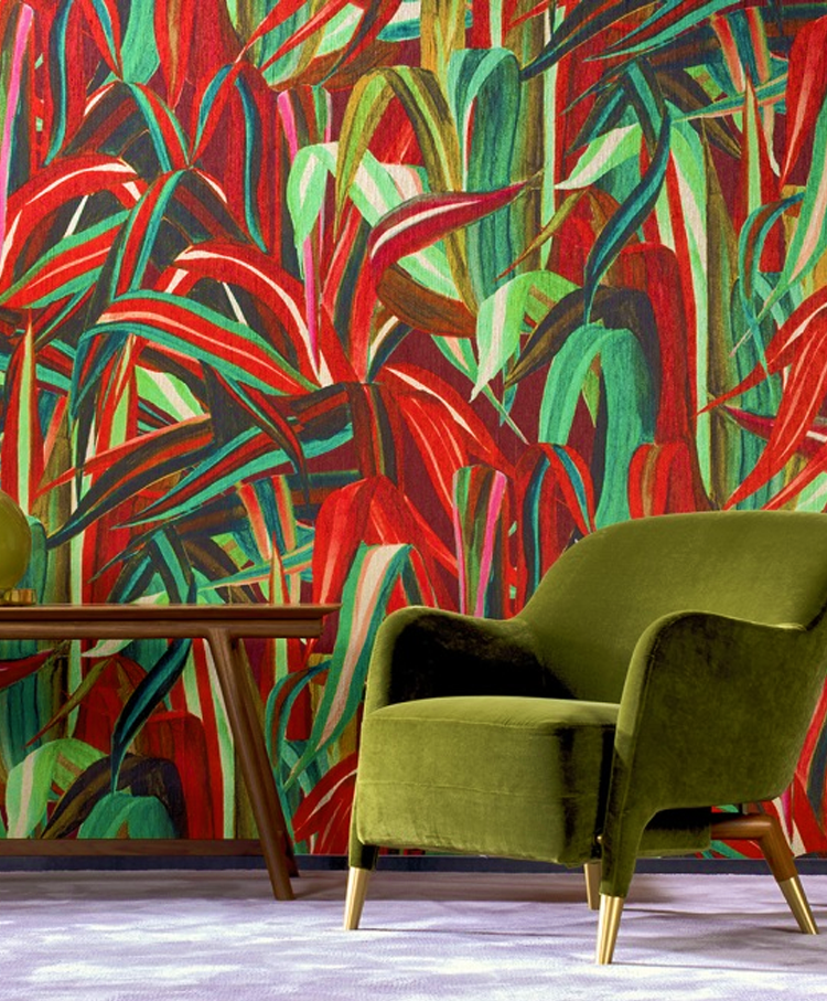
Different patterns are plentiful. One trend is foliage—lots of plants and big leaves. Another is animals, a jungle look with exotic birds. Patterns like these can be an exciting choice to use in an area like a home theater foyer.

Grass cloth has also made a comeback and is now available in many colors and textures. It is even available with metallic accents. Silks are a sexy way to go. Wall coverings with smooth metallic shiny finishes with 3D effects are an amazing complement to a modern space—a perfect choice to give a theater’s rear wall some interest. 

What I love most about wall coverings is that they can just be in the background. They don’t have to have a big pattern that stands out. Using an elegant texture on a wall instead of paint gives dimension and will produce a sophisticated look. 

The options are nearly infinite. For a price, some manufacturers will customize a covering, allowing you to have a personalized color and pattern—the ultimate for exclusive design.

The best way to make a covering work well is to not only select the right one but to also place it on the appropriate wall. Where you enter a room determines which wall is the focal point. Most often, this is the wall I would select to create an impact with wall covering. 

Here’s my take: Think outside of the box and discover the many new options that exist and give wall coverings a chance. You won’t be disappointed! 

Maria Deschamps is a certified Interior Designer, IDC, NCIDQ, APDIQ and has been designing home theaters and media rooms since the year 2000. She also designs high-end residential, restaurant, and commercial spaces, and is a partner at TKG, the Theo Kalomirakis Group. 

above | when the projection screen is raised, a TV is revealed, backed by a cork wall covering with acoustic properties

related article

Belgian manufacturer Omexco offers many options of eco-friendly cork wall coverings with metallic details or printed designs

foliage, a jungle look, exotic birds, animals, and colorful plants are possibilities for a home theater foyer (Arte International)

Generic selectors
Exact matches only
Search in title
Search in content
Post Type Selectors

© 2023 Cineluxe LLC
Secret Cinema

Secret Cinema

SECRET CINEMA

tucked away within a manor house nestled in the lush English countryside, this high-performance private theater proves to be something very much more than just an intriguing novelty

BY MICHAEL GAUGHN

Secret Cinema
Secret Cinema

You’d expect an article entitled “Secret Cinema” to be all about how cleverly this room is hidden away. It’s not. Putting all the emphasis there would be doing the room, the home, the homeowners, and the team that whipped up this cool, gleaming gem of a theater a huge disservice because, while the whole “hidden away” thing is definitely intriguing, leaning on it too hard would obscure that this is as much a serious cinema as a secret one.

Hidden theaters aren’t a new idea. But they’re too often little more than a gimmick or a novelty in homes where they just don’t belong. And because they’re a wedged-in fit, the graft rarely takes and they quickly go the way of most man caves, with their secluded status making it that much more easy for them to fall into neglect. But there’s a romance to the idea of a concealed room in an old English manor house that makes secreting away a theater feel perfectly apt, even inevitable, as expected as the climbing ivy, supercilious felines, and moldering aristocrats.

Hidden theaters aren’t a new idea. But they’re too often little more than a gimmick or a novelty in homes where they just don’t belong. And because they’re a wedged-in fit, the graft rarely takes and they quickly go the way of most man caves, with their secluded status making it that much more easy for them to fall into neglect. But there’s a romance to the idea of a concealed room in

an old English manor house that makes secreting away a theater feel perfectly apt, even inevitable, as expected as the climbing ivy, supercilious felines, and moldering aristocrats.

The cinema here is the work of Equippd, the Surrey-based firm founded in 2013 by brothers Charlie and Matthew McCourt. The McCourts are representative 

Secret Cinema

Equippd’s Matthew McCourt

of a new breed of custom integrator, as aware of architecture and design and the overall domestic environment as they are of picture and sound. Unlike their predecessors, whose roots as alarm installers and AV guys too obviously and often showed, they think beyond creating drab, intimidating spaces optimized for playing demo scenes to how they can put tech, design, and structure at the service of the entertainment experience, paying just as much attention to the look and feel of the space as to the gear.

Because they get it—and get it with flair—Equippd was perfectly positioned to create this ambitious melding of old and new worlds.

The cinema here is the work of Equippd, the Surrey-based firm founded in 2013 by brothers Charlie and Matthew McCourt. The McCourts are representative of a new breed of custom integrator, as aware of architecture and design and the overall domestic environment as they are of picture and sound. Unlike their predecessors, whose roots as alarm installers and AV guys too obviously and often showed, they think beyond creating drab, intimidating spaces optimized for playing demo scenes to how they can put tech, design, and structure at the service of the entertainment experience, paying just as much attention to the look and feel of the space as to the gear.

Because they get it—and get it with flair—Equippd was perfectly positioned to create this ambitious melding of old and new worlds.

Room to Dream

The hidden-room thing wasn’t even part of the original plan. The homeowner had converted a stuffy and unloved Edwardian ballroom into a children’s playroom but the space was so big it felt more oppressive than playful. Having encountered one of Equippd’s other cinemas in a home in 

The hidden-room thing wasn’t even part of the original plan. The homeowner had converted a stuffy and unloved Edwardian ballroom into a children’s playroom but the space was so big it felt more oppressive than playful. Having encountered one of Equippd’s other cinemas in a home in Wimbledon, she approached the company about somehow incorporating something similar into her albatross of a room.

Secret Cinema

the very contemporary cinema is secreted within a very traditional country manor house located in Rodborough Common in Glousterschire

That description doesn’t do her reaction justice, though. As Matthew McCourt relates the Wimbledon encounter, “She walked in, saw the room, and said, ‘I want this—exactly this—at my house.’”

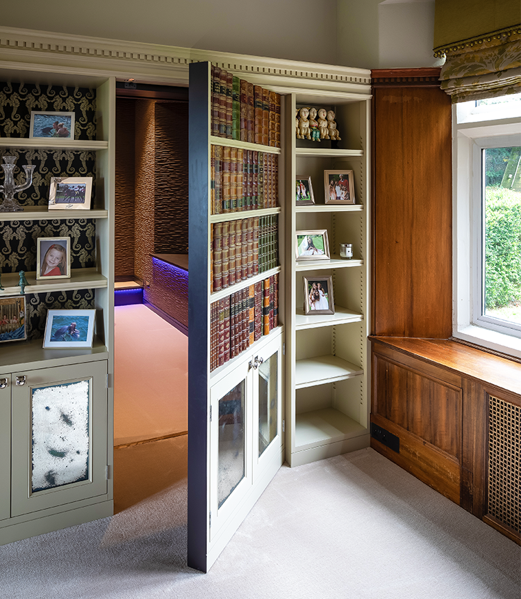
Equippd’s solution was to bisect the ballroom, retaining the play space in one half and conjuring up a theater in the other, using a prominent structural beam as a natural line of demarcation. While planning the partition wall, the unavoidable issue arose of what to do about the door. Doors are the bane of any theater designer’s existence. They’re an obvious necessity but there’s rarely a great way to integrate them. It was tackling that problem, though, that brought the whole concept for the theater into focus. As McCourt remembers, “Suddenly it was like, ‘How do we incorporate a door into the partition so you can access your cinema? Well, let’s hide it.’” The result was a flush-mounted entrance in the theater covered in the same fabric as the walls, allowing it to blend into the decor, and, in the playroom, a hinged faux bookcase, devised by designer Nadira Van de Grift.

But the impact of entering the hidden realm rests less on the theatrical touch of the prop bookcase and more on the dramatic contrast between the environments on either side of the wall—a play space with unmistakable traces of its Edwardian roots on one and a very much contemporary entertainment hideaway on the other. “Hiding the cinema,” says McCourt, “creates the experience of transitioning from a traditional house to a completely different dimension.”

Wimbledon, she approached the company about somehow incorporating something similar into her albatross of a room.

That description doesn’t do her reaction justice, though. As Matthew McCourt relates the Wimbledon encounter, “She walked in, saw the room, and said, ‘I want this—exactly this—at my house.’”

Equippd’s solution was to bisect the ballroom, retaining the play space in one half and conjuring up a theater in the other, using a prominent structural beam as a natural line of demarcation. While planning the partition wall, the unavoidable issue arose of what to do about the door. Doors are the bane of any theater designer’s existence. They’re an obvious necessity but there’s rarely

a great way to integrate them. It was tackling that problem, though, that brought the whole concept for the theater into focus. As McCourt remembers, “Suddenly it was like, ‘How do we incorporate a door into the partition so you can access your cinema? Well, let’s hide it.’” The result was a flush-mounted entrance in the theater covered in the same fabric as the walls, allowing it to blend into the decor, and, in the playroom, a hinged faux bookcase, devised by designer Nadira Van de Grift.

But the impact of entering the hidden realm rests less on the theatrical touch of the prop bookcase and more on the dramatic contrast between the environments on either side of the wall—a play space with

Secret Cinema

the work of designer Nadira Van de Grift, this faux bookcase offers an appropriately theatrical way to enter the private cinema

PROJECT TEAM

Matthew McCourt
Equippd

Nadira Van de Grift
NV Design

James Morton
JPM Carpentry

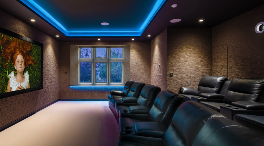
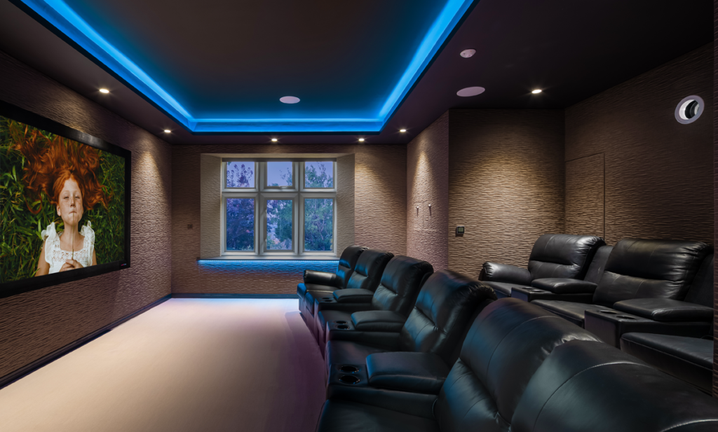
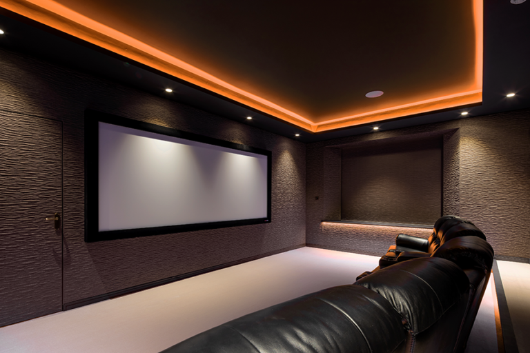
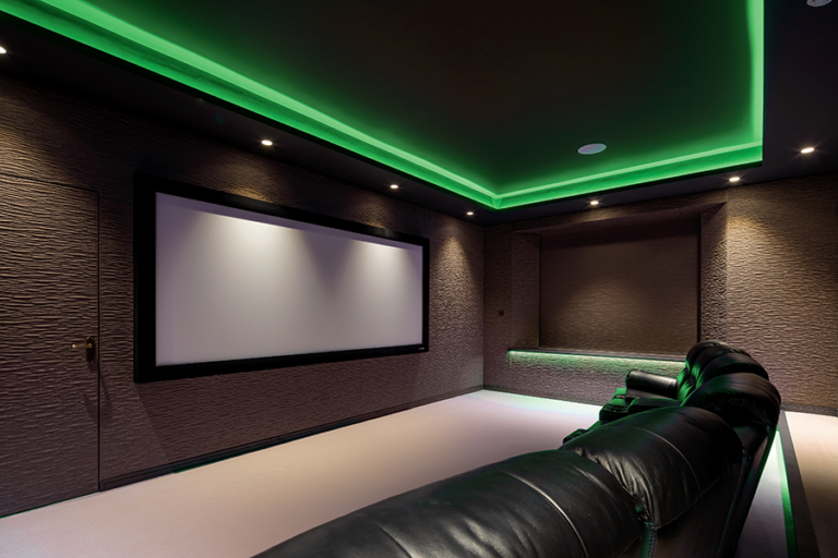
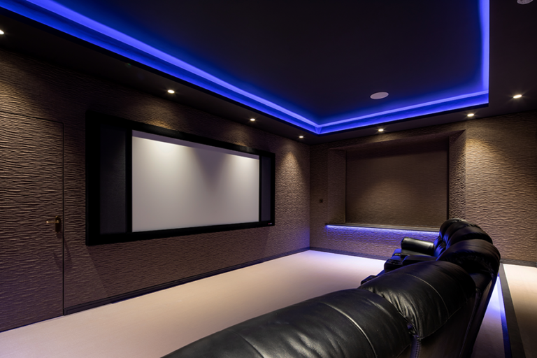
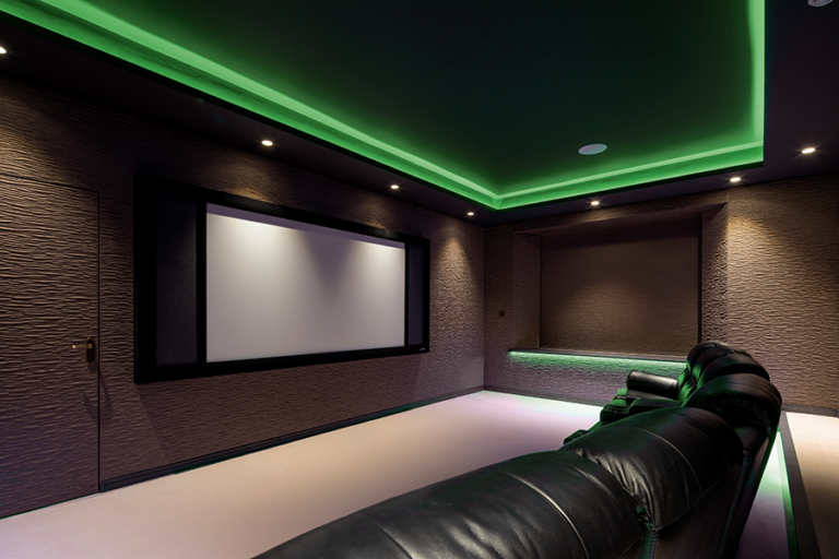
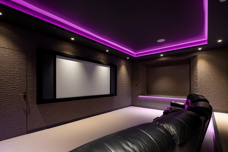
The theater’s striking yet understated look is all the doing of Equippd, which was given free rein over not just the entertainment system but the room itself. The textured wall material is a variation on the covering from the Wimbledon theater, with the recessed LED accent lights lining the ceiling, window ledges, and riser carried over from that theater as well. The result is a space that feels like a private retreat, separate from the rest of the home, but without looking like it dropped from the moon. 

unmistakable traces of its Edwardian roots on one and a very much contemporary entertainment hideaway on the other. “Hiding the cinema,” says McCourt, “creates the experience of transitioning from a traditional house to a completely different dimension.”

The theater’s striking yet understated look is all the doing of Equippd, which was given free rein over not just the entertainment system but the room itself. The textured wall material is a variation on the covering from the Wimbledon theater, with the recessed LED accent lights lining the ceiling, window ledges, and riser carried over from that theater as well. The result is a space that feels like a private retreat, separate from the rest of the home, but without looking like it dropped from the moon. 

The Proper Respect

In a literal sense, though, the secret cinema isn’t even part of the home at all. Since this is a historic residence, Equippd had to make every effort to preserve the original room, exhibiting a surgeon’s care when executing the theater. 

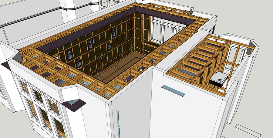
The answer—which actually solved a number of problems—was to a create a completely independent structure within the existing space. The theater is basically a stud-wall box that rests inside the ballroom, only anchored to the walls, floor, and ceiling where absolutely necessary. As McCourt relates, “It could actually be dismantled and the room returned to its original form without too much trouble.”

the theater is essentially a completely independent box resting within the confines of an Edwardian ballroom

the theater is essentially a completely independent box resting within the confines of an Edwardian ballroom

Taking this tack allowed Equippd to create a self-contained modern theater with the ideal acoustics already built in. To keep sound from traveling to other parts of the home, the subwoofers are suspended within the walls, and the ceiling sits decoupled from the room’s actual ceiling to prevent any bleed into the children’s bedrooms just above.

The theater also comes with its own infrastructure. “Because this room is essentially sealed off, air handling was quite important,” explains McCourt. “So we created a fresh-air input, which gently comes through the fabric on the front wall, to give you a nice flow of air through the cinema. We also have a very quiet extraction system at the back, which then pulls out the old air.”

The knocks against having windows in a theater are many. They can be distracting, allow in unwanted sunlight, make it harder to control the climate in the space, and reflect audio from the speakers, muddying the sound. The usual recourse is to just cover them over or remove them completely. But the views of the Gloucestershire countryside are so spectacular it would have significantly diminished the impact of the theater to conceal them. Plus, the windows help keep the smallish space from feeling claustrophobic.

But, very much of their period, they could have been a jarring note in the otherwise contemporary design. Equippds solution was to employ a Lutron automated shading system, wedding the textured wall covering to a standard set of blackout shades so the windows all but disappear at movie time.

Another Dimension

Because the home sits in the middle of an intensely scenic area with a dearth of commercial cinemas nearby, the private theater gets heavy use. And because the family is hardcore about their movie watching, it needed to be high-performance. The 4K projector beams onto a screen that can be adjusted to accommodate both standard and widescreen viewing. A Dolby Atmos system provides the sound, while the room-within-a-room construction offers optimal acoustics and the shading system seals out any extraneous light. 

Achieving Serenity

Inside the Ultimate
Home Entertainment Space

A Tribeca Trendsetter

Luxury Made Easy

the cinema features a screen that can accommodate both standard and widescreen aspect ratios, textured wall covering that’s also incorporated into the door and shades, and variable-colored LED accent lighting

Sign up for our monthly newsletter
to stay up to date on Cineluxe

But high-performance systems are almost invariably complex. And it’s tempting, with all that technology on hand, to attempt to automate every aspect of their operation. But that can often result in leading users down rabbit holes they then can’t easily emerge from. Equippd’s approach was to take basic functions like selecting the aspect ratio or the sound format and make them simple “this or that” choices so there’s no possible confusion and an evening’s entertainment isn’t ruined by rigid automated routines that have other ideas about how things should go. 

One of the theater’s most intriguing features is fully automated, though, with a series of triggers and sensors synced up to provide ease of use and help create the appropriate mood. A contact switch in the door lets the system know when someone has first entered, causing it to bring down the shades, bring up the lights, turn on the projector, and so on. Occupancy sensors then monitor if the room is in use so it doesn’t go into its startup routine every time somebody comes through the door. When the last person has left, everything returns to standby mode after 15 minutes, ready to kick in again for the next movie night. 

The line between gimmickry and legitimacy really isn’t that thin. Neither is the line between a theater that’s imposed on a home—and the homeowners—and one that’s respectful of the residence and responsive to how people actually live their lives. Home cinemas are, finally, after all these decades, evolving beyond their man cave ancestors, being higher performance, more flexible, and in every way more sophisticated. And that doesn’t just pertain to more radical open-floorplan entertainment spaces but has seriously upped the game for traditional private theaters as well.

Yes, this British cinema is hidden—but Equippd’s mastery of modern trends and responsiveness to the clients’ needs and desires allowed McCourt and company to transcend what could have been little more than a parlor trick and deliver both a solid, up-to-date theater and a captivating room that successfully checks off all the boxes.

Michael Gaughn—The Absolute Sound, The Perfect Vision, Wideband, Stereo Review, Sound & Vision, The Rayva Roundtablemarketing, product design, some theater designs, a couple TV shows, some commercials, and now this.

Inside the Secret Cinema

MORE ABOUT EQUIPPD

Generic selectors
Exact matches only
Search in title
Search in content
Post Type Selectors

© 2023 Cineluxe LLC
Idea Book: Private Cinema Seating

Idea Book |
Private Cinema Seating

Higher-end seating for entertainment spaces is almost infinitely customizable, offering options well beyond the typical overstuffed recliner

by Dennis Burger
July 31, 2022

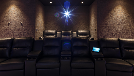
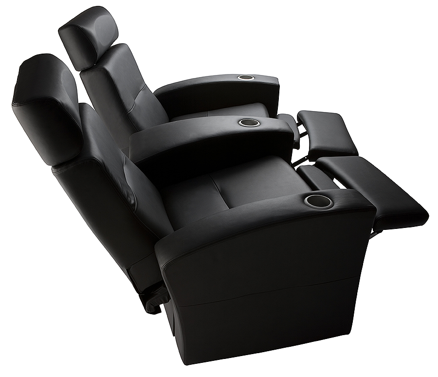
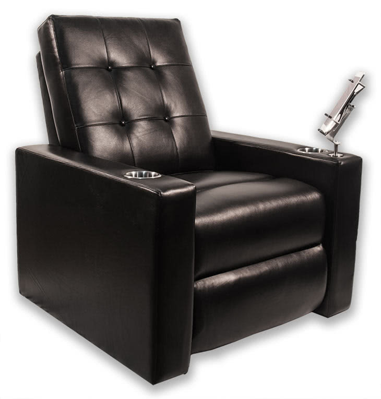
Think of your typical home cinema seating solution and you’re probably conjuring something like a bog-standard black recliner with beefy armrests and built-in cupholders, maybe joined arm-to-arm with others of its kind to form a row. To be fair, that is the standard, but it doesn’t have to be. All good seating solutions should have a few things in common: They should be comfortable, but not too comfortable. You should be able to sit through the extended edition of The Fellowship of the Ring without squirming but you should also be able to enjoy a film without falling asleep. Good seating should also fit the design of your private cinema, whether that be an homage to the classic studio movie houses or a sleeker modern design. Thankfully, there’s near infinite variation in the available seating that meets those criteria, and although the selection here is far from comprehensive, it should give you a good taste of what’s possible.

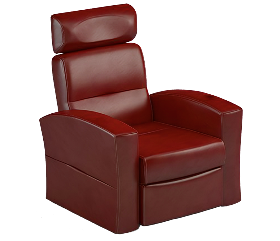
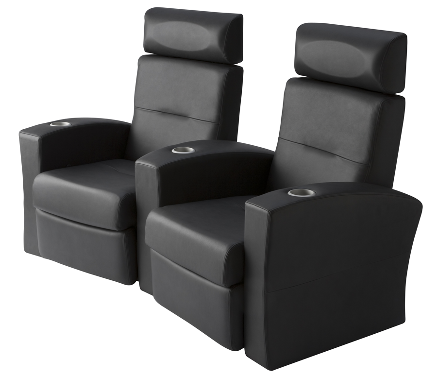
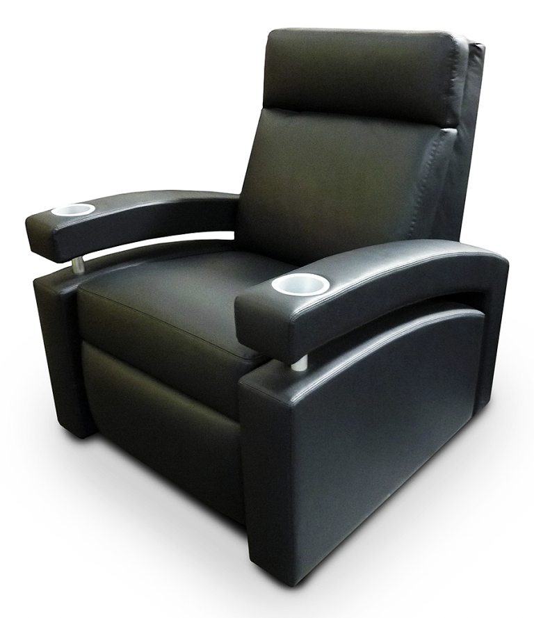
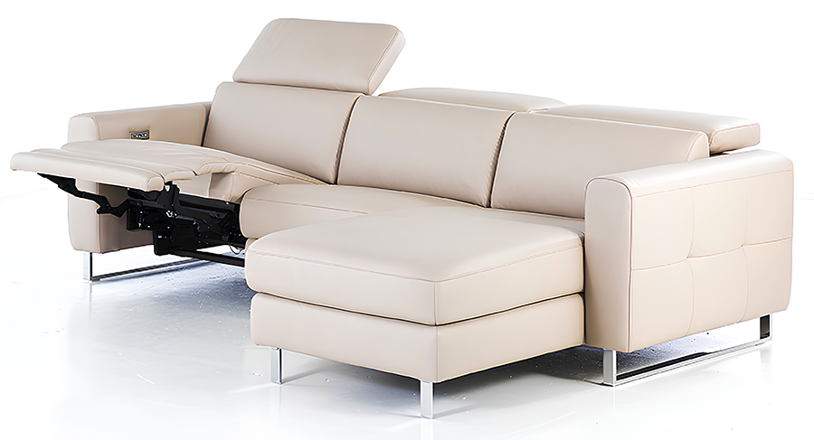
Salamander Designs Matteo

If your heart is set on a home theater recliner that looks like a home theater recliner—just more sculpted, more refined, leaner, less boxy—the Matteo is a great choice, whether you need single seats, a curved row of four with arms between each seat, a straight row of six with arms between every other seat, or any number of other combinations. One thing that sets Salamander apart from many home cinema furniture makers is if none of its numerous fabric or leather finishes fits your environment, you can provide your own custom upholstery material and have a truly one-of-a-kind seat. 

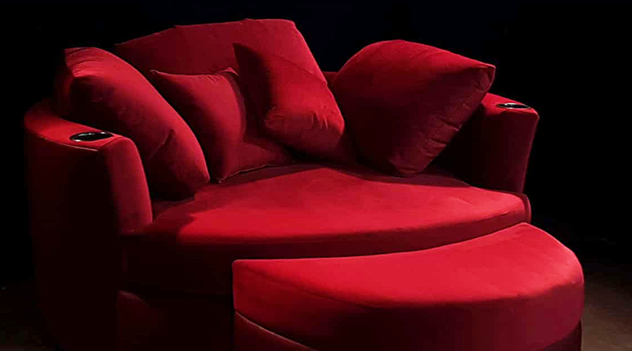
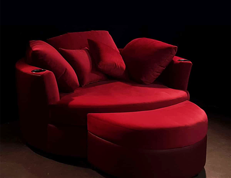
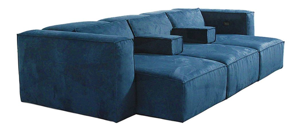
Elite HTS Cuddle Couch

It certainly isn’t the right seating solution for every home cinema or media room, but if “stream and chill” is the vibe you’re going for or if supreme comfort is your first priority, this highly customizable option from Elite HTS certainly fits the bill. Both the upper and lower sections of the Cuddle Couch can be specified in your choice of 26 colors across two material types—extremely soft Cine Suede and, our preference, super durable, buttery, and breathable synthetic Silk Leather—giving you plenty of options for making it your own.  

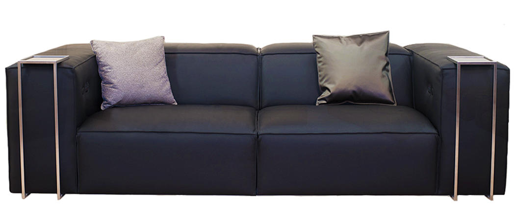
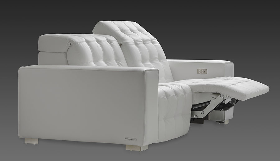
Cineak Gramercy

Designed to be something of a study in contrasts in and of itself, the Gramercy manages to be simultaneously cushy and contemporary, casual and elegant. It also isn’t obvious at first glance that this highly customizable model is a recliner, but it is. Headrests and leg support appear out of nowhere at the push of a button—or without any button pressing if you have a Kaleidescape system, which can be programmed to adjust the seating automatically as soon as a film starts. Numerous addons such as side tables, inlay trays, and per-seat lighting make the personalization options near infinite. 

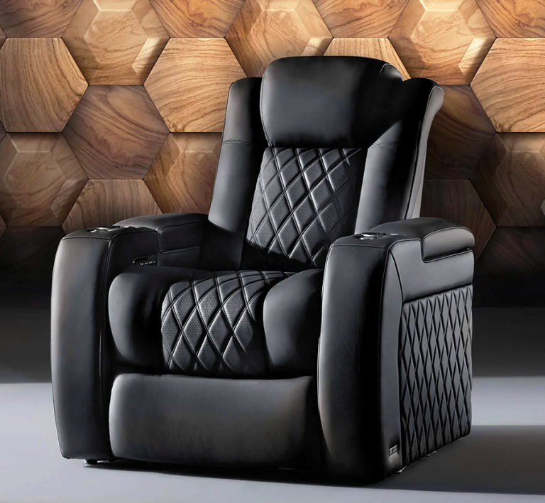
Valencia Tuscany Ultimate Luxury Edition

Its name may be a bit on-the-nose, but this upscale version of Valencia’s popular Tuscany recliner certainly earns all the superlatives thanks to its upgraded materials—specifically the best-quality semi-aniline Italian Nappa leather—and advanced technology, such as motorized control of the head rest. Inspired by the interior aesthetic of a Rolls Royce, the Tuscany Ultimate boasts perforated French diamond stitching, customizable lighting accents, and concealed arm rest console storage lined with Parisian velour and fitted with a soft-open strut mechanism.

Dennis Burger is an avid Star Wars scholar, Tolkien fanatic, and Corvette enthusiast who somehow also manages to find time for technological passions including high-end audio, home automation, and video gaming. He lives in the armpit of Alabama with his wife Bethany and their four-legged child Bruno, a 75-pound American Staffordshire Terrier who thinks he’s a Pomeranian.

Generic selectors
Exact matches only
Search in title
Search in content
Post Type Selectors

Idea Book |
Private Cinema Seating

Higher-end seating for entertainment spaces is almost infinitely customizable, offering options well beyond the typical overstuffed recliner

by Dennis Burger
July 31, 2022

Think of your typical home cinema seating solution and you’re probably conjuring something like a bog-standard black recliner with beefy armrests and built-in cupholders, maybe joined arm-to-arm with others of its kind to form a row. To be fair, that is the standard, but it doesn’t have to be. All good seating solutions should have a few things in common: They should be comfortable, but not too comfortable. You should be able to sit through the extended edition of The Fellowship of the Ring without squirming but you should also be able to enjoy a film without falling asleep. Good seating should also fit the design of your private cinema, whether that be an homage to the classic studio movie houses or a sleeker modern design. Thankfully, there’s near infinite variation in the available seating that meets those criteria, and although the selection here is far from comprehensive, it should give you a good taste of what’s possible. 

Fortress Odéon

Designed by Sheba Kwan—co-founder of the award-winning interior design and consulting firm Red Theory—the Odéon is available in single-recliner configurations, long attached rows, and even chaise longue–style sofas. But across all variations, one thing remains consistent—those delightful floating arms, which give this otherwise sturdy design something of a light and delicate quality. Like all Fortress recliners, this one also offers two levels of recline—a “viewing position” that merely raises the foot rest and a “full recline” that only requires five extra inches of clearance behind the seat.

AcousticSmart Aria

Part of AcousticSmart’s lifestyle European collection, it really only takes two words to capture the essence of the Aria: “soft comfort.” But that barely scratches the surface. Aria’s cushions are available in custom widths from 23 to 30 inches, and all seats feature dual motorized recline operation and a zero-clearance design that means you can put them right up against a wall or bar counter if need be. The head and foot rests also work completely independently, if you’d like to recline without blocking the sound from the speakers in the back of your room.

Cinematech Estrella

One of the most popular designs from a company that has been building home cinema seating since before most people had heard of home cinemas, the Estrella motorized sectional is a wonderful example of just how customizable this category can be. Say you want a full-blown recliner experience but your partner wants a chaise longue with a motorized headrest—that’s something you can have built. Unlike many home cinema seating solutions, the Estrella also works well without armrests between every seat, although you can still have them if you want them.

Acoustic Innovations Humphrey

For the Madmen-obsessed executive who has everything except the perfect private cinema recliner, the Humphrey is a mashup made in old-school boardroom heaven. At a glance, it evokes martinis, single-breasted continental suits, and skinny ties, and it’s almost surprising Acoustic Innovations doesn’t offer it with an optional ashtray. There are the expected tray tables and cupholders, though, in addition to in-arm USB chargers, heat and massage functionality, D-Box motion controls, and tactile transducers that make the bass in your home cinema felt as much as heard.

Dennis Burger is an avid Star Wars scholar, Tolkien fanatic, and Corvette enthusiast who somehow also manages to find time for technological passions including high-end audio, home automation, and video gaming. He lives in the armpit of Alabama with his wife Bethany and their four-legged child Bruno, a 75-pound American Staffordshire Terrier who thinks he’s a Pomeranian.

© 2023 Cineluxe LLC
Deschamps on Design: Better Sound Through Design

Deschamps on Design: Better Sound Through Design

Deschamps on Design |
Better Sound Through Design

Acoustic panels, imaginatively deployed, can be the difference between a great- and terrible-sounding room

by Maria Deschamps
July 26, 2022

About the only people who really get excited about discussing acoustic treatments are acousticians. With clients, treatments are way down at the bottom of the list, below deciding what type of pad to use under the carpet. But treatments make a huge difference in the sound quality of a room—and, while they have a reputation for being unsightly, that really doesn’t matter because they can be inconspicuous when properly designed.

Given that, why oh why are luxury theater designers just installing acoustic panels on top of their drywall? I have seen far too many installs of 24 x 48-inch panels directly on a wall or ceiling, either in a theater or music studio—and they are uggg-ly! As a consequence, a lot of my new clients say to me “Do we have to have acoustic panels?” and my response is “Yes, you do, but we can make them part of the design, either by hiding them completely or by dressing them up so you’ll never know they’re acoustic panels.”

Certainly, hiding the panels by installing them behind a stretch-fabric system is a much better and cleaner alternative. In that case, all of the panels are hidden—no one sees them so you don’t have to worry about what they look like. Because of that, it doesn’t matter what color or texture they are. A stretch fabric is indeed the preferred solution for acousticians since they can install as many panels or baffles as they need and put them wherever they want. The speakers are also hidden behind the fabric, and the nice thing is that the result is a clean, flat surface. 

Stretch fabric systems aren’t for everyone, however, and it’s not as easy as you would think to find a fabric that meets all the technical criteria acousticians require, like elasticity, acoustic transparency, breathability, and opacity. Imagine, we must start with these requirements and then make sure the acoustically transparent fabric also meets the design concept and color criteria that satisfy the designer and client. 

This Maria-designed home theater uses custom-designed round acoustic panels accented by LED strip lighting

CLICK ON THE IMAGES TO ENLARGE

Sign up for our monthly newsletter to stay up to date on Cineluxe

One thing is for certain: Acoustic panels are a must in a home theater. They reduce reverberation and minimize noise pollution. They play a major roll in increasing sound quality—not to be confused with sound isolation, which is what keeps the sound inside from traveling outside of your theater and vice versa. When designing a theater, we need to specify and design surfaces that reflect and surfaces that absorb sound. Acoustic panels absorb sound. They are made mostly of fiberglass and come in several thicknesses. 

What I love about these panels is that they’re easily customizable. Although they still need to be covered with an acoustically transparent fabric, we can use another finish—like a sexy wall covering—next to them. Using different finishes gives us more possibilities to create an interesting concept. We can make them any size or shape and we can place a long run of several panels side by side with an inconspicuous joint. Once the exact locations of the surround speakers are determined, we can design the panels to hide the speakers behind them. We can also layer panels on top of each other to increase the density and functionality as well as create design interest. Finally, we can carve out recesses on the edges of panels to hide LED strip lights—and you know how much I love indirect lighting!

My take is that creativity is paramount in a private theater, so the space should be distinctive and authentic. Technical elements like acoustic panels shouldn’t inhibit design creativity, and by customizing them they can really be part of the “Wow!” factor. So please, no more 24 x 48-inch wall panels—design something magnificent! 

Maria Deschamps is a certified Interior Designer, IDC, NCIDQ, APDIQ and has been designing home theaters and media rooms since the year 2000. She also designs high-end residential, restaurant, and commercial spaces, and is a partner at TKG, the Theo Kalomirakis Group. 

For this media room, Maria used custom-made acoustic panels with an organic curve along the top with indirect LED strip lighting behind

Generic selectors
Exact matches only
Search in title
Search in content
Post Type Selectors

© 2023 Cineluxe LLC

Music for Art’s Sake

Music for Art's Sake

Music for Art’s Sake

The desire to have an expansive art collection on display made filling this Manhattan apartment with sumptuous sound a challenge

by Michael Gaughn
July 13, 2022

The one inescapable truth of Manhattan real estate is that, no matter how prodigious the space or the wealth of resources at hand, getting what you want requires being a master of the art of compromise. The trick is making it all happen without feeling squeezed—space-wise, convenience-wise, performance-wise, pleasure-wise.

Everything about Hudson Yards would be considered generous, even by Manhattan standards. A gleaming-new city within the city resting above the railroad yards in midtown, its opulent living spaces offer heart-of-the-island convenience, killer views, and, when it comes to square footage, a decent amount of room to roam. But there are limits. 

Paint Me a Picture

Consider this scenario: You have an extensive collection of paintings and sculpture you want to have on display to both ponder and savor. The collection will fill virtually all of the walls and much of the floor. But you also want to fill your space with music, which you’re used to experiencing at a level of quality on par with your other art. So where do the speakers go?

That was the challenge facing Anthony Chrisostomo of Home Theater of Long Island who, along with co-owner Nick Tzortzatos, had worked with the client for years, having provided the

photos & video | John Frattasi, Gusto Multimedia

photos & video | John Frattasi, Gusto Multimedia

entertainment and smart-home amenities for her residences in Morristown and Stone Harbor, New Jersey. They’d been able to easily meet her needs before—but they’d also had a lot more room to work with.

The client didn’t want any speakers on the walls at Hudson Yards—but even if she’d been willing to consider it, building policy frowns heavily on breaching anything in the apartments. As Chrisostomo explained, “This building has more requirements than any other one we’ve worked in because it’s above the rail yards, so there’s heightened security.” Also, two of the walls in the main living area are filled with floor-to-ceiling windows offering views of downtown from Chelsea to Battery Park and up and down the Hudson River. So placement options were limited—beyond limited.

the minimalist sculptural form of Meridian’s 7200SE speakers proved the ideal complement to the client’s extensive collection of art

Music for Art's Sake

the minimalist sculptural form of Meridian’s 7200SE speakers proved the ideal complement to the client’s extensive collection of art

Then there was the Meridian factor. The client already has speakers from that high-performance audio brand throughout her two main residences and very much wanted them in her pied-à-terre as well. But Meridian’s offerings are known as much for being bold statements in design as for their sound and engineering. They’re not bland little boxes you tuck discretely away in a cubby or corner—you put them proudly on display.

That proved to be both a plus and a minus. The top-tier 7200SE models in the main living area can be appropriately described as sculptural, and their clean modernist lines dovetail nicely with the other art in the room—so, that problem solved. But having freestanding speakers means having cables, and cables have to run somewhere, and cables are, at best, unsightly. But since the Meridians have the necessary electronics built in, they require just a single wire carrying the music source. Chrisostomo was able to use the standard networking lines already threaded throughout the building to send sound to the speakers, which meant only having to have one thin strand of cable running from the wall.

A naive bystander might wonder “Why not go wireless?” And Chrisostomo acknowledges that would have been an option. “But that would have detracted from the aesthetics of the space because we would have had to place equipment within the room to feed and power the speakers.”

The master and guest bedrooms weren’t as daunting because they’re smaller spaces where sound is needed mainly for TV viewing. And both placement and wiring were much simpler since less imposing speakers could be clustered around the screens. The master bedroom has the demure for Meridian M6 speakers wedded to a Leon soundbar placed beneath  the screen, while the

Showcase

Inside the Ultimate
Home Entertainment Space

Achieving Serenity

A Tribeca Trendsetter

the master bedroom (above) and guest bedroom (below)

soundbar in the guest bedroom is joined with a pair of Meridian DSP3200s, which are decidedly compact but clearly born from the same design lineage as the statement speakers in the main living area.

A Place in the Sun

Though not as big a challenge as the speakers, the “art everywhere” and “no breaching” edicts made implementing lighting and shading control a little more interesting than it would usually be. Art and sunlight are mortal enemies but, thanks to the western-facing curtain wall, the sun blasts into the apartment for hours leading up to twilight. Just sealing out the light—and thus the views—wasn’t an option, though. 

But because the tech involved is far more discreet than it would have been for the speakers, wireless was an option here, with Chrisostomo able to deploy a Lutron Homeworks QS system that automatically adjusts the raising and lowering of the shades for the time of day. Paired with semi-transparent shading material that sufficiently dims the room without entombing it, warm evening light still suffuses the space but without threatening the art.

It’s probably not surprising to learn that the quality of light, in all its many forms, was

Sign up for our monthly newsletter
to stay up to date on Cineluxe

especially important to the client—which led to her getting fairly heavily involved with setting up the automation. “She’s very particular about the different moods she wants to set,” said Chrisostomo, “so she got really granular when it came to each button and what it was going to do.”

And the Lutron system treats the apartment with the proper respect, with the minimalist controls able to be mounted on the walls while looking like they’re integrated into the walls. The combination of wall keypads and desktop controllers placed within easy reach give the client complete but unobtrusive control over the many moods of her space.

It’s hard to emphasize just how flexible and responsive technology—and the designers and integrators who deploy it—have become within the past few years. Just about everything involving high-end home entertainment used to be a major bait & switch, promising effortless comfort and infinite pleasure and delivering something that not only didn’t live up to the promise but was frustrating, even maddening, to use. Not just the tech but the design mindset of the recent past wouldn’t have been able to make something like this Hudson Yards dwelling happen, instead forcing the homeowner to settle for a series of unacceptable compromises that would have seriously detracted from the quality of her life. But the fetters are now off, and the evidence of the new paradigm is abundant. The trick, of course, is hooking up with a design team that’s attuned to your desires but once you’ve cleared that hurdle, the course is clear and the finish line now easily with reach.

Michael Gaughn—The Absolute Sound, The Perfect Vision, Wideband, Stereo Review, Sound & Vision, The Rayva Roundtablemarketing, product design, some theater designs, a couple TV shows, some commercials, and now this.

Generic selectors
Exact matches only
Search in title
Search in content
Post Type Selectors

© 2023 Cineluxe LLC

Scroll to top

sign up for our newsletter

receive a monthly recap of everything that’s new on Cineluxe