• Type:
  • Genre:
  • Duration:
  • Average Rating:

Movies

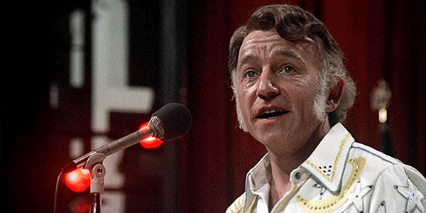
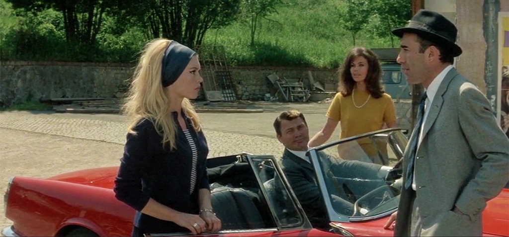
Review: A Woman Is a Woman

Probably Godard’s most accessible film, this remains a charming dissection of the American musical—and an indispensable record of Paris in the early 1960s

by Michael Gaughn
June 4, 2022

Watching a Godard film is a lot like taking an exam in 20th-century philosophy administered by a brilliant but sadistic college professor. No matter how certain you are of your answers, he will always find some fiendishly abstruse and cryptic way to prove you wrong, relishing making you feel like a dope in the process. Godard is the film snob’s equivalent of a secret handshake, the thing the cognoscenti deploy to mock and spit on the peasantry.

And it doesn’t help that his work became more and more harsh and inscrutable as the ‘60s went on, until he reached his Vertov Group period, doing highly politicized, abstract films in collaboration with Jean-Pierre Gorin that are for the most part both wearisome and gratingly coy. 

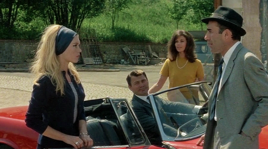
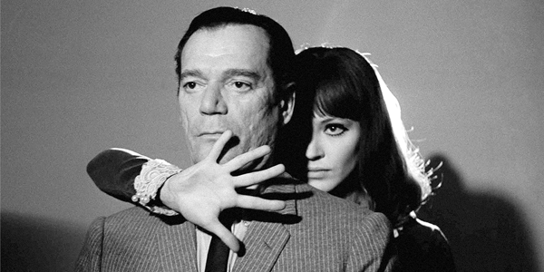
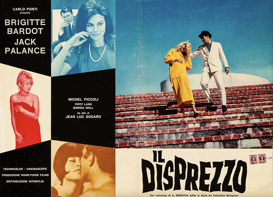
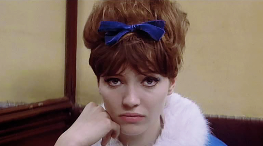
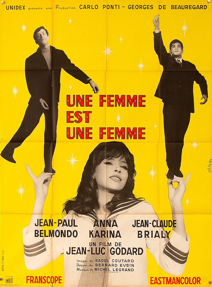
But there is still that initial period of the early ‘60s where, yes, he was aggressively and blatantly reinventing cinema, but he was doing it playfully, with abundant energy and wit, not yet embarrassed by his obviously sincere romanticism. Films like Bande à part, Contempt (Le Mépris), Alphaville, and Pierrot le Fou remain fresh and unmatched and, from beginning to end, exhilarating. Maybe the most accessible of that early batch is Godard’s riff on the Hollywood musical, as a way of riffing on the whole artifice of movies, A Woman Is a Woman (Une femme est une femme). 

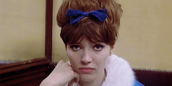
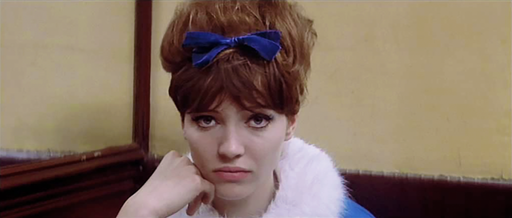
You don’t need to get film-school analytical to explain the joys of this movie. It’s easier to just tick them off: Anna Karina, who the camera (and clearly Godard) loves and who devours the camera in turn; Raoul Coutard’s véritê shooting style, in subtle but evocative Eastmancolor, which keenly documents early ‘60s Paris without turning it into a series of postcards; the gags, which are admittedly quirky and smartass but still startlingly funny; and that constant playing with and questioning of film technique, which somehow hasn’t dated a day and energizes the movie in a way that can never be done by coloring within the genre lines.

Godard was always a radical, but he was a radical who knew he had a large international audience, especially in America, and while his affection for American culture soured as the ‘60s went on, and while his skepticism is apparent throughout A Woman Is a Woman, he also knew Hollywood was the lingua franca of moviemaking at the mid century, and you can sense he’s almost in awe of what it was able to churn out. 

This is probably best on display in the long scene where Karina and Jean-Paul Belmondo sit at a table in a small cafe while she struggles with whether to sleep with him to spite her live-in boyfriend. It’s all very New Wave-y with a lot of oblique comments and a lot of jump cuts. But then Karina asks Belmondo to play a Charles Aznavour record on the jukebox, and the movie basically just stops for three and a half minutes while the tune plays out. Yes, that was revolutionary for the time, and is still radical because, unlike the theme-park experience of most contemporary movies, which essentially straps you in for the duration then guides every millisecond of the ride, inducing carefully graduated jolts along the way, Godard wants you to use that caesura to inject your own thoughts and feelings into the film, to essentially collaborate with him—which is why A Woman Is a Woman can never be the same for any two people who come across it, or for any one person viewing it more than once. 

But that moment, by leaning on pop music, is also very Hollywood, is Godard knowing that, if he was going to unravel the fabric of the typical movie-watching experience that drastically, he needed to toss a sop to make it palatable. Sadly, his subversive impulse here would, like everything, be ultimately coopted and corrupted by mainstream filmmaking, leading to the now pervasive use of pop songs as a crutch to cover up the filmmakers’ basic lack of creativity (and feeling).

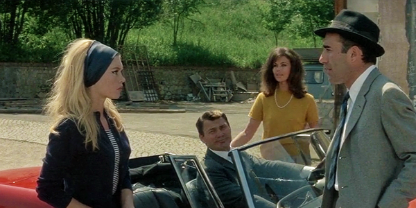
But you don’t have to watch A Woman Is a Woman at anything approaching that level to enjoy it. Even skimming its surface brings pleasures you won’t find elsewhere. Coutard’s cinematography is groundbreaking, justly famous, and remains sublime. There are salient examples everywhere but a couple of the most striking (both night shots) are Karina and Jean-Claude Brialy standing in front of a shop window with “Lancome” in white neon behind them and Brialy stepping out onto the apartment balcony with the boulevard lights floating off into the distance. The former is very much like what Russell Metty was doing in Douglas Sirk films like All That Heaven Allows, but shot simply, on location, without soundstages or lighting grids, and with a documentary-size crew. 

And while Amazon Prime’s presentation isn’t the last word—you long for a 4K release while praying nobody will be dumb enough to attempt what currently passes for a restoration—it’s so true to the elegant grit of the original film that very little is lost by watching it this way. The colors are rich but never over pumped, and the subtlety of the gradations—essential to presenting this film—is for the most part maintained. It’s legitimate to hope something better will some day come along, but it will need to be significantly better than what’s offered here to mean anything at all.

The audio isn’t pristine, but it wasn’t at the time, and the patina of the era—reflected in the heavy reverberation in a lot of the music cues—is essential to the film’s impact. Putting the score on an equal footing with the dialogue and then bringing cues in and out like he was arbitrarily flicking an on/off switch was a big part of what Godard was after, using the lulling reassurance we usually take from wall-to-wall film music to yank us out of our complacency—kind of like taking a toy from a baby to ultimately return it in the end. So, while the score isn’t very well mixed by contemporary standards, it’s actually a stunning mix if you’re focusing on the needs of the film, which is as it should be.

There’s only one real irritant here: The size, thickness, and black border around the subtitles, which are all out of scale and a constant distraction. Retaining the original crappy-looking titles baked into the print would have been a huge improvement all the way around. 

There is really only a handful of movies that qualify as true classics, a number small enough to rest comfortably in the palm of your hand; films that transcend the zeitgeist, fleeting emotional attachments, and the aura created by relentless marketing and that tap into far deeper and more sustaining currents than the vast majority of fare. This is one of them. But given the aversion, which still persists, to foreign films—or at least to the ones that don’t try to ape American films—it’s necessary to make the case a little more forcefully here than you have to for the Hollywood standards. So let’s try this: You can’t say you know and love movies if you haven’t at least tried Godard. And possibly the best place to begin that journey is the current release of A Woman Is a Woman.  

Michael Gaughn—The Absolute Sound, The Perfect Vision, Wideband, Stereo Review, Sound & Vision, The Rayva Roundtablemarketing, product design, some theater designs, a couple TV shows, some commercials, and now this.

PICTURE | Amazon Prime’s 1080p presentation isn’t the last word but it’s so true to the elegant grit of the original film that very little is lost by watching it this way

SOUND | The audio isn’t pristine but does a serviceable job of maintaining the patina of the era, which is essential to the film’s impact

Generic selectors
Exact matches only
Search in title
Search in content
Post Type Selectors

© 2023 Cineluxe LLC

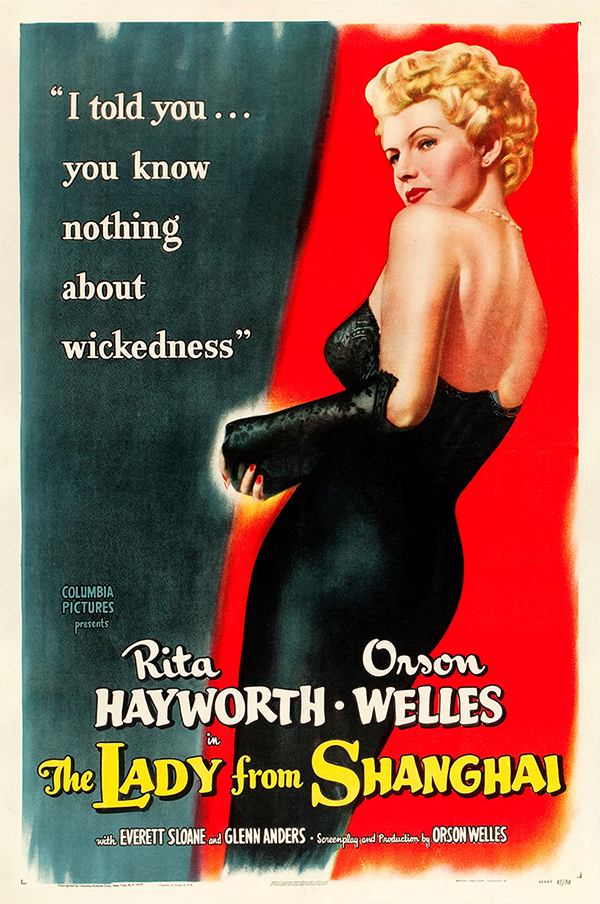
Review: The Lady from Shanghai

The Lady from Shanghai (1947)

review | The Lady from Shanghai

also on cineluxe

Sign up for our monthly newsletter
to stay up to date on Cineluxe

Probably Orson Welles’ most eccentric—and biting—film, Shanghai features two for-the-ages supporting performances

by Michael Gaughn
June 1, 2022

Why review an older film like The Lady from Shanghai if it’s not a restoration or appearing in 4K for the first time? Partly because certain older films are far more vibrant and relevant than others and it’s worth it to pluck the gems from the pile. Partly to underline for anyone who’s gotten burned by checking out catalog titles online that the consistency of the quality of their presentation has improved tremendously of late. And partly because, in a culture obsessed with living in a perpetual present and with erasing history on its way to erasing memory, it’s important to push back by emphasizing the value of the past.

Citizen Kane kind of sells itself. It hasn’t yet been pulled down from its pedestal—and hopefully never will be—so you don’t really need to say a lot about the film itself when reviewing something like the 4K release. But what about the other Welles, the stuff he tried to make within the studio system but that was inevitably extensively retooled on its way to release, the films you have to work at a little to appreciate because you have to peer around all the obstructions erected by the studio if you want to catch glimpses of the film Welles originally made?

The Lady from Shanghai wasn’t just reshot and recut by Columbia, it was savagely beaten into submission. But enough of Welles’ effort survives in the theatrical release, even though broken and bruised, to make watching it a satisfying experience. In fact, the tension between what he created and what the studio did to it actually played into his hands, making the film even edgier, even more collage- and dreamlike.

Shanghai comes from the period when Welles had exhausted almost all his credit in Hollywood and was on the verge of becoming a caricature, ensconced so deep inside his arrogance that he was all but blind to when he just looked silly.  That too much of his smugness shows through to make him believable as a wide-eyed innocent in no way diminishes the value of this film. He offers up so much else to be savored that it’s more than worth it to look beyond his perpetual gloat.

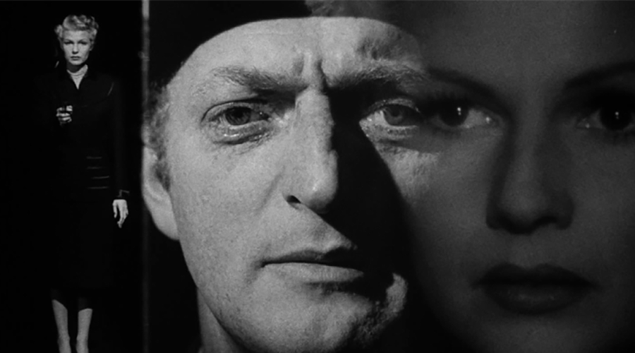
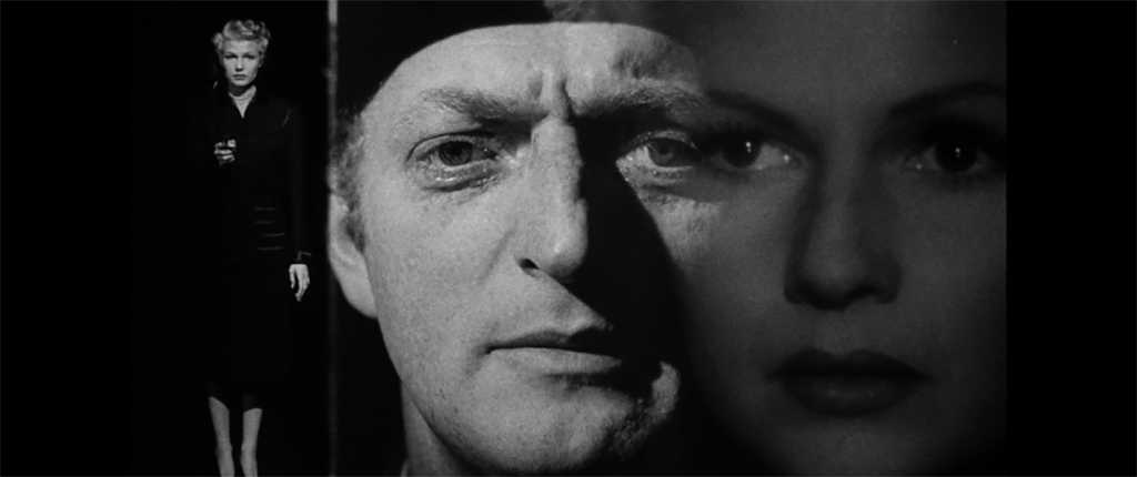
Shanghai is usually labelled a film noir, and I guess that pertains, as far as it goes—but it doesn’t go far enough to define what it really is, which is a dense cluster of character studies of a depth and incisiveness—and of the kind of people—Hollywood hardly ever allows. And the irony of that is that this movie isn’t really that much about the romantic leads, Welles and Rita Hayworth, but about the two law partners, Grisbee and Bannister. You can watch it for the stylistic stuff, but you’ll be missing the real meat if you don’t surrender utterly to what Everett Sloane and Glenn Anders put forth. 

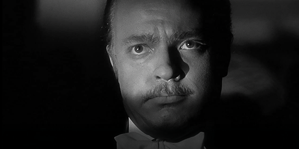
Sloane delivers one of the best performances ever captured on film—the kind of thing he might have been able to do in Kane if he wasn’t relegated to playing a thinly-drawn ethnic stereotype and if he and Joseph Cotten weren’t in constant danger of Welles eating them alive. You’re led to believe early on that his character is the villain, and he is, in a way, but who’s the villain, and the definition of villainy, is so slippery in this film that you’re left more with the impression of a brilliant but broken man whose physical paralysis has come to cripple his entire being. 

As for Glenn Anders—there’s something miraculous about what he pulled off here. His performance is famously eccentric, but gloriously so, and fully, and impishly, fledged. It shouldn’t work, but it does, partly because Anders and Welles make his madness insidious. While Sloane’s crafty attorney is to some degree descended from Victorian mustache twirling, Anders is something new, the craziness of a heedless society embodied, that craziness then spreading out and permeating the rest of the film. (It’s hard not to watch Anders now and not see anticipations of Jack Nicholson’s Jack Torrance in The Shining.)

Partly because of all the reshoots, and partly because of the state of the film, the look of Shanghai is all over the place, but the moments that are solid—especially the camera lingering over Hayworth on the Circe, the probing closeups of Sloane, and the jarring closeups of a sweating, twitching Anders—look strikingly good in 1080p on Prime. Unless somebody does a digital makeover and turn this into a kind of 4K comic book à la The Godfather—which isn’t likely—Shanghai will always look this uneven. But if you see this movie as off-kilter to its core, as you should, then that’s OK.

(A quick update on the whole “films looking good on Prime” thing: I’ve been spotchecking titles, pretty much at random, and you can’t take this as gospel, but I would say the odds are about 3:1 of a film looking pretty damn good if you dive into the catalog offerings. There’s a lot of room for improvement, of course, but Prime is becoming a boon for anyone who cares about the entire breadth and depth of film and not just the fleeting shiny objects of the moment.)

As usual, there’s not much to be said about the sound. It probably wasn’t that good to begin with, and this presentation is probably faithful to whatever there was to work with. Wish they’d balanced out the disparity between the dialogue and the music cues, and between some of the scenes, but that’s not a dealbreaker. 

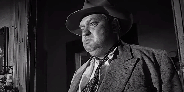
Every time I want to dismiss Orson Welles as more than a bit of an overweening jerk—which he was—I find myself getting pulled deep into something like Lady from Shanghai or Touch of Evil, works so sublime and subversive and of their own world they almost forgive all his many sins. Almost.

Michael Gaughn—The Absolute Sound, The Perfect Vision, Wideband, Stereo Review, Sound & Vision, The Rayva Roundtablemarketing, product design, some theater designs, a couple TV shows, some commercials, and now this.

PICTURE | The look of Shanghai is all over the place, but the moments that are solid—especially the closeups—look strikingly good in 1080p on Prime

SOUND | The sound probably wasn’t that good to begin with, and this presentation is probably faithful to whatever there was to work with

Generic selectors
Exact matches only
Search in title
Search in content
Post Type Selectors

© 2023 Cineluxe LLC

Review: Top Gun (1986)

Top Gun (1986)

review | Top Gun (1986)

A 4K/Atmos makeover helps breathe new life into this Tom Cruise career-maker

by John Sciacca
May 21, 2020

The United States Navy could scarcely have crafted a more effective recruiting film for promoting naval aviation than if they had actually written, produced, and directed Top Gun. (The Navy was involved in the production, providing access to jets and pilots, allowing filming on an active carrier, and suggesting some script rewrites.)

Tony Scott’s fast-paced film introduced viewers to a world most have never heard of—a school where the Top 1% of fighter pilots went to hone their craft—and does everything possible to glamorize the fast-paced, life-on-the-edge, alpha-male lifestyle that is being the best-of-the-best: A member of the Navy’s elite carrier-based fighter squadron. Beyond its huge success at the box office—and launching a bomber-jacket craze across the country—the movie actually led to a huge recruiting increase for the Navy, to the point where recruiters actually set up stations at some theaters showing the film!

Beyond establishing his bona fides as a big-budget action director, Top Gun was Scott’s first collaboration with the dynamic production duo of Jerry Bruckheimer and Don Simpson. The film also features a host of young rising stars, including Tom Cruise in the lead role of something-to-prove renegade, Maverick; Val Kilmer as the mechanical, precise, and aloof Iceman; Anthony Edwards as Maverick’s RIO (Radio Intercept Officer, aka “back seater”), Goose; and the too-cute Meg Griffin as Goose’s wife, Carole. (Also, keep an eye out for an incredibly young-looking Tim Robbins as Merlin on the carrier at the end when he removes his flight helmet.) 

Released in 1986, Top Gun holds up incredibly well (except for the technology shown in the post-flight briefs, which looks like a worn-out VHS tape badly in need of some head tracking). Sure, some of the banter is cheesy, and there’s that random shirtless volleyball scene, but overall the film remains very entertaining, with enough of a plot and character development to keep you involved and caring about the characters until the next aerial dogfight. The numerous air-combat scenes feature actual planes opposed to the “let’s do it in CGI” world most effects films now live in. And the camera angles and dynamic pacing remain dynamic and exciting, and offer a sense of what it’s like to sit in the cockpit as you pull high-G maneuvers and go head-to-head against another jet with closing speeds exceeding 1,000 miles per hour. And the soundtrack is still every bit as catchy as you remember. 

Top Gun was filmed in Super 35 format (apparently because the anamorphic lenses were too large to fit inside the F-14 Tomcat’s cockpit) and comes to the home market with a new scan of the film taken from a 4K digital intermediate. This release was likely designed to coincide with—and build excitement for—the upcoming sequel, Top Gun: Maverick, originally scheduled for theatrical release on June 24, now pushed to December 23.

As good as the film looks—which, without question, is the best it has ever looked—it isn’t realistic to expect it to have the same razor-sharp edges and micro detail of modern films shot digitally. The opening shots of the jets sitting on the carrier deck with the early morning light and smoke billowing around reveal a fair bit of grain and noise—as do some of the flying scenes taken in low-lighting conditions—but this is rarely distracting, and stays true to the film’s look instead of taking too heavy a hand with the digital noise reduction. 

Edges are sharp and defined throughout, and closeups reveal tons of detail. Every star is clearly visible on the shoulder flag patches worn on uniforms, and you see the scratches, scuffs, and even seams in the detail tape used to decorate the pilots’ flight helmets. Tight shots on actors’ faces reveal every pore and whisker (including one distracting whisker Viper [Tom Skerrit] obviously missed while shaving), along with Cruise’s unibrow, which has various stages throughout. 

Something both my wife and I commented on was just how sweaty the actors are. Like, a lot. Faces are almost always covered, nay drenched, in sweat, even when there is apparently no reason for it. I’ve no doubt the US Navy Fighter Weapons School is an intense program, but actors frequently look like they have just finished a lengthy Bikram Yoga class. But these are the kinds of details the 4K transfer makes you aware of. 

Colors are natural and lifelike, with that orange-pink-purple color of West Coast evening sunsets looking very accurate and free of noise and banding—something difficult for a streaming service to do on a highly compressed delivery. The high dynamic range gives some nice punch to the gleaming white T-shits, adds some nice brightness boosts to the Tomcat engines on full afterburners, and provides images with more overall depth and dimension. 

The audio mix has been given a full Dolby TrueHD Atmos makeover, and while not as dynamic as a modern mix, it does a fantastic job of breathing new sonic life into this near-35-year-old film. Right from the start, Harold Faltermeyer’s “Top Gun Anthem” is given more space and room, then come the sounds of the mechanical noises aboard the carrier deck—the whipping winds, the ratcheting of gear and retracting chains, the roar as jet engines spool up for launch, and the steam from the catapult launch. 

Once in the air, you can appreciate the increased dynamics of the high-powered jet engines, with jets streaking and roaring past overhead or ripping back along the side walls. Beyond the throaty roar of the engines, missile impacts and explosions have a ton of bass output that will energize your room. The final scene, as Maverick and Ice hold off the Russian MiGs, sounds fantastic, and will likely become part of your home theater demo reel. 

The soundtrack also does a nice job of delivering subtle (and not so subtle) atmospheric effects. For example, there is a completely different sonic quality when the camera is inside the cockpit, with the sounds of wind outside and breathing through the oxygen mask, compared to outside the jet. And when in the classroom, you’ll hear a variety of appropriate background sounds in the distance, including various planes and helicopters, as well as a jet periodically ripping past overhead. 

Top Gun is a classic for a reason, and it remains as much fun to watch now as the first time I saw it at a matinee back in the summer of 1986. Paramount did a wonderful job restoring the film, and this new 4K HDR version with Dolby Atmos audio is guaranteed to make your home theater feel the need . . . the need for speed!

(I was fortunate enough to do an overnight stay aboard a US aircraft carrier on deployment, and got to stand on the “foul line” and watch them launch and recover F-18s—a sound that feels like it’s going to shred your ears and shake your body to bits! You can read more about my real-life adventure here.)

Probably the most experienced writer on custom installation in the industry, John Sciacca is co-owner of Custom Theater & Audio in Murrells Inlet, South Carolina, & is known for his writing for such publications as Residential Systems and Sound & Vision. Follow him on Twitter at @SciaccaTweets and at johnsciacca.com.

PICTURE | As good as this film looks—and this is the best it has ever looked—it isn’t realistic to expect it to have the same razor-sharp edges and micro detail of modern films shot digitally 

SOUND | The mix has been given a full Dolby TrueHD Atmos makeover, and while not as dynamic as a modern mix, it does a fantastic job of breathing new sonic life into this near-35-year-old film

Generic selectors
Exact matches only
Search in title
Search in content
Post Type Selectors

© 2023 Cineluxe LLC
Review: Prehistoric Planet

Prehistoric Planet (2022)

review | Prehistoric Planet

recent reviews

Sign up for our monthly newsletter
to stay up to date on Cineluxe

This Planet Earth-like documentary series uses stunning CGI to bring the world of the dinosaurs to life

by Roger Kanno
May 28, 2022

Apple TV+’s latest big-budget spectacle is Prehistoric Planet, a five-part nature documentary that debuted May 23 with a new episode available each day through May 27. With executive producers Jon Favreau and Mike Gunton attached to this BBC Studios Natural History Unit project, Sir David Attenborough providing narration, and Hans Zimmer, along with Kara Talve and Anže Rozman, composing the score, it doesn’t lack for high-powered creative talent to help it create buzz. Apple even hosted live premiere events at IMAX theaters in Los Angeles and London preceding the streaming release of the series, which they claim “will transport viewers 66 million years into the past to discover our world—and the dinosaurs that roamed it . . . in an epic week-long event.” 

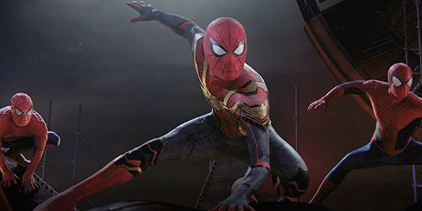
State-of-the-art CGI provides a glimpse into the world of dinosaurs in this BBC Planet Earth-like series. While I’m not sure I would characterize it as an epic week-long event, it is extremely well made, will appeal to those who enjoy natural-history documentaries, and is especially family-friendly. Each episode is based on a particular habitat, with titles such as “Coasts” or “Deserts,” and tells humanizing stories about the different species of dinosaurs that inhabit them and their struggles to survive. The narrative is engaging and the information presented is said to be based on paleontological evidence, with the series managing to both educate as well as entertain. 

The main reason to watch Prehistoric Planet is to see the photorealistic renderings of the dinosaurs. The CGI was created by the Moving Picture Company, which has worked on myriad other projects including collaborating with Favreau on The Jungle Book and The Lion King, winning Visual Effects Oscars for both. The DolbyVision HDR presentation is absolutely breathtaking at times. The manner in which light reflects off the scaly skin of the creatures in closeups is stunningly realistic. There are also dinosaurs with fur or feathers with similarly fine levels of detail present. Colors are not over-the-top saturated and are actually a little muted; even so, they look very natural even though the visuals may be computer generated. Not all of the shots in Prehistoric Planet are CGI but the animation is so lifelike it’s difficult to tell where the occasional live-action shots have been incorporated.

The camera angles change within scenes, and background and foreground objects move in and out of focus, providing a more realistic viewpoint of this artificially created world. The motion of the creatures is also incredibly smooth and natural. As gigantic Dreadnoughtus males clash in a display for mates, the movement in their legs and long necks looked exactly how I would imagine such enormous creatures to move. Every rippling muscle under their leathery skin and the unified motion of their entire bodies as they methodically shift their massive weight was perfectly captured. One of the few times my disbelief wasn’t totally suspended was during an underwater scene where the rapid swimming motions of a predatory Kaikaifilu looked a little too choppy. Otherwise, I was constantly in awe of the spectacular visuals. 

While the visual presentation is nearly flawless, the Dolby Atmos soundtrack is not as stellar. This is a nature documentary so I didn’t really expect massive, room-crushing T-Rex foot stomps, but a bit more volume and drama at times would have been welcome. The surround and height channels are used sparingly, such as during underwater scenes, to provide a subtle sense of envelopment. However, in forest scenes or even shots taking place in caves, there is little sense of surround ambience, with much of the sound anchored to the front channels. The music score is well-recorded but is presented at fairly moderate levels with very few rousing crescendos to enhance the onscreen action. 

If you’re looking for heart-pounding, Jurassic Park-like thrills, you’ll have to look somewhere else. However, the five episodes of Prehistoric Planet do manage to deliver quality, family-oriented entertainment with fantastic visuals. 

Roger Kanno began his life-long interest in home cinema almost three decades ago with a collection of LaserDiscs and a Dolby Surround Pro Logic system. Since then, he has seen a lot of movies in his home theater but has an equal fascination with high-end stereo music systems. Roger writes for both Sound & Vision and the SoundStage! Network.

PICTURE | The DolbyVision HDR presentation is absolutely breathtaking at times, with colors looking very natural even when the visuals are computer generated 

SOUND | The Dolby Atmos soundtrack doesn’t rise to the level of the visuals. You don’t expect room-crushing T-Rex foot stomps in a nature documentary but a bit more volume and drama would have been welcome.

Generic selectors
Exact matches only
Search in title
Search in content
Post Type Selectors

© 2023 Cineluxe LLC
Review: California Split

California Split (1974)

review | California Split

related reviews

Sign up for our monthly newsletter
to stay up to date on Cineluxe

Pretty much Robert Altman’s last uncompromised effort, it can take a while to settle into this movie’s groove but it’s a great ride once you’re there

by Michael Gaughn
May 26, 2022

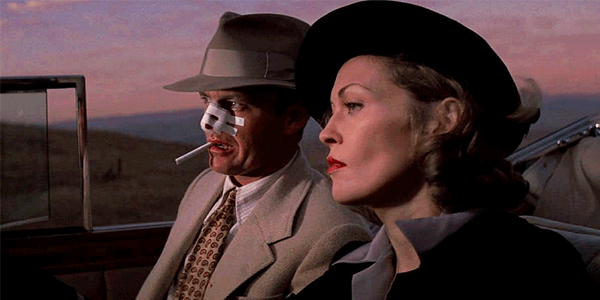
California Split came right after The Long Goodbye and Thieves Like Us and right before Nashville—in other words, during that period when practically no one knew what to make of Robert Altman anymore and when most people, even during the directionless era of early ‘70s filmmaking, were ready to write him off. This is Altman at his most uncompromising and elliptical—which, with him, were pretty much the same thing—when he was really making his audiences work to keep up with him but was rewarding them well if they rose to the challenge.

Nashville would be kind of a concession to prevailing tastes and would restore some of his luster. But then something went awry and Altman spent the rest of the ‘70s and all of the ‘80s just wandering from one ill-conceived, half-baked and, for the most, not very interesting project to another until he hit on The Player. In a sense, California Split is his last film at his strongest.

You can forget about heroes & villains here—fortunately, the return of that delusional and ultimately oppressive worldview was still three years off at the time. But you can forget about anti-heroes, too. Altman tended to eschew most of the accepted gestures of his era and just did what he wanted to do. If he referenced fads, it was usually to skewer them. 

His is some of the most mature filmmaking to ever make it into the mainstream—which isn’t to say it was hugely mature but just more so than the puerile fantasies of most filmmakers. There has always been something fundamentally adolescent about American cinema, going back to its roots, so it’s not too surprising that, since the early ’80s, we’ve seen one wave after another of increasingly more childish directors. The big difference from the past is that we now tend to laud the most emotionally retarded of them as our most serious artists—which is an accurate enough reflection of the state of the culture, but one that ought to scare instead of sustain us, and should send us scrambling back to Square One. It’s not.

The above isn’t the bitter digression it might seem but crucial to understanding Altman’s importance. Looking at his peak from 1970 to 1975 and comparing it to the present really underlines how far we’ve devolved and how much we’ve lost. Yes, the audiences are way bigger now, but they’re also way more stunted, thuggish, almost primal, uninterested in edification but happy to just be manipulated and shocked and placed under the culture’s thumb, deadening their nerve endings along the way.

Altman’s characters are rarely mainly good or bad but are almost inevitably to a great degree compromised, and lost. While that expressed a somewhat elitist view of society, it was also an acute one—a mirror not a lot of people want to look into, but a self examination necessary for achieving any kind of integrity and meaningful self-worth. Not surprisingly, it’s what the broader audience has always disliked most about Altman’s work. 

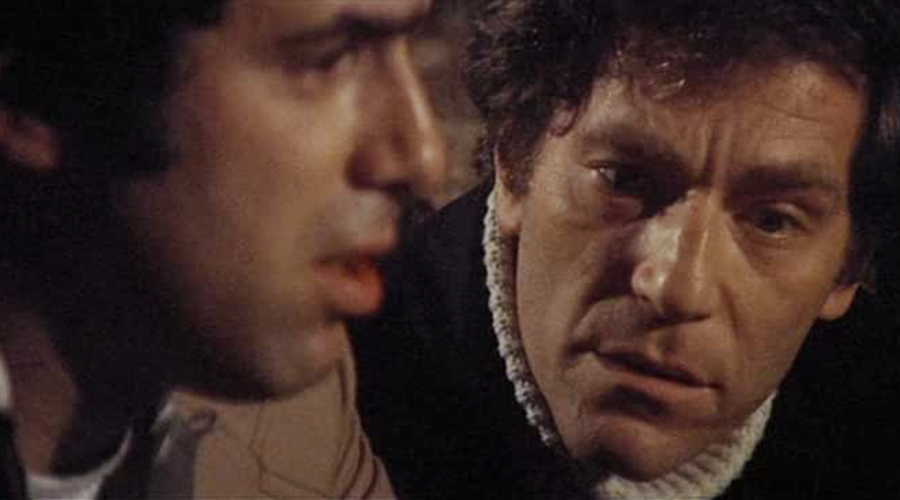
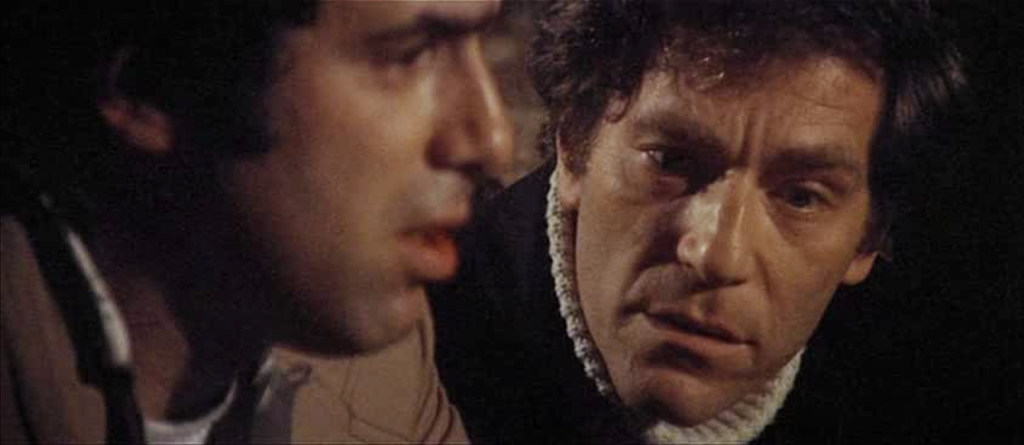
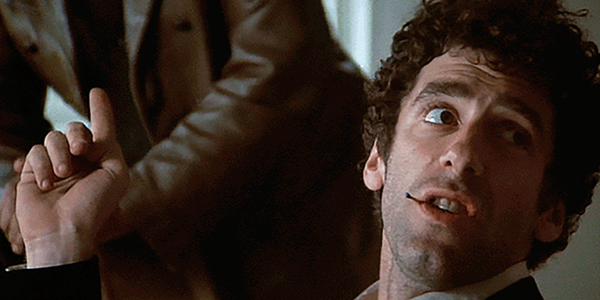
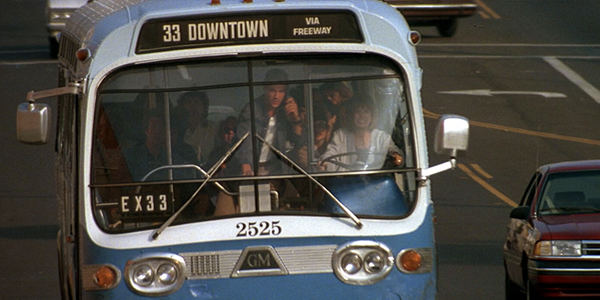
Altman tries everybody’s patience during the first half hour or so of California Split, making you wonder why you should care about Elliot Gould or George Segal—or Ann Prentiss or Gwen Welles. What you pick up on early on is that it’s a film about gambling, that the two male leads are good at it and that they’re bonding but their lives beyond the tables are nothing but a mess. And that ends up being pretty much the whole film. What makes it compelling is Altman incisively capturing the world at that somewhat unsavory and desperate level and then setting Gould and Segal in motion within it while resorting to as few clichés and trendy devices as possible, which helps it all feel like not just another movie.

Early on you get you get the sense, as you often do in Altman, that he doesn’t care that much about the technique. But that always turns out to be the wrong place to go because, just because he’s not flashy in the usual sense doesn’t mean he doesn’t have virtuosic control over his material. The way he develops characters, builds scenes, and creates the overall arc of a film really has no precedent, but it’s all accomplished masterfully and in a way that kind of creeps up on you from behind.

What I saw on Amazon Prime seemed remarkably true to how this film should look. This is another one of those HD offerings, like The Apartment and the other titles I mentioned in my review of that film, that looks exceptionally good on Prime. Nothing really happens to make you aware of the presentation or to suggest it’s in any way distorted or otherwise compromised. It’s perfectly apt to the material at hand. And California Split is a dazzling study in grain, in how it can bring an energy and interest to the frame, a nuance that’s lost when it’s inexcusably damped down or scrubbed away.

But I have to add this footnote to my comments in The Apartment review: Step carefully. While many of the movies on Prime do look way better than they did until recently, there’s tremendous inconsistency from title to title, and a lot of them are lemons. Amazon says Detour is in UHD, but it’s not. It looks just as bad as it did as a public-domain closeout on VHS. The Man with the Golden Arm is unacceptably washed out and fuzzy. So is Tom Waits’ Big Time. And on and on. 

The sound in California Split is clean enough but there’s nothing particularly interesting going on there—but it seems like there should since this was the first time Altman used multitracking to capture overlapping or simultaneous dialogue. There’s not a lot of lateral separation when this occurs in the mix, even when the characters speaking are placed some distance apart in the frame, and sometimes the balance just feels off between the voices. This was probably all in the original mix but there were moments that seemed flat-out wrong. 

In a world of brain-dead action flicks, of pervasive gun-toting empowered females, of one-dimensional beings running around in their footie pajamas, I realize the audience for Altman is small. But you have to think of it as the equivalent of the monks who kept literacy alive in the Middle Ages, point toward the things that can give us sustenance and hope in a dismal age, and pray that, somehow, this too will pass, with something more enlightened eager to be born on the other side. Altman would have laughed his ass off at the suggestion that California Split should be seen as a beacon of hope, but such is the world we’ve come to create, who we’ve come to be.

Michael Gaughn—The Absolute Sound, The Perfect Vision, Wideband, Stereo Review, Sound & Vision, The Rayva Roundtablemarketing, product design, some theater designs, a couple TV shows, some commercials, and now this.

PICTURE | Another one of those HD offerings that looks exceptionally good on Prime. Nothing really happens to make you aware of the presentation or to suggest it’s in any way distorted or otherwise compromised. 

SOUND | The sound is clean enough but there’s nothing particularly interesting going on there—but it seems like there should since this was the first time Altman used multitracking to capture overlapping dialogue

Generic selectors
Exact matches only
Search in title
Search in content
Post Type Selectors

© 2023 Cineluxe LLC

Review: The Apartment

The Apartment (1960)

review | The Apartment

related content

Sign up for our monthly newsletter
to stay up to date on Cineluxe

Not up with Billy Wilder’s very best work, but something of a revelation—for unexpected reasons—when viewed on Prime

by Michael Gaughn
May 23, 2022

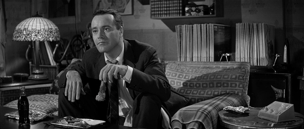
I’ve never been a big fan of this 1960 Billy Wilder portrait in dour but, unable to sleep one night last week and with nothing else inviting on Prime, I decided to give it another shot—and was surprised to find myself engaging with and through it in ways I never have before. It will never be one of my favorite films, but I walked away with a lot of respect for the movie Wilder meant to make and a deep fascination with what he inadvertently captured along the way. 

Movies about New York might be our most accurate cultural barometer; they tend also to be the most nuanced views of who we are a whole. And that’s largely because no other city seems to be swayed and jolted by—or more forcefully influence—the societal currents more overtly or dramatically. Just consider films like The Naked City, Sweet Smell of Success, Breakfast at Tiffany’s, Taxi Driver, or Manhattan. No other city is as evocative on film, or more readily acts as magnet for our emotions or biases or preoccupations. And I say that knowing The Apartment is about as New York as Wiener schnitzel, but I’m talking about capturing the essence of the city at a certain moment in time—even though most of this film was shot on soundstages 3,000 miles away. 

New York and American culture were both at their peak in 1960. The previous five years had seen the emergence of a kind of renaissance, with pop and serious culture achieving as good a symbiosis as two such antithetical forces can ever hope to achieve. Its hub was Manhattan; its influence was national—global, too. Pop was inflecting things like high-end design and fashion, classical music, and gallery art in ways that would have been unthinkable at the beginning of the decade, and things like serious music and architecture and foreign film were being embraced—admittedly somewhat tentatively—by the mainstream, resulting in an unprecedentedly fecund cross-pollination. 

The Apartment embodies all of that—and because it both expresses and feeds from that phenomena, it shows how volatile the various elements were, and how brittle the balance. It also shows—mostly unconsciously—the emerging forces that, within a couple of years, would shred everything the culture had achieved and open a massive wound that still hasn’t healed, and may never heal.

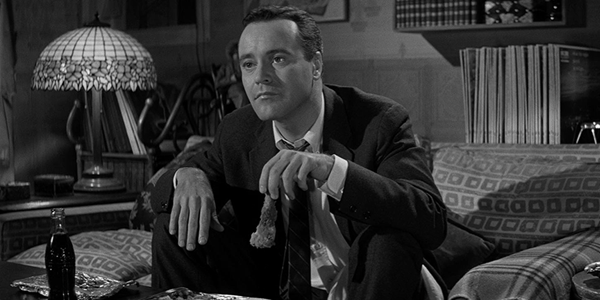
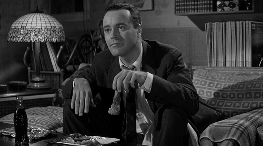
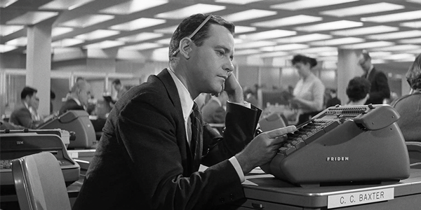
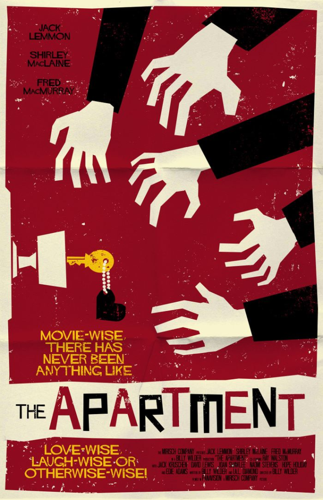
Consider some facts: Jack Lemmon’s character is a junior accountant at a Manhattan insurance company. His weekly pay is $94.70. He has a one-bedroom apartment two and a half blocks from Central Park for which he pays $85 a month. At one point, a switchboard operator—a white female—asks for cab fare back to her apartment at 179th Street in the Bronx. At another point, Fred MacMurray tips a bootblack a dime for a shine. Most people in the present would be incapable of processing any of that information, let alone of putting it in context. It all reads like intercepted transmissions from some alien civilization. And yet that was us, once.

I’m not being nostalgic, just accurate. You can’t watch this film and not sense the tremendous gulf between those two eras, these two worlds. Which underlines the fact there is just no way to see The Apartment the way audiences did at the time—they were different beings. But it sure is fun to try.

This is thought of as a comedy, but only about 10% of it could be labeled that; maybe about 30% could be considered romantic comedy. The rest is pretty damn serious, and troubling. And Wilder shifts the tone constantly, sometimes from scene to scene, sometimes shot to shot.

Re Wilder: Double Indemnity and Sunset Boulevard are constantly near the top of my ever-fluctuating list of favorite films. But he was starting to get shaky by the mid ‘50s. Ace in the Hole is too self-consciously and relentlessly cynical. Sabrina has its moments but it’s uneven, and there’s something about the ‘50s preoccupation with pairing up Audrey Hepburn with middle-aged men that’s just downright creepy. Some Like It Hot is just shrill. Kiss Me, Stupid and One, Two, Three, which came after The Apartment, are even shriller. From then on, it just gets bleak. The Apartment was the last time Wilder was in effective control of his art, and there’s a certain irony in the fact that it always seemed to be drama that brought the best out of him.

Jack Lemmon is, almost throughout, too Jack Lemmon-y. But there are moments when he’s allowed to act beyond his patented preppy nebbish routine and be something other than a caricature—mainly in the quiet exchange between him and Shirley MacLaine after her suicide attempt where his restraint makes the scene’s emotion palpable. Surprisingly strong is Jack Kruschen as Lemmon’s neighbor, Dr. Dreyfuss, who starts out as a stock-company Jew but who brings a surprising amount of nuance and depth to his performance as the film plays out. The scene where he tries to revive MacLaine, alternately slapping her, waving smelling salts under her nose, forcing her to drink scalding coffee, and talking her back from the other side of the void, is the movie’s pivot, is still wrenching to watch, and is masterful on the part of all involved.

For all the bubbly music cues, brightly lit office interiors, and flippant banter, this is a very dark film—literally so with Joseph LaShelle’s quietly riveting cinematography, which often allows for little more than telling pinpoints of light. Not only is it dark, it’s shot in 2.35:1 Panavision, which I doubt a single other soul was doing with black & white domestic comedies at the time—

And I have to pause for a second and tip my hat to Amazon Prime. Something wonderful has been percolating there for about the past year, and that ungainly behemoth of a service really seems to be hitting its lumbering stride. Older HD films were almost unwatchable on Prime until recently—A Funny Thing Happened on the Way to the Forum, for instance, used to alternate between blurriness and massive attacks of pixelization. But it looks terrific now—so does The Band Wagon, so does The Conversation, so does The Fisher King. And Dennis Burger stumbled across To Catch a Thief in 4K HDR last week—for free. This serious uptick in quality and this kind of access have to have the other online purveyors shaking in their heavily subsidized booties.

The Apartment looks similarly great. And this is in lowly 1080p. Apparently a 4K digital intermediate was created just recently, and I’m keen to revisit the film if it gets a higher-res re-release. But, for now, this version gets just about everything right.

Except for some of the audio. The original mix was mono; what I heard was stereo. And it features so much badly done hard panning that I at first assumed it originated from the time of the film’s release. Maybe that’s the case, or maybe some well-intentioned soul in the present was trying to mimic early ‘60s ping-ponging, but the choices were so radical they pulled me out of the film more than once. 

As I said up top, I can’t say I love this film, but I do admire it, and I found the experience of filtering the past and present of the culture through it, if not enjoyable exactly, then intriguing and unsettling and ultimately gratifying. You should watch The Apartment, if you haven’t seen it or haven’t seen it in a while. It’s got some real meat on its bones; and it’s an invaluable snapshot of a both tangible and illusory but undeniably decisive, invigorating—and I would argue, squandered—moment in time. 

Michael Gaughn—The Absolute Sound, The Perfect Vision, Wideband, Stereo Review, Sound & Vision, The Rayva Roundtablemarketing, product design, some theater designs, a couple TV shows, some commercials, and now this.

PICTURE | The Apartment looks great, even in lowly 1080p. A higher-res release from the recently struck 4K intermediate would likely look better but, for now, this version gets just about everything right.

SOUND | The stereo mix of the original mono features so much hard panning it can pull you out of the film at times

Generic selectors
Exact matches only
Search in title
Search in content
Post Type Selectors

© 2023 Cineluxe LLC

Review: Operation Mincemeat

review | Operation Mincemeat

recent reviews

Sign up for our monthly newsletter
to stay up to date on Cineluxe

A young Ian Fleming is a key character is this well-done Netflix presentation of a real-life WWII spy tale

by Roger Kanno
May 16, 2022

Operation Mincemeat is a gripping historical drama based on the book of the same name by Ben Macintyre. It recounts the tale of a World War II British spy mission to deceive German forces into believing an Allied invasion would occur on the shores of Greece to conceal an actual landing planned for Sicily. The covert plan was based on an idea contained in the top-secret “Trout Memo,” reportedly written by British naval intelligence officer Ian Fleming. Yes, that Ian Fleming, the one who later went on to write the James Bond novels and whose character plays a supporting role in the film and provides the narration. The film premiered at the British Film Festival in Australia in November 2021, was released in the UK on April 15, 2022, and began streaming on Netflix on May 11.

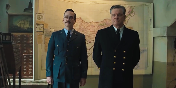
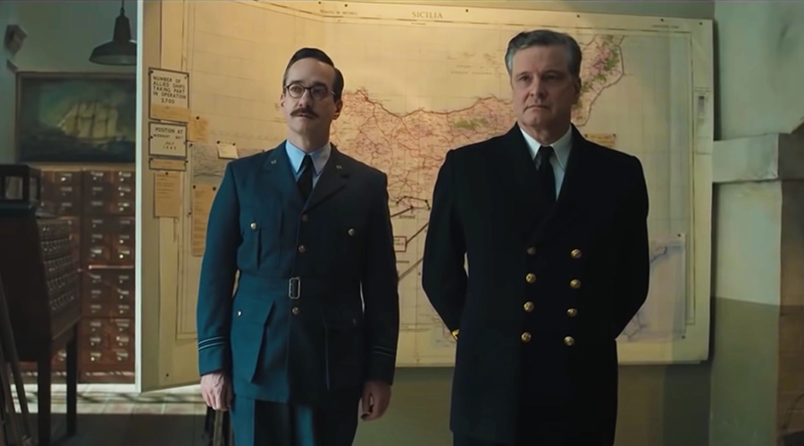
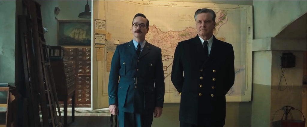
Lieutenant Commander Ewen Montagu (Colin Firth) and Flight Lieutenant Charles Cholmondeley (Matthew Macfadyen) develop a plan to plant false papers on a corpse disguised as a fictitious British airman, Major William Martin, in the hopes German intelligence will intercept the fake documents. To make the deception more believable, Montagu, Cholmondeley, and their team create an entire false identity for Martin. Watching the meticulous process of developing that fabricated identity is both fascinating and revealing of the characters and of the team’s dynamic.

Firth and Macfadyen are excellent as the leaders of the team, but Kelly Macdonald and Penelope Wilton flesh out the storyline as Jean Leslie and Hester Legget respectively, the women recruited to provide support to the team. Both Macdonald and Wilton manage to steal many scenes as they reveal the strength of their characters and their importance to the development of the operation. The direction by John Madden (Shakespeare In Love, Best Exotic Marigold Hotel) is solid, although a few plot elements, such as romantic tensions between the team members, seem slightly forced at times. Otherwise, he keeps the story flowing at a good pace and there was enough suspense and tension to keep me absorbed in the film without overwhelming me. 

The film was shot in ArriRaw at 4.5K and mastered in 4K, and the DolbyVision presentation on Netflix has a pleasingly natural appearance. Scenes involving a submarine during a nighttime storm were challenging, but the breaking waves and driving rain looked crisp and well-defined even in the low light. Another particularly demanding scene has Montagu walking through pitch darkness with a lantern illuminating a circle of light around him. The picture remained solid and finely detailed as the nature of the light changed when it was reflected off the uneven ground, creating rapidily changing shadows. 

Interior shots often exhibit a sepia tone, providing a vintage look appropriate to the film’s setting of nearly a century ago. When the scenes shift to outdoors, the picture takes on a slightly cool, bluish hue. In a garden scene where intelligence officers, including Fleming, meet with Prime Minister Churchill, the collars of their crisply pressed white shirts are bathed in the pale blue light. This lighting gave their black wool coats and felt hats a slightly lighter hue, but there was exquisite detail in the stitching and fibers of the materials. 

From the opening suspenseful music mixed with thunderously crashing waves and howling wind, the sound design of Operation Mincemeat is engaging and active even though it’s presented in standard 5.1 audio. The stark clacking of typewriter keys is used as an effective device to introduce scenes, along with the dry, matter-of-fact delivery of the narration by actor/musician Johnny Flynn who plays Fleming. The score is atmospheric and involving, but music is also used to punctuate the onscreen action as when Montagu and his team visit a Soho club and the jazzy tones of a saxophone and a moody piano fill the air. A big band plays later in the scene and is limited primarily to the front speakers, but the sounds of indistinct conversations emanate subtly from the surrounds, creating an effective sense of envelopment.

I was pleasantly surprised by Operation Mincemeat. The picture and sound aren’t quite reference quality but they are still very good, and combined with the film’s compelling narrative, make this one of Netflix’s better recent releases.  

Roger Kanno began his life-long interest in home cinema almost three decades ago with a collection of LaserDiscs and a Dolby Surround Pro Logic system. Since then, he has seen a lot of movies in his home theater but has an equal fascination with high-end stereo music systems. Roger writes for both Sound & Vision and the SoundStage! Network.

PICTURE | The DolbyVision presentation on Netflix has a pleasingly natural appearance, even if it isn’t quite reference-quality

SOUND | The sound design is engaging and active even though it’s presented in standard 5.1 audio

Generic selectors
Exact matches only
Search in title
Search in content
Post Type Selectors

© 2023 Cineluxe LLC

Review: Casino Royale (2006)

Casino Royale (2006)

review | Casino Royale (2006)

recent reviews

Sign up for our monthly newsletter
to stay up to date on Cineluxe

The initially derided Craig rebooted the franchise in a big way in this gritty interpretation of Fleming’s first Bond book

by John Sciacca
April 9, 2020

As I mentioned in my Goldfinger review, my dad was always a Connery man. It was the Bond he started out with and who he associated with the character. Roger Moore was the Bond I grew up with, and his looser style and cooler gadgets—thanks to improvements in Q Branch no doubt—resonated with me. For years, For Your Eyes Only was my favorite installment in the franchise. 

But as I got older, read the Ian Fleming (and John Gardner and Raymond Benson) novels for myself, and had more Bond options, I realized Moore really wasn’t the best representation of the character. Where Moore was quick with a quip or tongue-in-cheek comeback, Fleming’s Bond was often brutal and not into trading barbs of the verbal variety. He went about his business of killing with professional detachment, taking no joy in the act, but never shying away from it.

In Fleming’s own words, “I didn’t intend for Bond to be likable. He’s a blunt instrument in the hand of government. He’s got vices and few perceptible virtues.” 

In many ways, Timothy Dalton got closest to the brutal edge that was the literary Bond. Unfortunately, though, he hit the not-likable part a little too literally for much of the Bond viewership.

For me, the Bond films reached a franchise low-point with Pierce Brosnan. I initially had high hopes for him after Goldeneye but then the Brosnan films started relying too much on gadgetry and ridiculousness. (Denise Richards as nuclear physicist Dr. Christmas Jones in The World is Not Enough?! Ugh . . .). And when we finally got to Bond parasailing a giant wave into enemy territory, followed by racing around in an invisible car, and a cameo of a fencing Madonna in 2002’s Die Another Day, well, I didn’t think I had another day to give. That is, until we got Daniel Craig.

Remember, though, that when Craig was initially cast, the world was anything but supportive. The press dubbed him “the blonde Bond,” a clear departure from Fleming’s descriptions, and fans were also similarly dismissive. (Fleming, by the way, several times describes Bond as looking like singer, songwriter, actor Hoagy Carmichael. A description from Moonraker describes Bond as “certainly good-looking . . .  Rather like Hoagy Carmichael in a way. That black hair falling down over the right eyebrow. Much the same bones. But there was something a bit cruel in the mouth, and the eyes were cold.”)

With four years between Day and Casino Royale, it gave the franchise a chance to cool off. And by the time Royale came out, Bond was ready for a much-needed reboot, not only with a new leading man, but with an entirely new realism and edge, reborn in the 21st century.

Casino Royale is the first Fleming novel, a fitting point for the series to restart from, and the film opens in gritty, grainy, ultra-high-contrast black & white where we see a relatively inexperienced Bond new on the job. This is a Bond yet to earn his 00 license, which we quickly learn requires two kills to attain. The first kill is a brutal, personal, up-close-and-ugly affair that doesn’t go quick. The second is . . . easier. Gone are the quips and jokes. This is the brutal, blunt instrument Fleming imagined.

After Brosnan’s heavy reliance on gadgetry, here we have a Bond utterly stripped of gadgets and tricks. (Though you’ll notice several key instances of Sony product placement throughout.) Instead, we see Bond at his best, relying on his guts, brains, and self to outwit and scramble out of trouble. Craig is clearly—and visibly—in fantastic shape, and he isn’t the “pretty Bond” of his predecessors. His grappler’s body is scarred, and his face shows the wear of numerous fights and the hard life Bond leads, but when we see Craig thrust into Bond’s world, he is utterly believable. 

Fleming’s Bond also had a voracious appetite for liquor, and his consumption of bottles of wine, champagne, and hard liquor at meals would have made Don Draper look like a teetotaler. We get a sense of that here, with Bond drinking heavily. We are also introduced to the Vesper, a martini of Bond/Fleming’s creation. (Finding key ingredient Kina Lillet can often be a challenge if trying to recreate this for yourself.)

There are many things that separate this Bond—both film and character—from the others. For one, the overall tone of the film is just darker, moodier, and more intense. We also get the series’ most brutal onscreen torture scene—one pulled directly from the book. Where other villains monologue about what they are planning to do to Bond, here Le Chiffre (Mads Mikkelsen) just gets down to business. 

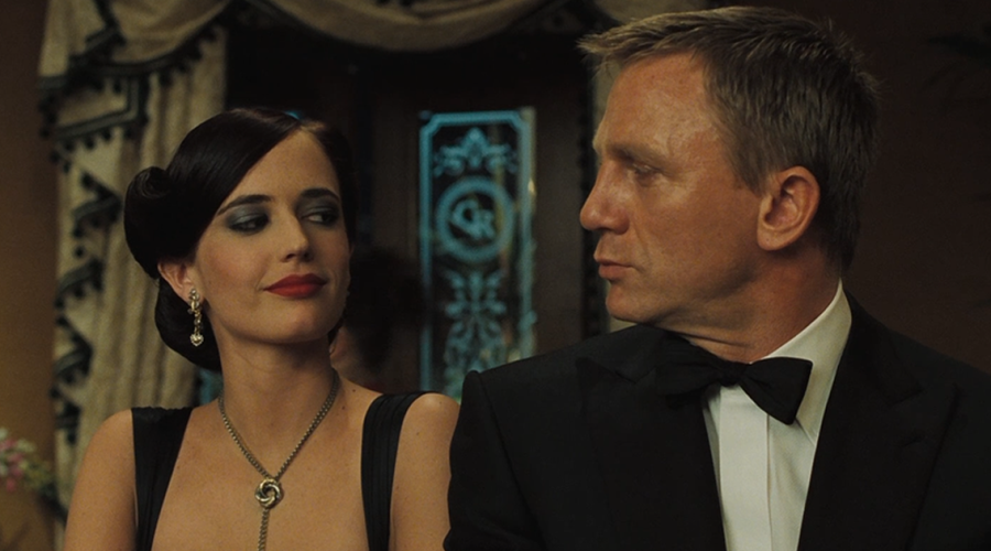
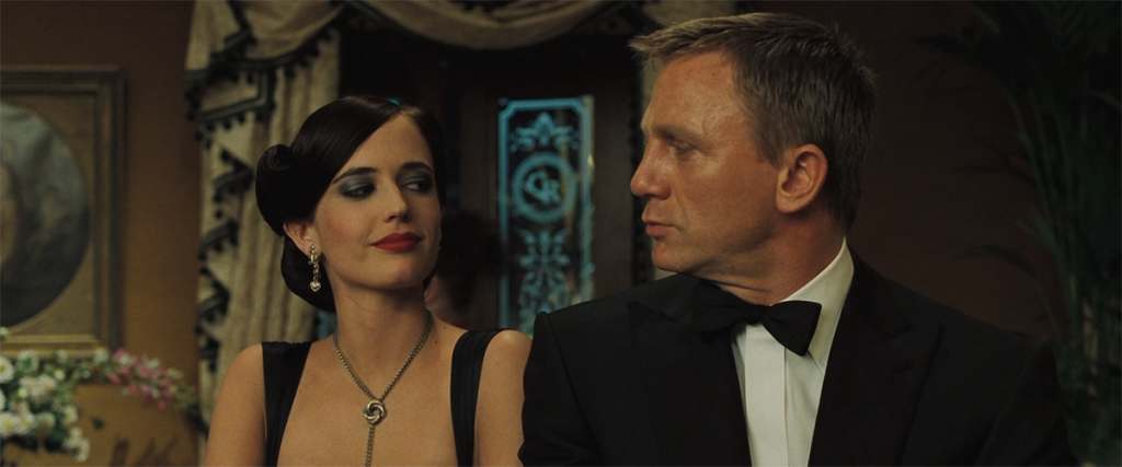
Also different is the character- and relationship-building we see developing between Bond and those around him, notably Vesper Lynd (Eva Green), M (Judi Densch), and Felix Leiter (Jeffrey Wright). The dialogue between Bond and these characters is sharp and fast, smart and poignant, looking well past the opportunity to simply work in some witty quip, and actually interested in developing the story and characters and challenging Bond. It also helps to make Bond seem more human, relatable, and vulnerable. Here we see a Bond who has fallen in love, who lets his armor down and decides to commit to another person and resign from MI6 before it consumes—or kills—him.

The movie is long. At 2:24, it is the second longest Bond film, giving it plenty of time to develop the story and the characters. The Texas Hold ‘Em card game at the titular casino in Montenegro between Bond and Le Chiffre lasts a long time, but manages to keep tension and remain engaging without feeling overly long. It succeeds here because of the dialogue between characters, the developments on and off the table, and the way the game is broken up, allowing the players to rest and go about other business. Further, changing the game from baccarat (Bond’s preferred game in the novels) to poker for the film was also a brilliant stroke. Baccarat’s rules are far more basic, and wouldn’t have given this lengthy battle of wits and wills the same tension or pacing.

Shot on 35mm film, this is taken from a 2K digital intermediate and images look mostly great but don’t always rise to reference quality. The opening black & white images remind me of some Kodak professional film stock I once used at a wedding, resulting in images that are either deep black or pure bright white, giving it a stark look that pops in HDR. The whites look a bit overexposed, revealing some speckles and giving it a (likely intended) gritty look to capture Bond’s admission into the 00 ranks. 

Closeups reveal tons of facial detail as well as the fabrics in clothing, such as the fine detail and texturing in Rene Mathis’ (Giancarlo Giannini) tie, the pebbled texture in Bond’s tuxedo shirt or the delicate white-on-white V pattern in Bond’s suspenders. It also resolves single strands that have fallen loose from Vesper’s hair. Exterior shots in Montenegro and Venice also look fantastic, with buildings having brilliant sharp edges and definition, and full of color. It’s the mid-length shots, such as when the camera pulls back at the gaming table, that don’t seem to have the same sharpness, almost as if a different lens or film stock was used, slightly pulling you out of the fantasy world.

There are a lot of night scenes, either driving around the streets of Miami or a chase outside an airport, or the bright lights illuminating the gaming table, and these benefit from HDR’s deep blacks and bright whites. We also get a lot of “natural” bright reflections as sun reflects brightly off rocks or gleams on sweating faces and bodies. Outdoor scenes just look more real and natural with the wider contrast range. I didn’t find that the film makes much use of HDR’s wider color gamut, but skin tones are natural, as are the green foliage in a jungle and a dust-filled embassy.  

I was initially bothered that there’s not a new audio mix here, just a “basic” 5.1-channel DTS HD-Master audio track; but fortunately, that disappointment didn’t last long as Royale’s soundtrack is dynamic and active. (It’s also worth mentioning that the disc release also contains the 5.1 mix.) 

Audio is used extensively to properly place you in the environment, and a quality home theater processor’s upmixer does an admirable job creating a truly immersive mix. During an early scene, rain is pouring overhead, and the mix does a great job of putting that water up above you. As Bond runs through a construction site, the room comes alive with sounds of the site, with drilling, cutting, welding, and distant shouts all surrounding you. While in the airport, the room fills with sounds of passengers chatting and PA announcements. And during the interrogation scene, the audio takes on the low-ceilinged flat echo quality of the small space, with water dripping and splashing periodically in the corners. 

There is plenty of gunfire, and the dynamics are loud and sharp, capturing the crack of the bullet and different sonic characteristics of different weapons. During the battle at the embassy compound, bullets hit and crash all around, with glass shattering, impacts striking into walls, and debris falling and splintering. Bass is authoritative, with impact, collisions, and explosions sending waves of low-freqeuncy energy through the room.

Dialogue is well presented and easy to understand, as is the equally important—and beautiful sounding—12-cylinder engine note of the Aston Martin DBS (a car I actually got to spend an entire weekend with driving around New York several years ago . . .).

I had forgotten just how much I enjoy this film. From start to finish, Casino Royale is engaging, engrossing, and entertaining, and is the truest version of Bond as Ian Fleming imagined and wrote. Fans of the series will want to own this movie looking and sounding its best, but even non-Bond fans will find plenty of action and intrigue here that will leave them shaken not stirred. 

Probably the most experienced writer on custom installation in the industry, John Sciacca is co-owner of Custom Theater & Audio in Murrells Inlet, South Carolina, & is known for his writing for such publications as Residential Systems and Sound & Vision. Follow him on Twitter at @SciaccaTweets and at johnsciacca.com.

PICTURE | Images look mostly great, but don’t always rise to reference quality

SOUND | The disappointment over getting just a “basic” 5.1-channel DTS HD-Master audio track doesn’t last long since Royale’s soundtrack is dynamic and active

Generic selectors
Exact matches only
Search in title
Search in content
Post Type Selectors

© 2023 Cineluxe LLC

Review: Goldfinger

Goldfinger (1964)

review | Goldfinger

related reviews

Sign up for our monthly newsletter
to stay up to date on Cineluxe

The most iconic of the Bond films shows little of its age in this 4K transfer

by John Sciacca
April 7, 2020

“The name’s Bond. James Bond.” There is perhaps no more iconic introduction catchphrase in the history of cinema, a line cribbed and lampooned countless times in nearly as many different genres. 

Say “James Bond” and it immediately conjures a host of similar images in people’s minds. Bond, ever cool under pressure, gliding through a world inhabited by fast women and faster cars, pitted against ruthless super-villains bent on world domination. Bond, always perfectly attired, knowing the right thing to say or do in any situation, doing whatever necessary to complete the assignment at hand regardless the risk, saving the world and leaving with the girl. 

Bond is the original man men wish they could be, and women wish they could be with. While Ian Fleming’s Bond was a popular character in literary fiction—actually mentioned by President Kennedy as one of favorite books, leading to From Russia With Love to be the second film made—it wasn’t until Bond hit the big screen with Dr. No in 1962 that he truly caught on and hit worldwide acclaim.

I came to Bond through my father, and I can remember watching the latest Bond adventure when it would hit TV, gaping at the opening title sequences as each film revealed more and more inches of female skin, and wondering what incredible gadget the super spy would have up his sleeve (quite literally in the case of the Rolex Submariner he wore in many of the early films).  

My dad, who read all the Fleming (and subsequent John Gardner and Raymond Benson) books, was a Sean Connery man, faithful to the original. And while Bond is now entrenched in the world’s zeitgeist, it’s likely there would be no Bond today had the casting fallen short with that first film. 

Bond needed to be able to handle himself physically, but not be so big that he stood out. With a weightlifting and boxing background, and a 6-foot 2-inch height, Connery fit the bill. He also needed to have enough style and charm that he could fit in playing baccarat with billionaires in Monte Carlo or be believable driving around in an Aston Martin with a beauty at his side, but also be equally at home getting his hands dirty when the time called for it. Connery’s Bond oozed confidence and cool, and he wore the character like a second skin, setting the benchmark against which all future Bonds would be judged. And launching a franchise character who has now survived 26 films by a variety of actors and spanning seven decades. 

Goldfinger comes to us renewed in 4K resolution, looking impossibly clean and fresh for a film that is now 56 years old. A final credits screen displays “Pristine Digital Restoration by Lowery Digital Images, a DTS company.” Lowery Digital won the right to restore the Bond films for Blu-ray back in 2004, and the company did significant work on the films at that time, restoring damage, doing digital cleanup, and making a 4K scan of each frame. It’s likely that these are the scans taken at that time, and also why we don’t have versions of these early films featuring HDR.

Today, the Bond opening title sequences are mini features of their own, and Goldfinger is the first Bond film to really push the opening to be something more than just a song and credits. While the title sequence is incredibly tame by modern standards, with just clips from the film projected onto shimmering gold-colored models while Shirley Bassey belts out the title track letting you know beyond any question that Goldfinger loves only gold, it was the first step that got us to where we are today. 

The first thing you notice about Goldfinger is that it’s presented in a slightly odd (albeit the original theatrical) aspect ratio of 1.66:1. When accurately presented, this will not quite fill  a 16:9 display, with small black pillarbox bars to the left and right of the image.

The next thing you notice is how clean images look. It is as if they polished off years of grime and neglect from a window, giving you a startling glimpse into what the cinematographer saw through the lens over 50 years ago. Closeups are startlingly sharp and detailed, with edges in razor-sharp focus. Any scene where the camera pulls in tight reveals tons of micro detail and texture, whether in clothing, faces, playing cards, or building details. You can actually see the dirt under Q’s (Desmond Llewelyn) fingernails. There are also plenty of opportunities to appreciate the varieties of fabric in Bond’s suits or see the sharp and jaggie-free lines in the vertical stripes of Felix Leiter’s (Cec Linder) seersucker hat. 

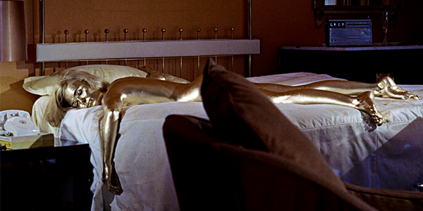
Colors pop, especially in bright outdoor scenes. There is a shot of a helicopter panning over a hotel and pool in Miami that dazzles with bright gleaming whites and tons of appropriate bikini-clad skin tones, and gold shimmer with appropriate luster, whether in bars or in the paint covering Jill Masterson’s (Shirley Eaton) body.  

Blacks are nice and dark, and noise-free. A shot with Bond in a tuxedo clearly shows the different shade and sheen of his lapels compared to the jacket. 

Not everything is perfect here, though, as the razor-sharp focus reveals the limitations of some of the technology at the time. For example, many of the shots around the pool where Auric Goldfinger (Gert Frobe) is playing cards are so crisp, the blurred backgrounds look to be obvious backdrops. The same effect is visible again when Bond is driving Tilly Masterson (Tania Mallet) around Switzerland in the famous Aston Martin DB5. And while closeups look tack-sharp, longer shots often don’t fare nearly so well. The famous scene where Bond is strapped to the laser cutting table—“Do you expect me to talk?” “No, Mr. Bond. I expect you to die!”—jarringly cuts back and forth, with the far shots looking much softer, almost like a completely different film. 

Also, the opening sequence when Bond is coming out of the water in his scuba suit has an odd frame speed up where he appears to move in double speed for a second. On first viewing, I thought perhaps I’d imagined it, but it’s definitely there and clearly a speed shift. This isn’t unique to the Kaleidescape download so it’s something from the source material, perhaps due to damage or lost elements.

Sonically, Goldfinger comes with a 5.1 DTS-HD Master soundtrack but as the original film included a mono soundmix, you can’t expect too much from this. And, well, it doesn’t deliver much in the way of actual surround sound. The film is primarily spread across the front three channels, with little bass activity even during explosions. Gunshots have some nice dynamics but a modern soundmix this isn’t. Even still, dialogue is well presented and every word is easily understood, and we also get some nice atmosphere, such as the audio inside the cavernous Fort Knox at the end or Oddjob’s (Harold Sakata) hat sailing past.  

As mentioned, Goldfinger isn’t the first or even second Bond film but rather the third, and is actually the seventh novel in Fleming’s series. But by this point in both the film and literary world, Bond was truly hitting his stride. He was established as the world’s greatest secret agent, helped by a Q-Branch producing high-tech gadgets in the form of one of the most iconic vehicles ever committed to film, with Connery starting to lighten up with some quips—“Shocking. Positively shocking,” after electrocuting a baddie in a bathtub—with perhaps the most on-the-nose Bond Girl name ever in Pussy Galore (Honor Blackman), and producing one of the most memorable villains in the series. The film scored a franchise high critics rating of 98% on Rotten Tomatoes as well as tying the franchise-high audience rating of 89%, and it comes to the home looking as good as you’ve ever seen it.

Probably the most experienced writer on custom installation in the industry, John Sciacca is co-owner of Custom Theater & Audio in Murrells Inlet, South Carolina, & is known for his writing for such publications as Residential Systems and Sound & Vision. Follow him on Twitter at @SciaccaTweets and at johnsciacca.com.

PICTURE | Goldfinger looks impossibly clean and fresh for a film that’s 56 years old

SOUND | The film comes with a 5.1 DTS-HD Master soundtrack but as the original film included a mono soundmix, you can’t expect too much from that

Generic selectors
Exact matches only
Search in title
Search in content
Post Type Selectors

© 2023 Cineluxe LLC

Review: Rear Window

Rear Window (1954)

review | Rear Window

related reviews

Sign up for our monthly newsletter
to stay up to date on Cineluxe

The 4K transfer exposes both the good and the bad of Hitchcock’s best-known film, but ultimately offers a satisfying way to re-engage with a classic 

by Michael Gaughn
September 19, 2020

As I mentioned in my Psycho review, more has been written about Hitchcock than any other filmmaker—and more has probably been written about Rear Window (1954) than any other film. It and Vertigo (1958) are often considered his most accomplished efforts—a conclusion I would vigorously dispute, but not here. Rear Window has gotten the most attention because, between the two, it’s the squeakier wheel.

It’s undeniable that this hubristic exercise in artifice, or stagecraft as cinema, would have completely unravelled in the hands of a lesser filmmaker. And it remains impressive how much Hitchcock is able to make the pure contrivance of his elaborate set a big part of what makes the film so engaging. You almost don’t care that it’s the epitome of mid-’50s Broadway set design. There’s something about its sheer physicality that makes everything that’s presented on it feel convincing.

Because Hitchcock was relentlessly ambitious, his reach constantly exceeded his grasp, so Rear Window has more than its share of shots that don’t quite work, storyboard concepts that had to be triaged in post, characters that could have used a little more development. Thelma Ritter’s part is ridiculously overwritten, and you can feel her pausing for laughs that faded it into the void more than five decades ago. Grace Kelly is just a little too Grace Kelly, with a patrician accent that can’t help but grate on modern ears.

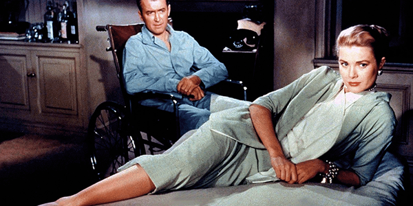
The film works mainly because of the ingenious way Hitchcock makes the set, with its vignettes, convincing as projections of Jimmy Stewart’s various states of mind, making the film from early on feel dreamlike. And it works because of Stewart’s performance. He, pre-World War II, was a good, even great, actor—his work in Mr. Smith Goes to Washington is jawdropping, even today. But he was also kind of lightweight, sometimes clownish. After the war, there’s an undeniable sense of experience behind his eyes that he was able to employ deftly in his best roles—like in the Anthony Mann westerns, in Vertigo, and here.

Not that his performance is flawless. As always with Hitchcock, there are weak moments in the script and in the direction that cause Stewart, adrift, to lapse into his patented Stewartisms. But in the hands of a more traditional Hollywood pretty boy type, L. B. Jeffries snooping out of the back of his apartment could have seemed just comic, or even diseased. Stewart creates a perfect tension between making it all seem justified and also the dangerous preoccupations of a troubled soul.

The 4K HDR presentation is a must-have for anybody who even thinks they care about movies—not because it smooths over the flaws but because it presents everything honestly, the good and the bad. Seeing Rear Window in any other format inevitably puts you at a distance from the film, which inevitably places you at too great of a distance from what’s going on in the apartments across the way. You need to see it at this resolution to get pulled back into the film, so it stops feeling quaint and again becomes relevant and compelling.

The flaws are pretty egregious. Hitchcock, of course, endlessly obsessed over how to present Kelly, but there’s a shot at 29:51, during a sequence meant to scream “beguiling beauty,” where she looks like a walking corpse. Even more jarring is a closeup at 1:50:29 of the hapless Wendell Corey that looks like it was originally part of a wider shot that was ruthlessly enlarged on an optical printer. 

For whatever reason, cinematographer Robert Burks didn’t do as good a job here as he would on Vertigo, but for everything that takes you out of the film, there’s plenty to keep you engaged. Probably no other movie has better conveyed the feel of New York at sunset, or especially at three in the morning. And, while the HDR makes its presence felt just here and there, it is an absolute revelation during the climax. Anyone who knows Rear Window will know exactly where I’m going with this, but Raymond Burr being blinded by Stewart’s flashbulbs fell solidly into the “suspension of disbelief” camp until now. Presented in HDR, those white flashes become searing, making you feel Burr’s disorientation and sense of absolute loss. Rear Window is worth seeing in this form just for that moment alone. 

The audio is “only” DTS-HD Master Audio stereo. I used quotes because the thought of somebody mucking around with Hitchcock’s innovative and masterful sound mix to take it into the land of Atmos is both terrifying and nauseating. In the right hands, it could definitely enhance the experience—but who’s got the right hands? And I think there’s a good chance an enhanced sense of spaciousness could actually end up emphasizing the one-dimensionality of a lot of the stagecraft.

The mix here does a great job of allowing you to savor what Hitchcock originally wrought, where he used mainly volume, timing, and reverb to convey the sense of voices and other sounds heard in various spaces and from various distances away. The soundtrack, as is, is so strong it could almost stand on its own as a radio play.

But allow me just a brief swipe at Franz Waxman’s score, which is the weakest link in the film. It’s not that I don’t like Waxman—his work on Sunset Boulevard represents the pinnacle of the film-scoring art—but he’s just not in sync with this film at all. The opening theme—if you can call it that—is a hackneyed pastiche of Gershwin clichés—42nd Street meets The Naked City. But what makes it really fall flat is the sense of complete disconnection from the evocative use of source cues that makes up the rest of the soundtrack. I know Hitchcock was aiming for a kind of overture as the curtains literally went up, but he missed the mark.

And then there’s that song. Another of Hitchcock’s offerings placed on the altar of Grace Kelly, it was a great idea in concept—show a composer struggling to write a song to parallel Jimmy Stewart’s conflicted feelings about Kelly and then have it all come together as an example of songwriting perfection. Problem is, the song sounds fully worked out—and not very good—from the start. Had it been great, it could have really enhanced the film—and not made the salvation of Miss Lonelyhearts look like the worst kind of Victorian contrivance. But “Lisa” is a real stinker.

I’m not a big fan of Top 10 or Top 100 or whatever lists—they’re almost all laughable when they’re not outright dangerous. So let’s just say that Rear Window, for too many reasons to ignore, is an essential. Not only does it stand on its own as entertainment for all but the most jaded contemporary audiences, but its reverberations can still be strongly felt in filmmaking in the present. In 4K HDR, it becomes not just another movie, but a glimpse of the very wellspring of cinema.

Michael Gaughn—The Absolute Sound, The Perfect Vision, Wideband, Stereo Review, Sound & Vision, The Rayva Roundtablemarketing, product design, some theater designs, a couple TV shows, some commercials, and now this.

PICTURE | This 4K HDR presentation is a must-have for anybody who even thinks they care about movies—not because it smooths over the flaws but because it presents everything honestly, the good and the bad

SOUND | The stereo mix does a great job of allowing you to savor what Hitchcock originally wrought, where he used mainly volume, timing, and reverb to convey the sense of voices and other sounds heard in various spaces and from various distances away 

Generic selectors
Exact matches only
Search in title
Search in content
Post Type Selectors

© 2023 Cineluxe LLC
Scroll to top

sign up for our newsletter

receive a monthly recap of everything that’s new on Cineluxe