• Type:
  • Genre:
  • Duration:
  • Average Rating:

Reviews

Review: Writing with Fire

Writing with Fire (2021)

review | Writing with Fire

recent reviews

Sign up for our monthly newsletter
to stay up to date on Cineluxe

Shot mostly with cellphones and inexpensive cameras, this documentary is an engrossing examination of journalism and new technology in lower-class Indian society

by Dennis Burger
March 25, 2022

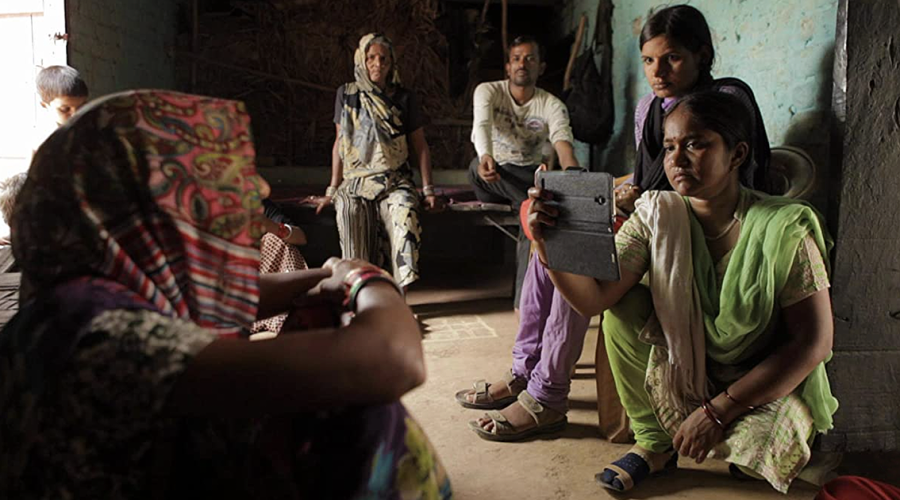
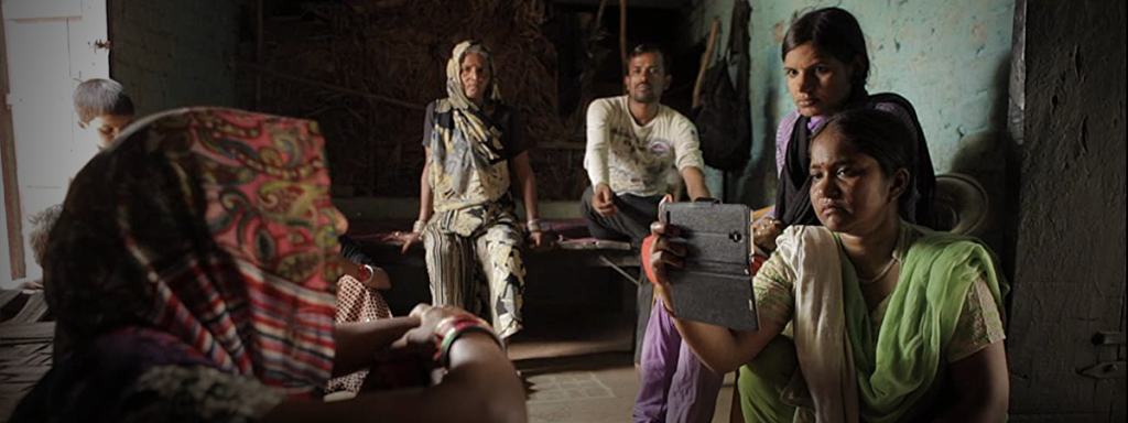
Writing with Fire, the Oscar-nomianted feature-length debut by filmmakers Sushmit Ghosh and Rintu Thomas, is as prime an example as I’ve seen lately of a documentary that serves as both window and mirror. On the surface, it follows the journalists of Khabar Lahariya, a newspaper run by Dalit women—the lowest of the lowest-class citizens of India—as they transition from operating as a small weekly paper to creating a digital enterprise that functions primarily in the new-media space.

Brewing just beneath the surface, though, is a sweeping indictment of corporate news; a discussion about finding the balance between journalism as a responsibility and media as an industry; a rumination on the critical distinction between neutrality and objectivity; and perhaps most importantly, a meditation on all the topics dissected by Edward S. Herman and Noam Chomsky in their seminal 1988 book Manufacturing Consent: The Political Economy of the Mass Media. 

How much of that is intentional I can’t know, of course. Probably very little. It seems as if Ghosh and Thomas set out to tell the story of these women in the midst of a transformational moment and deeper truths simply rose to the top. But it hardly matters. Intentional or not, they’ve created a film that contains not only resonant universal truths but also insights into a culture most Westerners can’t begin to pretend to fully comprehend. 

To give just one example: Early on, as the paper’s chief reporter, Meera Devi, discusses with her staff the importance—and dangers—of having a larger social-media presence, one of the young writers reveals that she has never even touched a smartphone. Her family only owns one between them but she has never used it out of fear of damaging it. And now she’s being told that this is an essential tool of her job. 

There’s another scene toward the middle, which will no doubt keep me awake tonight, that I wish I could put in front of everyone I know and beg them to absorb it and reflect on it. One of the three main journalists at the heart of the documentary is attending a press conference, sitting across the desk from a high-ranking police official. As she refuses to accept canned answers from him and continues to press him for the truth, a mainstream correspondent sitting behind her berates her for her dogged approach. Later, outside, he lectures her about the importance of playing nice with authority figures, of maintaining access, of offering praise before criticism. 

The film doesn’t bother spoon-feeding this to the viewer, opting instead for a show-don’t-tell approach, but this small scene serves as an especially impactful commentary on how the people for whom our institutions function at all, no matter how inefficiently, are always the first to silence those who are completely failed by those same institutions when they dare speak out. 

There are numerous other examples but they ultimately all boil down to one point: This is a study in contrasts and commonalities, of the universal juxtaposed against the deeply personal, of the unique dangers these women face placed on equal footing with the shared truths we should and would be discussing out in the open if only more of us cared. 

I wish Writing with Fire were more readily available but, best I can tell, right now it’s only available in the U.S. to rent or buy on Amazon Prime Video. A physical media release is slated for late April 2022, but only on DVD.

That old SD format is probably more than sufficient, although Prime delivers the film in HD with Dolby Digital+ 5.1 audio. There isn’t much to say about the picture, given that it was shot on, as best I can tell, a mix of cellphones and consumer-grade mirrorless cameras with a run-and-gun approach. As such, the quality of Amazon’s streaming presentation varies from shot to shot, although when conditions are right, lighting is sufficient, and the resolution is there, the picture quality is about as good as HD gets. More often than not, the source material is a bottleneck in terms of quality, though. It is what it is.

The audio, on the other hand, was a tough nut for me to crack. For about the first hour, I was distracted by some seriously weird idiosyncrasies in the mix. Ambient and environmental sounds were well placed in the surround soundfield, but voices tended to hover a few feet in front of me in the form of an amorphous and indistinct blob of ethereal audio. They even followed me as I moved from one side of my sofa to the other. Granted, I don’t understand Hindi, so intelligibility wasn’t the problem. But it was still unnerving. 

I eventually figured out that the issue was that I had my system’s Dolby Atmos up-mixing capabilities turned on, which isn’t usually a problem with films of this sort since there isn’t much to up-mix. But for whatever reason, voices are placed in both the front left and right channels here—not the center—and, worse, they’re slightly out of phase. Because of that, Dolby Surround doesn’t recognize the split vocal tracks as a common signal that should be combined and routed to the center and instead spreads them out into the surrounds and overhead speakers. When I changed my system to the Pure Direct setting—which bypasses all DSP and turns the preamp into a straight decoder, not a processor—voices took their rightful place toward the front of the room but still nowhere near the middle of the screen.

If any of the above seems critical or needlessly technical, that’s not my intention. It’s simply that I encourage you to watch and appreciate this film, and if you’re doing your watching in a home cinema environment, I want you to have the best experience possible. 

That’s not to say that Writing with Fire is perfect, even ignoring the technical shortcomings. At 96 minutes, it positively whizzes by, and there are several story threads I wish we could have sat with for another 15 or 20 minutes here and there. But I’d far rather spend time with a film that leaves me wanting more than one that overstays its welcome, even when the subject matter is as important as this. 

Dennis Burger is an avid Star Wars scholar, Tolkien fanatic, and Corvette enthusiast who somehow also manages to find time for technological passions including high-end audio, home automation, and video gaming. He lives in the armpit of Alabama with his wife Bethany and their four-legged child Bruno, a 75-pound American Staffordshire Terrier who thinks he’s a Pomeranian.

PICTURE | Because of the quality of the source material, Amazon’s streaming presentation varies from shot to shot, but when conditions are right, lighting is sufficient, and the resolution is there, the quality is about as good as HD gets

SOUND | Ambient and environmental sounds are well placed in the surround soundfield of the 5.1 mix, but voices can be indistinct and badly positioned if any kind of upmixing is employed

Generic selectors
Exact matches only
Search in title
Search in content
Post Type Selectors

© 2023 Cineluxe LLC

Review: Drive My Car

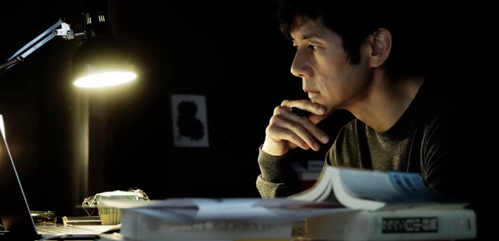
Drive My Car (2021)

review | Drive My Car

recent reviews

Sign up for our monthly newsletter
to stay up to date on Cineluxe

This Oscar-nominated Japanese film is aloof, detached, chilly, and pretentious—and more than worth it in the end

by Dennis Burger
March 23, 2022

I’ve rarely felt as conflicted as I do right now, standing in front of my keyboard, trying to collect my thoughts about Ryusuke Hamaguchi’s Drive My Car. The film is, at three hours long, an exercise in not only delayed gratification but also delayed insight. It moves at the pace of a pitch drop experiment, and by the time its opening credits rolled at somewhere around the 40-minute mark, after a long and borderline impenetrable prologue, I found myself tempted to walk away from it and not look back. Indeed, I might have done so had I not been tasked with reviewing it. 

The story doesn’t really start to congeal until somewhere near the 90-minute mark, at which point it stingily begins to dole out keys to locks it’s been forcing the viewer to fiddle and fumble with in frustration to that point. By the third act, its various thematic threads start to come together to form an incredibly impactful and moving meditation on pain, grief, language, art, solipsism, forgiveness, and self-reflection. And there’s some part of me that wants to return to the beginning with insights gleaned from the ending. But I’m not sure I will, if only because Drive My Car asks—nay, demands—that you give it as much or more than it gives you in return. 

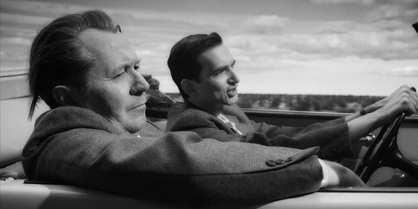
The film follows a man’s attempts to stage a multi-lingual stage production of Chekhov’s Uncle Vanya two years after the sudden and unexpected death of his wife, while also being forced to submit to having a driver at the insistence of the theater. And while I appreciate the simplicity of its story, I think the bulk of my hesitance comes from the fact that for most of its runtime, it comes across as aloof, detached, chilly, and more than a little pretentious. Looking back on the work as a whole, that’s sort of a necessary conceit to make the journey work, but there’s simply no denying that from moment to moment, it can feel laborious. 

And the look of the film does little to help you connect with its characters, environments, or quiet drama. Captured digitally in ArriRaw at 3.4K resolution and finished in a 2K digital intermediate, the imagery seems to have been processed to a degree after leaving the camera, although it’s not the typical film-look processing you might expect. Instead, it appears as if contrasts have been turned down and black levels elevated, which results in a flatness and apparent loss of saturation, all of which combines to give the picture a foggy quality. 

As of this writing, Drive My Car is only available to view in the U.S. on HBO Max, which delivers a nearly perfect presentation in HD. Given the tonal flatness of the image and the overall lack of chromaticity—really, lead character Yūsuke Kafuku’s beloved red Saab and the occasional glare of brake lights contribute more color to the film than anything else—it’s hard to imagine the picture benefiting much for an HDR grade, and there are only two minor blink-and-you’ll-miss-them instances of aliasing in the background of the image that hint at the need for higher-than-HD resolution. But only briefly. Whether they’re a consequence of the down-sampled DI or HBO Max’s encoding of the master files, I have no way of knowing. But they’re so fleeting that it feels like nitpicking to bring them up.

The film makes its way to the streaming service with its original soundtrack intact—primarily Japanese with a heaping helping of Mandarin, Korean, and English thrown in—in Dolby Digital+ 5.1. Although the surround channels are rarely employed for anything other than music, it’s a nice front-heavy mix that does a wonderful job of capturing the ambience of its environments, as well as the occasional meteorological punctuation and the droning of wheels on asphalt. Dialogue clarity is top-notch and Eiko Ishibashi’s hauntingly beautiful score is delivered with excellent fidelity. If you hadn’t guessed already, it’s not exactly home cinema demo material but you could have just as easily gathered that from the trailer. 

That doesn’t mean you shouldn’t watch Drive My Car. But nor can I heartily recommend that you do watch it. That would be like me telling you to go train for a marathon, assuming you’re physically capable. Would you find it rewarding in the end? Perhaps. Would you hate my guts for a solid 16 to 20 weeks in the leadup to the final event? Probably. 

At least with Drive My Car, your loathing would last a few hours at most, although it might feel like much more than that. Ultimately, though, I think my biggest source of ambivalence is that I desperately long for more films of this sort to be made. I very much want it to succeed, because I borderline need more writers and directors to make slow, contemplative, introspective films, especially ones that pay such rewarding dividends in the end. I just wish this one were an hour shorter, a little less repetitive, a lot less austere, and had more faith in its audience to connect with its themes without belaboring them half to death. Looking back on the experience of the film as a whole, I have to say I appreciate the hell out of it. But I just can’t bring myself to love it.

Dennis Burger is an avid Star Wars scholar, Tolkien fanatic, and Corvette enthusiast who somehow also manages to find time for technological passions including high-end audio, home automation, and video gaming. He lives in the armpit of Alabama with his wife Bethany and their four-legged child Bruno, a 75-pound American Staffordshire Terrier who thinks he’s a Pomeranian.

PICTURE | HBO Max delivers a nearly perfect HD presentation with only two minor blink-and-you’ll-miss-them instances of aliasing in the background of the image

SOUND | The front-heavy Dolby Digital+ 5.1 mix does a wonderful job of capturing the ambience of the environments, exhibits top-notch dialogue clarity, and delivers the hauntingly beautiful score with excellent fidelity

Generic selectors
Exact matches only
Search in title
Search in content
Post Type Selectors

© 2023 Cineluxe LLC
Review: Parallel Mothers

Parallel Mothers (2021)

review | Parallel Mothers

recent reviews

Sign up for our monthly newsletter
to stay up to date on Cineluxe

Almodóvar’s latest is melodrama as art, done with the flair of New Wave-era Godard

by Dennis Burger
March 22, 2022

I was recently chatting with a dear friend about a particularly awful movie I’d just finished watching. In the course of the conversation, I likened it in ways to a Rubik’s Cube that had been “solved” by someone who simply pulled off the stickers and reaffixed them, with no real understanding of the fundamentals of a standard 3×3 cube layout (e.g., red is always opposite orange, blue opposite green, etc., and the center squares of each side never move relative to one another). I won’t call that movie out, since it hardly matters. I only bring it up because Pedro Almodóvar’s Parallel Mothers also reminds me in many ways of a distinctive solution to a Rubik’s Cube.

Rather than a ham-fisted, amateur attempt at lazy deception, this film brought to mind watching my favorite blindfolded cubers, who are forced to solve the puzzle in their heads before temporarily losing use of their eyes, and who rely on complicated mnemonic memory aids that I just barely understand. If they make a mistake somewhere in the middle of the solution, they usually don’t know until it’s too late. And if they do flub a turn and somehow catch themselves and course-correct, it’s almost more impressive than a perfect solve. 

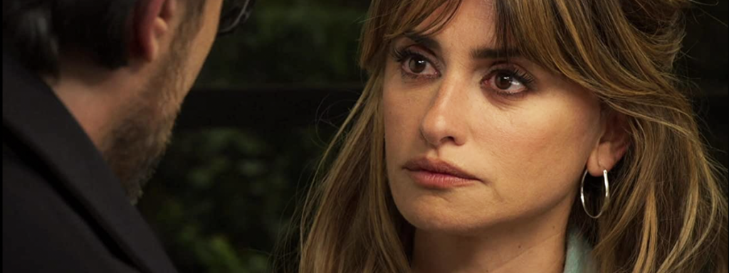
And in case it wasn’t obvious, I’m talking about Rubik’s Cubes because I don’t want to talk about Parallel Mothers on its own terms. There’s simply too much for one review to contain and far too many surprises I could spoil. But here’s the gist: The film follows two parallel storylines, both centered on Penélope Cruz’s character Janis. One follows her ongoing efforts to have a Spanish Civil War-era mass grave in her hometown excavated so her forebears and others can receive proper burials. The other involves two unplanned pregnancies and a hospital oversight that results in her newborn being swapped with another. And in weaving these stories together, Almodóvar manages to say something truly meaningful and resonant about generational differences, intergenerational trauma, and the idiosyncratic familial bonds that form between humans, related and unrelated alike.

That’s enough info to give you a sense that Parallel Mothers is ultimately melodrama. But it’s melodrama elevated to the level of art due to skillful and at times subtle scripting, meaningful character development, brilliant performances all the way around, and some cinematic techniques that occasionally reminded me of Godard’s best New Wave-period films. It’s a shame it’s not amongst this year’s Best Picture nominees since it belongs in the conversation alongside Dune and CODA as one of 2021’s better cinematic efforts. 

As of this writing, Parallel Mothers is only available in the U.S. as a PVOD rental from most major digital retailers, and I point that out because I suspect the quality of its presentation might be affected by that. Even on Kaleidescape, the film is only available in SDR, although the resolution is UHD. 

The former isn’t as impactful as you might suspect. Despite being shot digitally and recorded in Sony’s X-OCN (extended tonal range Original Camera Negative) format at 16 bits, and despite being an incredibly vibrant film with wonderful color design throughout, the image doesn’t seem to be constrained by its 8-bit presentation. I spotted a brief instance of what looked like white-clipping in one shot, but other than that, the delicious color palette and tonal scale seem to fit comfortably within the constricted gamut of SDR. 

The cinematography is exceptional and detail is at times just lovely. But—and this is a big but—there are some issues with the presentation whose causes I can’t quite figure out. The image is pretty noisy, and I’m not sure if that noise was captured in the camera or involves some sort of film-look process including faux grain. What’s more, even on Kaleidescape, there are misplaced textures and glitches of the sort you might associate with extremely low streaming bitrates—far lower than those employed by better services like Disney+ and Apple TV+. But that hardly makes sense, given that this is a full-bandwidth download. So I strongly suspect the problems come from the files provided by Sony. 

Mind you, these problems only really rear their heads at large cinematic proportions. Sitting 6.5 feet from my 75-inch display (~45.5 degrees field of view), I found the noise and the odd movement of textures distracting. When I moved back to around 7.5 feet, though (~40 degrees field of view, comparable to a 120-inch projection screen viewed from a distance of 12 feet), the image was consistently lovely, and the impact of the weird noise and apparent encoding issues all but disappeared. So if you’re viewing this in your home cinema and your preferred seat is in the first row, maybe move back to the second row. 

Kaleidescape presents the film with its original Spanish mix, encoded in DTS-HD Master Audio 5.1, with forced English subtitles in yellow. For the most part, it’s an understandably front-focused mix, aside from the score music, which often dances out into the room. But the shape of the sound mix changes near the end, thanks to some artfully employed surround effects that pull you into the screen, seemingly placing you between the camera and its subjects. It’s a neat effect, and its judicious application makes it all the more effective. 

Hopefully by the time Sony Pictures prepares the film for a proper North American home video release, the issues with the noise and funky textures will have been resolved, because this one is a keeper for me. It’s probably Almodóvar’s best film since 2006’s Volver, and it’s a damn sight better than most of this year’s Best Picture noms. Just know going in that if you rent the film during its PVOD window, you might find the somewhat flawed presentation of its lovely cinematography a little distracting—or maybe this is just what the film looks like. I honestly can’t know for sure.

Dennis Burger is an avid Star Wars scholar, Tolkien fanatic, and Corvette enthusiast who somehow also manages to find time for technological passions including high-end audio, home automation, and video gaming. He lives in the armpit of Alabama with his wife Bethany and their four-legged child Bruno, a 75-pound American Staffordshire Terrier who thinks he’s a Pomeranian.

PICTURE | The delicious color palette and tonal scale seem to fit comfortably within the constricted gamut of the rental’s UHD SDR presentation, but there are some issues with glitches, noise, and misplaced textures that seem to stem from Sony’s transfer files

SOUND | The 5.1 DTS-HD Master Audio mix is understandably front-focused, aside from the score music, which often dances out into the room

Generic selectors
Exact matches only
Search in title
Search in content
Post Type Selectors

© 2023 Cineluxe LLC

Oscars 2022: The Most Demo-Worthy Scenes

Oscars 2022: The Most Demo-Worthy Scenes

Oscars 2022 | The Most Demo-Worthy Scenes

Kaleidescape customers’ favorite scenes from this year’s Oscar nominees turn out to be—not surprisingly—great home theater demos as well

by John Sciacca
March 22, 2022

The Cineluxe reviews team has been diligently watching and reviewing as many of this year’s nominated films as possible, with 27 reviews posted. With the Oscars being handed out on March 27, there isn’t a lot of time left to check out any of the movies you may have missed. No worries! With the help of Kaleidescape, we’ve compiled a list of the top-viewed scenes from many of the nominees, giving you a chance to take a quick sample and get a taste of the film or just refresh your memory before the big event.

Besides delivering films in the highest audio and video quality available anywhere, Kaleidescape bookmarks the pivotal scenes and songs within a film. These are often the defining moments, like “The Cantina” from Star Wars: A New Hope, “Running from the Boulder” from Raiders of the Lost Ark, or “Wounded in the Buttocks” from Forrest Gump

Not too surprisingly, the three films that dominated the Top 25 scenes viewed by Kaleidescape owners were all big, action-filled blockbusters bursting with replayable, demo-worthy moments. Shang-Chi and the Legend of the Ten Rings had five of the highest-ranking scenes, including Nos. 1, 2, and 3, while Dune and No Time to Die  grabbed seven of the Top 25.

Below are some selections from the 65 most-watched scenes, with each scene’s viewing popularity rank out of the 65 and running time.

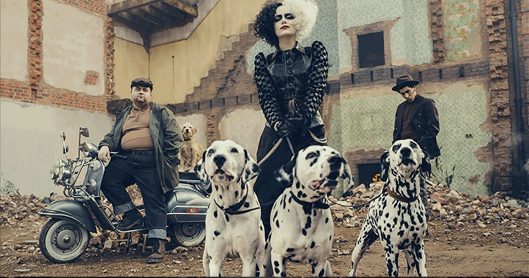
Cruella

“Cruella Has Arrived” (No. 31 |  3:55)
The film’s Oscar-nominated costume design is on fine display here as Cruella makes her grand entrance into the Baronness’s black-and-white ball. The home is filled with partygoers wearing a variety of formal outfits observing the dress code (“No color”) when Cruella makes a huge splash by first destroying a champagne tower and then burning off her white outer coat to reveal a show-stealing blood-red dress. You can practically hear each piece of glass shatter and skitter across the wood floor before music fills the room as Cruella refuses to go quietly.

“Rebelliousness Turns to Guilt” (No. 35 | 3:56)
At just 7 minutes into the film, we meet young Estella sneaking her way into a party at a mansion filled with people dressed in French Revolution-era garb (again showing off why Cruella was nominated for costume and makeup). Notice the sheer volume, variety, and attention to detail on all the outfits as the camera pans around the room, the 4K HDR transfer giving texture to all the different fabrics.

Dune (2021)

“The Harkonnens Arrive” (No. 6 | 2:20)
Coming about halfway in, this is the most traditionally sci-fi blockbuster-esque action sequence in the film, so it’s no real surprise that it’s the most popular scene from Dune. You get a really good sense of the film’s excellent visual effects and sound design. But viewed outside the context of the story, it’s mostly just “loud things go boom,” which certainly makes it appealing as home-cinema demo material.

“Saving the Miners” (No. 7 | 5:40)
A little over an hour in, this stunning rescue sequence is probably the best in the entire film for demonstrating Dune‘s seamless effects work and its innovative and intense sound design. It’s also the best subwoofer demo of the year, thanks largely to the underground undulations of the mostly unseen—but heard and felt—sandworm.

“A Test of Control” (No. 9 | 4:45)
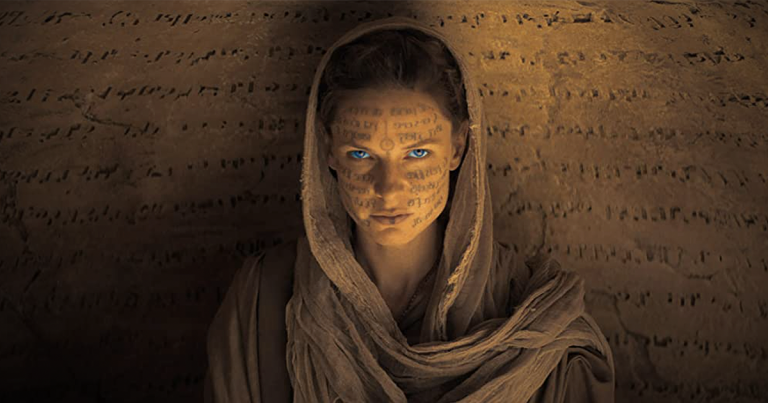
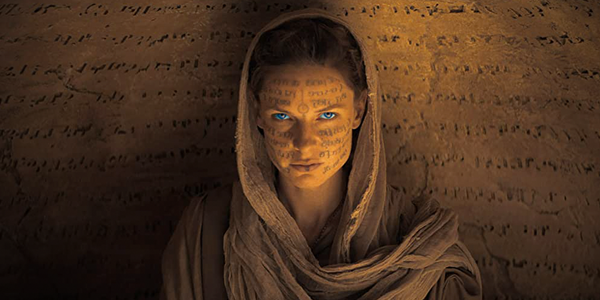
This is the scene director Denis Villeneuve had to get right for his Dune adaptation to be effective. It’s a master class in costume design, sound mixing, cinematography, and economy of storytelling, and the performances are simply spot-on. HDR grading is also brilliantly used to add depth and nuance to an incredibly dark scene. 

Encanto

“We Don’t Talk About Bruno” (No. 16 | 3:36)
Never doubt the musical prowess of Lin-Manuel Miranda, who co-wrote this catchy tune you’ve probably heard even if you haven’t watched Encanto, as it recently hit No. 1 on the Billboard Hot 100 chart, making “Bruno” the second Disney song ever top reach No. 1! (“A Whole New World” from Aladdin was the first to do so in 1993.) My daughter Audrey loves this song and plays it on Spotify all the time! The Atmos mix helps you appreciate the layering of voices during this ensemble number, which completely fill the room and come from all sides.

“The Family Madrigal” (No. 20 |  4:16)
This song plays right after the opening title comes up and is my personal favorite from the film, introducing us to all the members of the family Madrigal and their special gifts. Note the bright vibrant colors—especially the flowers that bloom around Isabella—and the glowing gold on the family’s doors. The music is the sonic star of the Atmos soundtrack, giving voices space to spread across the front of the room and even up into the ceiling. It also helps you better understand Miranda’s signature rapid-fire lyrics.

Free Guy

“Getting His Own Sunglasses” (No. 19 | 3:12)
At 11 minutes in, Guy, beginning to realize he can be something special, decides to stop being an NPC and fight back against a bank robber. Once he puts on the glasses, he sees the world in a whole new light, filled with bright graphics and power-ups. The audio definitely immerses you in Free City, with a jet that flies overhead, along with sounds of helicopters and traffic off in the distance.

“Dude vs. Guy” (No. 26 | 4:46)
At 1 hour 28 in, this scene is the Boss Fight, with Guy having to fight a super-sized—yet unfinished—version of himself named Dude. Dude’s Death Blow punches produce room-energizing bass, but Guy has some power-ups of his own and there are a couple of great MCU and Star Wars tie-ins that are sure to bring a smile to your face.

Luca

“The Swim to Portorosso” (No. 8 | 1:11)
At 27 minutes in, this scene highlights the bright and beautiful colors throughout Luca, as Luca and Alberto swim to “Vespa town” (aka Portorosso), jumping in and out of the water as they change from sea monster to human and back. Pixar’s animation skills in rendering the ocean—both above and below—and the varied shades of blue are on full display.

“First Time Houseguests” (No. 12 | 3:05)
Luca and Alberto visit Giulia and her dad for dinner, trying to keep their secret from the great fisherman. Notice the attention to detail throughout the scene— from the fine detail in dad’s sweater, to the glassware, to the trenette al pesto he prepares, where you can see the noodles slick with olive oil and highlights on the basil leaves.

No Time to Die

“We’re Leaving” (No. 4 | 5:16)
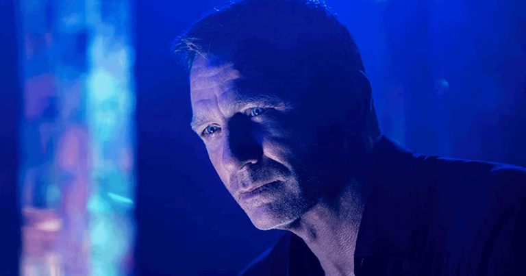
At 18 minutes in, this takes place shortly after the scene below, but it is one of the film’s highlights, and if you ever wanted to see the glorious Aston Martin DB-5 from Goldfinger flex its muscles, this scene is for you! Bond races through the curvy, stone-paved Italian hills before being “trapped” in the city center. The audio is fantastic, with the screech of tires and the revving engine, the chime of church bells filling the room, and the hail of gunfire and thunk of bullets hitting into the bullet-resistant glass coming from all around, placing you in the car with Bond—right up until he decides to let the DB-5 unleash Hell!

“Cemetery Visit Cut Short” (No. 5 | 2:46)
Occurring 15 minutes in, the scene begins immediately after Bond is blown up after visiting an old friend’s grave. He gives chase on foot across an old bridge in Southern Italy but is ambushed by armed gunmen in a car and motorcycle. Bond ultimately steals the bike and makes a bold getaway, but pull your eyes away from the action long enough to appreciate the cinematography. It’s filled with wide vistas and an ancient city in the background, all beautifully illuminated in the naturallighting.

Raya and the Last Dragon

“A Betrayal of Trust” (No. 50 | 4:54)
At 15 minutes in, young Raya shows her tribe’s sacred dragon gem to Namaari, who decides to steal it for her tribe. During the struggle to take the gem, it shatters, releasing the Druun, whose touch turns people to stone. This is another showcase for HDR, with the dragon gem glowing a beautiful blue-white in the dark inner temple, and the Druun having a vibrant glowing-purple effect. The sound design is also great, with deep bassy rumbles and crackling stones as the gem shatters and the temple starts collapsing, causing people to flee in all directions.

“Tail’s Dragon Gem” (No. 55 | 4:13)
Here a grown Raya is partnered with last dragon Sisu as they retrieve another lost piece of the dragon gem. Fine details in the animation abound, from Sisu’s fur, to Raya’s leather arm band, to the individual leaves on the tree, to the vest worn by Namaari. Near the end, the exploding toot-and-boom bugs leave a vibrant cloud of HDR-glowing colors before Ray and Sisu jump on Tuk Tuk and roll to freedom, riding off a cliff into the water.

Shang-Chi and the Legend of the Ten Rings

“The Battle Begins” (No. 1 | 5:33)
Near the film’s end, this is the prelude to the big finale as two armies face-off in Ta Lo. Note the wide-open outdoor sounds of wind rustling leaves and water in the quiet opening moments. Once the fighting starts, the mystical weapons have vibrant blue and red-orange colors enhanced by HDR, and this battle involves dozens of fighters fighting and being tossed all around the room. The scene ends with a battle between Shang-Chi and his father Xu Wenwu, which is fast and full of action.

“The Ten Rings” (No. 2 | 2:26)
Taking place a few minutes after the above scene, Shang-Chi continues his battle with Xu and takes control of the mystical rings. The visual effects are on full display here, with the rings encircling and protecting Shang-Chi and Xu fighting with his own set of rings that he uses as a whip, with the rings glowing and crackling in bright colors. This scene also has some great low-frequency extension, with impacts that will flex your subwoofers and energize the room.

“A High-Rise Obstacle” (No. 3 | 4:52)
At 38 minutes in, this scene has all the ingredients for a great demo—a clear beginning and end, easy to understand, lots of action, and it doesn’t spoil the film! Shot at night outside a high-rise building in Macau, it has a much different look than the other scenes. Shang is trying to escape a group of assailants as he scrambles around on scaffolding, while also keeping friend Katy safe. Night city scenes always look beautiful in 4K HDR, and this has plenty of pop from the surrounding buildings and great depth of field as you look down through the scaffolding. There is also a lot of Atmos audio excitement with things smashing, crashing, and falling all around.

West Side Story

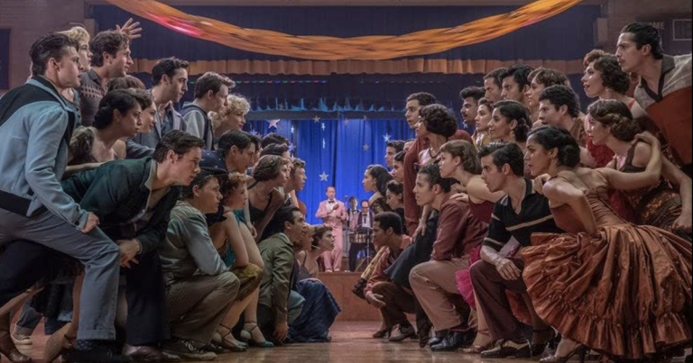
“Tony Meets Maria” (No. 62 | 2:47)
This takes place about 39 minutes in, after the terrific, long single-take shot following The Sharks into the gym and the Mambo dance. A meet-cute between Tony and Maria under the bleachers at the big dance, the scene is lit in dreamy pink and blue lighting, with bright lights streaming in through the bleachers illuminating the dance happening a world away behind the characters. The ill-fated couple meets on neutral ground, dance-flirt for a bit, and start falling in love.

“The Rumble” (No. 65 | 7:24)
Happening at the hour-forty mark, this is the climatic territorial showdown between the Jets and Sharks. Taking place in a dark warehouse with bright light streaming in through the windows, the camera circles the fighters and pulls back into long shots, with the audio showing off the space’s wide-open, echoing acoustics.

Probably the most experienced writer on custom installation in the industry, John Sciacca is co-owner of Custom Theater & Audio in Murrells Inlet, South Carolina, & is known for his writing for such publications as Residential Systems and Sound & Vision. Follow him on Twitter at @SciaccaTweets and at johnsciacca.com.

Generic selectors
Exact matches only
Search in title
Search in content
Post Type Selectors

© 2022 Cineluxe LLC
Review: The Adam Project

The Adam Project (2022)

review | The Adam Project

recent reviews

Sign up for our monthly newsletter
to stay up to date on Cineluxe

This latest Ryan Reynolds/Shawn Levy collaboration might not be Free Guy but it makes for a family-friendly action comedy

by Roger Kanno
March 23, 2022

Netflix’ latest big-budget feature, The Adam Project, is brought to you by director Shawn Levy and star Ryan Reynolds, the same people who created Free Guy. In this family-friendly action-comedy, Reynolds plays Adam Reed, who travels back in time to save his wife and fellow time pilot while enlisting the help of his childhood self along the way. It’s not of the same caliber as Back to the Future—no time-travel film has yet come close to equaling that Robert Zemeckis classic—nor is it as much fun as Free Guy, but Reynolds is his usual engaging self and Levy’s direction and the overall production is polished and proficient.  

The fast-talking, almost constant banter from Reynolds can become a bit much at times, but there are plenty of exhilarating action scenes to keep the film moving along at a nice clip. And although it is mostly family-friendly, it’s rated PG-13, so there is some cursing and it does get more serious and a little sentimental part way through. There is excellent support from Mark Ruffalo and Jennifer Garner as Adam’s parents. They don’t capture the chemistry they had in 13 Going on 30, but they too are their usual appealing selves. Netflix has produced some excellent dramas recently—The Irishman, Uncut Gems, and Roma among others come to mind—but their blockbuster action films have not yet been able to equal the success of those dramas. Nonetheless, The Adam Project is an amusing diversion even if it fails to break any new ground. 

Contributing to the enjoyment is how wonderful it looks on a high-quality display. There are a few instances where the Dolby Vision picture streamed from Netflix broke up slightly, such as scenes with explosions and a lot of smoke and fire filling the screen, but these were infrequent. Much of the film takes place during overcast days or at night, but the lighting always remained consistent and natural with extremely dark black shadows and excellent HDR details. For instance, as the young Adam walks through a forest at night, objects directly in the beam of his flashlight are perfectly illuminated, while reflected light reveals a lot of detail in faces and background objects. So while the scene is very dark overall, there are still plenty of visual cues such as the dampness of the glistening undergrowth. Then when he stumbles upon the time jet’s crash site, the glowing embers gently falling from the tree tops really pop against the dimly lit, starry sky.  

Many of the scenes exhibit a stylized blue-green tinge, and the picture has a somewhat soft character, giving the movie an almost film-like quality as opposed to the hyper-detailed look of a lot of films shot on digital. While the lighting is extremely natural and captures the languid beauty of cloudy skies and misty outdoor locations shot in the Pacific Northwest, the CGI time-jet scenes can be a little over the top and look cartoonish, although that suits the light-hearted nature of the film.

The sound design is also first-rate and presented in a satisfying and enveloping manner in Dolby Atmos with aggressively mixed action sequences often accompanied by great classic rock songs. This movie might not elicit the urge to create a mixtape as with Guardians of the Galaxy and its memorable soundtrack, but I couldn’t help but bob my head and tap my toes as Steve Winwood belted out the vocals from “Gimme Some Lovin’” during the time-jet dogfighting scenes. The final fight scene features hand-to-hand combat choreographed to Boston’s “Foreplay/Long Time” and judicious use of the surround and height channels, so the constant action is all around with some very deep bass effects to make your audio system really rumble. 

I’m really looking forward to the more adult, upcoming R-rated collaboration between Levy and Reynolds in Deadpool 3. In the meantime, the extremely active Dolby Atmos surround mix and excellent visuals delivered in Dolby Vision, help make The Adam Project an entertaining movie to enjoy with the family.  

Roger Kanno began his life-long interest in home cinema almost three decades ago with a collection of LaserDiscs and a Dolby Surround Pro Logic system. Since then, he has seen a lot of movies in his home theater but has an equal fascination with high-end stereo music systems. Roger writes for both Sound & Vision and the SoundStage! Network.

PICTURE | The Dolby Vision image looks wonderful, with extremely black shadows and excellent HDR details, although scenes with smoke and fire can cause it to break up slightly

SOUND | The Atmos mix presents the first-rate sound design in a satisfying and enveloping manner, with aggressively mixed action sequences often accompanied by great classic rock songs

Generic selectors
Exact matches only
Search in title
Search in content
Post Type Selectors

© 2023 Cineluxe LLC
Review: Citizen Kane

Citizen Kane (1941)

review | Citizen Kane

also on Cineluxe

Sign up for our monthly newsletter
to stay up to date on Cineluxe

Perhaps the most innovative and audacious movie ever makes the move to 4K

by Michael Gaughn
March 21, 2022

No matter how you slice it, a 4K HDR release of Citizen Kane is a big deal. Whether or not you agree that it’s the greatest American film, it is undeniably a hugely important one, and its leap to UHD is inevitably to going draw more attention than it would for most other movies.

So let’s get this out of the way: If you come to this expecting an audio/video experience that’s significantly better than has been delivered on the earlier home releases of Kane, you’re going to be disappointed. If you’re approaching Kane for the first time and are expecting the 4K to help sell you on the film, it likely won’t. And if you’re skeptical of Kane and its reputation, this release could very well help shore up your biases.

That’s not to say you shouldn’t check it out—you should; but just don’t expect the picture or sound to be any kind of tremendously revelatory experience. Adjust your expectations accordingly. There are revelations here, but they’re mostly reserved for attentive viewers already familiar with the film who are willing to tolerate some pretty erratic fluctuations in the presentation. For them, it will be the first home release that even hints at what Kane was like when it was released in May 1941.

The good stuff first: There are certain shots—typically medium shots and closeups —that have a subtle gradation and a luminous quality that suggest what Kane looked like when the first prints were struck. Since the original negative is lost, it will never be possible to confirm that conjecture but, if true, it suggests that Orson Welles and cinematographer Greg Toland were going for a much more nuanced look than was usually found in Hollywood films. And, if true, it was likely a (successful) effort to give Kane a quiet emotional resonance, to help temper the often blind and sometimes brutal actions of its lead character.

Taking in those shots, and then imagining that look applied to the whole film, Kane becomes a different experience—one very similar to my recent encounter with the 4K HDR release of A Clockwork Orange, which had never felt right in any of its earlier home releases. Orange is a nasty film, but Kubrick never meant for it to be that relentlessly nasty, and seeing the cinematography finally done right gave it wit and verve, restoring the original aesthetic balance.

Certain shots in Kane have a startling depth and subtlety very much reminiscent of what Alfred Stieglitz was able to achieve with the platinum prints of his photos. (See, for instance, the shots listed in the “Reference Images” sidebar.) Little of the rest of Kane in this 4K release—and none of Kane in the earlier home releases—looks much like this, and it’s hard to know how many of those deviations in the look, sometimes extreme, are attributable to having to make up for the lost negative, for the elaborate compositing and optical printing used in many of the shots, or other factors. 

All of the above might sound like esoterica—it’s not. If Kane was meant to have a look more toward those tighter shots I cited, then we’re talking about a different, and more profound, film. “Rosebud” has frequently been dismissed as just a gimmick, a way to keep the audience hooked during Welles’ elaborate time-jumping, but if the original photographic style was meant to give certain shots and scenes a subtle but sustained emotional subtext, then Rosebud becomes something much more than a sop for the masses.

It also goes beyond just being a gratuitous reference to Marion Davies’ pudenda. Famously, the film opens with Kane’s death and it effectively ends when he staggers across the terrace after Susan’s departure. That moment has never really carried its proper weight before, and I suspect that’s because Susan has never been properly presented before. You have to literally see how much Kane is projecting onto her to glimpse the core of the film and to fully understand what drives his character.

Like I said, this transfer is a bit of a mess and its visual inconsistency will likely throw the casual and uninitiated, who might be better off approaching the film through a lower-res presentation, where a lot of the unevenness would be smoothed over. But it’s a tantalizing opportunity for anyone who’s wondered whether Kane deserves its reputation. Yes, you have to work at it, but the dividends are huge.

Because it’s hard to nail down exactly what contributed to which flaws, there’s little point in listing all the various problems with the transfer. But I need to point to two things in particular. Many of the shots seem unnecessarily contrasty and harsh, abuzz with noise that doesn’t seem to be organic grain. And somebody needs to be slapped with a big penalty for consistently pushing the whites to 100 percent. That is not how this film was meant to look. The various white-on-black title cards all stick out jarringly—partly because of that extreme whiteness, partly because they look static, frozen. (Titles were created knowing they would be run through a film gate and reflected off a screen.) 

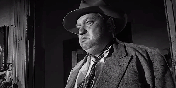
Just as bad are the moments when certain whites are pumped so hard they make some of the scenes look artificially digital. One is the end of the scene in Bernstein’s chairman-of-the-board office where the flames in the fireplace are so distractingly bright they look matted in. Another is Kane’s dress shirt during the legendary low-angle confrontation between him and Leland, which is so white it occasionally seems to float in mid air, independent of Welles’ body.

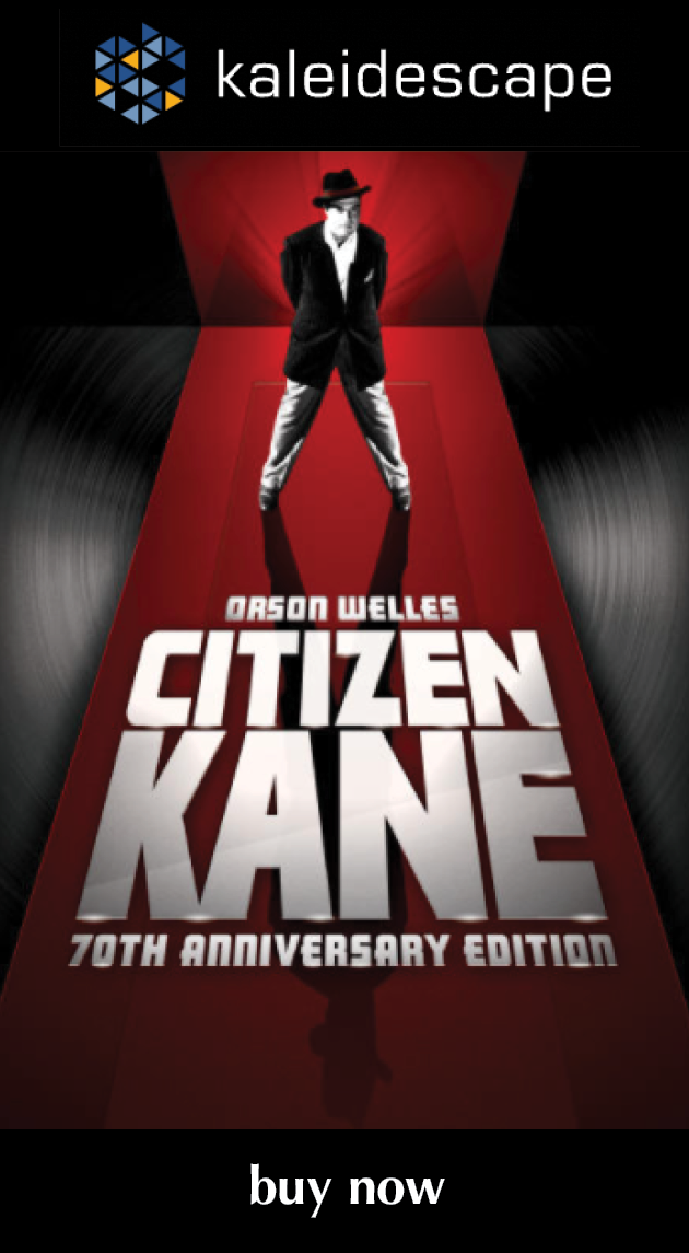
One last little bit of carping on my way out the door: Why does this release, from the transfer to the extras to even the cover art, feel so half-hearted and perfunctory? It’s like all involved vaguely understood this is an important film but they weren’t really into it. The extras are the same stuff that’s been floating around for decades, presented in a somewhat slapdash way. Kane, of all films, cries out for some context and some new perspectives—there are none here. The cover art looks like it was thrown together in about 20 minutes in Photoshop by some office lackey. What gives?

Does Kane deserve its reputation? Hell, yeah—every square inch of it. And mainly not for the reasons that are usually trotted out. Welles, with this film, beat the studio system at its own game and reinvented filmmaking. The problem is that his innovations were so radical—and I’m talking about things, like thematic material, aesthetics, and the reflexive deployment of movies, that go well beyond technical considerations—that it took more than 50 years before even some of it, half-digested and mostly superficially, began to make its way into mainstream filmmaking. Eighty one years on, we have barely even begun to mine this particularly rich vein, and there are good reasons to think we never will.

Michael Gaughn—The Absolute Sound, The Perfect Vision, Wideband, Stereo Review, Sound & Vision, The Rayva Roundtablemarketing, product design, some theater designs, a couple TV shows, some commercials, and now this.

PICTURE | The transfer’s visual inconsistency will likely throw the casual and uninitiated. But the upping in resolution creates a tantalizing opportunity for anyone who’s wondered whether Kane deserves its reputation.

SOUND | The track exhibits an impressive dynamic range but, for Jiminy’s sake, opt for mono not stereo because that’s how it was meant to be heard

Reference Images

52:26 | medium closeup of Emily Kane
Chapter 15 | the closeups of Susan during her first meeting with Kane
1:01:33 | Emily Kane and her son at the political rally 
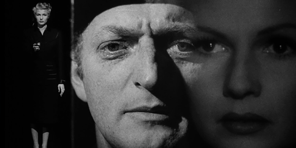
1:30:54 & 1:30:59 | the alternating closeups of Kane and Susan during her opera performance

Generic selectors
Exact matches only
Search in title
Search in content
Post Type Selectors

© 2023 Cineluxe LLC

Review: Spider-Man: Far From Home

Spider-Man: Far From Home (2019)

review | Spider-Man: Far From Home

the MCU on Cineluxe

recent reviews

Sign up for our monthly newsletter
to stay up to date on Cineluxe

This second entry in the third franchise reboot helps firmly cement Spider-Man’s position in the MCU

by John Sciacca
September 20, 2019

Like James Bonds—and maybe even Batmans—people undoubtedly have a favorite Spider-Man between Tobey Maguire, Andrew Garfield, and Tom Holland, the latest webslinger to wear the red and blue. For me it has less to do with the man behind the mask—although, I’ll admit to being partial to Holland’s portrayal—and more to do with the storyline and relationships that makes the latest Spider-Man films the best of the bunch.

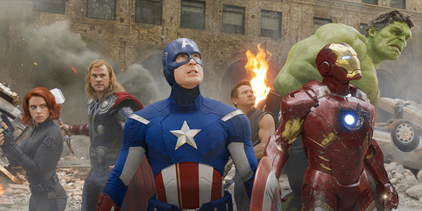
This third franchise reboot can trace its roots back to Captain America: Civil War, where Tony Stark (Robert Downey Jr.) took young Spidey under his Iron wing, gave him a better suit, and helped him in his fight against Cap and the Avengers. That mentor relationship continued in Spider-Man: Homecoming, Holland’s first turn carrying a film as Peter Parker and Spidey and one that, thankfully, didn’t make us relive the entire “bit by a spider, hunted down my uncle’s killer” origin. Of course, Spider-Man’s relationship with Tony Stark played a role in both Avengers: Infinity War and Endgame, and Far from Home picks up and continues that storyline.

There will be some major story spoilers if you’ve yet to see Endgame, as much of Far from Home’s first act revolves around the ramifications of both Infinity and Endgame. So I would strongly suggest watching both of those films first—plus, they’re just a ton of fun to watch.

Home picks up about 8 months after Endgame, and the world has come to call this time “the Blip.” We get a nice bit of exposition in an opening newscast from Peter’s high school, where we find how the kids are dealing with the ramifications of the Blip, where some have missed five years of their lives, while others who were previously much younger are now older. (If you’ve seen Endgame, you understand.) Peter is still personally reeling from Stark’s death, and he sees signs of Tony/Iron Man literally everywhere. 

During a class trip to Europe, Peter is called on by Nick Fury (Samuel L. Jackson) to help a new superhero, Quentin Beck/Mysterio (Jake Gyllenhaal), who comes from another earth in the Multiverse, battle giant Elementals bent on destroying the planet. Peter is reluctant to help, wanting to just have a chance to relax and be a kid and profess his love for MJ (Zendaya), but Fury rearranges the trip’s itinerary to continue putting Peter in a position to help. Of course, not all is as it seems, and Peter is forced to make some tough decisions while trying to win the girl, save his friends, and keep his identity secret.

As I mentioned, it’s the continued relationships developed over the years of the MCU that make these latest Spidey films so much more enjoyable and feel so much richer. In Home, we get Happy (Jon Favreau) trying to step in as a Stark mentor replacement, while also romancing Aunt May (Marisa Tomei), who looks terrific here. Fury is trying to restructure after losing so many Avengers, and trying to get Spider-Man to step up to fill a bigger role. 

The relationship between Peter and man-in-the-chair Ned (Jacob Batalon) continues, but complicated by a new romantic interest, along with douchey Flash Thompson (Tony Revolori), who admires Spider-Man but loathes Parker. The humor is deftly handled, and there are several references to other Marvel characters. (Pay close attention to the movie options Peter browses for his in-flight film!)

Definitely stick around for both the mid-credits scene—which potentially alters Peter’s life forever—and the post-credits scene, which has a nice callback to another recent Marvel film. And, while it in no way impacts the movie, there is sadly no Stan Lee cameo here.

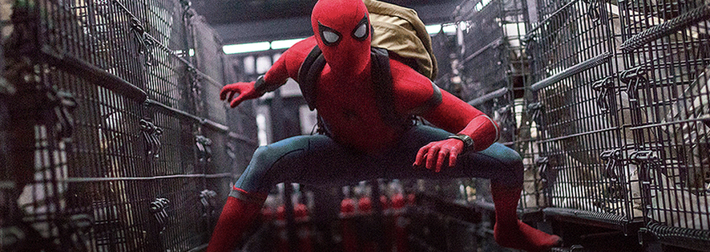
Far from Home looks fantastic. Filmed in a combination of 2.8 and 3.4K resolution, this transfer is taken from a 2K digital intermediate but it is never wanting for pop or detail. This is a marquee title and it absolutely looks it. Both closeup and long shots have great detail and texture and razor-sharp edge detail with incredible depth and dimension—things like the metallic texture of Spidey’s Iron Spider suit or the fine detail in Ned’s hat. 

The film travels through three major European cities, which all have their own look. While in Venice, many of the scenes are outdoors during the day, and the city looks so beautiful you could be watching a travelogue. At night, interiors are lit by the soft glow of lamps, revealing warm and natural colors. In contrast, much of the scenes in Prague are at night, and we get the bright lights and color of fireworks at a carnival.

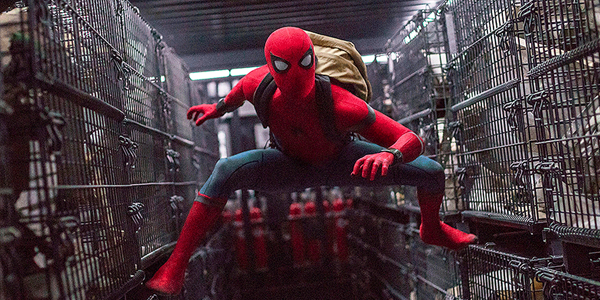
Home definitely benefits from the high dynamic range and wide color gamut of UltraHD, and both are used well throughout to push images to their best. From the vivid red of Spidey’s suit, to Mysterio’s green blasts, to the broiling red-orange of the Fire Elemental, images pop off the screen when they should. Also, HDR just lends an overall better sense of depth to the image. Black levels are also deep and clean, with clear differences between shades of black, such as Happy’s black suit, Peter’s black shirt and pants and Fury’s black leather trench coat and turtleneck. The images are all reference-quality and offer no room for criticism.

The Dolby Atmos track is also an absolute treat, with near constant and aggressive use of the surround and height speakers. There’s a scene in a hotel in Venice where you hear workers hammering overhead even with no visible construction happening on screen, which is a great audio moment letting you know exactly what’s going on even without seeing it. 

The battles also offer a complete hemispherical experience, with things crashing and being destroyed all around or water splashing and raining down from the ceiling. Another scene where Spidey is inside the Illusion has voices swirling constantly overhead, moving from speaker to speaker all around and above you, creating a sonic illusion I don’t think I’ve heard in any other film. 

Available now for download in 4K HDR from the Kaleidescape Store a full two weeks before the physical disc is released, Spider-Man: Far from Home is a fun and engaging movie that looks and sounds fantastic, making for a great home cinema selection. 

Probably the most experienced writer on custom installation in the industry, John Sciacca is co-owner of Custom Theater & Audio in Murrells Inlet, South Carolina, & is known for his writing for such publications as Residential Systems and Sound & Vision. Follow him on Twitter at @SciaccaTweets and at johnsciacca.com.

PICTURE | The transfer is taken from a 2K digital intermediate but is never wanting for pop or detail

SOUND | The Atmos track is an absolute treat, with near constant and aggressive use of the surround and height speakers

Generic selectors
Exact matches only
Search in title
Search in content
Post Type Selectors

© 2023 Cineluxe LLC
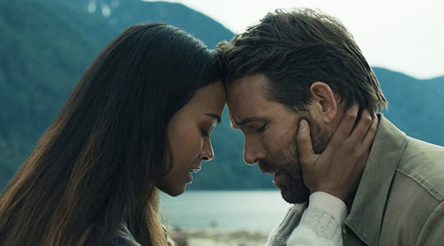
Review: Spider-Man: No Way Home

Spider-Man (2021)

review | Spider-Man: No Way Home

This billion-dollar-grossing endorphin rush is packed with demo scenes that will give your home theater a workout

by John Sciacca
March 18, 2022

Many people had looked at the recent dire returns at the box office and declared the death of commercial cinema. But then along came Spider-Man: No Way Home to shatter all manner of box-office records: Highest-grossing film (by far) in 2021 after just two weeks at the box office, sixth highest-grossing film ever, first film since Star Wars: The Rise of Skywalker in 2019 to gross over $1 billion, third-fastest film ever to reach the Big B milestone, and first to do so in the pandemic era. 

So, clearly, if you give the people what they want, they’ll come back to the theater to see it. And what they want seems to be the escapism of big-budget superhero films. (Need further proof? The Batman is currently the highest-grossing film of 2022. No Way Home is second.)

This is the third film in Tom Holland’s Spider arc and is a direct sequel to 2019’s Spider-Man: Far From Home, but much in the way Avengers: Endgame was the culmination of 11 years and 21 films’ worth of Marvel Cinematic Universe buildup, No Way Home is far more than just a single film. And while it’s certainly possible to enjoy this movie on its own, to really appreciate the entirety of the story you should at least watch the two previous Holland films. 

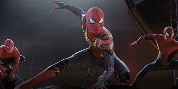
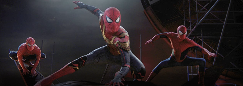
But those looking for the deepest dive and the most emotional connection (and payoff) should also revisit the original Tobey Maguire Spider-Man trilogy (2002, 2004, and 2007) and the Andrew Garfield The Amazing Spider-Man (2012 and 2014) films as well as the animated Spider-man Into the Spider-Verse. Fortunately, this is a perfect time for a rewatch as all of those films (with the exception of the first Spider-Man) are available in 4K HDR with new Atmos mixes via Kaleidescape, and I can attest that they all look and sound fantastic, with some really exciting and immersive surround. 

No Way Home begins immediately after the mid-credits scene from Far From Home, right after Mysterio (Jake Gyllenhaal) frames Spidey for the UK attacks and then announces to the world that Spider-Man is really Peter Parker, with the film’s first act having Peter (Holland), girlfriend MJ (Zendaya), and best friend/guy-in-the-chair Ned (Jacob Batalon) coming to terms with the world suddenly knowing Peter’s identity. 

Of course, when you’re friends with a wizard named Doctor Strange (Benedict Cumberbatch), you can just ask him to cast a forgetting spell that makes the world forget who Spider-Man is. But when Strange is interrupted during the casting process, well, the broken spell causes a rift in the multi-verse, drawing people from other universes.

I really enjoyed this movie, and it is up there as one of my favorites in the entire MCU. I saw it in the theater and couldn’t wait to watch it again at home, and I’m happy to say that not only did it hold up on a second viewing, the 4K HDR picture and Dolby TrueHD Atmos sound from the Kaleidescape download were truly reference-quality throughout.

Shot on Arri at 4.5K, this transfer is taken from a 2K digital intermediate but you’d never know it as images are pristine and full of detail throughout. From the opening moments, you’ll notice just how clean, clear, and razor-sharp everything looks, letting you appreciate all the texture and detail of Spidey’s suit. Edges of buildings are also sharp and clearly defined with no jaggies or aliasing. There’s also a ton of depth to the images, with several shots appearing near 3D such as when Spidey is swinging along or an overhead pan looking down on the city from way up, and another shot in a cemetery with the individual branches and limbs of a tree having a ton of dimensionality. You also get incredibly fine facial detail on closeups or the ability to see individual grains of sand that drop and shift off one character. 

The HDR grade gives the images a ton of pop but also delivers really natural-looking outside daytime shots on the city streets or low-lit interior and exterior night shots. There are a few shots at sunset that have a wonderful warm, golden glow, and also some scenes in Strange’s “crypt” lit by low overhead lights casting the room in nice shadow. 

One scene that really stood out was after a nighttime attack on an apartment building where there was hazy smoke all around. In the chaos, there are car headlights, flashing police lights, fire, and even lasers. There’s a ton happening here visually compounded by all the light diffusing through the smoke and darkness without any banding or other video artifacts. 

While black levels throughout the film are mostly deep, the opening credits, end credits, and one complete fade to nothing in the middle of the film are just a dark grey—noticeably far lighter in color than the pure black of the letterbox bars above and below the image. Having become accustomed to the utter and complete blackness my Sony OLED can produce, this was worth mentioning.

Other highlights include Spidey’s suit, which is a deeply saturated red, effects like Doctor Strange’s magic with its glowing golden rings, bright blasts of electricity that crackle and streak across the sky, the vibrant greens of the Daily Fix studios and monitors, and a vibrant purple that rips across the sky. 

The Dolby TrueHD Atmos soundtrack will give your theater a workout with tons of immersive audio that comes from all around and overhead. There are lots of small atmospheric moments like winds that whistle and the echo of voices while talking in Strange’s mansion, water drips falling around the room in Strange’s crypt, the wide-open sounds of a forest at night, or the general traffic noises in the city. 

There are also plenty of the big, demo-worthy surround moments you’d expect, including numerous helicopters throughout that hover high up in front of the room or sail off into the sides and back or zip overhead. Other examples include a scene where a glider swoops overhead, or one inside the “mirror dimension” when the sound wraps up from the sides and overhead, or when a villain flings cars and items that crash and smash all around. Or check out the magic circles that swirl overhead and around the room, or when Peter goes on top of a car and you hear his voice travel overhead and across the top of the room. 

There’s also plenty of deep low-frequency info for your sub to dig into and energize the room. Whether it’s the heavy thunk of Strange’s doors opening or closing, the massive impact sounds of one villain’s arms smashing and grabbing things, the crackle and rumble as the multi-verse tears open, shattering concrete and collapsing girders, or bombs exploding, the bass is big and tactile. 

At 148 minutes, No Way Home is long, but it’s so filled with action, characters, humor, and heart-filled moments that it zips by. By the time you get to the finale—which is huge, cinematic, and full of heart, risk, and payoff, and crammed with effects and sonic bombast—you’ll have that endorphin rush that almost feels like you’ve completed a workout. This movie is reference-quality throughout, and is easy to recommend! 

Probably the most experienced writer on custom installation in the industry, John Sciacca is co-owner of Custom Theater & Audio in Murrells Inlet, South Carolina, & is known for his writing for such publications as Residential Systems and Sound & Vision. Follow him on Twitter at @SciaccaTweets and at johnsciacca.com.

PICTURE | The transfer is taken from a 2K digital intermediate but you’d never know it as images are pristine and full of detail throughout 

SOUND | The Atmos soundtrack will give your theater a workout with tons of immersive audio that comes from all around and overhead 

Generic selectors
Exact matches only
Search in title
Search in content
Post Type Selectors

© 2023 Cineluxe LLC
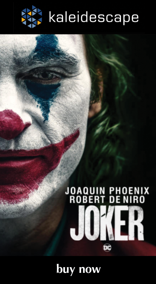
Review: Joker

Joker (2019)

review | Joker

recent reviews

Sign up for our monthly newsletter
to stay up to date on Cineluxe

More character study than comic-book epic and definitely not an exercise in escapism, this genre evocation of ’70s NYC is very much anchored in Joaquin Phoenix’s performance

by Dennis Burger
December 18, 2019

I had to watch Todd Phillips’ Joker twice to write this review. And it required two viewings because I realized, as the credits rolled the first time, I had absolutely nothing meaningful to say about the video transfer or the sound mix. From beginning to end, I was so hypnotized (and horrified) by Joaquin Phoenix’ performance as the titular character that I honestly forgot I was supposed to be reviewing a home video release. 

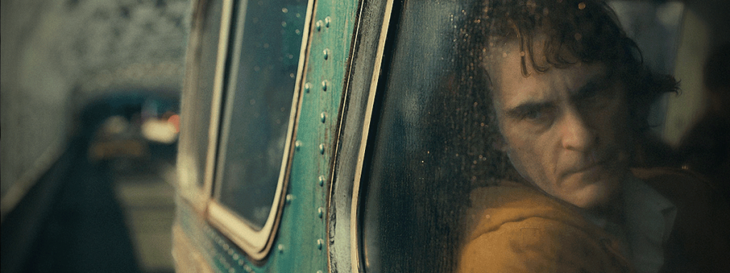
Had I gone ahead and put fingers to keyboard after that first viewing based on my hazy impressions, I would have told you a story about a grungy, filmic 4K HDR transfer that evoked the gritty neo-noir classics of the 1970s and ’80s. It took a second pass to realize that Joker’s cinematography is actually pristine, which makes sense given that it was captured digitally in a mix of 3.4K, 4.5K, and 5.1K resolutions, and finished in a 4K digital intermediate. It’s the set dressing, the lighting, the framing, and indeed the movement of the camera that evokes the look of the cinematic era the film aspires to. When you get right down to it, though, Joker is an objectively gorgeous film with a wonderfully revealing home video presentation.

The sound mix, too, would have gotten an inaccurate assessment had I not gone back for a double-dip. Hildur Guðnadóttir’s brilliant, minimalist cello score would have certainly been the focus of my discussion, as it dominates the mix, or at least one’s memory of it. But other than that, nothing really stuck to my ribs in terms of the overall delivery of audio, aside from a few distant ringing phones, ignored in the background, which struck me as being rendered with a wonderful illusion of space.

It wasn’t until the second time through that I even realized the soundtrack for the Kaleidescape release of the film is Atmos, but you shouldn’t take that oversight as an indication that the mix is subtle. Focusing more on the technical presentation than the performance at the heart of the film, it’s an ambitious and at times aggressive mix, one that uses its height channels to enhance the vertical elements of the filth-ridden cityscape of Gotham. (Not the stylized Gotham of the Burton or Nolan films, but a blatant homage to the New York City of ’70s cinema.) The fact that I barely noticed the height channels the first time is as much a credit to the artistry of the mix as it is to Phoenix’ mesmerizing performance. As with the imagery, the sound simply works in service of the narrative and never serves to distract from it. 

If it seems as if the only aspect of the film itself I can focus on is the acting of its lead, there’s a reason for that. Joker isn’t story-driven. It’s as pure a character study as I’ve seen in ages. For those of us who love comic books and the movies based on them, it’s easy to go into a film like this—ostensibly an origin story about a character who has never had a consistent canonical backstory—with a ton of baggage. The thing is, though, Joker isn’t interested in your baggage. It isn’t interested in the 79-year history of the character as Batman’s archnemesis. Hell, it isn’t interested in Batman at all. Indeed, the overall mythology of Gotham City and its most famous residents is so tangential that it could have been left out of the film altogether and it wouldn’t have had any major effect on the plot, what little of it there is. 

Director/co-writer Phillips seems so completely uninterested in any of the normal trappings of comic-book films that to call this a comic-book film at all feels dishonest. To discuss it in relation to the four-color serialized stories on which it is (very) loosely based would be to miss the point entirely. To understand the film, we have to view it for what it is: An exploration of the internal and external forces—personal and societal—that combine to create not merely a villain or a criminal but an unabashed agent of chaos, one that is, in this film, more man than myth.

In exploring all of this, Phillips touches upon a lot of conflict familiar to modern audiences—wealth inequality and the rage of the working class aimed at the apathetic ruling class, the failures of bureaucracy, media bias, our weird attitudes toward mental illness, our complex and often contradictory attitudes toward nonconformity. 

As I mentioned, there isn’t a lot by way of plot here and it’s often difficult to figure out what Phillips wants us to take away from the film on any of these topics. Indeed, in the supplemental material included with the Kaleidescape download (and due to be included on the UHD Blu-ray release in January), he claims that the film isn’t really about any of these things. I’m not sure I buy that. I think it was easier to hide behind that dismissal than it was to admit that he doesn’t really have the answers—he simply wants us as an audience to do some of the heavy lifting and accept the unique part we play in creating such monsters, individually and collectively.

But it’s entirely possible you’ll come away from the film with completely different impressions than I did about whatever underlying message there may be. I, for example, couldn’t help but read into the narrative some serious thematic exploration about agency and free will, both topics I think about quite a bit. But in a few brief discussions with others who’ve seen the film, I seem to be alone in that, at least within my friend circle.

A lot of that has to do with how abstract Joker is at times. I referred to it as pure character study, and I stick by that. There are plenty of wonderful actors sharing the screen with Phoenix, namely Zazie Beetz, as well as Robert De Niro, whose character is largely a nod to The King of Comedy, a film that very much inspired elements of this one. But Arthur Fleck, aka “Joker,” is the film’s only real character. 

As well as pure character study, Joker is also pure cinema—a work of art that simply couldn’t have existed in any other form than as a motion picture. Imagery and audio sit in the passenger seat alongside character development and story just sort of seems to be dragged along for the chaotic ride, hanging onto the rear bumper for dear life (and I assure you, I don’t mean that as a slight in any way).

That focus on fundamental human truths combined with the undeniable ’70s and ’80s aesthetic keep Joker from feeling too zeitgeisty, despite the current subject matter it grapples with. There is one thing, though, that betrays the film as absolutely not a product of the era it emulates. Many parallels have been drawn between Joker and Taxi Driver, and they’re not unfair. One crucial difference, though, is that this film’s titular character could not, in any light, be viewed as a hero or anti-hero or anything other than a force of nature unleashed by circumstance and his own weaknesses. To write it off as a mere mashup of Taxi Driver and The King of Comedy, would be intellectual laziness of the highest (and snottiest) order. 

Phillips walks a very thin line: He wants you to understand this character without sympathizing with him. He doesn’t want you to want to watch the world burn—he simply wants you to recognize and acknowledge why some people do. And as with the best interpretations of this character (or at least the character that goes by this name) in print and on screen, Phillips wants you to admit that, as wrong as he may be and as dangerous as he may be, there’s an alluring element of truth behind the Joker’s lies, and refusing to admit as much is why we struggle to honestly understand the seemingly senseless acts of violence that have become so commonplace they barely register in the 24-hour news cycle unless the body count is truly catastrophic. To tiptoe right up to that line without crossing over into the territory of glorification is perhaps this film’s neatest trick.

In the end, though, I can imagine some viewers taking uncomfortable issue with this approach, with the lack of moralizing, the lack of overt condemnation for this murderous clown. Speaking for myself alone, I don’t think the film needs it. I think it’s implicit. I can’t imagine anyone cheering at the end of this cinematic tone poem. Then again, I didn’t see Joker in commercial cinemas, and I’m glad I didn’t. Because anything other than slack-jawed silence as its credits rolled would have confirmed my worst suspicions about humanity.  

Viewed at home, via my own AV system, with no rustling snack packaging, whispering, cellphones glaring from the peripheral, or obtrusive snickering at the two or three overt references to comics history the film makes when it serves its purposes—in other words, taken on its own terms, and viewed without distraction—I can honestly say that this is one of the best films of 2019. 

I can also say, without hesitation, that it’s one I’ll return to again and again, to meditate on its themes, its red herrings, and most importantly one of the most captivating, heartbreaking, frustrating, and fascinating character portrayals I’ve witnessed in ages. But it almost seems vulgar to discuss how beautifully shot it is, and how wonderful this home video presentation preserves its sumptuous cinematography.  

Dennis Burger is an avid Star Wars scholar, Tolkien fanatic, and Corvette enthusiast who somehow also manages to find time for technological passions including high-end audio, home automation, and video gaming. He lives in the armpit of Alabama with his wife Bethany and their four-legged child Bruno, a 75-pound American Staffordshire Terrier who thinks he’s a Pomeranian.

PICTURE | Joker’s cinematography is pristine, resulting in an objectively gorgeous film with a wonderfully revealing home video presentation

SOUND | This is an ambitious and at times aggressive Atmos mix that uses its height channels to enhance the vertical elements of the filth-ridden cityscape of Gotham

Generic selectors
Exact matches only
Search in title
Search in content
Post Type Selectors

© 2023 Cineluxe LLC
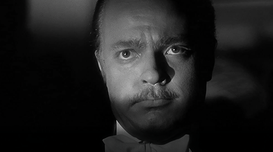
Review: Parasite

Parasite (2020)

review | Parasite

recent reviews

Sign up for our monthly newsletter
to stay up to date on Cineluxe

Kaleidescape offers a sumptuous 4K HDR presentation of this 2020 Best Picture recipient 

by Dennis Burger
January 15, 2020

Three thoughts occurred to me pretty much simultaneously as I sat and reflected upon Bong Joon-ho’s Parasite as the closing credits scrolled by. Thought the first: How on earth am I going to say anything meaningful about this film without spoiling the entire experience? I’ve never been one for rehashing plots, so it’s easy enough to shy away from giving away story beats or plot twists. What a film means and how well it’s made are generally far more interesting to me than the what-had-happened-was of it all. 

With Parasite, though, the themes are so nuanced and ever-evolving that to go down that road would be to rob you of half the experience of watching the film. Just as you think you’ve figured out what Parasite is really about, it becomes about something subtly different, in a way that seems shocking at first but utterly inevitable in retrospect. 

Thought the second: What a fascinating counterpart to Todd Phillips’ Joker this film is. It isn’t, I think, a spoiler to say that on the surface Parasite is about wealth inequality and class struggles, territory Joker explored as well. But while Phillips uses this thematic kick-starter primarily as fuel for one of the most enthralling character studies of the past few years, Bong uses it as the bedrock of a tightly scripted narrative that doesn’t merely encourage rapt attention—it downright demands it. 

While Joker lives or dies by Joaquin Phoenix’ improvisation, and indeed feels like it could have been cut together a hundred different ways resulting in a hundred different films, Parasite by contrast comes across as a meticulous orchestration that hinges upon every piece of punctuation in the screenplay. Shorten one lingering glance or snip one line of dialogue, and I can’t help but feel as if it would be akin to playing Rush’s “YYZ” in 4/4 time. 

Of course, comparisons between the two films can only go so far, as one is a drama based on a comic book and the other is a wholly original black comedy that morphs into farce before shifting gears into thriller territory before evolving into . . . well, something else altogether. And yet, I can’t help but see the two films as opposite sides of the same coin—perhaps due to the proximity of their release? Maybe. But it feels like there’s a deeper connection going on here, something both zeitgeisty and timeless. 

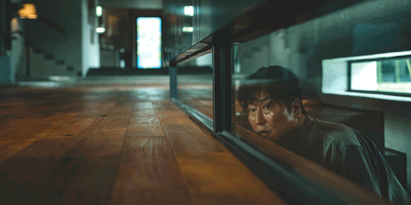
In addition to surface thematic similarities, the films do share one other thing in common: Stunning cinematography and absolutely unimpeachable home video presentations. Kaleidescape’s UHD HDR release of Parasite wonderfully presents the 4K digital intermediate of the film, which was shot on Arri Alexa 65 cameras and captured at 6.5K resolution. The transfer doesn’t lean too heavily on intense highlights but has a high-contrast look that makes most use of its expanded dynamic range at the lower end of the value scale. Colors are simply sumptuous, but more than anything else, it’s cinematographer Hong Gyeong-pyo’s eye for framing and composition that makes Parasite such a visual feast.

Kaleidescape presents the film with your choice of 5.1 or stereo sound, both in Korean despite being labeled as English. There are no caption options, as subtitles are baked into the transfer and positioned within the 2.39:1 frame. 

There will be some controversy, I’m sure, over the fact that Universal decided to release the film without its original Atmos soundtrack here in the U.S. This is true of both its digital release now as well as its disc release (Blu-ray only, no UHD) later in the month. Interestingly, other local distributors (The Jokers Films in France, for example) are delivering Parasite with its object-based audio intact, and I’ll admit even I’m intrigued to hear what that sounds like, because the surround mix is as bold and cheeky as the film itself. Aggressive pans from the surround soundstage into the front channels are employed frequently, though not gratuitously, to redirect the viewer’s attention and extend the fabricated reality of the film out into the room.

If I had to speculate about why we’re not getting Atmos in the U.S. (and let’s be clear here, this is nothing more than speculation), I would guess that the 5.1 option we’ve received is a new nearfield mix intended for the relatively more intimate confines of home theaters or media rooms. Whatever the reality, it’s hard to complain about such a brilliantly crafted audio experience, and it does up-mix quite nicely into Atmos, if that’s your preference. 

Thought the third: If Parasite wins a condescending Best International Feature Film Oscar and gets snubbed for Best Picture, I’m going to pitch a hissy. (And I say this as someone who normally puts as much stock in the Academy Awards as I do the serving-size suggestions on a box of Cheez-Its.) This isn’t the sort of token foreign film Hollywood trots out every year and then dislocates its collective shoulders in an effort to pat its own back for patronizingly celebrating a film with subtitles. It’s a universally applicable work of art whose themes resonate across cultural boundaries. 

It’s also one of those rare films that manages to be both poignant and approachable. It asks tough questions without offering pandering answers and it somehow manages to not be even slightly opaque in the process. Quite frankly, if it doesn’t win Best Picture, I can only assume it’s because the Academy jealously recognizes that few modern American directors would have had the courage to make this film, at least not in quite this way.

Dennis Burger is an avid Star Wars scholar, Tolkien fanatic, and Corvette enthusiast who somehow also manages to find time for technological passions including high-end audio, home automation, and video gaming. He lives in the armpit of Alabama with his wife Bethany and their four-legged child Bruno, a 75-pound American Staffordshire Terrier who thinks he’s a Pomeranian.

PICTURE | Kaleidescape’s UHD HDR release wonderfully presents the 4K digital intermediate of the film, with a transfer that doesn’t lean too heavily on intense highlights but has a high-contrast look that makes most use of its expanded dynamic range at the lower end of the value scale

SOUND | The 5.1 surround mix is as bold and cheeky as the film itself. Aggressive pans from the surround soundstage into the front channels are used to redirect the viewer’s attention and extend the fabricated reality of the film out into the room.

Generic selectors
Exact matches only
Search in title
Search in content
Post Type Selectors

© 2023 Cineluxe LLC
Scroll to top

sign up for our newsletter

receive a monthly recap of everything that’s new on Cineluxe