• Type:
  • Genre:
  • Duration:
  • Average Rating:

Reviews

Review: Turning Red

Turning Red (2022)

review | Turning Red

related reviews

Sign up for our monthly newsletter
to stay up to date on Cineluxe

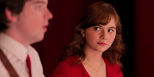
The latest Pixar offering falls squarely into so-so territory, way closer to Luca than Soul

by John Sciacca
March 14, 2022

The term “dumping ground” certainly has negative connotations but it seems an apt description for how Disney has been using Disney+ for recent Pixar films. Once the crown jewel of animated titles, expected to generate upwards of $1 billion in worldwide box office per film, the past three Pixar features, including its latest, Turning Red (which debuted on Friday March 11), have all skipped the theater and been released directly onto the streaming service without even requiring the add-on “Premier Access” fee for early viewing.

One of the things you typically expect from Pixar is a multi-faceted story that appeals across multiple generations. At the studio’s best—Inside Out, Toy Story 3, Soulit creates stories and characters with so much depth and emotion it can bring viewers to tears. (I swear, the end of Toy Story 3 gets me every time.) 

While it was beautiful-looking, I felt Pixar’s last film, Luca, was an especially weak and overly sweet entry in its oeuvre, especially following Soul, which tackled such deep and heady topics. I’d like to say the studio returned to form with Turning Red, its 25th feature, but it just lacked the depth I was hoping for. 

Red is directed and co-written by Domee Shi, who previously helmed the 2018 Pixar short Bao, which I thought was wonderful. In that sub-eight-minute film, she gave us a full emotional story arc that made us care for a dumpling that served as a metaphor for the mother’s love for her son and him growing up.

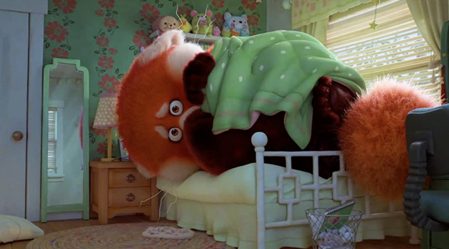
Shi clearly understands and is interested in sharing Chinese culture, and she doesn’t stray from that here. Meilin (Rosalie Chiang) is an overachieving 13-year-old girl currently in Grade 8 growing up in Canada. She has a ride-or-die crew of three friends who are starting to notice boys and want nothing more than to see boy-band sensation 4*Town in concert when they come to Toronto during an upcoming tour. But, of course, Meilin’s tiger mom, Ming (Sandra Oh), has objections to this. Complicating things is that, due to an ancient family blessing/curse, Meilin—like all the women in her family when they reach a certain age—has started suddenly transforming into a large red panda whenever she gets too excited or is overcome with emotions. And, as a teenager, this is nearly all the time. 

In some ways, Turning Red reminded me of a different take or follow-on to Inside Out, however not as brilliant or entertaining. But this is more of an “outside in,” as we see all the external things Meilin is going through and how they affect her emotions. As the parent of a teenage daughter, there’s a lot that’s relatable here and the “not a girl, not yet a woman” purgatory that can be the teenage years. The film’s core message is about growing up, changing, and developing into adulthood and discovering your own self, but without disappointing family or leaving it behind. 

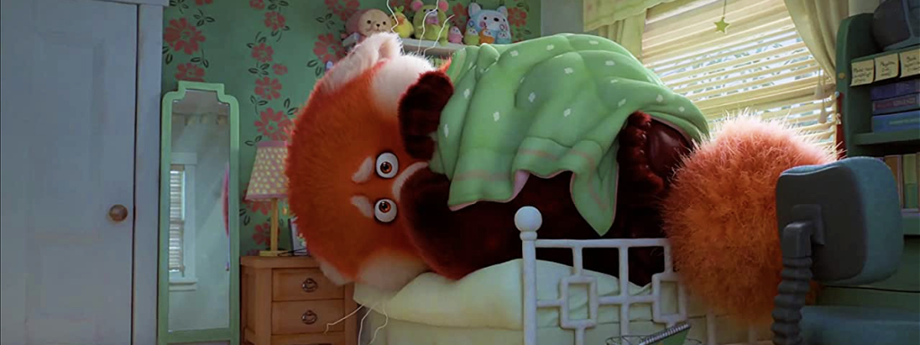
One area where I’m happy to say Pixar is still very much on point is picture quality. The studio seems to raise the bar on the technical capabilities of its computer animation with each film, and that is certainly on display here. Turning Red is visually stunning, and you could pick any frame and dissect the shading, texturing, lighting, and detail that went into it.

Taken from a 4K digital intermediate, the subtle textures really stood out. Things like the texture in a metallic name tag Meilin wears working at the family temple, the tight herringbone pattern in a hat, a rubber dodge ball, the fuzzy/furry textures of Meilin’s stuffed toy animals, or the natural shimmer and texture of the fabric on the emerald-colored blazer Ming wears. And the detail and movement in the fur work when Meilin is Red Panda is a clear evolution from Sully in Monsters Inc. 

The animators show incredible attention to even the smallest details, such as single strands of stray fabric on a hat or sweater or a loose strand of hair. In one scene, Meilin is shown in profile lit by moonlight through a window, and you see these fine tiny hairs on her chin and neck. Or notice the smoke curling off the incense sticks in the temple as it softly coils and winds its way towards the ceiling while slowly dissipating. 

There is definitely more stylized animation here. For example, when characters are overwhelmed by something’s cuteness, they will get large, starry manga eyes, and there are also a lot of lighting effects that are very anime-inspired. There’s a scene about 9:30 into the film where the dad is cooking that’s especially stunning, causing everyone in our family to literally say, “Wow!” at the same instant. It’s near photo-realistic animation that is just beautiful to behold, and I’d happily watch an entire show of nothing but the dad preparing a meal in that style and quality. Also, stay through the end credits for another scene that is incredibly lifelike.

There is plenty of red here, which is an extremely auspicious color in Chinese culture, and the HDR with Dolby Vision grade helps it to really pop, as do the many scenes around town colored with bright pinks and pastels. Also notice the color shading in Meilin’s red hair, with its blended layers and shades of red, orange, and yellow. Near the end, she visits a magical bamboo forest where there are a lot of vibrant and glowing lighting effects. 

The Dolby Atmos soundtrack has a good bit of atmosphere and immersion but, like with many of Disney’s recent sound mixes, I found myself pushing the volume knob about 5 dB louder than usual. The mix’s primary goal is clearly presenting the dialogue and it pulls that off well, but there’s a nuance to the quality of the audio here depending on the environment where characters are speaking. For example, voices in Meilin’s small, tiled bathroom have a completely different tonal quality than when they’re speaking inside the temple or shouting in the bamboo forest. 

Outdoor scenes have plenty of ambient surround effects such as traffic sounds, or thunder that cracks and rolls overhead, or the rustling of bamboo branches and leaves in a forest. Notice the calming Zen music and gentle, room-filling chimes, the winds that blow through the temple, the voices chanting all around you, or the arena atmosphere at the 4*Town concert. 

Your subwoofer gets a bit of work, giving some serious heft to the panda’s giant footsteps, or when Meilin poofs into the panda during one especially embarrassing moment at school, or for the panda’s booming voice, or during the concert.

Turning Red seems to have critics and audiences split, with critics giving it a 95% Rotten Tomatoes rating, matching both Soul and Wall-E, and audiences scoring it a more mediocre 66%, closer to The Good Dinosaur’s 64%. While I didn’t find Turning Red to be among Pixar’s strongest outings, it’s entertaining and looks fantastic, and certainly worth checking out for Disney+ subscribers. 

Probably the most experienced writer on custom installation in the industry, John Sciacca is co-owner of Custom Theater & Audio in Murrells Inlet, South Carolina, & is known for his writing for such publications as Residential Systems and Sound & Vision. Follow him on Twitter at @SciaccaTweets and at johnsciacca.com.

PICTURE | Subtle textures really stand out in the 4K presentation, and the near photo-realistic animation is just beautiful to behold

SOUND | The Atmos soundtrack has a good bit of atmosphere and immersion but, as with many of Disney’s recent mixes, is about 5 dB softer than it should be

Generic selectors
Exact matches only
Search in title
Search in content
Post Type Selectors

© 2023 Cineluxe LLC
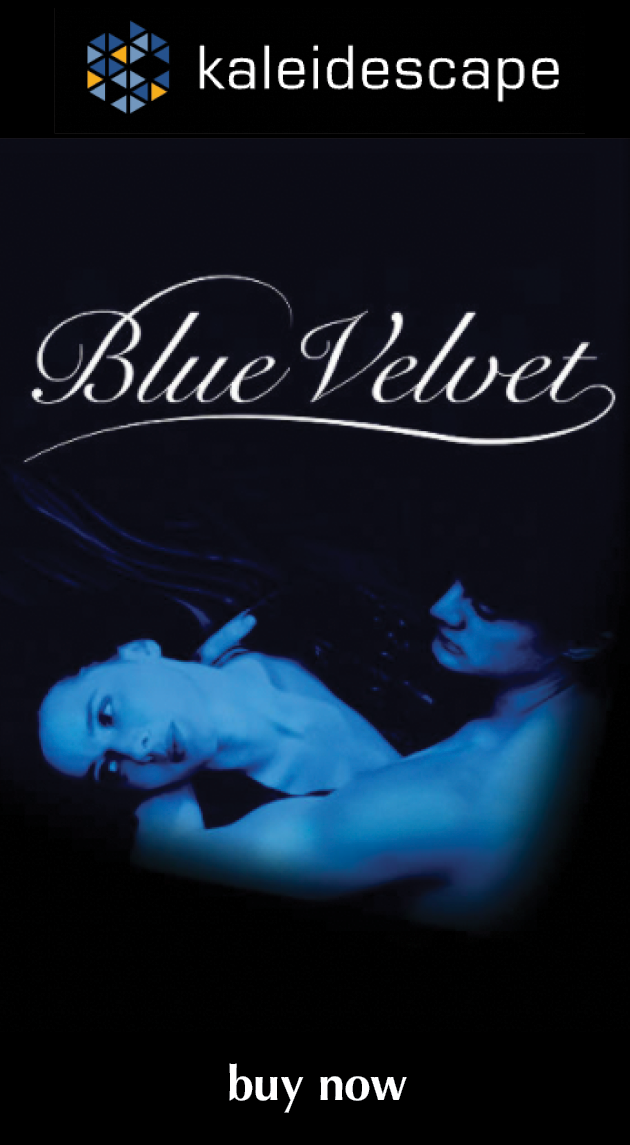
Review: Blue Velvet

Blue Velvet (1986)

review | Blue Velvet

also in Reviews

Sign up for our monthly newsletter
to stay up to date on Cineluxe

David Lynch’s breakthrough effort is still a compelling viewing experience but, in retrospect, proved to be a harbinger of what’s worst about contemporary film

by Michael Gaughn
January 23, 2021

I used to be a huge David Lynch fan. His films were a welcome relief from the increasingly juvenile and shrill mainstream fare of the ‘80s and ‘90s without the pretentiousness and unearned seriousness of typical Oscar fodder. And they were, for the most part, fun to watch, even exhilarating.

But I also had my doubts. Something about his work never quite aligned the way it should. Each movie was ultimately less than the sum of its parts, seeming to deliver as you watched it but quickly dissipating after the lights went up, scattering as quickly as the dreams he has always tried to ape.

And there were always efforts along the way that were just plain indigestible—the mercilessly vicious and cruel Wild at Heart, the pointlessly incoherent Lost Highway, and the just plain pointless Inland Empire. 

On the other hand, I’ve always liked the much derided Fire Walk with Me, for some reason, and have a soft spot for The Straight Story. Mulholland Dr. might be the one film of his people will still look at 50 years from now, thanks mainly to Naomi Watts’ performance—although they might jump ship once they realize it means having to put up with Justin Theroux for two hours. 

The thing that sealed all of my doubts about Lynch and morphed those doubts into a kind of disgust was the misguided and inept Twin Peaks reboot. As with most reboots, it gave hardcore fans, who are by definition uncritical, exactly what they wanted. But for those who appreciate unique experiences and the passé notion of quality, it was all half-baked, nasty, and relentlessly ugly.

The point of this potted history was to bring us to the film that really set the whole “Lynch” thing in motion, Blue Velvet. Until then, he only had a glorified student film that became a glorified cult film, a dull portrait of a historical freak, and a completely disjointed and uninteresting sci-fi epic under his belt. Velvet not only finally established his career but also launched all of those mannered, fetishistic tropes that defined the Lynch brand—the arch little faux Dali jokes, the ambiguous images and actions and gestures and phrases and stylistic splashes that were meant to be dreamlike but ultimately meant even less than dreams, the politically motivated retrograde embrace of the 1950s, the dipping into his record collection to parasitically create unearned emotional effects, and the raw sadism we were supposed to accept because it was the unfiltered upwelling of the unconscious or something. Beyond, and because of, all that, it ultimately helped launch the most corrosive trends in the history of the movies, resulting in our current atrocity-based cinema. But I’ll get to that.

It’s probably been a decade since I last watched Blue Velvet so I was able to approach it with somewhat fresh eyes, and it still works. It’s still a compelling piece of filmmaking that leaves you feeling like you’ve experienced something—although my sense of what that something is has changed considerably over the years.

One of the reasons it still works is that it has a rudimentary plot with something resembling emotional hooks. Of course, it’s a pretty lousy excuse for a story and daring somebody to retell it accurately is an all but guaranteed way to win a bet, but it at least acts as a kind of dog fence for reining in all of Lynch’s various indulgences, lending something resembling form, unlike the inchoate and dull randomness of most of his other work.  

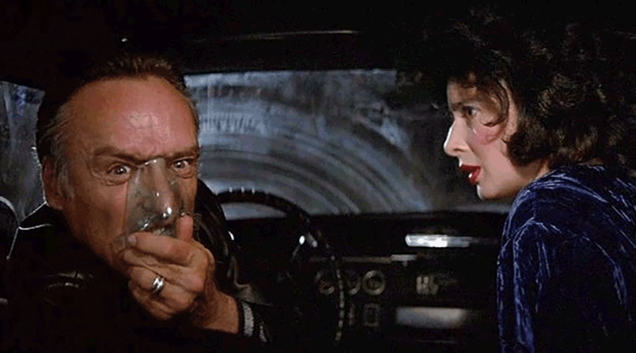
But what really struck me on this viewing is just how much Dennis Hopper makes this film. He is Blue Velvet. Kyle McLachlan is a far from riveting screen presence and Laura Dern’s gangly awkwardness can make their scenes together uncomfortable to sit through. But once Hopper appears, everything clicks neatly into place and the film leaps from being a stylistic exercise to something worth watching. 

Hopper always struck me as a one-note actor—when he wasn’t raging, he wasn’t anything. But he perfectly channels all of that here, convincingly making pure rage equal pure evil and making you wonder if all the treacly stuff at the beginning and end isn’t just insincere pretext. Most people would assume Lynch meant McLachlan to be his onscreen surrogate, especially after all the Agent Cooper crap in Twin Peaks. But I seriously have to wonder, especially in light of the rest of his career, if Lynch didn’t really feel most at-one with Hopper’s Frank Booth. McLachlan is kind of a nugatory presence but Hopper is the well-head of all energy.

Frederick Elmes’ hugely influential cinematography is still effective—but the film’s low budget was a little more obvious this time around and runs the risk of being even more blatant when Velvet eventually makes the leap from HD to UHD. There’s the dirt on the lens during the famous opening pan down from the improbably blue sky and an obvious screen-door effect from a lens filter during the early shot where Jeffrey crosses the field where he’ll discover the severed ear. Also, the heavy reliance on wide-angle lenses causes curvature on the edges of the frame that becomes distracting and then annoying, and ultimately dates the film. 

Alan Splet’s equally influential sound design is still intriguing, but since it’s not always clear what it’s in the service of, it’s almost like listening to an abstract exercise in musique concrète. Blue Velvet deserves credit, though, for being one the first films to make a convincing case for using surround sound for something other than the usual bludgeoning mayhem.

Angelo Badalamenti’s score is, let’s say, interesting, mainly a Schoenberg pastiche (you get the sense Lynch was using Verklärte Nacht for a temp track) interspersed with some not very convincing cop-drama cues. It has the saving grace of having been done with an actual orchestra, unlike the more watery synth-driven stuff Badalementi tended to lean on in Lynch’s later films.

There is no denying that Blue Velvet contains some brilliant filmmaking, that parts of it have a purity of execution that’s invigorating and rare. And if that was all that was relevant to judging a film, Lynch could be considered one of the great directors. But there’s something at the heart of this movie that’s just depraved, something that Lynch’s frequent flashing of his TM Get Out of Jail Free card just can’t absolve. Blue Velvet remains disturbing because it’s disturbed—there’s just no other way to slice it.

And that presents the biggest rub. Lynch helped make amoral depravity fashionable. It’s not like he didn’t have a lot of help, but he, with this film, pretty much single-handedly created its art-house wing. And he opened the floodgates for every other callow entitled type who could hide their fundamental immaturity behind dazzling exercises in style to trash anything that could be considered serious filmmaking. Without Lynch, there is no Fincher—or PTA or Spike Jonze or Aronofsky or any of the other aesthetically or morally half-born types we now bank our notions of “serious” filmmaking on. 

Of course, this raises questions of whether these directors—or the machines that have their names attached to them—actually influence the culture or just reflect it. This isn’t the place to go into that, and what I feel is the correct answer is far from fashionable. All I can say is that the perception of Blue Velvet, and of Lynch, would be far different if the film had remained an exception, if hadn’t been a harbinger, if it hadn’t become the rule.

Michael Gaughn—The Absolute Sound, The Perfect Vision, Wideband, Stereo Review, Sound & Vision, The Rayva Roundtablemarketing, product design, some theater designs, a couple TV shows, some commercials, and now this.

PICTURE | Frederick Elmes’ hugely influential cinematography is still effective—but the film’s low budget runs the risk of being even more blatant when Velvet eventually makes the leap from HD to UHD. 

SOUND | Alan Splet’s equally influential sound design is still intriguing, but since it’s not always clear what it’s in the service of, it’s almost like listening to an abstract exercise in musique concrète 

Generic selectors
Exact matches only
Search in title
Search in content
Post Type Selectors

© 2023 Cineluxe LLC
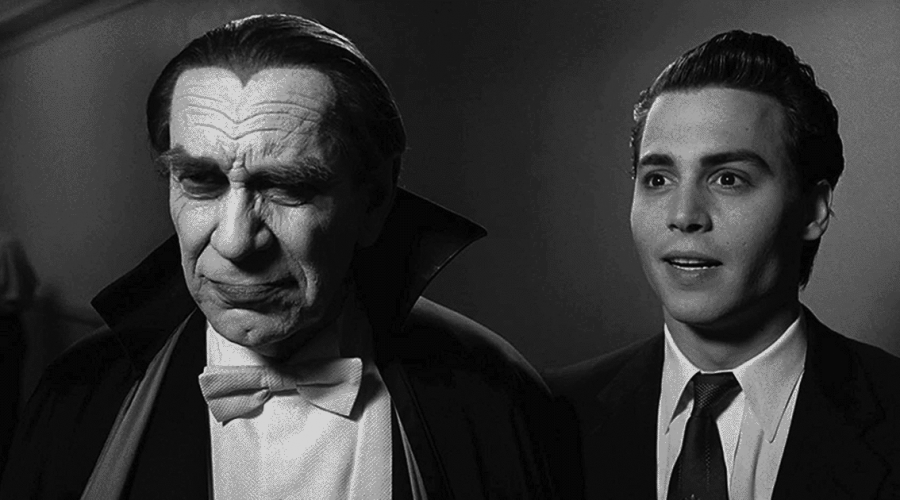
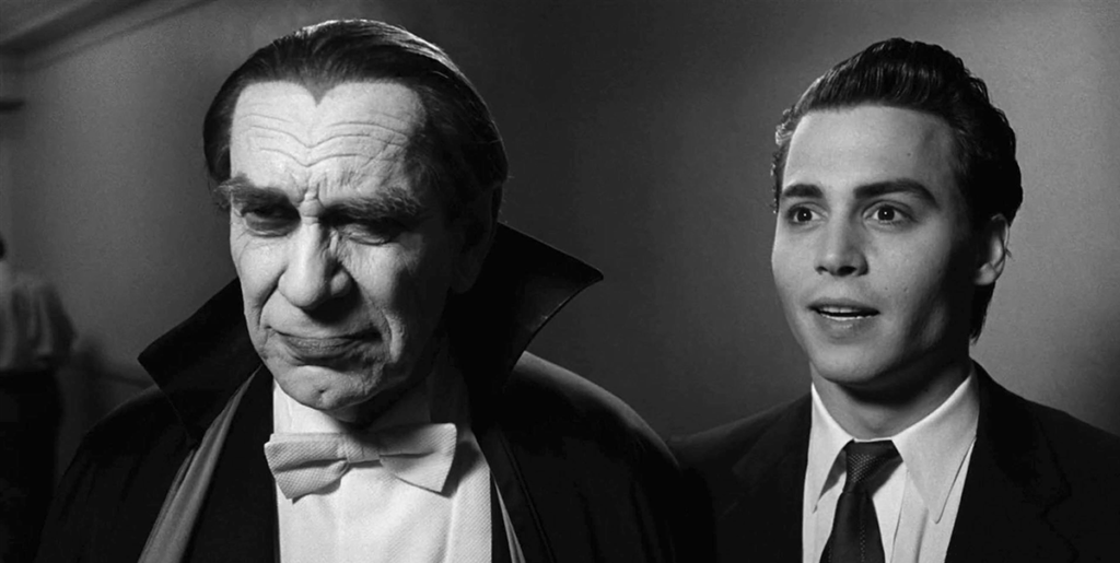
Review: Ed Wood

Ed Wood (1994)

review | Ed Wood

also in Reviews

Sign up for our monthly newsletter
to stay up to date on Cineluxe

Unfairly slighted and neglected, Tim Burton’s best film (you read that right) still shines almost 30 years on

by Michael Gaughn
October 15, 2020

I told myself I was going to make this one a quickie and not belabor my points. So, Point No. 1—this is the only good Tim Burton movie. Point 2—it features Johnny Depp’s best performance, by far. Point 3—it’s astonishing Martin Landau did such a great job of playing Lugosi without getting much help from behind the camera. Point 4—Ed Wood died at the box office, not because it’s not a great film—it is—but because it doesn’t fit within the all too predictable definition of what a Burton film is supposed to be. And because it committed the unforgivable sin of being in black & white.

I guess this is going to take some explaining after all.

I continue to be amazed by the number of people who haven’t seen Ed Wood, and by the number who have seen it but didn’t realize Burton directed it. In an age where practically everything, no matter how inept, has its rabid fan base, there’s something fundamentally wrong about the neglect this film has suffered. It seems like its financial failure caused Burton to decide to only do “Tim Burton” films from that point on—akin to what happened after De Niro played a very Ed Wood-like Rupert Pupkin in King of Comedy. Audiences weren’t willing to accept him as anything other than “Robert De Niro,” so he was forced to be that somewhat limited character for the rest of his career.

If the points I rattled off at the top weren’t enough to get you to check this movie out, here are a few more. It’s got one of the great opening-credits sequences, which manages to capture both the feel of Wood’s movies and set the tone for what’s to come without feeling arbitrarily grafted onto the rest of the film. Beyond Landau and Depp, there are some hugely entertaining turns by Sarah Jessica Parker, Jeffrey Jones, Bill Murray, and especially Mike Starr as the head of the C-grade exploitation house Screen Classics. (The one big casting misstep is a so-meek-she’s-barely-there Patricia Arquette as Wood’s wife.)

Then there’s the writing. Ed Wood stands above Burton’s other films mainly because it’s one of the few times he’s had an exceptional script to work from—by far the best effort from Scott Alexander and Larry Karaszewski (the team responsible for the strictly pedestrian The People vs. Larry Flynt and Man on the Moon, and the inexcusable The People vs. OJ Simpson). Their portrait of Wood might not be very accurate, but it’s exactly who we need Wood to be, serving up one big fat softball after another for Depp to knock out of the park. 

The movie is laugh-out-loud funny in a way Burton films rarely are. You can thank the script for most of that, but it’s more than ably realized by Depp, who displays some genius comedic chops he’s just been too cool to bother to use since; by Murray, who adds some nicely timed flourishes; and especially by Starr, who aces every scene he’s in.

The script can also claim most of the credit for the nicely modulated shifts of tone. While Ed Wood is mainly a comedy—and frequently a really broad one—it occasionally transitions deftly to drama, especially when dealing with Lugosi’s drug addiction. And it pulls off the really neat trick of not having Wood come across as just a cartoon or complete loser or clown. The actual Ed Wood doesn’t get enough credit for having tapped into the often trashy archetypes that define American culture in ways more sophisticated directors have never been able to. Wood wasn’t the worst director of all time, just the most naive.

Then there’s Stefan Czapsky’s black & white cinematography, which convincingly evokes the feel of ‘50s LA despite some lapses in direction and production design. The film looks both gritty and elegant, even in plain old HD on Amazon Prime. Besides, a color film about Ed Wood would just be absurd.

In the same way this is the best work from Burton, Landau, Depp, and Alexander & Karaszewski, it’s the only Howard Shore score I’ve ever been able to stomach. Pared down and witty, it’s an effective complement to the action and helps paper over some of the deeper sags in the mis en scène.

And, finally, Ed Wood is well worth watching because it’s one of those rare films that just feels like Halloween. While we tend to associate that holiday with shock-machine gore fests, they rarely capture the feel of the evening itself—which is one of the reasons why the studios tend to dump them on the market at the end of summer. But Ed Wood—along with Pixar’s sublime Coco—is redolent with the feel of All Hallow’s Eve.

To say Ed Wood was one of the best films of the ‘90s would border on being a slight, since that was a pretty abysmal decade for filmmaking. Better to say that it stands outside that decade, and the rest of Burton’s oeuvre, as an example of what happens when the right forces come together at the right time and somewhat magically manage to conjure up something that’s better than the sum of its parts.

Michael Gaughn—The Absolute Sound, The Perfect Vision, Wideband, Stereo Review, Sound & Vision, The Rayva Roundtablemarketing, product design, some theater designs, a couple TV shows, some commercials, and now this.

PICTURE | Ed Wood looks both gritty and elegant, even in plain old HD on Amazon Prime

SOUND | Howard Shore’s pared down and witty score is an effective complement to the action and helps paper over some of the deeper sags in the mis en scène 

Generic selectors
Exact matches only
Search in title
Search in content
Post Type Selectors

© 2023 Cineluxe LLC
Review: Chinatown

Chinatown (1974)

review | Chinatown

also in Reviews

Sign up for our monthly newsletter
to stay up to date on Cineluxe

This 4K HDR transfer doesn’t begin to do justice to Roman Polanski’s neo-noir classic 

by Michael Gaughn
January 17, 2021

Let me get the obligatory reviewer equivocation out of the way right up front: Yes, you should watch Chinatown in 4K HDR. No, this isn’t the transfer this film deserves.

Chinatown is, of course, one of the great films of the ’70s and, given that it was made by a bunch of smug movie-industry types, represents something much greater than the sum of the various talents involved. Call it The Casablanca Effect—a film that rises well above the norm more due to the spirit of the age and the chance gathering of forces than any concerted effort of creative will. Hollywood is designed to ensure that truly great movies can’t get made, and it’s only been the very rare—and now extinct—iconoclasts who’ve ever figured out how to game the system and create anything resembling art. Nobody involved in Chinatown fits the iconoclast MO.

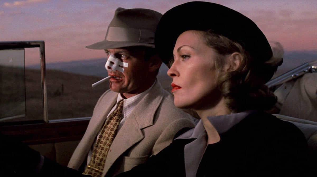
The film has its rough spots. Jack Nicholson never seems entirely comfortable in the lead role and sometimes comes across like a kid playing dress-up. The opening with him and Burt Young is stilted and forced. And some of the secondary casting is questionable, draining the air from some of the scenes. 

But this is probably Roman Polanski’s best work (although a convincing case could be made for Rosemary’s Baby) and Robert Towne never came near topping his justly famous screenplay, which successfully updates Raymond Chandler without veering into parody or fawning pastiche. 

But pointing out individual contributors detracts from the more important point that Chinatown, as a kind of spontaneously generated entity with a life of its own, perfectly sums up the mid ‘70s by leaning so heavily on the 1930s. Robert Altman took a similar tack at around the same time with his far more auteuristic riff on Chandler, The Long Goodbye. Those films, considered together, reflect a culture toying with the notion that a retreat into the past might be the best response to the turmoil of the ‘60s. They—and to some degree the first two Godfather films—anticipate the emergence of retro and the Reagan era.

But for those without a sociological/political bent, Chinatown still makes for a ripping good yarn. Yes, it cakewalks a lot of the detective-story clichés but takes them dead serious in the service of a tale that’s seemingly about unbridled greed but proves to be about mass complicity in the exercise in cultural corruption that is LA.

Again, if you don’t like to dive that deep and prefer to swim near the surface instead, Chinatown is a mannered but convincing exercise in atmospherics, combining a soundstage-bound Studio Era vibe with a stylized vérité evocation of pre-World War II Southern California. 

Given the slow film stock of the time, it’s astonishing how well Polanski and cinematographer John Alonzo capture the lingering LA sunsets and how evocatively they weave them into the fabric of the film. They consistently nail the LA light at various times of day, not by striving for accuracy but by capturing the romantic tinge that was key to the various booster efforts of the time, especially the citrus industry’s legendary orange-crate art.

And that brings me to why I said Chinatown deserves a better transfer. For such a beautiful film, it looks inexplicably dull in 4K HDR. It’s hard to say where the fault lies but this movie should not look this flat. 

The biggest problem is with the black levels. You’d rightly expect more nuance in an HDR transfer but the film here looks like it’s trying to ape Gordon Willis’s shadow-driven aesthetic in The Godfather—something Paramount wanted at the time of production but that Polanski fought hard to avoid. Looking at this release with its crushed blacks, and with scenes like the ones in Mulwray’s office so dim they become murky, you’d get the sense the studio prevailed. 

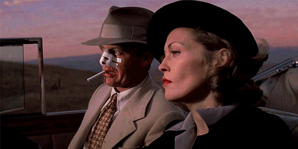
Skin tones are wildly inconsistent, with many of the scenes in the first half looking almost monochrome or, at best, like hand-tinted postcards. In an early scene where Nicholson and Faye Dunaway sit outside talking, Dunaway looks like she was dipped in bronze. Given that there are occasional scenes where skin tones look more natural—and certain closeups, like the one of Dunaway in mourning apparel as she lunches with Nicholson, that look stunning—you have to suspect the problem isn’t with the original film. I don’t remember this having been an issue before, and although it could be inherent in the original materials, it’s hard to believe Polanski, Alonzo, or the studio would have signed off on something this all over the map.

All of that said, I again have to emphasize that Chinatown is so engrossing that it’s possible to look beyond all the flatness, blackness, and visual inconsistencies and get caught up in the experience. While I was thrown the first time I watched this new transfer, I found myself much less distracted during subsequent viewings.

On the audio side, Jerry Goldsmith’s score is something of a miracle—not least because he conjured it up in less than two weeks after Paramount rejected Phillip Lambro’s stab at the music. Rather than go wall to wall, which is tempting in any film that leans so heavily on the Studio Era aesthetic, Goldsmith alternates between Mancini-like splashes of the lush main-title theme and very angular, astringent, mainly percussive cues that lend a distinctly ‘70s edginess and anxiety to the proceedings. 

Chinatown is a film set almost a hundred years in the past that’s really about an era now almost 50 years in the past but is rooted so firmly in the constants of human behavior that it feels surprisingly fresh and relevant. Polanski lends the material a level of seriousness and perverse humor no other director could have brought to it, while the blindly creative forces of the larger culture then raise all that to a level where few Hollywood efforts are ever allowed to go.

Allow me a moment’s more equivocation on my way out the door: Chinatown is a movie that needs to be seen, and re-seen, and while this isn’t the transfer the film deserves, this is the best it has ever looked at home. 

Michael Gaughn—The Absolute Sound, The Perfect Vision, Wideband, Stereo Review, Sound & Vision, The Rayva Roundtablemarketing, product design, some theater designs, a couple TV shows, some commercials, and now this.

PICTURE | Chinatown deserves a better transfer. For such a beautiful film, it looks inexplicably dull in 4K HDR—this movie should not look this flat.

SOUND | Jerry Goldsmith’s score is something of a miracle, alternating between Mancini-like splashes of the lush main-title theme and very angular, astringent, mainly percussive cues that lend a distinctly ‘70s edginess and anxiety to the proceedings 

Generic selectors
Exact matches only
Search in title
Search in content
Post Type Selectors

© 2023 Cineluxe LLC
Review: Get Shorty (1995)

Get Shorty (1995)

review | Get Shorty

also in Reviews

Sign up for our monthly newsletter
to stay up to date on Cineluxe

Barry Sonnenfeld’s deft little gem might be the best Hollywood satire ever

by Michael Gaughn
January 10, 2021

UHD has put anybody who reviews home releases in a really odd position. Most catalog titles are still in HD, with many having Blu-ray-quality transfers. But it’s become impossible to watch any of these films without speculating on what they’d look like in 4K HDR—which is something of a gamble because some older titles haven’t survived the process well, looking decidedly uneven. But then there are unquestionably stunning gems like Vertigo, The Shining, and the other titles gathered in “4K HDR Essentials” that have you salivating for more.

Barry Sonnenfeld’s note-perfect Hollywood satire Get Shorty is one of those films that has me shamelessly drooling. You can definitely appreciate its deft, droll visual style in its current HD incarnation, but you can also sense how much more delicious it would be with a 4K HDR buff and shine.

As I’ve said before, Sonnenfeld is the master of the puckish fairy tale, and here he gets to graft his bone-dry style of humor onto Elmore Leonard’s Damon Runyon-meets-Goodfellas mobster yarn, resulting in a film that plays as well 25 years on as it did on the day of its release.

Shorty is worth watching for its flawless casting alone. I’m not a Travolta fan but he doesn’t miss a beat here, giving his small-time hood a boyish innocence and enthusiasm that never feels forced. Hackman is miles from Lex Luthor, turning in a nuanced comic performance that gets big laughs while presenting a fully realized character. This has to be DeVito’s best star turn. And Delroy Lindo is both menacing and charming and Dennis Farina is flat-out funny as the mobsters who just can’t get a break.

This continues all the way down the cast line to the smallest roles. Nobody is here just to be the butt of a joke. Every bit part is fleshed out and compelling. Special kudos go to David Paymer for his story-within-the-story turn as the dry cleaner who fakes his death in a plane crash and flees to L.A. with 300 grand in mob money, sweating all the way. 

Sonnenfeld doesn’t get enough credit as an actor’s director, but the scene where Travolta shows DeVito how to play a shylock is so perfectly modulated it deserves to be ranked with the best. It’s almost impossible to convincingly portray an actor acting, let alone actor/director interaction, but all involved are so perfectly in sync here that you’re laughing not just at the jokes and the situation but the sheer virtuosity of the execution. 

What Shorty gets right, above everything else, though, is LA and the many ways the movie business overlaps with LA life. It unerringly and evocatively captures the feel of Beverly Hills, the Sunset Strip, the Hollywood Hills, and all the trendy little West Hollywood restaurants that sit practically in the middle of traffic. Maybe the film’s second-best scene—although this might just come from having suffered through this too many times myself—is DeVito going way off-menu to order an elaborate omelet for the table then leaving before it arrives, forcing the other guests to figure out what to do with it.

Shorty works as a satire because it doesn’t come from the often hypocritical vitriol that drives most similar efforts, instead using the quiet accumulation of spot-on touches to make its point, making it far more akin to Raymond Chandler’s The Little Sister than to more overwrought works like The Day of the Locust and SOB. (And don’t even bring up Tarantino, who’s way too much of a raging Neanderthal to even begin to grasp anything as subtle as irony.)

This approach is seamlessly translated into the movie’s visual plan, where the camera moves are restrained (for a Sonnenfeld film) and the lighting is for the most part true to the locales—which I suspect was in part a deliberate strategy to heighten the impact of the film’s stylized, proscenium-warping finale. And it’s exactly because Shorty dances right up to the edge of caricature and exaggeration without crossing over that I think it would benefit immensely from a tasteful application of 4K HDR. Some judicious enhancement would make it that much more engaging without turning it into gratuitous eye candy. (The operative word here, of course, is “judicious.”)

No problems with the sound. This is a dialogue-driven film only occasionally punctuated by bursts of action, and the lines (“E.g., i.e., f— you,” “You think we go to see your movies, Harry? I’ve seen better film on teeth.” “My favorite color—putty”) are all crisp and clear, as are the gunshots. It’s usually a little too obvious when temp tracks make their way into the final film but Sonnenfeld does such a great job of deploying Booker T. & the M.Gs that it’s hard to make much of a stink. The cues are nicely placed in the foreground without ever being in your face.

It’s one thing to call Get Shorty the best film in the very circumscribed mobsters-come-to-Hollywood genre, it’s another to say nobody’s ever done a better job of skewering Hollywood—a windmill many have tried to tilt only to wind up on their asses. Shorty never tries to be bigger than it needs to be, which is why it continues to shine as a compact, quietly dazzling gem. 

Michael Gaughn—The Absolute Sound, The Perfect Vision, Wideband, Stereo Review, Sound & Vision, The Rayva Roundtablemarketing, product design, some theater designs, a couple TV shows, some commercials, and now this.

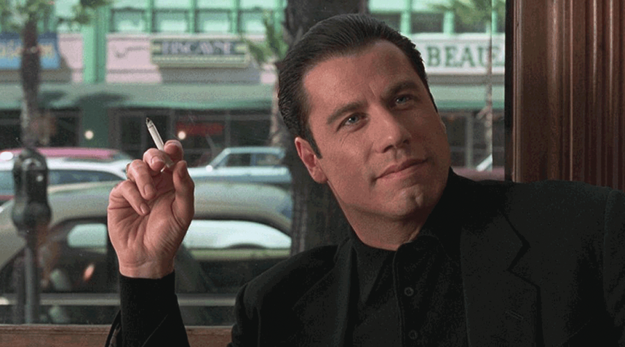
PICTURE | While you can appreciate the movie’s deft, droll visual style in its current Blu-ray-quality incarnation, you can also sense how much more delicious it would be with a 4K HDR buff and shine

SOUND | This is a dialogue-driven film only occasionally punctuated by bursts of action, and the lines are all crisp and clear, as are the gunshots 

Generic selectors
Exact matches only
Search in title
Search in content
Post Type Selectors

© 2023 Cineluxe LLC
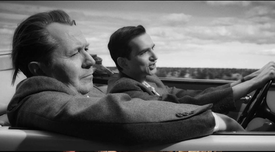
Review: Mank

Mank (2020)

review | Mank

also in Reviews

Sign up for our monthly newsletter
to stay up to date on Cineluxe

Yet another misguided—and poorly made—attempt to steal the credit for Citizen Kane from Orson Welles

by Michael Gaughn
March 27, 2021

For proof that it was a really bad idea to have the Oscars in the middle of a pandemic, you don’t need to look any further than David Fincher’s Mank. It’s had a ton of nominations heaped upon it and it’s the kind of film that stands a decent chance of walking away with some major awards. But it’s also an astonishingly bad movie, and in a legitimate year—like say 2019—it wouldn’t have been allowed to even stick its head in the Academy’s door.

I’m going to offer up my rationale for the above conclusions not because I want to let this thing reside in my brain for a single second longer than necessary but since it’s being puffed up as a really big deal, an important film, it would be irresponsible to shirk making the case against it.

First off, the story it tries to tell is incredibly old news. The myth that Herman Mankiewicz, not Orson Welles, is responsible for the greatness of Citizen Kane has been Hollywood folklore from the time of Kane’s creation. The tiresome Pauline Kael later latched onto it and made it the subject of her notorious Raising Kane. HBO’s unforgivable RKO 281 (1999) tread the same ground. It’s an argument that’s so easily picked apart I won’t even bother going there but comes down to being yet one more instance of the American terror of the outsider. Mank breaks no new ground here.

The film’s deepest flaw is one common to all of Fincher’s work—he’s just an overgrown kid who approaches everything he does like a giggly teenager who’s adopted a completely unearned cynicism to mask his fundamental immaturity. That leads him to take an incredibly complex and potentially rich tale and reduce it to the overstylized and remedial presentation of a comic book. The film is full of superficial busyness. All of the actors speak in exposition. All plausibility is optional and only grudgingly deployed. There is no nuance.

A fundamental example: Fincher is so obsessed with pulling off clever shots and editing patterns, and is so fundamentally limited as an actor’s director, that he lacks the interest, ability, or trust to just let people sit in the same space and organically interact. To resonate at all, this needed to be a tale of very real, very vulnerable people striving in some very heightened worlds. It instead feels like a bunch of indifferently-drawn stick figures meant to serve some storyboard hopelessly stuck in Fincher’s head.

Also, for the movie to have any power, it needed to stay true to who these people were and what these institutions were within the world of 1930s California and Hollywood. But Fincher, for all his faux cynicism, is really just a big lapdog of a director so he can’t resist the temptation to draw contemporary parallels throughout and give his characters contemporary attitudes. Remolding Welles as a hipster is faintly amusing but also a little too pat, like everything else here. 

I was more impressed by Gary Oldman than I expected to be. I’ve always felt he was an “actor,” not an actor, and have been suspicious of his work ever since he was overpraised for his Sid Vicious impression in Sid and Nancy (1986). He’s almost engaging here, I suspect, because everything else in the film is so barely and poorly formed that even a yeoman-like turn seems intriguing.

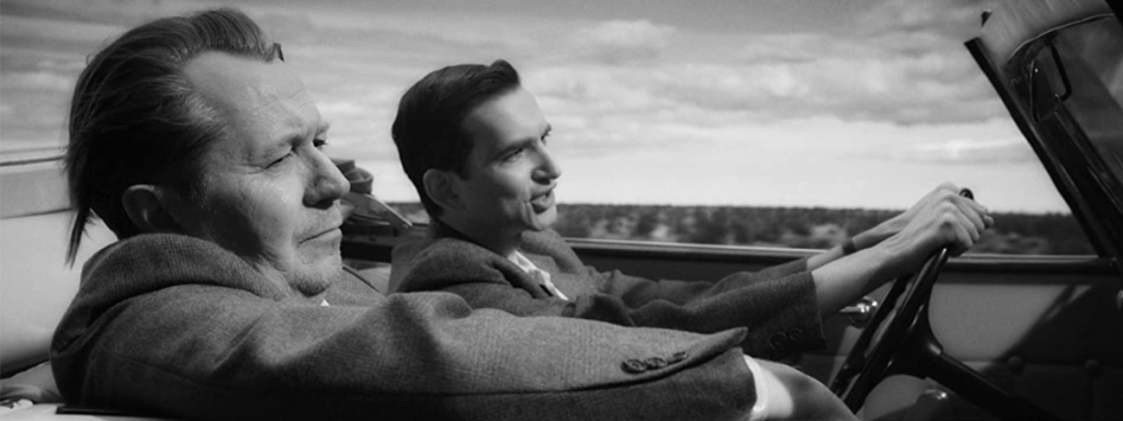
It’s so easy to pick apart the movie’s ill-conceived and silly visual plan that I’ll leave that to others. The one thing I will point out is that the black & white cinematography is so contrasty, with the whites pumped up wretchedly high, that most of the images are painful to look at. Add to that a lot of fundamentally ill-conceived CGI work and you’ve got the visual equivalent of sandpaper.

There’s really nothing to be said about the Trent Reznor/Atticus Ross score except that it’s so predictable it’s like it’s not even there. But I was surprised by how badly this film is mixed. Since the dialogue was frequently unintelligible, I watched Mank a second time listening on headphones just to make out most of the lines. 

If you like movies that are full of a sense of their own cleverness and that tell you exactly what to think and feel—and I realize there’s a substantial audience for that—then by all means wallow in Mank. But it’s hard not to watch something like this and continually sense how much more the movies can do, how much more they have done, and see it as a deeply troubling sign that this kind of simplistic twaddle is somehow seen as important. Citizen Kane brought an unprecedented depth to the movies; Mank is a celebration of the kind of bright, shiny surfaces Welles’ film was meant to pierce. 

Michael Gaughn—The Absolute Sound, The Perfect Vision, Wideband, Stereo Review, Sound & Vision, The Rayva Roundtablemarketing, product design, some theater designs, a couple TV shows, some commercials, and now this.

PICTURE | The black & white cinematography is so contrasty, with the whites pumped up wretchedly high, that most of the images are painful to look at

SOUND | This film is so badly mixed that the dialogue is frequently unintelligible. The Trent Reznor/Atticus Ross score is so predictable it’s like it’s not even there. 

Generic selectors
Exact matches only
Search in title
Search in content
Post Type Selectors

© 2023 Cineluxe LLC
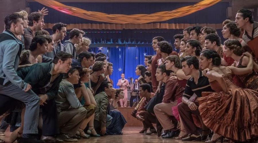
Review: West Side Story

review | West Side Story recent reviews Apple TV+ | CODA Google Play | Rifkin’s Festival Kaleidescape | Summer of Soul Apple TV+ | The Tragedy of Macbeth see more in Reviews Sign up for our monthly newsletter to stay up to date on Cineluxe Spielberg takes a stab at musicals with this Oscar-nominated revamping […]

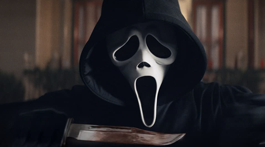
Review: Scream (2022)

Scream (2022)

review | Scream (2022)

also on Cineluxe

Sign up for our monthly newsletter
to stay up to date on Cineluxe

This franchise reboot ups the brutality and gore but fails to top the 1996 original

by John Sciacca
March 10, 2022

While Scream 2 came just a year after the original film debuted in 1996 and Scream 3 was released in 2000, there was an 11-year drought before Scream 4 came out in 2011, followed by another 11 years before this latest franchise entry. I rewatched the original Scream when it received a 4K HDR transfer for its 25th anniversary, and was impressed how well it held up. 

This latest Scream is the first film in the series not directed by franchise creator Wes Craven, who died in 2015. But it remains true to the spirit of the franchise and brings back key cast, including Randy Jackson returning to voice Ghostface, with some quick cameos and voiceovers from actors that have been in the earlier films. I did find the violence to be a bit more brutal and gorier, and the language to be a bit saltier, so definitely not suitable for younger viewers. (Common Sense Media rates it 16+)

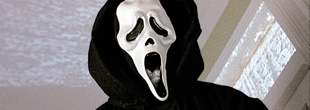
Like all of the Scream films, the story is essentially the same: A killer dressed in a Ghostface mask is terrorizing people of Woodsboro, California who are somehow associated with the events from the first film, taunting them on the phone—often discussing horror-movie-related trivia—before attempting to stab them to death. They also do a nice job of updating the tech to keep it current, like having smart-home door locks. And as always, there are certain rules that must be followed to survive, including the most important one: The first victim always has a friend group the killer is part of. 

Many of the film’s subtle references are about Stab, the fictional film-within-the-film based on the events that have transpired in Woodsboro. Here, Stab superfans are really upset over how the series has gone off the rails with the latest release, Stab 8.  As one character tells us, we’re in the middle of a “requel”—not quite a reboot, not quite a sequel. The movie has to be new, but not too new, and it has to be part of an ongoing storyline, having new main characters but supported by and related to legacy characters. Also, “It always, always goes back to the original.”

In this vein, we have a new group of youngsters being terrorized,  but as the killings continue, the old gang returns to set things straight. Dewey Riley (David Arquette) still lives in town, but after being stabbed nine times, resulting in permanent nerve damage and a funny little limp, he’s retired from the force. His ex-wife Gale Weathers (Courteney Cox) is off in New York hosting a TV morning show and still chasing fame. And Sidney Prescott (Neve Campbell) is married and raising a child with no intentions of ever returning to Woodsboro. 

Shot in 3.4K, images are consistently clean. Edges have nice definition and you can see textural details like the fine lines in Dewey’s corduroy jacket. While closeups have plenty of detail, letting you easily appreciate the differences between the smooth, near-poreless complexions of the “new” cast and the fine lines around Sidney’s eyes and the weathering and wrinkles in Dewey’s face, images were never tack sharp like some digital productions and felt more film-like.

The HDR isn’t overdone but does provide a realistic image, with some extra brightness when needed for the occasional bright lights. Outdoor scenes look terrific with loads of natural lighting, and you can clearly see the difference between the exterior lighting and the stark fluorescent overheads inside a hospital or the bright sunlight pouring in through sheer blinds. Blacks are nice and clean and blood-reds are appropriately saturated.

Horror movies are often the perfect playground for creative and immersive Dolby Atmos mixes, and while this Scream’s Dolby TrueHD mix isn’t over the top, it gets the job done and has some nice moments that certainly add to the tension, such as jump-scare music and ill-timed phones ringing. Outdoor scenes have plenty of atmospherics in the form of whistling wind, traffic sounds, and birds chirping, with the interior of the hospital sounding completely different with people chattering, phones ringing, the buzz of lights, and elevators dinging. During one scene, rolling thunder travels through the room overhead, and notice the clear sound of Dewey’s spent brass falling on the ground, bouncing and rolling.

Deep bass is called on to punctuate certain moments, such as adding sonic weight to door locks clunking into place or the deep throaty engine roar of a big muscle car firing up, and then the throbbing rumble and growl of it idling. Gunshots also have nice sharp dynamics. 

Scream/Stab is a “meta-slasher whodunit” and it kept me guessing up till the end about who was behind the mask. While there’s enough new here to keep noobs entertained, you should at least watch the original as it is still the freshest and most original of the bunch and lays the foundation for this Scream. And with a Scream 6 already greenlit, now is a great time to revisit Woodsboro. Just remember . . . trust no one! 

Probably the most experienced writer on custom installation in the industry, John Sciacca is co-owner of Custom Theater & Audio in Murrells Inlet, South Carolina, & is known for his writing for such publications as Residential Systems and Sound & Vision. Follow him on Twitter at @SciaccaTweets and at johnsciacca.com.

PICTURE | Closeups have plenty of detail, letting you easily appreciate the differences between the smooth complexions of the “new” cast and the fine lines around Sidney’s eyes and the weathering and wrinkles in Deputy Dewey’s face

SOUND | While the Dolby TrueHD Atmos mix isn’t over the top, it gets the job done and has some nice moments that certainly add to the tension, such as jump-scare music and ill-timed phones ringing

Generic selectors
Exact matches only
Search in title
Search in content
Post Type Selectors

© 2023 Cineluxe LLC
Review: Scream (1996)

Scream (1996)

review | Scream (1996)

related reviews

Sign up for our monthly newsletter
to stay up to date on Cineluxe

Wes Craven shocked the slasher genre back to life with this meta-heavy horror classic

by John Sciacca
October 26, 2021

The teen-slasher genre had been stagnating in the ‘90s when along came Wes Craven of Freddy Krueger and A Nightmare on Elm Street fame to totally upend and breathe new life into the genre with Scream. It’s hard to believe Scream is celebrating its 25th anniversary but the good news is that Paramount has given it a 4K HDR transfer. 

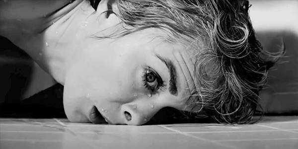
 While Scream certainly has its share of gore, it never feels like the focus of the story. Right from the get-go, it lets you know this was going to be a different horror-movie experience, and in the opening 12 minutes, it unsettled the audience by killing off its biggest star, Drew Barrymore. Of course, Craven just aped what Alfred Hitchcock famously did with Janet Leigh in Psycho. 

The script was also unique in just how self-aware the characters were. They not only love horror movies but the cast frequently name-checks other horror films. They also lay out—and then the film plays with—the classic slasher-film “rules” and clichés about who survives. And as the ultimate wink-nod to horror fans, Craven himself has a cameo as a striped-sweater-wearing school janitor who happens to be named Fred. Red herrings and misdirection abound throughout, and after the shock of Barrymore’s death, viewers knew anyone could be killed—all of which told moviegoers they were in for a new and different ride, and the traditional rules of the genre were out the window.

It was interesting to re-watch Scream knowing the outcome, much like people will go back through The Sixth Sense to see if M. Night Shyamalan made any continuity mistakes. Here, when you know what—and who—to look for, there are some subtle clues that tell you who the killer is that give the film another layer of enjoyment.

Originally shot on 35mm film, this transfer is from a 4K digital intermediate, and the clarity and detail show. Of course, as with many film-to-4K transfers, there are some moments of softness or uneven focus but these are likely in the original and the movie still has that organic film look. What I really appreciate with a well-done transfer is just how clean images look. Fortunately, much of Scream—particularly the opening—is filmed up close, letting you really see the texture and detail in the actors’ faces—the smooth skin and fine whiskers, Sidney’s freckles, and the detail in Barrymore’s sweater and the fine strands of her hair.  

Don’t expect a lot of eye-popping HDR but the grade definitely enhances the natural look of the film with nice deep blacks and shadow detail. Also, much of the second half is shot at night, and things like bright car headlights, police lights, fluorescent lighting, lightning strikes, and bright white T-shirts get some added pop, as do subtle things like the glints of highlights from droplets of sweat or tears on actors’ cheeks. I also noticed the subtle sparkle and flecks of silver in the killer’s black outfit. Nothing really pushes the bounds of HDR’s wider color gamut but we get some really nice and vibrant yellows, oranges, and reds in a sunset, along with the rich blue of Sidney’s denim, and of course the intense reds of blood.

The Kaleidescape download features a 5.1-channel DTS-HD Master Audio mix. The dialogue is always presented nice and clear in the center channel. Sounds like ringing phones, ticking clocks, and creaking floors happen way off screen, expanding the width of your listening area. My processor’s DTS: Neural X upmixer was also able to extract some nice ambience from the mix. Small sounds like clocks and wind chimes, echoes, wind whistling through an HVAC register, or PA announcements fill the room and immerse you in what’s happening on screen. Parts of the score are also “lifted” up to the ceiling speakers to add a nice height layer. 

The mix isn’t super dynamic but it can deliver some strong, even tactile, bass, such as during a big lightning storm in the opening. And while there isn’t a lot of gunfire, the few instances are recorded loud and sharp and are definitely standout moments.  

While some of the dialogue between the “teenagers” (Campbell and McGowen were 23, and Ulrich and Matthew Lillard were both 26) is a little cringey, most of Scream holds up surprisingly well and it’s still a lot of fun to watch. The timing is also a bit serendipitous as rewatching this new transfer of the 1996 original will help set the mood for the Scream reboot  coming in January 2022, which brings back the big surviving three—Sidney, Gale Weathers, and Deputy Dewey—from the original film.

Probably the most experienced writer on custom installation in the industry, John Sciacca is co-owner of Custom Theater & Audio in Murrells Inlet, South Carolina, & is known for his writing for such publications as Residential Systems and Sound & Vision. Follow him on Twitter at @SciaccaTweets and at johnsciacca.com.

PICTURE | As with many 35mm-film-to-4K transfers, there are some moments of softness or uneven focus, but these are likely in the original film, and Scream still has that organic film look.

SOUND | The 5.1-channel DTS-HD Master Audio mix is certainly adequate for telling the story, and the most important element—the dialogue—is always presented nice and clear in the center channel

Generic selectors
Exact matches only
Search in title
Search in content
Post Type Selectors

© 2023 Cineluxe LLC

Review: Severance

Severance (2022)

review | Severance

recent reviews

Sign up for our monthly newsletter
to stay up to date on Cineluxe

This Ben Stiller-directed AppleTV+ series is less comedy and more sci-fi/mystery/thriller

by John Sciacca
March 4, 2022

Launched on November 1, 2019, Apple TV+ has been languishing as one of the many “others” in the streaming space. While trying to figure out how to gain subscribers and increase its content offerings, the company was literally giving the service away to anyone who purchased an eligible Apple product (iPhone, iPad, iPod touch, Apple TV, or Mac). After buying a new iPad for my wife, we enjoyed the free first year, which was then extended to nearly 18 months. After our grace period ran out, I found enough value in the service to keep it for the $4.99/month subscription.

Apple’s original offerings were pretty slim pickings but they’ve since developed a solid roster of compelling series including the highly-acclaimed Ted Lasso, For All Mankind, and The Morning Show, along with two of Tom Hanks’ latest films, Greyhound and Finch, and the Academy Award-nominated The Tragedy of Macbeth. One of the latest originals is Severance, and it’s one of those shows that will likely stick with you and stir up some conversations after an episode ends, with a lot of conjecture and “What if . . ?” thoughts.

Don’t let the fact that the series is directed by Ben Stiller make you think it’s a comedy. While there are some comedic moments, the humor is bone dry, and Severance is far more a psychological, sci-fi mystery think piece. Well, at least it is three episodes in.

We follow Mark (Adam Scott) as he works in an office with Irving (John Turturro), Helly (Britt Lower), and Dylan (Zach Cherry), along with ever-present supervisor Milchick (Tramell Tillman) keeping an eye on things, and department head Harmony (Patricia Arquette). 

Mark and team work on what is known as a “severed floor” deep within the basement bowels of a giant corporation called Lumon Industries. Severance is a controversial medical procedure the employees have all voluntarily—as far as we know—undergone that divides—severs—their work (“innie”) and non-work (“outie”) memories. Once you step into the Lumon elevator and begin descending to your floor, you completely forget all knowledge of your life that exists outside work. And once you ascend in the elevator, you have no recollection of what you do for Lumon. We’re told the severance procedure is complete and irreversible. 

The four employees work in a division known as “microdata refinement,” where they look at antiquated monochrome CRT monitors filled with numbers. Their job is to analyze the data until something jumps out at them and then they isolate “the scary numbers” from others, grouping them and putting them into data buckets. What does the data mean, what is it for, and what are they really doing? Speculation abounds, but answers are slow coming inside Lumon. 

Mark recently lost his wife, and chose severance as a way to deal with the pain. Both Irving and Dylan have been with Lumon for a couple of years, though we know virtually nothing (yet) of their past. Irving, played with wonderfully sincere seriousness by Turturro, is a strict company man, while Dylan seems far more interested in the tchotchkes that come from a job well-done, including the ultimate prize: A waffle breakfast. We do get a few brief factoids about Irving’s outie during a “wellness check” in Episode Two, “Half Loop,” where Ms. Casey (Dichen Lachman) shares facts that he should enjoy equally. 

Helly is a new employee introduced early in the first episode, “Good News About Hell.” Hired to replace suddenly-gone department head Petey (Yul Vazquez), we glean bits and pieces about life inside Lumon and the job through her training.

Parallels can undoubtedly be drawn between fictional Lumon and the ultra-secretive real-life Apple Corporation, which would probably love to offer an actual severed floor. While the facility itself doesn’t actually resemble “The Ring” of Apple Park (the company’s new headquarters in Cupertino, California), its symmetry, size, and scale are certainly evocative. And the balance—or rather division—of work and home life are easily relatable. 

Streamed in 4K HDR with Dolby Vision, image quality is definitely good enough for conveying the story. We get some nice punchy highlights from the numerous fluorescent lights and ever-present white walls, hallways, and corridors inside the massiveness that is Lumon, and there is plenty of facial detail in closeups and enough resolution to make out the individual pixels in the staff’s monitors. 

Severance also features a Dolby Atmos mix that so far is little more than serviceable. The vast majority of the show takes place inside the stark and sterile office space, and we do get a bit of office-sounds ambience and some expansion of the score. But dialogue is the key here, and fortunately it’s clear and intelligible. 

Unlike Netflix and Amazon Prime, which prefer to dump all of the episodes of a series at once, Apple takes more of a Disney+ approach and doles out new episodes each Friday. This makes it a perfect time to jump into Severance as you’re only three episodes “behind” as of this writing, meaning you can quickly catch up.

Probably the most experienced writer on custom installation in the industry, John Sciacca is co-owner of Custom Theater & Audio in Murrells Inlet, South Carolina, & is known for his writing for such publications as Residential Systems and Sound & Vision. Follow him on Twitter at @SciaccaTweets and at johnsciacca.com.

PICTURE | The image quality of the 4K HDR Dolby Vision stream is definitely good enough for conveying the story, with nice punchy highlights from the numerous fluorescent lights and ever-present white walls inside the massive office space

SOUND | The Atmos mix is little more than serviceable, although dialogue is clear and intelligible and there is some office-sounds ambience and some expansion of the score

Generic selectors
Exact matches only
Search in title
Search in content
Post Type Selectors

© 2023 Cineluxe LLC
Scroll to top

sign up for our newsletter

receive a monthly recap of everything that’s new on Cineluxe