• Type:
  • Genre:
  • Duration:
  • Average Rating:

Reviews

Review: Coco

Coco (2017)

review | Coco

recent reviews

Sign up for our monthly newsletter
to stay up to date on Cineluxe

This often subtle visual presentation of Pixar’s Day of the Dead tale makes a strong argument for HDR in digital animation

by Dennis Burger
September 10, 2021

It may seem strange to begin a review of Coco with a discussion of a man who had nothing to do with the film but hopefully this will all make sense in a few paragraphs. I am, to put it mildly, a magic enthusiast. I have a drawer in my dresser dedicated to all manner of illusions, from prop thumbs to Svengali decks to Scotch & Soda coins, and the list goes on. So it stands to reason I have an all-time favorite illusionist—a mischievous little imp known as James Randi, who performed for years as The Amazing Randi before transitioning into a career as a professional skeptic and debunker. 

What makes Randi my favorite magician is that he was honest about being a liar, famously stating, “I’m a trickster, I’m a cheat, I’m a charlatan. That’s what I do for a living.” The one time I got to see him perform illusions in person, he explained his craft in detail. He walked the audience through his tricks, exposing not only the mechanics but also why the audience fell for them.

And all of the above is simply context for what I’m about to say: One of my all-time favorite magic tricks is Pixar’s Coco. And yes, it is a magic trick. It’s illusory, after all, packed with deception and misdirection and sleights of hand both subtle and coarse. But what makes it such a great magic act is exactly what made Randi such a great magician—even after you recognize and understand the deceptions, they still work, they still have power, they’re still artful and masterful. 

And that is just one of the many reasons why Coco sits high on my all-time favorites list of Pixar films, and why it’s worthy of discussion today, some four years after its release. Another reason is the film’s thematic complexity—which I’m forced to contend with as I attempt to convey what the film means, what it has to say. The simplest I can come up with is that it’s ultimately about the struggle—the tug-of-war—between one’s intrinsic search for identity and obligation to family and society. But that’s too simple. It would be more accurate to say it’s about the complex way in which our identity is formed both from within and from without. More obviously, it also beautifully deals with death, legacy, and the afterlife in a way that feels mutually compatible with spiritual thinking and a more secular outlook on life. And somehow it manages all of this while feeling organic and spontaneous. 

Of course, a more obvious reason to discuss the film at this juncture is that Kaleidescape is currently running a Pixar Fest through September 14, with special pricing on select films from the studio’s catalog. Coco currently comes in at $14.99 in UHD/HDR. I mean, come on. At that price, it’s irresistible, even if you’re a Disney+ subscriber—and I know that may be a hard sell, but let me explain why. Firstly, Kaleidescape’s download comes with so many of the bonus features that are missing on Disney’s streaming service, including a wonderful (but far too brief) documentary called “The Real Guitar,” which is otherwise only available on disc or Apple TV. 

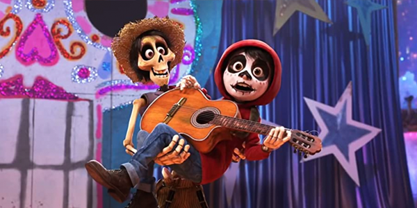
Kaleidescape’s UHD presentation is rich with subtle textures and the HDR10 color grade is a significant step up from the Blu-ray release. Coco is a gorgeous film at any resolution, mostly owing to its fantastic art design and animation but the HDR adds some meaningful enhancements that make the illusion all the more convincing. The expanded color gamut allows for a slightly more pronounced contrast between Miguel’s Día de las Muertas makeup and the actual bony flesh of the dead, for example, accentuating why the deception almost works, but not quite. The fluorescent glow that permeates the Land of the Dead also radiates with more intensity, making it all feel that much more magical. 

Kaleidescape’s Dolby TrueHD Atmos soundtrack is a textbook example of object-based surround done right. Panning and object placement are perfect within the base soundfield and the overhead channels are used to expand and enhance the ambiance and reverberance of the world without thwapping you over the head with distractions. 

It’s interesting to note that there are more significant differences between Kaleidescape’s presentation of the film and the stream available on Disney+ than would usually be the case. And that’s mostly because Kaleidescape relies on HDR10, while Disney+ has the film in Dolby Vision. It’s not a matter of which is better—in this case, it largely comes down to personal choice, as both have their merits. The Dolby Vision grade is more vibrant, with a more intense color palette and higher-intensity brightness in spots, making it obvious bait for videophiles. The HDR10 grade is more muted—at least in the land of the living—which makes the visual contrast between the two worlds stand out a bit more. Both look gorgeous, but again—and this is the main kicker for me—Disney+ only adds a few deleted scenes and one short featurette, whereas the Kaleidescape download comes with almost all the bonus goodies available on disc. Those supplements, as well as the more reliable access afforded by downloading the film once instead of streaming it on demand, make Kaleidescape’s release incredibly easy to recommend as a permanent part of your movie library. 

Dennis Burger is an avid Star Wars scholar, Tolkien fanatic, and Corvette enthusiast who somehow also manages to find time for technological passions including high-end audio, home automation, and video gaming. He lives in the armpit of Alabama with his wife Bethany and their four-legged child Bruno, a 75-pound American Staffordshire Terrier who thinks he’s a Pomeranian.

PICTURE | Kaleidescape’s UHD presentation is rich with subtle textures and the HDR10 color grade is a significant step up from the Blu-ray release.

SOUND | The Dolby TrueHD Atmos soundtrack is a textbook example of object-based surround done right.

Generic selectors
Exact matches only
Search in title
Search in content
Post Type Selectors

© 2023 Cineluxe LLC
Review: The French Dispatch

review | The French Dispatch

recent reviews

Sign up for our monthly newsletter
to stay up to date on Cineluxe

This most Wes Anderson of Wes Anderson films has both color and black & white, lots of aspect ratios, and a massive cast but, oddly, no HDR

by John Sciacca
December 19, 2021

I’m not sure there’s another filmmaker working today with as distinct a visual and storytelling approach as Wes Anderson. You could look at a still frame from practically any of his films and recognize it from his trademark style, with his framing, composition, colors, angles, and even casting choices.

I’m definitely a fan of his work but I’m not a super fan. While I loved his nearly all his early films, including Bottle Rocket, Rushmore, and The Royal Tenenbaums, and even more-recent titles like Moonrise Kingdom and The Grand Budapest Hotel, some of his work—The Darjeeling Limited and Isle of Dogs—just didn’t work for me. When Anderson is “on,” his quirky humor, absurdity, and whimsy make for compelling viewing. But when he’s “off,” the viewer can be left sitting there looking at a beautiful but incomprehensible and slow-moving mess.

It’s possible his latest, The French Dispatch, is the most Wes Anderson-y title to date. It’s like he’s taken all of his favorite tools—actors; music; symmetrical framing; voiceovers; aspect-ratio and color changes; and odd people thrust into bizarre situations—and amplified them. Dispatch takes all he’s learned and combines it into an amalgam of the quintessential Anderson film. Which isn’t to say it all works all the time but it’s certainly always interesting, and visually stunning.

To me, a Wes Anderson movie is a bit like receiving a fascinating and eclectic gift box. The box is beautifully polished and expertly crafted, and features attention to the finest details, and inside—cosseted into perfectly sized compartments—is a variety of beautifully wrapped and arranged curios that have no obvious connection to each other. There’s a straight-edged razor placed in a hand-carved whale-bone handle, a small pot of quince jelly, a hand-drawn map (in French!), a used (but lovingly cared for) fountain pen, and a single leather glove (size: ladies extra large). There’s often no rhyme or reason as to what is in the box but it’s a fascinating journey of discovery to see what will be uncovered under the next exquisite bit of wrapping and then trying to make sense of it.

He is also known for assembling ensemble casts, often anchored by actors that could be called “The Wes Anderson Players” for the frequency with which they appear in his films. If ever there was a director who embraced the motto, “There are no small parts, only small actors,” it’s Anderson, who fills even the smallest roles with big talent. The actors also seem to appreciate that he’s often reveling in the absurd and they lean into their roles with gusto. 

In that vein, Dispatch features the deepest cast of any of his films to date. Of course, it wouldn’t be an Anderson film if it didn’t have a lengthy list of returning players, and Dispatch includes Benicio Del Toro, Adrien Brody, Tilda Swinton, Frances McDormand, Bob Balaban, Tony Revolori, Lea Seydoux, Willem Defoe, and (narrating) Anjelica Houston, along with those actors who most exemplify one of his productions: Jason Schwartzmann, Owen Wilson, and, of course, Bill Murray. Joining them are newcomers Liev Schreiber, Elisabeth Moss, Christoph Walt, Henry Winkler, Jeffrey Wright, Lyna Khoudri, and Timothee Chalamet. And that’s not even a complete list! Nearly every frame is filled with a star of some sort.

Even before the first image hits the screen you’re greeted with a classic Anderson title card letting you know you’re in for something unusual. It reads:

The following film consists of:
an OBITUARY,
a brief TRAVEL-GUIDE,
and THREE FEATURE ARTICLES
all from
THE FRENCH DISPATCH
(an American magazine
published in Ennui, France).

Arthur Howitzer Jr. (Murray) is the editor of a very New Yorker-esque newspaper/magazine called The French Dispatch. After dying from a sudden heart attack, Howitzer’s final wishes, revealed in his will, are that publication cease following a farewell issue in which three prior articles are republished along with an obituary. This sets up the series of stories, with each concluding with a brief interaction between Howitzer and the writer as he relays comments or suggestions on the submitted work.

The first featurette, “The Cycling Reporter,” follows Herbsaint Sazerac (Wilson) as he takes a cycling tour of Ennui, showing what has changed and what has remained the same in the small city over time.

“The Concrete Masterpiece,” the second tale, begins with J.K.L. Berensen (Swinson) delivering a lecture at an art gallery where she recounts a tale of the unlikely life and rise to fame of artist Moses Rosenthaler (Del Toro). Rosenthaler—imprisoned for a grisly murder—has spent 10 years without picking up a brush, and then paints an abstract nude of his muse, prison guard Simone (Seydoux), which catches the eye of art dealer Julien Cadazio (Brody) and becomes a sensation in the art world.

The third chapter, “Revisions to a Manifesto,” was the most meandering, uninteresting, and difficult tale to follow. Lucinda Krementz (McDormand) initially reports on—then becomes involved with—a student protest led by Zeffirelli (Chalamet) and ends up secretly helping him write his manifesto.

The final tale, “The Private Dining Room of the Police Commissioner,” is perhaps the most classic Anderson of the bunch. It tells of the unlikely and inexplicable events that take place one evening with the Dispatch’s food reporter, Roebuck Wright (Wright), who recounts attending a private, gourmet dinner with the Commissaire of the Ennui police force prepared by legendary officer/chef Lt. Nescaffier (Steve Park). Nescaffier is an expert in the world of a highly specialized subset of haute cuisine meant to be consumed by working police officers, with all dishes designed to be eaten by the single, non-dominant hand to leave the other hand free. Before the first course can be served, however, a crime occurs that sends the tale spiraling off into a different direction, with Anderson switching to animation for some of the storytelling.

Shot on 35mm film, this transfer is taken from a true 4K digital intermediate. Curiously, Dispatch doesn’t seem to be available in HDR—my Kaleidescape download (as well as the versions available at Vudu and Apple) was in UHD, but not with HDR—which you can only assume is the way Anderson wanted it. While images were always clean and impressive-looking, I felt the black & white scenes—which make up most of the film—could have benefitted from HDR’s extra depth and range.

Images are clean and sharp but never look digital. Closeups certainly reveal fine etched lines and pores in actor’s faces, every wild hair in Del Toro’s beard, and the wispiness of Chalamet’s mustache. Clothing like the fine stripes and thin lines in plaid suits are sharp and clear. In fact, you actually see more fine detail and texture in faces and objects when presented in b&w.

Anderson plays with the combination of color and aspect ratio as a storytelling tool, opening the frame and switching to color when it benefits a moment, such as a dramatic reveal of Rosenthaler’s latest prison masterpiece in full, widescreen color following long minutes of constrained black & white. These dramatic bursts of color often felt brighter, more intense, and more saturated because you’ve been immersed in b&w for so long then suddenly thrust into a world bursting with yellows and reds.

Similar to in The Grand Budapest Hotel, Anderson once again plays with varying aspect ratios. While I almost always prefer watching movies on a large projection screen, an argument can certainly be made for viewing Dispatch on a premium direct-view display like an OLED, where blacks are truly black. Much of the film—I’d guess 90% of it is actually in 4:3 with black bars to the left and right of the squarish image, with the remainder of the film split into 16:9 (8%) and 2.4:1 (2%). Since he often plays with the ratios, quickly shifting between all three in a matter of moments, viewing on an OLED in a dark environment means that the black bars are never distracting. Also, there are several sudden cuts between scenes that almost jarringly plunge the room into complete blackness for a few moments.

As mentioned, not everything made perfect sense (to me at least), but it was frequently a case of just sitting back and appreciating the artistry of the visuals. The perfect framing, symmetry, and composition of shots; the impeccably crafted timing; and the use of lighting. (I was struck by how much of the lighting, framing, and angles of the beginning of “Private Dining Room” were reminiscent of episodes of The Twilight Zone, making me think Wright would make a fantastic Rod Serling in a reboot.)

Sonically, the 5.1-channel DTS-HD Master mix is really designed to preserve the dialogue, and it does that admirably. Dialogue is clear and primarily anchored to the center channel, with other sounds spaced widely across the front channels when appropriate to give some width to the presentation, letting you hear when things are happening well off screen. The surrounds are definitely used to enhance the space and openness of the listening room, with reverberant echoes, ambient sounds from the streets, the blowing and whistling of wind, sounds of footsteps, etc. There are a few dynamic audio moments—some gunshots and sparks of electricity—but this is not a film designed to test your audio system.

Anderson is also known for his wonderful incorporation of music, and here we mainly enjoy the original orchestral score of bits of classical music interspersed. (There are some more “jazzy” French tunes during the second act.)

If you belong to that subset that loves Anderson’s work then you’ll be in for a treat with The French Dispatch as it offers much of what you’ve come to love. If you aren’t a fan, I daresay there’s likely nothing here to convince you otherwise. And, if you’ve yet to form an opinion of his work, go in with an open mind—and wide eyes—and, as fellow reviewer Dennis Burger said, appreciate “his predictable chaos and eccentricity.”

Probably the most experienced writer on custom installation in the industry, John Sciacca is co-owner of Custom Theater & Audio in Murrells Inlet, South Carolina, & is known for his writing for such publications as Residential Systems and Sound & Vision. Follow him on Twitter at @SciaccaTweets and at johnsciacca.com.

PICTURE | The transfer is 4K but not HDR and while images are always clean and impressive looking, the black & white scenes that make up most of the film could have benefitted from HDR’s added depth and range.

SOUND | The 5.1-channel DTS-HD Master mix is designed to preserve the dialogue, which it does admirably, while the surrounds are used to enhance the space and openness of the listening room.

Generic selectors
Exact matches only
Search in title
Search in content
Post Type Selectors

© 2023 Cineluxe LLC
Review: Ratatouille

Ratatouille (2007)

review | Ratatouille

recent reviews

Sign up for our monthly newsletter
to stay up to date on Cineluxe

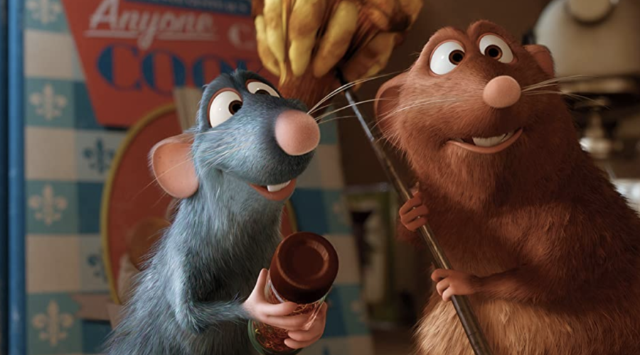
The best of the Golden Age Pixar films beats the “all animation looks good in digital” cliché, showing off the subtle virtues of HDR

by Michael Gaughn
September 21, 2021

On the heels of Dennis Burger’s review of Coco—probably the best of the recent harvest of Pixar films, likely because it was a holdover from the Lasseter era—comes this review of Ratatouille, probably the best of the films from the studio’s initial, defining Golden Age. Anointing a “best” Pixar film is almost impossible, especially when you’re talking about that early period when they could do no wrong—well, except for Cars.

Why Ratatouille? Mainly because nobody should have been able to create a mass-market cartoon about the world of gourmet cooking, let alone use it as a springboard for portraying that world in depth and at length, with both insight and affection, then draw a big enough audience to reap almost a billion dollars along the way. No live-action film could venture into that territory and expect to earn enough to even cover the crew’s car fare.

Making it even more miraculous is that Brad Bird and associates portray this rarified and exclusive world without succumbing to the Bay Area’s provincial snobbery, Silicon Valley’s endemic hubris, and the insufferable know-nothingness (and -everythingness) of the then emergent hipster movement. This movie should not exist—and yet there it is.

Fourteen years on, Ratatouille still holds up for the most part. The visuals don’t have the depth and photorealistic microdetail of Pixar’s more recent fare, but the production design and animation are so inventive that those technical improvements would be superfluous here. About the only thing that comes up short are the fire effects, which look smudgy.

Remy, Skinner, Ego, Emil, and Django are all still solid, Colette still feels perfunctory and obligatory, and Linguini is still consistently annoying, a sop to the youngest part of the audience that never felt right and hasn’t aged well—which brings up the biggest differences between this and earlier viewings of the film. It’s becoming apparent there’s a flaw in the Pixar formula that is going to become more obvious as time passes, a tendency to periodically amp up the action way beyond what the story calls for out of fear of losing the audience. This especially sticks out in Rataouille because it’s so unnecessary, the themes, characters, and plotting being so compelling (with a glaring exception) that all the little action set pieces jump out as arbitrary and disruptive. 

That glaring exception is the third act, which, for all their genius at plotting, the Pixar team badly bungled here. Not having properly balanced the various narrative threads, the result was something just short of chaos when they tried to pull them all together. Or, to shift metaphors, by the time Ego arrives at the restaurant for his dinner, they have so many balls in the air that you can sense their arms getting tired.

The time that elapses between Ego’s arrival and when he’s finally served is so drawn out that it stretches plausibility to the breaking point, even for a cartoon. Instead of maintaining the tension created by his presence and taking advantage of the momentum it creates, the movie jerks along in fits and starts as it tries to check off the boxes of all the various subplots, wreaking havoc on any realistic (or dramatic) sense of time.

For instance, we’re supposed to believe that Linguini has his freak out, then defends Remy, the entire kitchen staff quits, Remy becomes reconciled with his father, Colette reconsiders, the rats come to the rescue, the perpetually bumbling Linguini becomes a supremely coordinated skater, and they all conjure up a ratatouille while the most important food critic in France, with the power to ruin the restaurant, just waits—and waits, and waits. It doesn’t help that they too conveniently place the deposed and banished (and distinctly diminutive) Skinner in the middle of the dining room where he would have been instantly spotted by the wait staff. Poetic license can be a beautiful thing but this is all too much to swallow. You naturally give a cartoon a lot of leeway—but not when it squanders a natural point of dramatic energy because of shoddy plotting.

None of this fatally flaws the film—far from it. It’s just another aspect of Pixar being so hyper conscious of serving the audience that they didn’t fully invest themselves in the material—which would have led to a better, and likely just as successful, film. 

So let’s jump to the “modern animation always looks great on digital media, whether HD, Blu-ray, or 4K” cliché. I can see the merits of that argument but would then have to point toward what HDR brings to the presentation here. It’s a consistently restrained application but a consistently compelling one that takes full advantage of Paris’s reputation as the City of Light. Probably the best example is the shot toward the end of Ego standing looking out his tall study window at the skyline as he’s heard reading his review on the soundtrack. The deft enhancement of his desk lamp, the dimly lit chandelier, and the city’s glow is both subtle and dazzling. This is why animation is worth seeing in HDR.

I’m sometimes intrigued by Michael Giacchino’s work but wouldn’t call myself a fan. His scores are too often both ingratiating and derivative, and too big for the project at hand. But Ratatouille is one of his less turgid efforts—aside from those gratuitous action set pieces—with the scaled-back narrative causing him to rein in his usual excesses, leading to some evocative, and even graceful and restrained, flourishes from time to time. 

The TrueHD Atmos mix is appropriately atmospheric, convincingly placing you out in a field, in a farmhouse, in the sewer, in a gourmet kitchen, etc. But it does get a little too cartoony doing those moments when all involved felt obliged to goose the action.

The reputation of Pixar’s films is so strong it’s damn near invincible, so pointing out that some cracks might be starting to emerge is unlikely to trigger any kind of reconsideration. And it doesn’t make those early years any less of a miracle—the animation in the original Toy Story is really starting to show its age but that hasn’t yet had any real impact on enjoying the film. The same thing applies here, sort of—the animation in Ratatouille is still strong, and the Pixar team gets the expressive aspects so right that that third act fumble, which would have sunk a lesser film, triggers little more than a passing twinge. It’s hard, even at this late date, not to be in awe of what Pixar wrought here. 

Michael Gaughn—The Absolute Sound, The Perfect Vision, Wideband, Stereo Review, Sound & Vision, The Rayva Roundtablemarketing, product design, some theater designs, a couple TV shows, some commercials, and now this.

PICTURE | A consistently restrained but compelling application of HDR that takes full advantage of Paris’s reputation as the City of Light.

SOUND | The TrueHD Atmos mix is appropriately atmospheric but gets a little too cartoony doing those moments when the folks at Pixar felt obliged to goose the action.

Generic selectors
Exact matches only
Search in title
Search in content
Post Type Selectors

© 2023 Cineluxe LLC
Review: All Watched Over by Machines of Loving Grace

All Watched Over by Machines of Loving Grace (2011)

review | All Watched Over by Machines of Loving Grace

Another of Adam Curtis’s full-frontal assaults on contemporary culture, this BBC documentary is intensely cinematic throughout

by Michael Gaughn
February 13, 2021

Before diving in, I need to provide some context for why I’m reviewing a 2011 BBC series made up mainly of some pretty low-fi found footage. To the first point, when I stumbled upon this, Amazon Prime had labeled it as a 2020 release (which is when, I’m guessing, somebody spliced together the three episodes of the series). As for Point Two: This is, despite its lowly origins, the single most cinematic experience I’ve had in years.

Of course, I don’t need to be sold on watching anything with Adam Curtis’s name on it. He and Errol Morris (The Fog of War) are the two most innovative documentarians of recent times, and Curtis’s Century of the Self (about the rise of modern marketing—and social control—springing from the ideas of Freud’s nephew Edward Bernais), The Power of Nightmares (about September 11th and how Bin-Laden and the Americans essentially collaborated to create the myth of Al Qaeda), and HyperNormalization (about the consequences of embracing societal and virtual simplifications) are stunning, troubling, unequaled works. It’s impossible for anyone with an open mind to approach his series and not have their worldview turned on its head. 

To define my terms: Most of what passes for documentary filmmaking in the mainstream (and by mainstream, I mean TV networks, cable channels, and, primarily, streaming services—and primarily, within streaming services, Netflix) is really the bastard child of any legitimate documentary impulse, being more exercises in propaganda, marketing, and entertainment than any valid attempt to truly document anything. The filmmakers tend to know what they think and feel about a subject before they begin the project then spend the duration of the film continually reinforcing what they already believe, using their certainty and insistence to get you to buy into it too. 

That’s not Curtis. He poses things. While he has definitely done his due diligence, he also knows a video and audio presentation is a pretty flawed way of dealing with anything of substance, that, even if we won’t acknowledge it, we tend to go to media for a continual stream of diversions. But he also knows the importance of having an audience. So his series tend to be exercises in connecting up big things in unexpected ways, with some of those connections tentative, balancing his material between “this is” and “what if?” and, out of both a sense of responsibility and a desire to engage viewers in a way they’re not used to from TV, allowing for enough play that you ultimately have to think a lot of this through for yourself. 

Obviously, that’s a deeply frustrating experience for anyone who’s used to being told what to think or doesn’t want to think at all, which is why Curtis is frequently labeled a “cult” personality by both his admirers and detractors. (How anyone can have a recurring presence on the BBC and still be considered cult is a mystery to me.) For others, like me, his work is consistently liberating, partly because it runs so determinedly against the mainstream and so adamantly refuses to go to pat places. For all his well-seasoned British manner, Curtis is beneath it all a punk.

One more digression before I jump in, but it’s essential: Curtis is very much the child (or spawn, depending on your viewpoint) of documentarian Bruce Conner, specifically of his breakthrough 1967 short film Report, which used found footage from the mass media to offer an alternative take on the Kennedy assassination. The whole found-footage thing has become commonplace of course—stiflingly so—but nobody was doing it when Conner came up with Report, which treats its subject both seriously and with a deeply subversive wit.

Curtis creates knowing full well that we’ve literally seen it all before—and that’s his whole point. Yes, we’ve seen it but did we get it? Did we just buy into the bright, shiny surface and the pre-packaged context or did we maintain a skeptical distance and at least try to treat it on our terms instead of theirs? The frightening answer, for almost everyone watching his series—and this is Curtis at his most disturbing—is undeniably No. 

So Curtis isn’t for everyone (in fact, he’s for a pretty small subset of everyone). But everything he does is, again, intensely cinematic and, despite its sometimes harrowing subject matter, often entertaining—which helps explain his relative popularity. Someone could watch his series and not grasp a single fundamental point and still have a pretty good time.

The first thing I need to say about All Watched Over by Machines of Loving Grace (a title I promise you’ll never remember) is that it’s hard to find anything to say about it at all—partly because it’s so damned hard to get your arms around (deliberately so) and because, if you allow it to do its voodoo on you, it will leave you literally speechless.

Curtis’s work could be summed up as meditations on society, self, and selfishness—which I say knowing full well I’m being overly reductive. But you’ve got to start somewhere. All Watched Over could be said to ponder the overemphasis on rationality and how it tends to be trumpeted most loudly by the most deeply flawed and insecure. It begins with a meditation on Ayn Rand and by its dizzying and wrenching conclusion shows the devastating (il)logic that leads from Rand, through various too-explanatory models like the various, inherently unnatural attempts to define ecosystem and the vast computer-fed breeding grounds of narcissism, to the emergence of the selfish gene and the sad and somewhat insane ends of two of its proponents, Bill Hamilton and George Price.

But is that really what this series is about? We’re also treated to a disturbing (and exhilarating) tour of the Asian financial crisis and the subsequent backlash that then spurred the American financial crisis; the heyday of commune culture; the rise of the cure-all of self-organizing networks—and, in the series climax, a searing, haunting, ultimately overwhelming recounting of the genocidal consequences of the West’s brutal meddling in every imaginable aspect of the Congo.

All Watched Over is far more coherent than I’m making it sound; it’s just not conveniently linear. It’s also pretty fearless. Curtis tilts boldly at sacred cows ranging from Rand, Alan Greenspan, and the Clintons to The New York Times, Stewart Brand, Dian Fossey, Richard Dawkins, PS2, and, striking awfully close to his home base, David Attenborough and the BBC. 

Try not to be put off by my description. This is nowhere near as abstract and clinical an exercise as I might make it seem. It’s not just engaging but compelling. Even if you don’t get everything Curtis is putting in front of you, you want to. 

And I have to again emphasize how kinetic this all is. Nearly everything we watch now apes the conventions of cinema while dancing comfortably along the surface, oblivious to or dismissive or scared crapless of the depths. Curtis instead grabs your hand and pulls you down to the levels that matter, encouraging you to consider both the surface and the roots, inducing a sense of both terror and joy as you realize the tremendous distance and intricate relationships between them—and how much we’ve lost by coming to invest all our faith in the superficial.

He has never so deftly played with images, with the conscious juxtaposition and manipulation of their styles, their resolution, with their ironic and sometimes incongruous wedding, using edits to create deliberate gaps in which we’re encouraged to insert our own thoughts and emotions. His deployment of audio is similarly masterful, with sound often creating a sense of dread that can seem out of place until you realize, with a shudder, where he’s heading. And then there’s his use of existing music, which transcends the usual, lazy “forget your troubles come on get happy” efforts to get the audience to tune out of anything potentially challenging and instead radically recontextualizes it in a way that reminds me of Kubrick at his best.

As brilliant as Curtis’s other work is—and everything I’ve seen of his has been brilliant—All Watched Over is the best thing he has done to date.  Surprisingly, given how much of his reputation (like Morris’s) rests on his wry detachment, it functions on a more direct emotional level than his other efforts—but that’s just one of its many, many layers. If it were primarily emotional, it would run the risk of becoming sentimental or self-righteous in a hipster sort of way. But Curtis somehow maintains a delicate balance between all the elements of his inherently unstable and inchoate material, jazzed to be dancing on the edge of the void, which gives everything he does the thrill of a crime drama, like he’s constantly just one step ahead of the law.

I hope this hasn’t been hopelessly confusing, because that would be a disservice to Curtis and his creations. But it would also be a disservice to pretend they’re simpler or less troubling than they are. At a time when we’ve actually come to prefer things we can forget about the second we see them, Curtis’s films burn their way into you, like a brand. They’re a reminder that awareness isn’t just an awkward vestige to be purged but an essential part of any inherently and meaningfully human experience. All Watched Over by Machines of Loving Grace is cinema by other means—possibly, at a time when the world is purging its birthright en masse, by the only means that matter.

Michael Gaughn—The Absolute Sound, The Perfect Vision, Wideband, Stereo Review, Sound & Vision, The Rayva Roundtablemarketing, product design, some theater designs, a couple TV shows, some commercials, and now this.

PICTURE | Even though it’s a documentary made of often low-fi found footage, watch it in HD, if possible.

SOUND | And even though it relies on existing sources, the audio is respectable throughout.

click on the images to enlarge

Generic selectors
Exact matches only
Search in title
Search in content
Post Type Selectors

© 2023 Cineluxe LLC
Review: Spartacus

Spartacus (1960)

review | Spartacus

recent reviews

Sign up for our monthly newsletter
to stay up to date on Cineluxe

This sword & sandal Gladiator precursor proudly struts its stuff via a restoration and 4K HDR transfer

by John Sciacca
October 19, 2020

Of the stable of movie reviewers here at Cineluxe, I’m probably the least qualified to review Stanley Kubrick’s epic historical drama, Spartacus. I certainly don’t possess the encyclopedic film knowledge or ability to dissect filming styles like Mike Gaughn nor have the ability to draw wide parallels and comparisons like Dennis Burger. But what I can bring to this review is a fresh set of eyes and perspective since this was my first viewing. What I can hopefully answer is the question, “Is it worth my time/money to watch Spartacus?”

Doing even the slightest bit of digging into the film reveals it wasn’t the smoothest production. After failing to get the title role in Ben Hur, Kirk Douglas was looking for a major project for his production company, Bryna Productions, and optioned Howard Fast’s novel Spartacus. Fast was initially hired to write the screenplay but was replaced by Dalton Trumbo, who was on the Hollywood blacklist at the time writing screenplays under pseudonyms. Trumbo apparently turned the script around in two weeks and Douglas insisted that Trumbo be given onscreen credit for the film and publicly announced Trumbo as the writer.

Douglas fired the original director, Anthony Mann, after the first week of filming and replaced him with the 30-year-old Stanley Kubrick (who had worked with Douglas on Paths of Glory three years earlier). But this is the only film where Kubrick wasn’t given complete creative control and it included a significantly higher budget—$12 million (equivalent to $105 million today)—and far larger cast than anything he’d worked on befroe. Disagreements persisted throughout the production, based on Kubrick’s shooting style, pacing, the screenplay, and choice of location.

Despite all that, the film was a massive box-office success, receiving seven Academy Award nominations and winning four, including Supporting Actor, Art Direction, Cinematography, and Costume Design.

With a run time of three hours and 17 minutes, watching Spartacus is a significant time investment. While its 1960 opening ran 202 minutes, 41 minutes were trimmed for a 1967 re-release. It received an extensive restoration in 1992, backed by Steven Spielberg, and while the cut footage—including the “infamous” bath scene between Crassus (Laurence Olivier) and Antoninus (Tony Curtis)—was restored, the prints from the premiere were apparently lost and there are two short scenes that no longer exist. 

The film was given a major restoration for its 55th anniversary that included creating a new true 4K digital intermediate. A title card at the conclusion notes, “2015 Digital Restoration 6K scan from original large format Technirama Film Elements 4K color correction and digital restoration, 7.1 channel audio by NBCUniversal Studio Post”. The 4K Blu-ray includes a DTS:X soundtrack, while the Kaleidescape version reviewed here features Dolby Atmos.

Born into slavery, Spartacus (Kirk Douglas) is saved from death when purchased by Batiatus (Peter Ustinov), who runs a school that trains gladiators to fight and die “for ladies and gentleman of quality, those who appreciate a fine kill.” While in training, Spartacus meets and falls in love with another slave, Varinia (Jean Simmons). After she is sold, Spartacus leads a revolt and overthrows the soldiers at Batiatus’ camp. The revolt grows into an idea to rise up to free all the slaves of Italy, to create an army of gladiators that could fight their way to freedom to leave Italy forever to return to their homelands. After the slave army conducts a variety of raids on Roman garrisons where they gather treasure and more freed slaves, the Roman Senate enacts a plan to send Legions to crush Spartacus’ army.

Spartacus is classic old-school, epic Hollywood filmmaking. It opens with a four-minute musical overture, followed by another near four minutes of credits, and includes a mid-film intermission with a two-minute Entr’acte. Given its length, there’s plenty of time to develop characters’ stories, appreciate Spartacus’ rise to power and march across Rome, and delve into the political intrigue happening in Rome, though the pacing does feel a bit slow at times.

What drives Spartacus is the performances of the leads. Obviously motivated to turn in a strong performance, Douglas does much of his acting with his eyes, saying more with a stare, glare, squint, or furrowed brow than he does with his mouth. Olivier’s Crassius is a strong foil to Douglas but the star of the show for me was Ustinov, who seems to revel in his role as successful citizen turned sycophant to the Empire, tossing in off-handed comments and jokes that bring a bit of levity to the story, and example of which: “A gladiator is like a stallion that must pampered. Oiled, bathed, shaved, massaged, taught to use your heads.”

Spartacus’ influence on Gladiator is clear, though that later film relies far more on gladiatorial-battle set pieces and the CGI spectacle of recreating the Roman Colosseum. What Spartacus lacks in modern computer trickery it makes up for in sheer numbers, augmenting its cast with eight thousand Spanish soldiers to double as Romans for the climatic battle and doing much of its shooting on location (including California’s Hearst Castle—and anyone who has ever been on the tour will recognize the swimming pool at what is supposed to be Crassis’ estate), which looks fantastic captured in the 35mm Super 70 Technirama format. 

The quality of this transfer is apparent before the film even starts, as the title credits are razor-sharp, clean and clear. The opening shots reveal a natural bit of film grain in the blue skies, but images have incredible depth and sharpness, letting you see for miles into the distance. Resolution is impressive, letting you see individual pebbles and stones in the rocky ground, or the frayed edges on the sleeves of the slaves’ tunics, the detail of the embroidery, or the scuffs and wear in leather. The detail lets you know what the fabric of each actor’s costume would feel like, and reveals the quality differences between classes. The resolution also reveals incredible facial detail in closeups, clearly showing every pore, wrinkle, and line in Douglas’ leathery, sunburnt face. 

One of the downsides to suddenly revealing everything in a film—especially one that is now 60 years old—is that some of the filming techniques and shortcuts of the day are apparent. For example, there’s an interior scene where it’s obvious the brick and mortar of the walls is just set-dressing façade. It’s also clear when they’re shooting on an interior set rather than on location—and that the groups of Roman soldiers in some long-focus shots aren’t actually groups of soldiers. 

Also curious is the filming decision to nearly always defocus the camera when showing Varinia. The sharpness of every other scene makes this especially apparent. This had to have been a creative decision of the day, as Simmons was beautiful and had no apparent skin imperfections. (Though her acting was fine, her casting made me think they really wanted Elizabeth Taylor but instead used the closest substitute they could.) 

While the grand battle scene is impressive, I was surprised there weren’t more lengthy shots revealing the entirety of the fighting force. But there are plenty of scenes that show off an innumerable amount of people either marching, preparing for battle, or starting to charge. 

The training at Batiatus’ gladiator camp is also impressive. It’s clear the actors are doing their own stunts, some of which required a fair bit of dexterity and stamina, and it appears some people are actually being injured. For example, at the 54-minute mark, Spartacus fights Marcellus (Charles McGraw), and the higher resolution and color reveal that McGraw is actually bleeding from a wound and you see Douglas actually smashing his face into the cooking pot. 

This new transfer greatly benefits from the HDR grading, with interior scenes having deep shadow detail and inky, clean blacks. We also enjoy added highlights from sunlight glinting off sweating skin or in burning firelight. Having never seen the film prior, I can’t say for certain but it appears they took a pretty conservative pass with the HDR, and definitely remained true to the film’s original look. The wider color gamut brings out the richness of the crimson of the Roman soldiers and Senators, the gleam of shining gold, the red-orange as villages burn at night, and just a more natural quality to skin tones. 

Sonically, it felt like about 90% of the audio came from the front three left, center, and right speakers. If the surrounds were ever employed, it was sparingly, and not in a way that ever caused distraction or drew undue attention. The sweeping score is big and dynamic with its soundstage given a chance to open up across the width of the front speakers with a bit of the strings mixed up into the front height channels for added dimension. The only other time I was aware of any height-channel activity was during a thunderstorm were a bit of the storm is mixed overhead. They also use the subwoofer to bring weight to the musical score and to punctuate some of the battle scenes or marching. Dialogue is kept to the center channel, and it is clear and intelligible throughout. 

Spartacus remains a spectacle and triumph of its time, and it’s the kind of massive Hollywood epic we don’t often see any longer. The care and effort that went into this restoration are simply stunning to behold, letting you appreciate details audiences 60 years ago likely missed. Getting back to my opening question, “Is it worth your time/money to watch?” Absolutely. 

Probably the most experienced writer on custom installation in the industry, John Sciacca is co-owner of Custom Theater & Audio in Murrells Inlet, South Carolina, & is known for his writing for such publications as Residential Systems and Sound & Vision. Follow him on Twitter at @SciaccaTweets and at johnsciacca.com.

PICTURE | This 4K transfer greatly benefits from the HDR grading, with interior scenes having deep shadow detail and inky, clean blacks, and with added highlights from sunlight glinting off sweating skin or in burning firelight.

SOUND | About 90% of the audio in the Atmos mix comes from the front speakers. Surrounds are employed sparingly and not in a way that ever causes distraction or draws undue attention.

Generic selectors
Exact matches only
Search in title
Search in content
Post Type Selectors

© 2023 Cineluxe LLC

Review: My Fair Lady

My Fair Lady (1964)

review | My Fair Lady

recent reviews

Sign up for our monthly newsletter
to stay up to date on Cineluxe

The big-screen translation of Lerner & Loewe’s perennial still holds up for the modern viewer, with a nice boost from a stunning 4K transfer

by John Sciacca
December 8, 2020

Much like Spartacus, My Fair Lady is a gem from the early ‘60s that I had yet to see. Also like Spartacus, it’s available in a gorgeous new 4K HDR transfer that’s available for streaming from sites like iTunes. But to experience the transfer in its full glory, the 89.8 Gigabyte download from Kaleidescape is the best option. 

A third trait My Fair Lady shares with Spartacus is it was restored by Robert Harris (who also restored Lawrence of Arabia, Vertigo, Rear Window, and the first Godfather films). Harris originally restored the film in 1994 but was then hired by CBS in 2015 to perform a full digital restoration to prepare the film for its 50th Anniversary Blu-ray release. 

This was a lengthy process that took more than six months and started by creating an 8K scan of the original 65mm negative. There was a good bit of repair to scratches, tears, and splices; color correction; cleanup; and dust removal. Some 12 million glitches were said to hav been digitally moved and faded colors were returned to their original vibrancy using an archival print from the Motion Picture Academy as a reference. 

Immediately following the film, a vibrant pink title card proclaims, “Paramount Pictures has made a High Dynamic Range version on [sic] this film based on the efforts of Robert Harris, Fotokem, Audio Mechanics and the many others who helped with the original restoration.” (20th Century Fox’s press release on the restoration is pretty interesting reading.) 

As mentioned, this was my first viewing and at first blush Lady seems like a lot to ask of a modern viewer. It’s not exactly like a 56-year-old musical set in early-1900s London that lasts just under three hours (170 minutes) is something you’d plan for your next movie night. Also, the plot of a priggish linguist taking on the challenge of teaching a poor Cockney street girl “the majesty and grandeur of the English language” to fit into polite society doesn’t really grab modern eyeballs (though I do love Kaleidescape’s concise synopsis, “A London guttersnipe transforms herself into a proper lady under a language professor’s stern tutelage.”) 

However, as intrigued as I was about the quality of the 4K HDR transfer—especially after how impressed I was with Spartacus—it was really Audrey Hepburn starring as Eliza Doolittle that sealed the deal. She is truly a timeless beauty and it is just a treat to be able to watch and appreciate her—a testament to her charms, talents, and classic style that she is still such a draw so many years later.

A little digging reveals some pretty interesting things about Lady. With a production budget of $17 million dollars, it was the most expensive film shot in the US at the time. Based on the play Pygmalion by George Bernard Shaw, it had been adapted into a stage musical in 1956 that played on Broadway and in London. The stage version had Rex Harrison cast as Professor Henry Higgins (which he reprised in the film) with Julie Andrews playing Eliza. The film was nominated for 12 Academy Awards though Audrey Hepburn was notably snubbed from receiving a Best Actress nomination, rumored because many wanted Andrews to have the lead (she wasn’t considered well-known enough to star in such a big film) and because nearly all of Audrey Hepburn’s singing was dubbed by Marni Nixon. (Hepburn was told she would be able to do most of her singing and worked on the vocals for some time, but 90% of her lyrics were dubbed.) The film won eight Oscars including Best Picture, Director, Actor, and Cinematography. It also has extremely favorable critics and audience scores from Rotten Tomatoes, with 95% and 90% respectively. 

As a musical with 25 numbers, including the overture over the opening credits and a finale (all lovingly pre-bookmarked for easy and instant access by Kaleidescape’s Movie Guide team), I was thinking this would be a near-three-hour song-fest with all of the dialogue sung, but that (pleasantly) isn’t the case. In fact, quite a bit of the movie is spoken, with characters breaking into song as the moment calls. I was also surprised how many of the songs I was familiar with, just not knowing they were from Lady: “The Rain in Spain,” “I Could Have Danced All Night,” “Get Me to the Church on Time,” and “I’ve Grown Accustomed to Her Face.”

While I find myself still humming “Wouldn’t it Be Loverly?” even a couple of days later, my two favorite numbers were “With a Little Bit of Luck” and “Show Me.” “Luck” is performed by Doolittle’s father, Alfred (Stanley Holloway), with some humorous lyrics extolling the benefits of how some luck can get you out of tricky situations like doing hard work, getting hooked by a lady, or helping out a neighbor in need. “Show Me,” performed by Eliza, is about how a potential suitor needs to show his attentions with actions, not words. 

One character that does take a bit of getting used to is the surly Professor Higgins. He is in love with himself and linguistics, and shows large measures of disdain to all around him but mostly Eliza whom he meets after overhearing her extremely Cockney accent as she’s trying to sell flowers outside an opera. After a chance encounter with Colonel Hugh Pickering (Wilfrid Hyde-White), we have the opening number “Why Can’t the English Learn to Speak?,” which basically establishes the premise/bet that Higgins could teach anyone—even Doolittle!—to speak so not even the King could tell she didn’t belong, which would be then the key to them having a better life.

But Higgins hurls a constant barrage of verbal assaults at Doolittle throughout the film, including calling her creature, baggage, garbage, guttersnipe, squashed cabbage leaf, deliciously low, horribly dirty, draggletailed, barbarous wretch, and more. Some of these are off-handed descriptions while others are shouted insults. His feelings are also pretty well summed up in the number, “A Hymn to Him (Why Can’t a Woman Be More Like a Man?)”. I would say that his character is incredibly misogynistic. However, someone online argued that he’s actually a misanthrope (“a person who dislikes humankind and avoids human society”), which actually seems more accurate. 

That Higgins shows not the least interest, compassion, concern, or care for Doolittle—even on a human level, let alone a romantic one—makes the ending feel that much more forced. But what is more classic Hollywood than the leads coming together at the end?

So, how’s it look? In a word, stunning. 

Images are incredibly clean and detailed, with razor-sharp edges. Cobblestones in the street are clearly outlined and detailed, as is the distressing and texture in cement columns. Early on, Higgins is wearing a hat with a very fine check plaid, and the tight lines are clearly defined and visible. In another scene, he is moving about his grand library and even from a lengthy camera shot you can just about read the fine print on the books’ spines. Near the end, he sits in a white rattan chair that has incredible detail to its tight lines and pattern. 

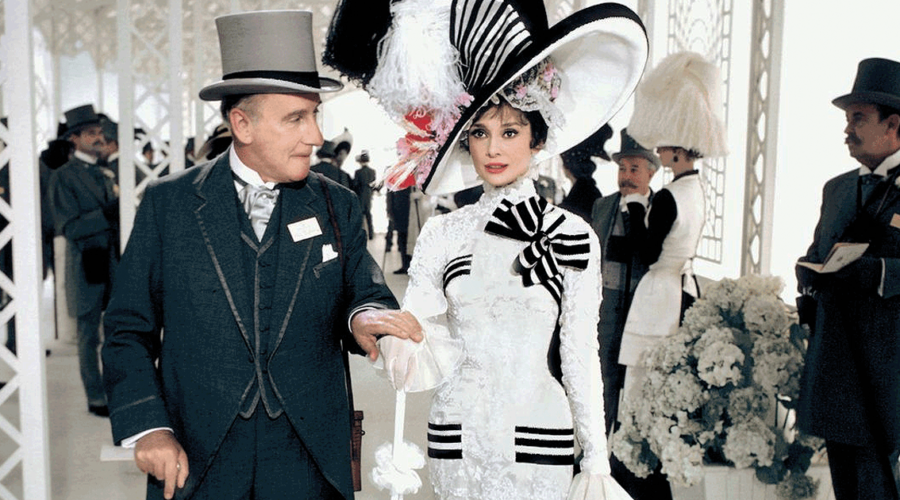
We also get terrific depth of field and focus. Shots such as at the Ascot Gavotte race or at the embassy dance show dozens of actors at once, all in crisp focus. You can also appreciate the costumes—especially Doolittle’s Ascot outfit and embassy gown—and other little attentions to detail and set dressing. It really demonstrates the benefits of being able to extract every bit of detail from the 8K scan of the original 65mm negative and Super Panavision 70 process. I was only occasionally aware of any grain, and it was never distracting, but at the same time it didn’t look like it had been scrubbed away, softening the picture. 

They took a light touch with the HDR grading but we do get some nice bright whites, especially in men’s crisp tuxedo shirts and Doolittle’s race dress. Blacks are also dark and noise-free, whether in nighttime street scenes or tuxedoes. The added contrast also provides more realistic and lifelike images throughout.

Don’t expect to use the 5.1-channel DTS-HD Master audio mix as demo material to show off your sound system but it keeps the attention and focus up front where it should be. If there was any audio mixed into the surround speakers, I didn’t notice it. I did notice that the mixers used the front three channels to give characters some room to move, not locking voices just to the center channel but letting them move left and right of center. This was also noticeable in the horse-race scene—the film’s most dynamic sonic moment—as the horses race from far right to far left. The orchestra is also given a lot of space to play in the front, with music having a nice tall soundstage helped by some processor upmixing to the front height channels. 

Dialogue was mostly intelligible but I did have some trouble early on when Doolittle is speaking in her heavily accented voice. Whether this was just difficulty with the dialect or the mix or a bit of both I can’t exactly say.

My only quibble with the audio is in the dubbing of Hepburn’s lyrics. I know it was a huge musical of the time and that audiences expected professional singing quality, but dammit if Gerard Butler can be The Phantom of the Opera then Hepburn could have sung for Eliza. We know she can sing from “Moon River” in Breakfast at Tiffany’s. But even taking the dub-snub away, it is the fact that the musical numbers have a noticeably different tone and quality to them, and the voice change just pulls you that much more out of the scene, but especially so in the numbers “Just You Wait” and “The Rain in Spain,” which has her singing some of the lines and Nixon clearly coming in and sounding vocally and tonally different. 

I can’t imagine My Fair Lady looked or sounded any better even on the night of its premiere. This transfer has images that look great for a modern film, let alone one that’s 56 years old, and it dazzles up on a big home theater screen. While the near three-hour runtime is a serious commitment, I found it thoroughly entertaining and definitely see why it’s considered a classic. 

Probably the most experienced writer on custom installation in the industry, John Sciacca is co-owner of Custom Theater & Audio in Murrells Inlet, South Carolina, & is known for his writing for such publications as Residential Systems and Sound & Vision. Follow him on Twitter at @SciaccaTweets and at johnsciacca.com.

PICTURE | This 4K transfer has images that look great for a modern film let alone one that’s 56 years old.

SOUND | You won’t use the 5.1-channel DTS-HD Master audio mix as demo material to show off your system but it keeps the attention and focus up front where it should be.

Generic selectors
Exact matches only
Search in title
Search in content
Post Type Selectors

© 2023 Cineluxe LLC
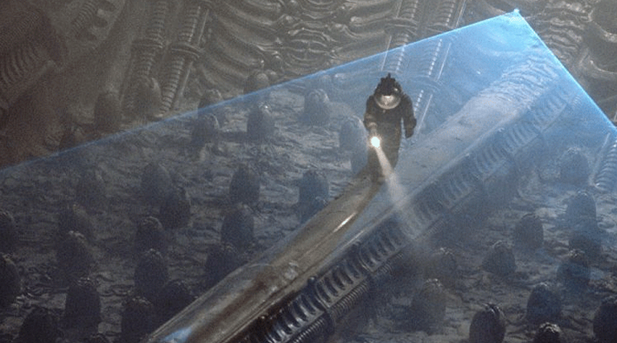
Reviews: Gladiator

Gladiator (2000)

review | Gladiator

The 4K HDR release of this Oscar-winning updating of the sword & sandal tradition does heighten the film’s impact—but also reveals its dated CGI effects

by John Sciacca
June 18, 2020

Having not watched Gladiator for years, what I most remembered about it prior to this viewing was the incredible recreation of the Roman Colosseum filled with tens of thousands of cheering, blood-thirsty fans. I recall marveling at the size and scope of it and how they’d been able to resurrect and recreate that 1,900-plus-year-old monument. 

Those digital effects didn’t hold up quite so convincingly viewed in 4K resolution 20 years later, but that’s OK. While the movie boasted some impressive effects for its day, they were always there just to serve the greater purpose of telling the story and never just for the sake of, “Look what we can do!” digital wizardry. At its heart, Gladiator remains a compelling story featuring powerful acting all around with impressive practical sets and effects, and with action scenes that remain dynamic and thrilling, keeping it as entertaining today as it was on its release back in 2000.

I’d also forgotten just what a powerhouse Gladiator was at the 2001 Academy Awards, snagging a total of 12 nominations and pulling down a total five Oscars including Picture, Actor (Russell Crowe), Costume Design, Sound, and Visual Effects.  

Director Ridley Scott wastes no time jumping into the story, quickly introducing us to General Maximus Decimus (Crowe) as he is about to lead his Roman army to victory against a Germanic horde in what will be the final battle of his latest campaign. It’s immediately clear Maximus is an accomplished war fighter, leading from the front, and beloved by his men. 

Following the battle, aging Caesar Marcus Aurelius (Richard Harris) tells Maximus of his plans to leave rule to him rather than to his debauched son Commodus (Joaquin Phoenix). Predictably, Commodus doesn’t take this news well, instead killing his father in private and declaring himself Caesar and then ordering the Praetorian Guard to kill Maximus and his family. When the soldiers fail to kill Maximus, he rides towards his home, arriving just in time to see it burnt to the ground and his family slaughtered. Severely wounded, he is taken prisoner and sold as a slave to Proximo (Oliver Reed) and made to fight as a gladiator. Maximus’ motivation throughout remains solely to survive long enough to be able to avenge his family by killing Commodus.

If Gladiator were just about fighting, fancy sets, and costumes, it wouldn’t hold up nearly so well. What keeps it great is the acting, primarily by Crowe who earns his Oscar in every scene and seems fully at home in the role of commanding troops and fighting. Maximus is always believable as the general that could come in and organize a band of gladiators to overthrow the people they are forced to fight, leading a rebellion from within. Phoenix brings just the right level of loathsomeness to petulant Commodus, someone solely interested in his own rise to power and willing to do whatever it takes to keep it, along with his lecherous relationship with his sister Lucilla (Connie Nielson). 

At over two and a half hours, Gladiator is a long film that doesn’t feel long. Rather, Scott takes us on what feels like an epic journey even though, in reality, the events portrayed in the film  would take less than a year to play out. The running time gives us plenty of opportunity to care about Maximus and his journey; to root for his fellow gladiator/slaves Jubu (Djimon Hounsou) and Hagen (Ralf Moeller); to follow the political machinations of the Roman Senators Gauis (John Shrapnel) as he tries to keep Commodus in check and do what is right for the Republic. It also allows enough time between matches in the Arena to keep the film from feeling like just a string of fights.

Filmed in 35mm, Gladiator was given a restoration in 2018, and both the UltraHD Blu-ray disc and the Kaleidescape download are taken from a new 4K digital intermediate. The movie looks like it has been born anew. Image quality retains its film-like look, with grain occasionally visible in some of the early morning sky scenes or through some of the battlefield smoke, but you’re drawn closer into the action with the clarity and cleanness of the picture. Native film scanned to 4K doesn’t produce the micro-level of detail seen in modern transfers, but you can still appreciate far better resolution here than in the previous HD version. 

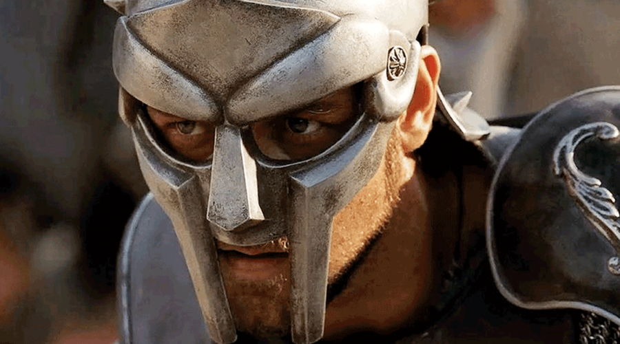
Closeups reveal the texture and feel of the fabrics used on the elaborate Academy Award-winning costumes, the nicks and dents in the battle armor or links in chainmail, the cracks and lines in the walls of the city, or the fine stalks of wheat with individually detailed wisps, or the dirt and dust Maximus rubs on his hands before each battle. 

The added detail also helps you appreciate the large vistas that give the film its sense of scope and scale. But I did notice that some of the long shots and even the occasional closeup appeared a bit soft. Also, the lengthy shots leaning heavy on CGI, such as the Colosseum and the initial Rome flyover, are softer due to the graphics limitations of the day, and the greater resolution makes the digital crowd feel a bit less real. 

The added contrast from HDR helps to improve images. There are a lot of low-lit scenes, whether in tents or prisons or at night, and the deep black levels and shadow detail add to the realism. Many interior scenes are lit by numerous torches, and we not only get the nice pop of brightness from the flames but the warm, natural glow of the firelight and the deep shadows as actors move around a space. The spectacle of Commodus’ Rome benefits from the wide colors, with bright, gleaming golds and other regal colors looking vivid, along with the bright red blood spilled in combat and the deep red-orange of fireballs and flames in combat. 

While the UltraHD disc receives a new object-based DTS:X soundtrack, the Kaleidescape version gets a DTS-HD Master 7.1-channel mix that’s still exhilarating and exciting, especially when run through the upmixer found on modern AV processors. The opening battle features shouts and chants from the armies along with the din of soldiers, which engulfs you from all around, followed by the sounds of arrows whistling past you into the surround channels and fireballs sailing overhead and bursting into treetops. The crowd noise inside the Colosseum is also appropriately huge and room-filling, putting you right in the middle of the action. Bass is deep and authoritative, such as chariots crashing in the arena or when the fireballs smash into trees.

Equally as impressive are the subtler audio moments that help to define and establish the scene and space the characters are in, with nearly every scene or moment featuring little bits of audio that help to set the space of things happening on or off camera. Listen to the carriage ride as Commodus is riding to the front—you hear the sounds of the rocking and creaking of the carriage itself along with things jingling inside, along with noises of the horses and wheels turning outside. In another scene, you can hear the delicate, gentle tinkle of Lucilla’s earrings knocking together as she talks. Or in the prison at night, where you hear the sounds of doors opening and closing, crickets chirping in the distance, or echoing footsteps. Throughout, the audio mix is impressive whether in the midst of battle or in quieter moments. Of course, Hans Zimmer’s dynamic Oscar-nominated score sounds wonderful, giving more room to breathe across the front channels and up into the height speakers. 

Gladiator holds up remarkably well after 20 years not just visually and sonically but also from its involving story and acting, and the new 4K HDR version clocking in at a whopping 95 GB from Kaleidescape represents the best you’ve ever experienced this movie! 

Probably the most experienced writer on custom installation in the industry, John Sciacca is co-owner of Custom Theater & Audio in Murrells Inlet, South Carolina, & is known for his writing for such publications as Residential Systems and Sound & Vision. Follow him on Twitter at @SciaccaTweets and at johnsciacca.com.

PICTURE | Taken from a 4K digital intermediate, the movie looks like it has been born anew, with images retaining their film-like look, with the clarity & cleanness of the picture drawing you further into the action.

SOUND | The DTS-HD Master 7.1-channel mix is exhilarating and exciting, especially when run through the upmixers found in modern AV processors.

Generic selectors
Exact matches only
Search in title
Search in content
Post Type Selectors

© 2023 Cineluxe LLC
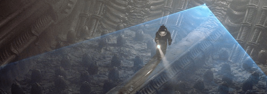
Review: The Empire Strikes Back

The Empire Strikes Back (1980)

review | The Empire Strikes Back

The latest release of the best of the Star Wars bunch excels on both the 4K HDR and Atmos fronts

by John Sciacca
April 29, 2020

Disney and Lucasfilm gave Star Wars fans a real gift this year, making all nine of the franchise films (plus offshoots Rogue One and Solo) available for the first time in 4K HDR transfers with Dolby Atmos immersive-audio soundtracks. And, as an even more special May the Fourth present, the films are also all currently marked down at sale prices through digital retailers, with each movie available for download at Kaleidescape for $13.99 (opposed to the usual $33.99). A bargain in any galaxy . . . no matter how far, far away!

While I’ve reviewed the two latest films in the Star Wars canon—The Last Jedi and The Rise of Skywalkerwe thought it would be interesting to take a look further back in the franchise and view one of the installments widely considered to be the best of the bunch: The Empire Strikes Back.

I was seven when Star Wars—now known as A New Hope—was released in 1977, and I can’t remember being as excited about seeing a sequel as when Empire came out in 1980. I clearly remember begging my dad to take me on opening night and then breaking down and sobbing when he said he wouldn’t—a devastating blow to 10-year-old me having to wait even one extra day! (For the record, I have seen every Star Wars film since—including the Special Edition re-releases—on opening day.) 

As impressive as the first film was, Empire ratcheted everything up several notches: Exciting new locations—Hoth, Dagobah, Bespin; new weapons—snow speeders and AT-AT walkers; Jedi training, and a far more impressive lightsaber battle between Vader and Luke (Mark Hamill) ; new characters—scoundrel/frenemy Lando Calrissian (Billy Dee Williams), the Emperor (Ian MacDiarmid), a character so powerful even Vader kneels before him, and a new Jedi Master, Yoda! Plus, a huge—you actually want to hear an audience let out an audible gasp!?revelation from Vader, along with introducing everyone’s favorite bounty hunter, Boba Fett. 

With all that going on, it’s no wonder this movie is both the best reviewed—Rotten Tomatoes critics’ score of 94—and most fan-loved—audience score of 97—of the series, along with being my personal favorite. And it not only holds up after 40 years, but, oh my damn! does it look and sound absolutely amazing! Fully restored and taken from a new 4K digital intermediate, Empire is clean, detailed, sharp, and visually stunning, and has never looked as good as we have it now. 

As stunning as the audio and video transfer is, nearly as impressive is not only how well the film holds up but just how impressive the visual effects still are. Sure, you can tell that the Tauntauns and AT-ATs are stop-motion miniatures and some of the matte paintings can’t compete with modern CGI, but overall, the film still absolutely delivers. (Leia calling Han “laser brain” and Luke oddly scratching Chewie under the neck still remain cringeworthy.) 

George Lucas famously broke away from the Hollywood machine after the first film, deciding to take full control of his story and opting to finance Empire entirely on his own (a story documented in the fascinating two-and-a-half-hour Empire of Dreams—The Story of the Star Wars Trilogy, available for streaming on Disney+). Doing this not only made him fabulously wealthy, it made him realize he would be too busy to take on the directing chores, instead asking a former film professor, Irvin Kershner, to take over at the helm. Besides managing finances, Lucas also supervised the special effects of his other budding enterprise, Industrial Light and Magic, and remained involved as executive producer, writer, and editor, something you get an interesting glimpse into via one of the included special-feature docs “George Lucas on Editing The Empire Strikes Back.”  

You’ll notice the improvement in picture quality literally from the film’s opening seconds. The starfield is black and crisp with hundreds of bright pinpoints of starlight (were there always that many stars?), and the text scrawl is a glorious vibrant yellow that’s so razor-sharp it leaps off the screen. 

All of the space shots are wonderfully deep and black, with bright star points and little lights illuminating the various ships along with a variety of colored engine plumes. These shots feature far more contrast, and the Imperial Star Destroyers look gorgeous. Featuring a beautiful shining-white leading edge, they’re illuminated by hundreds of lights, making them appear more ominous, alive, and massive, and allowing you to appreciate all the detail. 

Edges are just sharp and clean throughout with closeup detail so good you see every line and pore in the actors’ faces. Leia (Carrie Fisher) looks incredibly fresh-faced, young, and beautiful. You also notice that the shoulder restraints of the snow-speeder pilots appear to be just bubble wrap. The tight shots reveal individual strands of Chewbacca’s fur, along with each wispy piece of hair on Yoda’s head, face, and fingers, and each wrinkle and expression. Puppet Yoda is more alive and real than ever, and you can really appreciate the master work done here by Frank Oz.

The film has a lot of practical sets and props, and the image quality really lets you appreciate the detail and care that went into them. The detail and texture along the Falcon is amazing and you can see all of the little nicks and scratches and wear on the various pilots’ uniforms and helmets. The details of Han Solo (Harrison Ford) in carbonite—with little dimples and cracks and pits—are also clearly visible. We get several nice interior shots of the Falcon’s cockpit, alive with hundreds of glowing and blinking lights of different colors, all vibrant in HDR. 

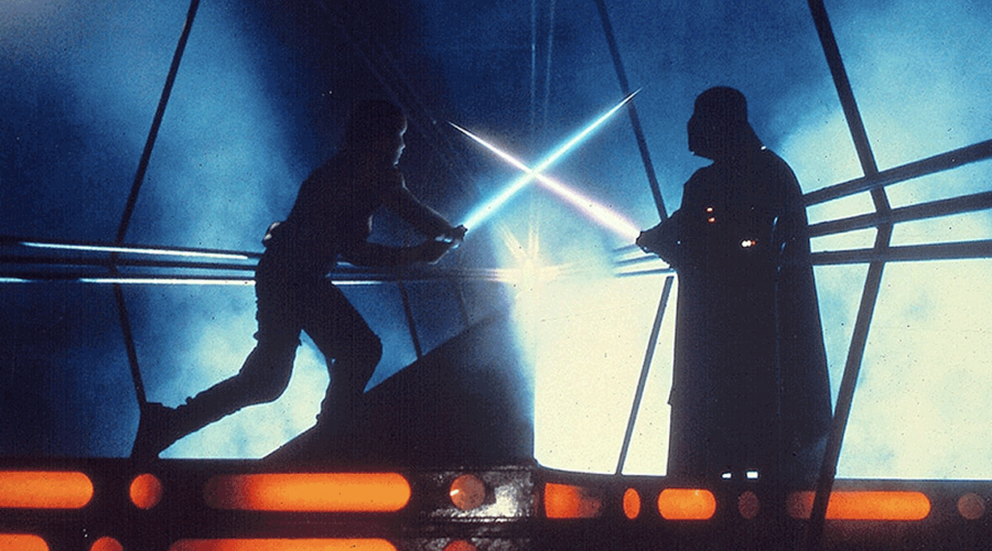
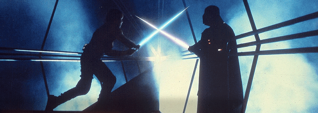
While the Hoth battle scene is one of my very favorites—and as exciting today as ever, enhanced with both better images and audio—one of the most visually striking parts of the film is in the carbonite freezing bay. Here the deep black of the room is accentuated with glowing orange, with bright blue lights and with smoke all around. When Vader and Luke face off here in the first saber duel, it looks phenomenal. The images are crisp with tons of contrast, creating cinematic images that are every bit as dynamic and compelling as anything you’ll see in modern film. 

As good as the images are, the sound does an equally impressive job of bringing Empire up to modern sonic standards, with the mixers taking every opportunity to have ships and objects flying or rumbling past overhead. Right from the start, probe droids launched from the Destroyer whiz across your ceiling, not to mention all the flyovers from tie-fighters, snow speeders, mynocks, and more. Ghost Obi-Wan (Sir Alec Guinness) and the Emperor’s voice boom from overhead and all around as appropriate.

Beyond the big action scenes, we get a ton of ambience and atmospheric sounds in nearly every scene. Listen to all the little things that are happening inside the Rebel bass on Hoth—there are shouts from off screen, ambient little buzzes and droid noises, and mechanical sounds of repairs going on. Outside on Hoth, the blizzard whips wind and snow around the room. On Dagobah, we;re immersed in jungle sounds, with creature noises and leaves rustling, and a brief rain storm that showers the room. 

Bass is deep and powerful, whether it is explosions or the mighty foot stomps of the AT-AT walkers. Perhaps most important, dialogue is always clear and properly placed, not always in the center channel but tracking characters as they move off screen.

I honestly can’t say enough about this 4K HDR transfer of The Empire Strikes Back; it is truly reference quality in every way. And having purchased the Star Wars films in so many formats and versions over the years—VHS, letterbox VHS, LaserDisc, DVD, Blu-ray—I was seriously planning on sitting this round of Star Wars releases out. But after watching Empire, I’m starting to question that decision. If you’re a Star Wars fan, you’ve never seen the movies look like this, especially in a fine home theater. In many ways, it feels like seeing them for the very first time—and that is a priceless experience. 

Probably the most experienced writer on custom installation in the industry, John Sciacca is co-owner of Custom Theater & Audio in Murrells Inlet, South Carolina, & is known for his writing for such publications as Residential Systems and Sound & Vision. Follow him on Twitter at @SciaccaTweets and at johnsciacca.com.

PICTURE | Fully restored and taken from a new 4K digital intermediate, Empire is clean, detailed, sharp, and visually stunning, and has never looked as good as it does here.

SOUND | The Atmos soundtrack does an equally impressive job of bringing the film up to modern sonic standards, with the mixers taking every opportunity to have ships and objects flying or rumbling past overhead.

Generic selectors
Exact matches only
Search in title
Search in content
Post Type Selectors

© 2023 Cineluxe LLC
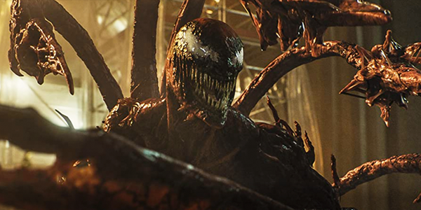
Review: Alien

Alien (1979)

review | Alien

The style-driven sci-fi horror flick that launched Ridley Scott’s career gets a terrific 4K HDR restoration, but not a new Atmos mix

by John Sciacca
August 26, 2019

Forty years. That’s how old the seminal sci-fi, suspense, horror film Alien turns this year. And to celebrate the milestone, 20th Century Fox has given it a complete 4K HDR restoration, supervised by director Ridley Scott, with the transfer taken from a 4K digital intermediate.

What can be said about Alien that hasn’t been said in hundreds of other reviews, columns, blogs, and forums? Released in 1979, the movie has a different look, feel, and style than anything else that had come before. And like throwing a boulder into a pond, it caused a ripple effect through the filmmaking world that influenced the style and storytelling of virtually every sci-fi film that followed—principally Scott’s own Blade Runner. Sigourney Weaver’s Ripley—looking incredibly young and fresh-faced here—launched the idea of a strong female hero, and Scott’s gritty, decaying Nostromo showed that the future didn’t need to be shiny and new. 

I remember the first time I saw Alien. All I really knew about it was the tagline, “In space, no one can hear you scream.” The original trailer had an incredibly slow build, almost a full minute of a slow pan down to an egg, followed by a lot of dark scenes with people running and panicking. And not a single spoken word—not one.

Of course, as an 11-year-old, the infamous chest-burster scene was shocking but not actually the nightmare fuel one might think. No, what lingered in my brain was nightmares of running through a darkened ship, klaxons blaring, strobes flashing, being chased by a monster as a countdown timer steadily wound down towards destruction. Fun times.

Unfortunately, Alien has never lived up to its potential on the home screen. DVD and LaserDisc versions were overly grainy and noisy, and the previous remastered Blu-ray version couldn’t do the shadow and black-level detail justice. All of that is made right with this 4K HDR version, which looks fantastic. Fortunately, the restoration isn’t heavy-handed, getting rid of the bad bits of noise and deterioration while keeping Scott’s look and stylistic feel solidly intact.

The film begins with the unrestored 20th Century Fox logo showing you just how grainy and noisy the source material was but once we jump into the film, the image is clean, clear, and beautifully solid. The blackness of space is deep, inky, and clean, with the stars as bright pinpoints of light. They definitely took a mild touch with HDR, not overdriving the film but enhancing key scenes, punching up the appropriate highlights like the ship’s drive engines, spotlights, flames, and strobes. Much—and I mean much—of the film takes place in the dark, with many things hidden in shadows, and it’s here the cleaned-up transfer and HDR have the greatest impact. 

Occasionally, there are scenes where the boosted brightness of a spotlight will highlight a bit of noise in the image, but these are few and unobjectionable. There’s a brutal video torture test at 24:30 in, where the crew is exploring the moon that’s the source of the spurious radio signal. Here we have myriad shades of gray illuminated by various lighting sources and swirling smoke that could be an absolute banding nightmare, but the image holds up wonderfully. While Alien will never be accused of being a colorful film, 4K’s wider color gamut is used modestly to enhance the bright reds and oranges of the many indicator lights located around the Nostromo. 

It’s been years since I’ve watched it, and I couldn’t entirely recall the storyline, so it was nice to go into it semi-fresh. What I really appreciated was the total lack of exposition. You’re thrown into the Nostromo with the crew as they’re awakened out of hyper-sleep and have to figure out things along with them. Several minutes pass before a word is spoken. The depth of the image during the slow, wandering journey through the empty space ship is almost 3D. HDR is used nicely here, allowing us to see more shadow detail than ever, letting you appreciate the lengths taken with the practical sets. The same can be said for the spacecraft the crew discovers on LV-426. Here you can marvel at H.R. Giger’s design style and really appreciate the look of the Space Jockey and leathery texture of the eggs in the egg farm.  

Whether by design or technical limitations, the glimpses of the Xenomorph are kept few and are often just snatches or in shadows. This reminded me of Jaws, where Spielberg keeps the huge Great White a visual mystery for much of the film, proving that often the dangers we can’t see are the most terrifying. 

I was amazed how well the story and effects hold up. The only things that really date the look are the ancient displays and computer tech located around the Nostromo. Some of the graphics on these screens look a bit of a mess, while others—namely the text on Mother’s screen—look razor-sharp. The alien looks just as terrifying as ever, with the workings of its glistening, goo-filled inner jaws clearly visible. 

Part of the danger of making a film this old look so good is that some things best left unseen are revealed. There were a couple of moments where it was too obvious that the alien’s movements were a tad too human-in-a-costume or that we were looking at models instead of full-sized crafts. Fortunately, these were minor and certainly didn’t detract me from enjoying the film. 

One thing not changed from the previous Blu-ray release is the audio, including the 5.1-channel DTS-HD Master Audio. Would I have loved a new Dolby Atmos or DTS:X mix? Absolutely. There are many scenes where an immersive track could have been used to great effect but this mix plays well in a luxury cinema and my processor’s upmixer did a great job of putting blaring alarm klaxons up into the overheads. 

Both the 4K disc and the Kaleidescape download include the original theatrical cut and the director’s cut (which actually plays a minute shorter) along with two commentary tracks and two isolated soundtrack scores. Alien is a must-have for any film fan, and I dare say it will never look better than what we have here.

Probably the most experienced writer on custom installation in the industry, John Sciacca is co-owner of Custom Theater & Audio in Murrells Inlet, South Carolina, & is known for his writing for such publications as Residential Systems and Sound & Vision. Follow him on Twitter at @SciaccaTweets and at johnsciacca.com.

PICTURE | The 4K HDR restoration looks fantastic, getting rid of the bad bits of noise and deterioration while keeping Ridley Scott’s signature style solidly intact.

SOUND | This is the same 5.1 DTS-HD Master Audio mix that was on the Blu-ray release but a processor’s upmixer can do a great job of putting things like the blaring alarm klaxons up into the overheads.

Generic selectors
Exact matches only
Search in title
Search in content
Post Type Selectors

© 2023 Cineluxe LLC

Review: The Wizard of Oz

The Wizard of Oz (1939)

review | The Wizard of Oz

recent reviews

Sign up for our monthly newsletter
to stay up to date on Cineluxe

The 4K HDR restoration shows there’s more subtlety to the film’s Technicolor palette than we’d expect based the previous home releases

by Dennis Burger
October 31, 2019

As much as we tend to discuss Ultra HD video and high dynamic range in relation to the latest Hollywood and Netflix have to offer, it’s sometimes easy to forget something important: The films that stand to benefit most from current home-video standards aren’t the newest digital spectacles but classic works created entirely in the analog domain. Older films possess a level of detail and nuance no previous home-video format has been capable of replicating and short of cinema revivals, most of us have never seen them in all their splendor. 

I don’t know of any film as old as 1939’s The Wizard of Oz to make the leap into 4K HDR before now. For that matter, I don’t know of any other movies filmed in three-strip Technicolor that have been remastered for 4K HDR to date. That alone makes this new home-video release academically interesting, even if the Judy Garland classic holds no emotional sway over you. 

Not that it matters, of course, but it does for me. Hold emotional sway, that is. I’ve owned Oz on every home-video format available in the U.S., including every VHS release, every Laserdisc release, every DVD and Blu-ray. But my love affair goes further back than that. One of my earliest memories is of lying belly-flat on the rug in our den, watching Dorothy and friends traipse down the Gray Brick Road on our old black & white tube TV. Much to my dad’s chagrin, that was the start of a yearly tradition for me—one I uphold to this day every Thanksgiving. 

I can almost define each era of my life in relation to how I experienced that annual ritual. My first time viewing it on a color TV was, it should go without saying, a significant revelation. And although there have been upgrades since (the 1989 restoration of the sepia tones in the opening and closing acts, the 2005 restoration and re-alignment of the original Technicolor film strips), rarely has any viewing of Oz blown my mind quite to the same degree as seeing it in color for the first time.

Until now. This 4K HDR release of The Wizard of Oz is the first to actually replicate the experience of viewing the movie by way of a pristine 35mm print. And this is evident as early as those early sepia-toned shots in Kansas, which you wouldn’t think would make for a great HDR demo. It’s important to remember that, for all the talk about peak brightness and nits and whatnot, the most significant boost to dynamic range HDR delivers is in the lower end of the value scale. There are simply more steps of near-black to work with here, and that’s put to good use in the opening scenes by dragging detail out of the shadows without brightening the overall image. 

It should come as no surprise, though, that this new transfer doesn’t really come to life until Dorothy steps through the monochromatic door of her wind-tossed home into the rainbow lands of Oz. But again, the benefits here may not be what you’re expecting. 

If you go in anticipating tons of intense specular highlights, you’re going to be left wanting. Some vibrant peak brightness is used to bring out the sparkle of Glinda’s jewels and of course the gleaming glimmer of Dorothy’s ruby slippers. But in all cases, this higher-intensity brightness is organic and tastefully done—so much so that it may only affect you subliminally. 

There’s simply no mistaking the color palette of this new transfer for that of any previous home  release. Early offerings of Oz did what they could with their limited color gamut. Around the time of the aforementioned remaster in the mid-2000s, though, Warner saw fit to actually boost the color saturation of the movie in order to approximate the Crayola hues Technicolor was capable of delivering. 

The problem with that was that the entire palette of Oz was dragged along for the ride. So, although the Wicked Witch’s verdant skin tones may have looked close enough, subtler colors like the pastels of the Lullaby League were overly boosted and overly intense—just plain wrong, when you get right down to it. 

When viewed via Kaleidescape, the 10-bit palette of this new release (which was taken from an 8K, 16-bit scan of the original film elements) puts all of the colors in their proper proportions. So, for example, in certain scenes in Munchkinland, subdued pastels share the screen with luscious primary hues—something most of us have never seen outside of the film’s more recent theatrical revivals. 

The detail and definition of this transfer will henceforth be my response to those who say we don’t need 4K resolution at home. Subtle details that were obscured by previous 1080p and lower-resolution releases are restored for all the world to see—even down to the individual hairs on Dorothy’s head. 

There is, of course, a hefty helping of softness to the image in places, especially in closeups of Billie Burke (Glinda). My point is, it’s taken until now to bring all of the detail—softened, filtered, gauzed though it may be in some scenes—to home displays. I’m struggling to see where even an 8K release could improve on what I’m seeing here in terms of detail and definition, much less color and contrast.

If I have a nit to pick, it’s that this new color grade still gets the early and late sepia-toned film a little wrong. It’s important to remember that this footage was shot in black & white and hand-tinted sepia—and then hand-tinted sepia again in the ’80s. And as with every release of the past couple decades, this version takes that tinting just a touch too far, with slightly too much warmth. But that’s only a concern if you get overly fussy about “filmmaker’s intent.” (Incidentally, if you’re curious about how I can speak to “filmmaker’s intent” in this case, given that there were so many chefs stirring this pot, we can look to a scene later in the movie in which Dorothy peers into the Wicked Witch’s crystal ball and sees her Aunt Em in Kansas, in all her sepia-tinted glory. That’s what Kansas is supposed to look like.) 

And . . . [checks notes] Yep. That’s it. That’s literally the only pedantic niggle I can come up with. Some viewers may take issue with the fact that those sepia scenes don’t quite hold up to the clarity and definition of the film’s colorful middle. That’s largely due to the original negatives for the first and last act having been lost in a fire in the 1970s, so they have since been sourced from an optical intermediate struck in the ’60s. The only original negatives we have at this point are for the color parts of the film, so this is the best Kansas is ever going to look. 

The purist in me also wants to half-heartedly complain about the lack of the the original mono soundtrack with this new release, but I just can’t bring myself to grump about that, given how great the DTS-HD Master Audio 5.1 remix sounds. And this is a new remix, by the way—not the lossless 5.1 mix that was included with the 70th and 75th anniversary Blu-rays. 

The surround channels are employed a little more frequently this time, and there’s an appreciable boost to dialogue intelligibility and vocal clarity, along with some enhanced bass, especially during the tornado sequence. But all in all, this surround mix is true to the sprit and overall aesthetic of the film. It’s certainly not as egregious or aggressive as some recent remixes for classic films. So even if the original mono were present, I can’t imagine I would ever listen to it.

As for the Kaleidescape presentation, my only beef is that, in addition to the 4K HDR version, you’ll also need to download the Blu-ray-quality version if you want access to all of the bonus goodies—including the audio commentary with historian and author John Fricke, which carries over from every home release since 2005. There’s also the excellent The Wonderful Wizard of Oz: The Making of a Movie Classic from 1990, hosted by Angela Lansbury, which for some reason was dropped from the 75th anniversary video releases but makes a welcome reappearance here. 

Oodles of other bonuses are worth your time if you’re a dedicated fan, but these two are essential viewing/listening for everyone, so download both versions of the film from the giddy-up. Why you can’t simply download the bonus features without double-dipping on the film itself is beyond me.

What else is there to be said? If you’re reading this, you already know what the film means to you—you’re simply deciding whether it’s worth the 4K HDR upgrade for an 80-year-old film. The answer to that is a resounding, enthusiastic, unapologetic “Yes!” Few films have benefited from the increased resolution, enhanced dynamic range, and most importantly the wider color gamut of our current home video standards nearly so much as this one. My biggest regret is that I can’t put 4K HDR screen grabs in front of you and let you see the improvements with your own eyes. Unfortunately, the limitations of the web make that impossible.  

Dennis Burger is an avid Star Wars scholar, Tolkien fanatic, and Corvette enthusiast who somehow also manages to find time for technological passions including high-end audio, home automation, and video gaming. He lives in the armpit of Alabama with his wife Bethany and their four-legged child Bruno, a 75-pound American Staffordshire Terrier who thinks he’s a Pomeranian.

PICTURE | Few films have benefited from the increased resolution, enhanced dynamic range, and wider color gamut of our current home video standards.

SOUND | The DTS-HD Master Audio 5.1 remix is true to the sprit and overall aesthetic of the film, never becoming as egregious or aggressive as some remixes for classic films.

Generic selectors
Exact matches only
Search in title
Search in content
Post Type Selectors

© 2023 Cineluxe LLC
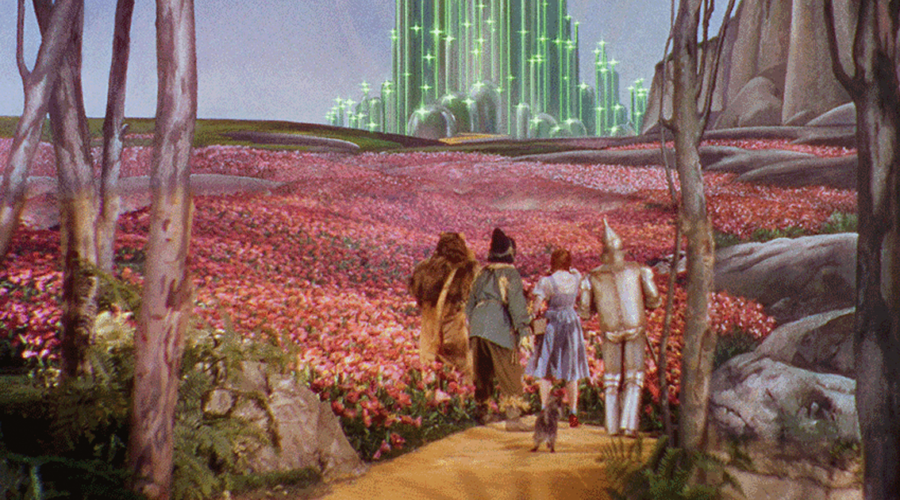
Scroll to top

sign up for our newsletter

receive a monthly recap of everything that’s new on Cineluxe