• Type:
  • Genre:
  • Duration:
  • Average Rating:

Reviews

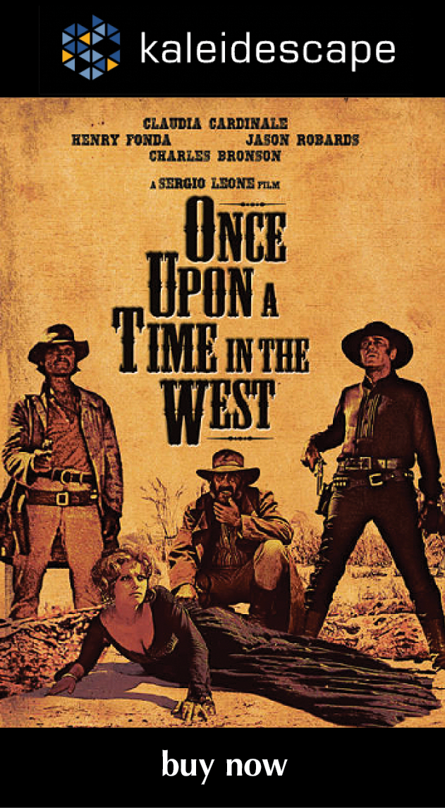
Review: Once Upon a Time in the West

Once Upon a Time in the West (1968)

review | Once Upon a Time in the West

Sergio Leone’s legendary epic finally makes the leap to 4K HDR with mostly admirable results

by Michael Gaughn
May 8, 2023

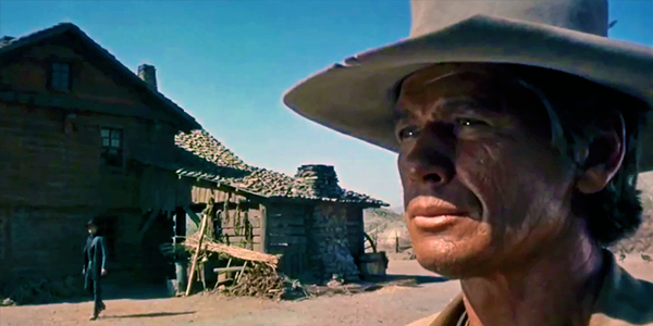
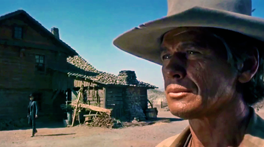
Once Upon a Time in the West has been on the short list of titles I’ve wanted to see in 4K HDR ever since the format was announced. And now that the day has arrived, my reaction can be summed up in two words: deeply ambivalent.

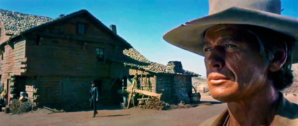
There’s no denying it looks striking, worthy of all the usual praise about pristine reproduction, fine detail, piercing highlights, rich, nuanced blacks, etc. But, interrupted by a call, I had to pause playback during Jason Robards’ big entrance at Lionel Stander’s trailside store, and when I came back and hit Play again, something didn’t feel quite right. I’d been enjoying the movie, but having been jolted out of it, I suddenly realized it just didn’t look like film. And once I’d been thrown for that loop, it became hard to buy back into the illusion.

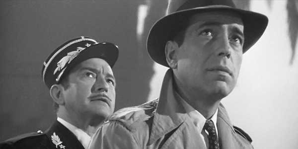
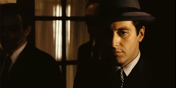
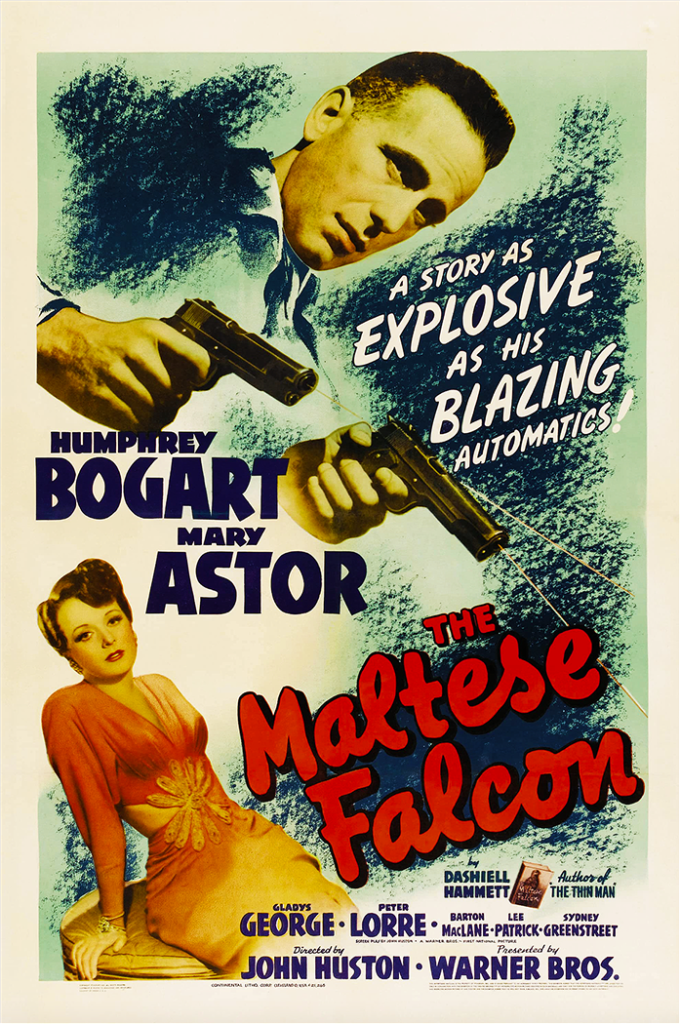
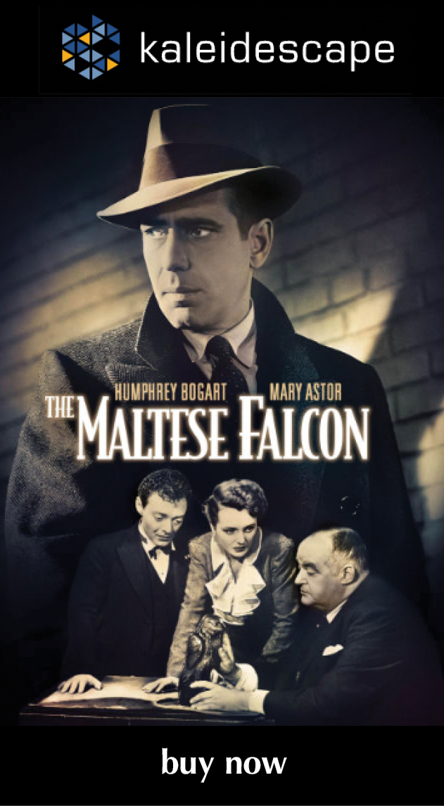
The faults in Once Upon a Time are nowhere near as egregious as they are with HDR transfers like The Maltese Falcon, Casablanca, or The Godfather, where you’re forced into a cartoonish parallel universe that bears little relation to what was originally committed to film. The intentions here seem to have been more honorable—they just took it all a little too far. A Sergio Leone western from the late ‘60s ought to have grain, which brings energy and texture to the frame. And smoothing everything over once again results in skin that looks a lot like pleather. (The Victor Laszlo Award this time around goes to Robards, with Claudia Cardinale coming in a close second.)

Film has signature traits that create a kind of analog aura that makes movies of the pre-digital age feel more human. But we’ve come, sadly, to see those traits as flaws, which is why tech guys running roughshod over classics tends to elicit nary a whimper when it ought to summon up howls. To use 4K HDR to impose a radical makeover when it could instead be used to make the home viewing experience match what it was like to see the film as it was originally shown in theaters feels criminal.

To give credit, it was nice to see things like the subtle gradations of the worn black fabric in Jack Elam and Woody Strode’s hats so well rendered, and in a film that thrives on extreme closeups, you can make a parlor game out of counting nose hairs and ferreting out scars. But I’m not sure how anyone benefits from being able to make out every line in Cardinale’s crow’s feet or all the innumerable tire tracks criss-crossing the desert, or any of the other things we were never meant to see. And this is another transfer where HDR makes some of the elements pop far too much. The fire Cardinale uses to warm her coffee looks out of line with both the film and reality, and the railroad baron’s blinding white shirt collar and cuffs float in the frame like the Cheshire Cat’s smile.

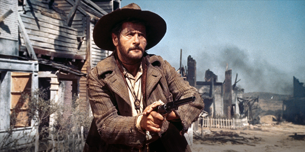
It was interesting to compare this new release to the recent straight 4K transfer of The Good, the Bad, and the Ugly (GBU). That earlier film is alive with grain, which does at times make its presence too emphatically felt; but the movie would lose much of its warmth and grit if it was all scrubbed away. Some of the elements are in questionable shape, causing some scenes to look a little flat and washed out. But you ultimately end up with an experience that’s remarkably true to the film Leone shot, which ought to be the goal.

(Adding to my ambivalence—and to get heretical here for a moment—rewatching GBU had me wondering if it isn’t the better movie. Its looser, droller, but still epic approach makes Once Upon a Time seem a little too aware of its own importance. Both films have been equally influential but in different ways, and GBU, which has little of the pretentiousness but all the ambition of the later effort, might actually be the more satisfying of the two.)

There isn’t much point in talking about Once Upon a Time as a film. What Leone created has become so iconic and has so permeated the culture that everyone is familiar with it, even if they’ve never actually seen it. But I was struck on this viewing by how almost all the conventions that determine modern film were born during that incredibly fecund period between 1967 and 1969, and by how stagnant things have gotten in the half century since, until the movie industry has become a kind of vast—but unquestionably lucrative—necropolis.

And I’m not just talking about film techniques but subject matter, tone, attitude, acting—the whole shebang. (To take just one example, Tarantino wouldn’t have a career without Once Upon a Time, and everything he’s done has essentially been a recapitulation of Leone, just cranked to 11.) Nobody ever seems to wonder why we’ve never moved beyond—outgrown—that era. It would be too much of a digression to speculate on that here, but it does seem to be a enervating case of massive repression.

But to return to the film at hand—which, in a sense, we never left—while Once Upon a Time in the West shows evidence of the tendency toward cockiness in recent 4K HDR transfers, and would have been amazing (and a candidate for our “Essentials” list) if it had shown just a bit more respect for the source material, it is enjoyable to watch, partly because the strength of Leone’s original effort allows this release to rise above its digital sins. It will do—and do well—for now while we hope the idea of trying to stay true to the filmmakers’ intentions makes a badly needed comeback.

Michael Gaughn—The Absolute Sound, The Perfect Vision, Wideband, Stereo Review, Sound & Vision, The Rayva Roundtablemarketing, product design, some theater designs, a couple TV shows, some commercials, and now this.

PICTURE | The 4K HDR release of the revered Leone epic looks gorgeous but is a little too clean, removing the necessary grit, resulting in a look that’s untrue to the original film

SOUND | Crisp and clean while staying true to the soundtrack—but, once again, where’s the original mono mix?

Generic selectors
Exact matches only
Search in title
Search in content
Post Type Selectors

© 2023 Cineluxe LLC
Review: Hannah and Her Sisters

Hannah and Her Sisters (1986)

review | Hannah and Her Sisters

also on Cineluxe

Sign up for our monthly newsletter
to stay up to date on Cineluxe

Falling short of the top tier of Woody Allen’s work, Hannah still offers up an inviting slice of New York life in the mid ’80s

by Michael Gaughn
updated May 6, 2023

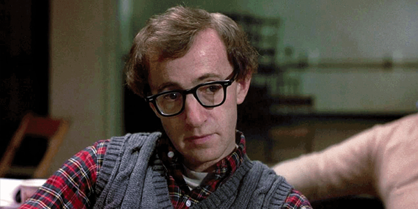
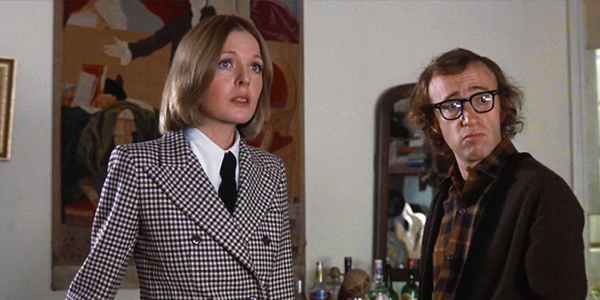
Many consider Hannah and Her Sisters one of Woody Allen’s best films. Some call it his best. I find it incredibly uneven. It does have some strong sequences, scenes, and moments that represent tremendous growth in Allen’s skill as a filmmaker, but it also has some off-key and sometimes embarrassingly lame moments that keep it from achieving a satisfying balance. And it’s about 20 minutes too long.

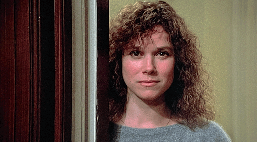
Allen hit his stride as an actor’s director here. He was able to draw effective performances out of a large and diverse cast, ranging from the Studio Era stylings of Maureen O’Sullivan and Lloyd Nolan to the Bergmanesque solemnity of Max Von Sydow to the looser, more indie vibe of Dianne Wiest and Barbara Hershey—both of whom are exceptional, especially Hershey. Even Carrie Fisher is something other than grating for a change. The one person who can’t seem to find the right groove is Michael Caine, who has his good moments but who seems determined—like Kenneth Branagh (Celebrity) and Jesse Eisenberg (Café Society)—to do some kind of Woody impression. It doesn’t work.

And then there are Allen’s cringe-worthy efforts to begin dismantling his own persona. I understand that he didn’t want the nuanced version of the Woody character to detract from the more dramatic plot lines and hoped to use his character’s misadventures here—mainly his scramble to find a religion he can buy into—as comic relief. But while occasional lines land, his scenes just aren’t funny. Allen always had a pitch-perfect ear for comedy, so he had to have known the bits set at the ersatz SNL were painfully weak. I remain baffled by what he was going for, and how he could have so readily abandoned a painstakingly molded character that had not only served him well but had become an unparalleled vehicle for expressing, mocking, and dissecting the age.

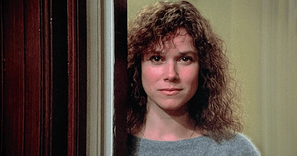
As for Hershey, films like Boxcar Bertha and The Stunt Man had given her a reputation as something of an indie-film bimbo, so it was heartening to see her get the chance to play a fully fledged, non-objectified character and run with it. Ultimately, Hannah doesn’t revolve around Mia Farrow or Caine or Allen or Wiest but Hershey, who stands firmly at its emotional core and brings it a substance and energy it might have been lacking if the role had gone to someone else. It’s a great loss that she never again got to play a part this good.

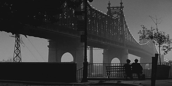
People were pleased but not necessarily surprised when Allen was able to create characters who evoked the world around him in films like Annie Hall and Manhattan. But they were shocked to find he could craft well-rounded and not-so-predictable characters like Hershey’s—or 27 years later, Cate Blanchett’s Jasmine.

Like a lot of people, I had assumed the ugliest decade in American culture was the ‘70s, so it was a jolt to be reminded that the ‘80s were actually worse. Most of the characters here look like they got their clothes at the Salvation Army, and there’s just a kind of elevated sloppiness to the whole world that’s, in retrospect, kind of repugnant. Of course, some of this was unique to New York, which was just emerging from its nadir in the mid ‘70s and making the grunginess of midst-of-being-flipped neighborhoods like SoHo chic in an effort to inflate real-estate values. But the scene near the end where Allen comes across Wiest in a Tower Records, with its salmon and teal cutouts, glandular lettering, and Barry Gibb posters, reminded me we all would have been better off if the ‘80s had never happened.

Cinematographer Carlo Di Palma deserves praise for taking the streets, walls, and doorways of the older, decaying New York, the affluent shabbiness of lofts and sprawling Upper West Side apartments, and the carefully cultivated disregard for personal appearance and making it all look beautiful. I doubt any other film has better evoked November in New York. This Blu-ray-quality HD download is an acceptable viewing experience, but Di Palma’s shooting style is so subtle that there are moments here that look flat when they should have an understated but distinctive pop.

Di Palma is also important because he helped dispel the myth that a lot of Allen’s skill as a director came from using Gordon Willis as a crutch. By this point, Allen had developed a basal aesthetic and technique he was able to successfully translate from film to film regardless of who was doing the shooting, giving lensers like Di Palma, Sven Nykvist, and Javier Aguirresarobe the latitude to enhance his material without ever having to prop it up.

This is the film where Allen began to be accused of creating what was called yuppie porn—a not unfair swipe since Hannah did help lay the groundwork for more unfortunate later works like Match Point. But the greater sin on display here could be called “assimilation porn,” which he paid a disproportionately high price for in the anti-Semitic backlash to his custody trial, when the seemingly hip but inherently conservative New York and Hollywood elites he showcased so well turned on him so viciously.

While it’s not possible to put Hannah and Her Sisters is the highest tier of Allen’s work, that’s not to say it can’t be enjoyable. Most of the characters are well crafted, most of the performances click, most of the presentation is satisfying, and Allen almost perfectly captured New York at that moment in time. Only his uncertainty about what to do with his own persona keeps it from coming together into a more cohesive whole.

Michael Gaughn—The Absolute Sound, The Perfect Vision, Wideband, Stereo Review, Sound & Vision, The Rayva Roundtablemarketing, product design, some theater designs, a couple TV shows, some commercials, and now this.

PICTURE | Thie Blu-ray-quality HD download is an acceptable viewing experience but Carlo Di Palma’s shooting style is so subtle that there are moments that look flat when they should have an understated but distinctive pop

Generic selectors
Exact matches only
Search in title
Search in content
Post Type Selectors

© 2023 Cineluxe LLC
Review: Indiana Jones and the Last Crusade

The Last Crusade

review | Indiana Jones and the Last Crusade

The third installment of the Indiana Jones franchise receives the same excellent 4K HDR/Atmos makeover as the previous two titles

by John Sciacca
update May 5, 2023

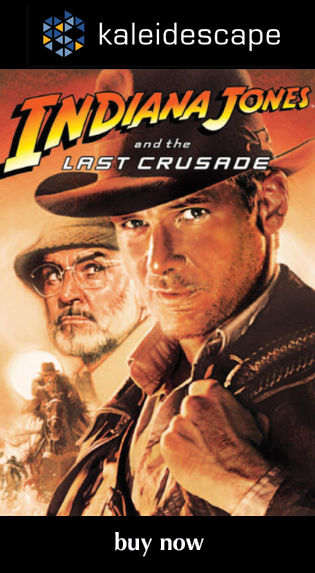
After the dark tone of Indiana Jones and the Temple of Doom, director Steven Spielberg looked to lighten things up a bit for The Last Crusade, returning Indiana Jones to more of the fun and light-hearted tone that made Raiders of the Lost Ark such a fan favorite. The result is a film that feels far truer to the original and is frankly just more fun to watch.

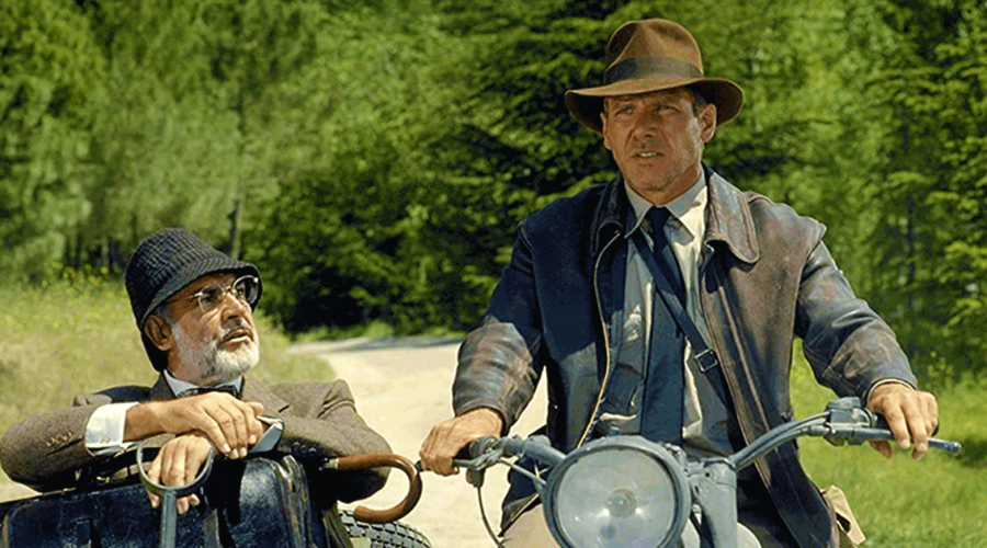
With The Last Crusade, we get both a prequel and a sequel, with two returning characters who have larger roles in this adventure, including Sallah (John Rhys-Davies), Indiana’s contact in the Middle East, and Marcus Brody (Denholm Elliott), the museum curator who is the recipient of many of Indy’s finds. More importantly, Crusade expands Indy’s family by adding his father, Professor Henry Jones, played brilliantly by Sean Connery. The dynamic between Harrison Ford and Connery is terrific, showing another facet of Indy’s character, and offering some additional humor and heart to the story, giving Indy something to care about more than just an ancient relic.

This film’s first act involves puzzle solving and adventuring that feels like it formed the blueprint for Dan Brown’s Robert Langdon character in The Da Vinci Code to come years later, before settling into the action that launches characters towards the finale and adventures that take them around the world. It also feels like Spielberg and Ford have settled into the rhythm and feel of Indiana, and the movie just clicks along, hitting familiar beats while also feeling new.

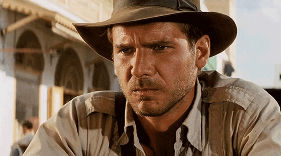
Filmed just eight years after Raiders and five years after Temple, Crusade’s video quality is similar to those films, which is to say the restoration and new 4K digital intermediate make for a great-looking presentation, again bristling with detail in many closeups. On the plus side, I noticed far fewer instances of softness or focus issues compared to Raiders, and right from the opening, skies here looked bluer and less grainy. Tiny details like fine bubbles rising in Jones’ champagne flute, and the texture in clothing like the tweed in his father’s suit, the heavy wool of Nazi SS uniforms, or the texture in Indy’s hat band, and the whiskers and pores on his preternaturally sweaty face are visible throughout.

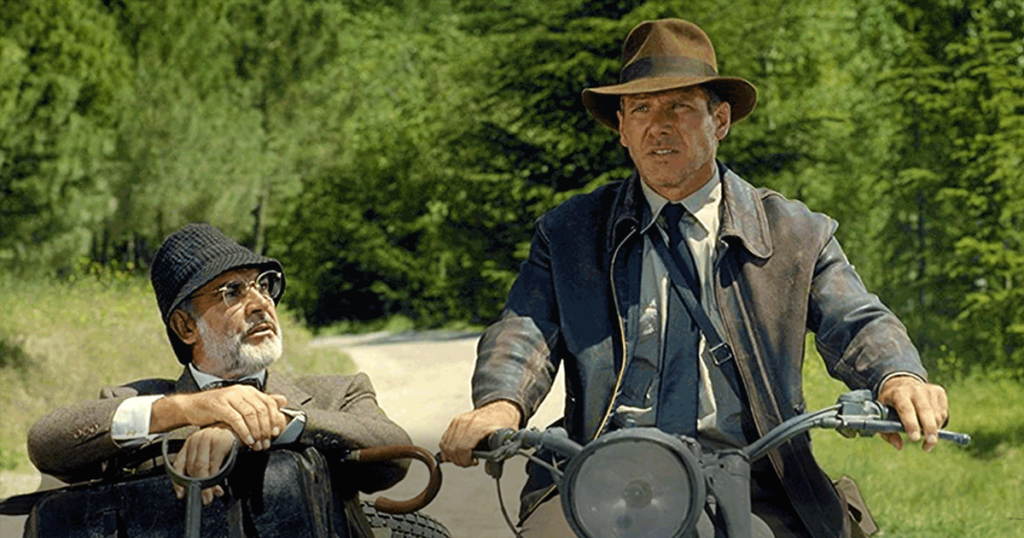
As with the first film, there are scenes that have such razor sharpness, clarity, and detail that they could pass for modern digitally shot media. One such moment was where Indy and dad are on a motorcycle in front of the crossroads sign to head to Berlin or Venice, which was stunning. Outdoor scenes, specifically the day shots in Venice, look like gorgeous travelogue material, and you can really appreciate the scope of the outdoor tank battle.

The HDR color grading is again reserved but it adds depth and texture to images, especially shadowy and dark scenes or the brightest highlights of the desert. You can also really appreciate the brilliant colors of a stained-glass window in the Venetian church/library.

Like the picture, Crusade’s new Dolby TrueHD Atmos audio mix takes a similar track as the other films, never looking to go too over the top (pun intended), but to just expand and enhance the original mix. Elements like driving wind, rain, and waves crashing up over the sides of a boat, or motorcycles racing up from the back of the room along the sides to pass into the front, and the room-filling roar and crackle of fire are all enhanced and expanded with the new sound mix. We also get more expansion of echoes, such as the hammer blows as Indy is trying to shatter marble, the ambience of water drips inside of catacombs, or tank shells that fly overhead.

Sonically, some of the film’s most dynamic and active moments come when some German fighters are attacking. Here we get planes strafing Ford and Connery in a vehicle, and the planes buzz all around the room, flying overhead, along the sides, and into the back. Their engines and guns are mixed aggressively, and add to the excitement of the moment. While never overused, the subwoofer is called on when appropriate, adding depth and weight to the soundtrack for things like explosions or collisions.

With Indiana Jones and the Last Crusade, we are brought back to Indy’s beginnings and earlier adventures in the best way possible. Even the ending echoes moments from Raiders’ opening cave scene but in a fresh way. And as our characters literally ride off into the sunset with John Williams’ iconic score erupting from all around, you can’t help but have a great time.

Probably the most experienced writer on custom installation in the industry, John Sciacca is co-owner of Custom Theater & Audio in Murrells Inlet, South Carolina, & is known for his writing for such publications as Residential Systems and Sound & Vision. Follow him on Twitter at @SciaccaTweets and at johnsciacca.com.

PICTURE | Some scenes have such razor sharpness, clarity, and detail that they could pass for modern digitally shot media

SOUND | As with the other Jones films, the Atmos mix never goes too over the top but just expands and enhances the original mix

Generic selectors
Exact matches only
Search in title
Search in content
Post Type Selectors

© 2023 Cineluxe LLC

Second Thoughts: Apollo 11

Apollo 11 (2019)

Second Thoughts | Apollo 11 (2019)

ALSO ON CINELUXE

Sign up for our monthly newsletter
to stay up to date on Cineluxe

The 4K HDR version of this visually stunning document of the Apollo 11 mission is a must-have for any serious movie collection

by Dennis Burger
updated May 4, 2023

If you’ve read my review of the original HD release of Todd Douglas Miller’s documentary film Apollo 11 from earlier this year, you may recall that it was a more of a rant than a proper critique. Not about the film, mind you. Apollo 11 still stands as one of the best cinematic efforts of 2019, especially in the more straightforward, less editorial approach it takes in capturing this monumental moment in history.

The rant was instead about the home video release, which was originally HD only, with no mention of a UHD/HDR followup. This was doubly troubling because Apollo 11 is among a handful of films released at that time to actually be sourced from a 4K digital intermediate. In fact, its original film elements were scanned at resolutions between 8K and 16K. Given that most modern films, especially Hollywood tentpoles, are finished in 2K digital intermediates and upsampled to 4K for cinematic and home video release, the lack of a UHD option for Apollo 11 was as infuriating as it was puzzling.

Thankfully, that mistake has been rectified. Apollo 11 has since become available in UHD with HDR on most major video platforms, including disc and Kaleidescape, with the latter being my viewing platform of choice. I mentioned purchasing the film in HD via Vudu in my original review but that purchase didn’t offer any sort of upgrade path for UHD the way Kaleidescape does.

I did a lot of speculation in that first review about the sort of differences I thought UHD would make, and having now viewed it, most of those predictions turned out to be true. UHD does reveal a lot of detail that was obscured in HD, which makes sense given that the source of so much of this film’s visuals existed in the form of 65mm/70mm archival footage.

One of the biggest differences when comparing the HD and UHD releases is in the textures of the Saturn V rocket. Ribbing in the first three stages that dwindle to nothing in HD are clear and distinct in UHD. The little flag on the side is also noticeably crisper, and the stars in its blue field stand out more as individual points of whiteness, rather than fuzzy variations in the value scale.

As predicted, the launch of Apollo 11 also massively benefits from HDR grading. The plume of exhaust that billows from the rocket shines with such stunning brightness that you almost—almost—want to squint.

One thing I didn’t predict, though—which ends up being my favorite aspect of this new HDR grade—is how much warmer and more lifelike the imagery is. In the standard dynamic range color grade of the HD version, there’s an undeniable cooler, bluer cast that never really bothered me until I saw the warmer HDR version. Indeed, the HDR grade evokes the comforting warmth of the old Kodak stock on which the film was captured in a way the SDR grade simply doesn’t.

The new UHD presentation does make the grain more pronounced in the middle passage of the film—where 65mm film stock gives way to 35mm and even 16mm footage. But that has more to do with the enhanced contrast of this presentation than it does the extra resolution. HD is quite sufficient to capture all the nuances and detail of that lower-quality film. But the boost to contrast does mean that grain pops a little more starkly.

That does nothing to detract from the quality of the presentation, though, at least not for me. And even if you do find this lush and organic grain somewhat distracting, I think you’ll agree it’s a small price to pay for the significantly crisper, more detailed and faithful presentation of the first and third acts.

It’s a shame Universal, the film’s home video distributor, has decided to hold back bonus features. The featurette included with the UHD Blu-ray release, which covers the discovery of the 65mm archival footage, is missing here—although it’s widely available on YouTube. And only Apple TV owners get access to an exclusive audio commentary. Then again, given how badly the studio fumbled the original home video release, it’s no real surprise they’ve dropped the ball on making the bonus features widely available.

But don’t let that turn you off of the film. This is one that belongs in every movie collection, especially now that it’s available in UHD.

Dennis Burger is an avid Star Wars scholar, Tolkien fanatic, and Corvette enthusiast who somehow also manages to find time for technological passions including high-end audio, home automation, and video gaming. He lives in the armpit of Alabama with his wife Bethany and their four-legged child Bruno, a 75-pound American Staffordshire Terrier who thinks he’s a Pomeranian.

Generic selectors
Exact matches only
Search in title
Search in content
Post Type Selectors

© 2023 Cineluxe LLC

Review: Raiders of the Lost Ark

Raiders of the Lost Ark

review | Raiders of the Lost Ark

The film that kicked off the Indiana Jones franchise receives a first-rate 4K HDR/Atmos makeover

by John Sciacca
update May 3, 2023

Wanna feel old? How about if I tell you that Raiders of the Lost Ark is celebrating its 40th Anniversary?! Wanna feel a little better about it? To celebrate this milestone, Paramount has re-released all four films in the Indy franchise, all restored and remastered in 4K HDR with new Dolby Atmos audio mixes with all picture work approved by series director, Steven Spielberg. 

Besides remembering seeing the film in the theater when I was 11, I recall when Raiders was first released to home video. At the time, most titles were priced as “Rental,” meaning they were all like $80 and up and sold to chains like Blockbuster. Paramount decided to make a splash with Raiders in the home market, pricing it at a shockingly low (for the time) $39.95, and I remember rushing down to the video store and picking up a copy on Beta the day it was released, barely able to wait until I could get home and watch the finale in slow motion. The film went on to sell over a million copies by 1985, making it the bestselling film of its time.

While the action/adventure genre is well established now, Raiders seemed shockingly fresh when it came out. For almost the entirety of its near-two-hour run time, you are pummeled with one action piece after another as Indiana is constantly thrown into increasingly impossible predicaments.

Sure, after 40 years, some of the bits—like Indy looking for Marion (Karen Allen) through the streets of Cairo as she is hidden in a basket—seem a bit cheesy and silly. But, I think the humor and B-movie-esque qualities are part of what makes it so much fun—such as when the Nazi Toht (Ronald Lacey) menacingly assembles what we think is going to be a weapon to interrogate Marion but what turns out to be a hanger for his coat, or when Indy just pulls out his gun to shoot the large sword-wielding thug, or Indy saying, “I don’t know, I’m making this up as I go.” 

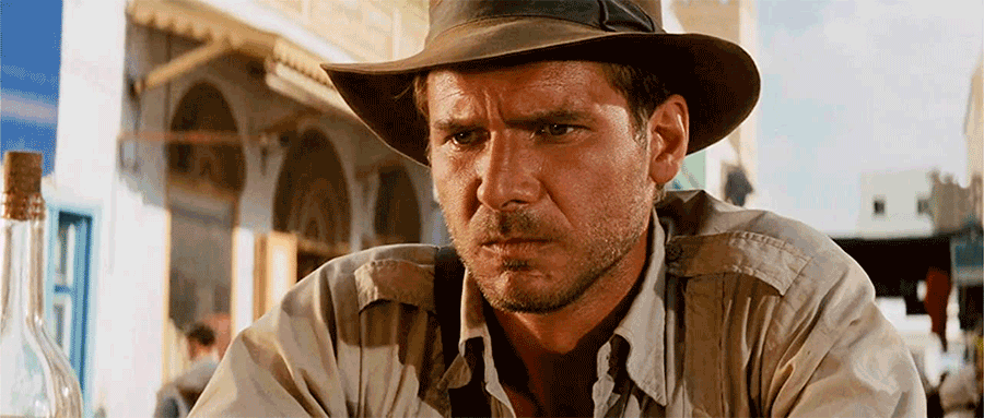
Originally shot on film, this transfer is taken from a new 4K digital intermediate, and it looks mostly fantastic. Closeups can have a startling amount of sharpness and detail. The daylight market and street scenes in Cairo are bright and fantastic, showing the sharp pattern of the bricks and stones, and the textured detail of the walls, and the weave of the baskets. Some scenes look so good, they could be from a modern film, such as the opening shot of the group crowded around the drinking game at Marion’s bar, or the scene of the Nazis at the dig site, which has incredibly sharp focus across the width of characters that fill the screen. I did notice that some scenes have inconsistent or soft focus, especially in the beginning and at the very end of the film when Indy and Marion are walking down the steps. This probably more noticeable because so much of the film just looks so good. I also noticed things like single vine strands or a single, ultra-fine spider web that Indy pulls along with him.

I never found film grain to be objectionable but it is definitely there and most noticeably in outdoor shots that show the powdery blue sky. We have enough grain for the film to show its film roots and retain tons of detail, without being softened away to look like digital mush.

While there was some effects cleanup, apparently this was mainly done to remove lines from the composites, and I never found it objectionable or noticeable in the way Lucas usually likes to go in and modernize his films. One change I did notice was that it was always apparent that the cobra striking at Indy and Marion was behind a piece of glass, and now that has been removed looking like they are in more peril. I also never noticed that the German phrase “Nicht stören” (Do not disturb) was written on one of the buildings in the map room. I’m sure it was always there but the new cleaned-up transfer and sharper resolution make it easier to notice small details like this.

Colors are natural throughout and the opening jungle scenes are both brighter and more contrasty than I recall them, with bright shafts of light pouring in through the trees and wispy smoke. Golds, especially of the Ark, look bright and brilliant. One scene with the lights in Marion’s bar and the various colored bottles of liquor backlit looked really good. Everything just looks as it should, whether it is the green jungle hues, the tans and browns of the desert, or the red-orange of fires.  We also get really nice and deep blacks, and good shadow detail that really benefits from the HDR grading, making dark scenes look more natural.

The sound designers didn’t look to hit you over the head (pun intended) with the new Dolby TrueHD Atmos mix but just to heighten and expand the soundtrack. Right from the opening moments, you’ll notice the sounds of the jungle—bugs, birds, rustling leaves—filling the room and coming all around you. Inside the cave, you hear water drips and splashes that help put you in the scene, plus there’s the sounds of winds howling outside Marion’s bar, the cacophony of downtown Cairo, or the clinks and clanks of machinery aboard the German U-boat. Big obvious sonic moments like the giant boulder rolling overhead are enhanced with weight and texture and it now literally rolls over your head, or the thunder and lightning while they are about to dig into the map room, or the roar of the German plane’s propeller, and the spirits now fly and swirl all around the room and overhead at the big finale. We also get some decent subwoofer involvement when called for, such as explosions, vehicle collisions, or that big boulder.

John Williams’ iconic score is also given more room to expand in this mix, letting you appreciate his music more fully than even before. And all-important dialogue is kept clear and intelligible and mostly in the center channel, except for a couple of fun moments such as Marion screaming “Indy!” as she is being carried around the city in a basket.

Raiders is one of those classic films that belongs in every movie collection, and it has certainly never looked or sounded as good as it does here.

Probably the most experienced writer on custom installation in the industry, John Sciacca is co-owner of Custom Theater & Audio in Murrells Inlet, South Carolina, & is known for his writing for such publications as Residential Systems and Sound & Vision. Follow him on Twitter at @SciaccaTweets and at johnsciacca.com.

PICTURE | Enough grain has been retained for the movie to show its film roots and display tons of detail without being softened away to look like digital mush.

SOUND | The sound designers didn’t look to hit you over the head with the new Atmos mix but just to heighten and expand the soundtrack

Generic selectors
Exact matches only
Search in title
Search in content
Post Type Selectors

© 2023 Cineluxe LLC
Review: Indiana Jones and the Temple of Doom

Indiana Jones and the Temple of Doom

review | Indiana Jones and the Temple of Doom

ALSO ON CINELUXE

Sign up for our monthly newsletter
to stay up to date on Cineluxe

Yes, it’s a credulity-straining mess of a movie, but it’s a mess that works—and Doom looks and sounds exceptional in 4K HDR

by Dennis Burger
updated May 3, 2023

If you’re looking for a study in ambivalence, you’ve come to the right place. My thoughts on Indiana Jones and the Temple of Doom are many, and they’re almost all contradictory. This first followup to what I consider to be one of the best action-adventures ever made is a mess. It’s erratic, tonally inconsistent, and utterly relentless. Its over reliance on gags (in more than one sense of the word) does it no favors, and it strains the bounds of credulity at every turn, never quite dipping into nuke-the-fridge territory, but coming awfully close.

And yet I absolutely adore this mess of a movie, perhaps even more than the superior Last Crusade, which was a massive course correction before the series went completely off the rails with its fourth entry, whose name I will not utter here. Temple of Doom may be flawed, but it’s fascinatingly flawed; it’s entertainingly flawed. And for all the nits I could pick, it’s never boring. And perhaps most importantly, it has a certain rugged charm, despite all the ick.

But hey, you’ve had 37 years now to figure out what you think of this movie and I’m unlikely to change those impressions. What you’re here for is a quick and simple answer to the question of whether the 4K HDR upgrade is worth it.

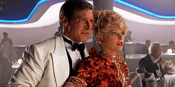
In a word: Yes! Indiana Jones and the Temple of Doom is exactly how a restoration of a movie like this should be handled. By that I mean that it undeniably still looks like film of its era. Despite some digital tinkering to improve the compositing and clean up a few practical artifacts, it hasn’t been tinkered with to the point that it looks like a modern movie, but it’s clean, well-preserved, and stunningly detailed.

The biggest improvements over the fundamentally flawed Blu-ray remasters from 2012 come in the form of much-improved contrasts and new color timing that doesn’t look like the negative was passed through a cheap Instagram filter. Saturation overall is way, way down from the Blu-ray, but the palette is punctuated by vibrant hues here and there that are way beyond the capabilities of 8-bit video. In that sense, it reminds me of the new remaster of The Wizard of Oz. There’s simply more nuance to the color overall. Every hue isn’t cranked to 11 the way it was in the previous Blu-ray release. The overall cast of the imagery is definitely warm but not cartoonishly so.

Equally important to the effectiveness of this new remaster is the expanded dynamic range, especially at the lower end of the value scale. That’s especially beneficial during darker passages, like the camping scene toward the end of the first act. Previous home video releases of Temple of Doom have either rendered the scene so darkly that you couldn’t appreciate the visual gags or so brightly that it simply wasn’t believable as nighttime. In the new 4K remaster, the scene is appropriately dark, the shadows sufficiently inky, but there’s still enough dynamic range in the image that you can actually see all the critters that torment Willie.

What’s true in that scene is true throughout the picture: The expanded dynamic range gives the image a richness and pop that makes it much more resolved, dimensional, organic, and analog in its presentation.

The audio receives similar treatment in the form of a new Atmos remix overseen by Ben Burtt. Again, the audio is undoubtedly of the era, especially in the way it leans heavily on the midrange, and some of the sound effects sound a bit thin. But I’ll take that any day over newly recorded digital effects foisted upon a soundtrack of this vintage, which almost never sound right.

Height effects are employed subtly but effectively, mostly to give John Williams’ score more room to stretch its legs. Some sound effects also get a bit of a lift but there’s nothing about the remix that’s going to pull your attention away from the screen. In fact, there were a few times when I wondered if anything was coming out of the height channels at all, only to turn off Atmos processing on my preamp and find myself surprised by the collapse of the soundfield. That is the highest compliment I could pay to any Atmos remix of an older film. I didn’t find it intrusive when it was there but I missed it when it was gone.

My only real beef with the 4K version of the Indiana Jones collection is that no new bonus features were created to mark the occasion. Well, that’s not wholly true: Paramount did sanction one new featurette about the sound design of the original film only to unceremoniously dump it on YouTube. Otherwise, the new collection carries over the bonus goodies from the last big release in 2012, of which there are plenty.

I took a sneak peek at Temple of Doom on my Apple TV 4K, and was pleasantly surprised that it looks amazing for the most part. The atmospheric smoke in the dance sequence in Club Obi Wan at the beginning looked a little noisy but not egregiously so. Switching over to my Roku Ultra, said smoke was a bit less noisy and the overall image was crisper and better resolved.

I’m sort of shocked that a bit of digital-looking noise in one shot is the only evidence of compression I could see, and inconclusive evidence at that. There are numerous scenes that function as torture tests of high-efficiency video encoding, like the quick shot of the glistening wet statue encountered by our heroes in the approach to Pankot Palace, or the jewels on the costume of the young Maharaja. Both boast a lot of specular brightness but also a lack of uniformity. In other words, there’s nothing about the patterns in the imagery that’s predictable, especially in motion, and codecs like HEVC thrive on predictability, especially at lower bitrates.

Long story short, if there are any significant shortcomings in Apple’s encoding of the film, aside from perhaps that bit of noisy smoke in the intro, I can’t see them. The bottom line is that the iTunes version in Dolby Vision makes the previous Blu-ray release look like hot garbage in every respect.

Dennis Burger is an avid Star Wars scholar, Tolkien fanatic, and Corvette enthusiast who somehow also manages to find time for technological passions including high-end audio, home automation, and video gaming. He lives in the armpit of Alabama with his wife Bethany and their four-legged child Bruno, a 75-pound American Staffordshire Terrier who thinks he’s a Pomeranian.

PICTURE | Despite some digital tinkering to improve the compositing and clean up a few practical artifacts, it hasn’t been tinkered with to the point that it looks like a modern movie, but it’s clean, well-preserved, and stunningly detailed

SOUND | The audio is undoubtedly of the era, especially in the way it leans heavily on the midrange, and some of the sound effects sound a bit thin, but the Atmos mix, while mostly subtle, is extremely effective

Generic selectors
Exact matches only
Search in title
Search in content
Post Type Selectors

© 2023 Cineluxe LLC
Review: The Maltese Falcon

The Maltese Falcon (1941)

review | The Maltese Falcon (1941)

also on Cineluxe

Generic selectors
Exact matches only
Search in title
Search in content
Post Type Selectors

John Huston’s famed directorial debut is sharper, steadier, and grain-free in 4K HDR, but in no meaningful way improved

by Michael Gaughn
April 29, 2023

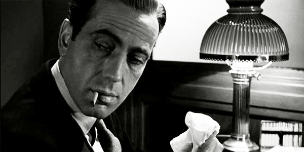
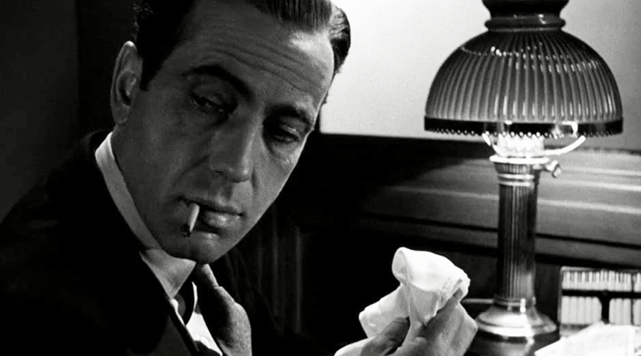
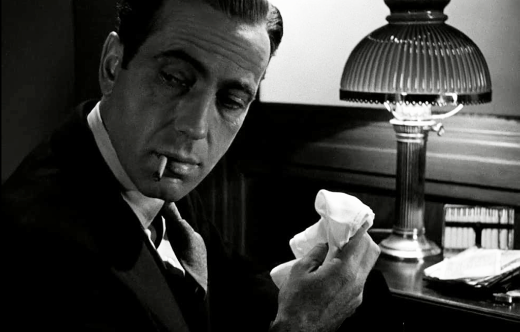
The Maltese Falcon just got the Casablanca treatment. If you’ve seen Casablanca in 4K HDR or read my review of that release, you know what that means. And you know that’s not good.

The treatment basically consists of removing anything that would suggest the movie was ever shot on film, instead making it look like a video game somebody opted to do in black & white. If this kind of radical do-over becomes the standard for upgrading older films, we’re in for a long, bleak future.

The grain is gone and there’s no sense of movement of film through a gate, which makes everything look too firmly etched. That might not sound like a big deal, and might even sound like a good thing, but the look of projected film was always taken into account when these movies were shot and is now being ignored, which is one of the reasons backdrops often look laughably fake in HDR transfers. The view out Sam Spade’s office window now looks like a diorama from It’s a Small World, with any illusion of depth shattered. And the HDR enhancement of the neon signs on the cardboard cutout buildings is so bright they look like Christmas ornaments hanging just on the other side of the panes.

Everything feels cold and plastic, especially the people. The Victor Laszlo action-figure look is most obvious on Spade’s partner, Miles Archer, who looks like he has Naugahyde skin and forehead furrows brushed in with model-airplane paint. Peter Lorre passed out on Spade’s couch looks like a ventriloquial figure. No one is spared—it’s all a matter of degree.

And, yes, some of the shots feel three-dimensional but since they were never meant to look that way, it’s kind of the equivalent of teaching your dog to tap out “Chopsticks” on the piano—kind of cool the first time you experience it but ultimately little more than a Stupid Pet Trick.

All of which raises the question of, who or what is this kind of brazen makeover meant to serve? It can’t really be argued it’s in the best interests of the film, because it runs roughshod over the whole aesthetic of the original creation. It could be argued it’s intended to make films like this one more accessible to people accustomed to the precise, antiseptic look of the digital world—but that sounds like the same kind of crap you hear in defense of colorization, and I have serious doubts whether either form of egregious meddling attracts enough people to justify the desecration.

I think it comes down to they do it because they can, and damn the consequences.

The Maltese Falcon isn’t John Huston’s best film—that would be The Asphalt Jungle—but it’s the one that put him on the map, and its cheeky tone and often arch performances still work remarkably well. Bogart’s Spade is more than a bit of a bully and creep, indulging in more than a little smiling sadism, but he does make it all feel true to the character. His take on Hammett’s detective also helps to underline the huge distance between Spade and Raymond Chandler’s Phillip Marlowe. People often confuse the two—partly because Bogart played both—but Marlowe followed a core code of honor (“Down these means streets a man must go . . .”) and never would have done anything like fool around with his partner’s wife (or even have a partner).

The Sidney Greenstreet, Peter Lorre, Elisha Cook Jr. ensemble of bumbling rogues has of course become iconic and it’s enjoyable to watch their outsized, genre-defining performances and appreciate where it all began.

I assume partly for budgetary reasons (this was a Warner Bros. production, after all), a little too much of the movie plays out in Spade’s apartment, which can make it feel stagey and claustrophobic, but Huston makes the limitations work to his advantage, creating a decent amount of action through cutting, tone, and stage business. The film remains surprisingly brisk and engaging, managing to avoid most of the stuffier conventions of the time.

One quibble before I wrap this up, because it’s become pervasive. Kaleidescape labels The Maltese Falcon a film noir. It’s not. Almost all the “dark” little movies, usually with a crime element, that people like to call noir don’t qualify for the tag at all. (Going there is just trendy laziness, like constantly leaning on “iteration” to say “version” or “variation,” or mangling “deconstruction.”) Every film noir is drenched in paranoia and in some way revolves around a cocky, deluded schnook. That doesn’t pertain here at all. Falcon can be called a crime drama or a mystery or even a thriller, but it has none of the trappings of noir. (The genre wouldn’t even be born until three years later with Chandler and Wilder’s take on Double Indemnity.)

By all means watch The Maltese Falcon in 4K HDR, but just about any of the earlier home releases, despite—or because of—their flaws, is far more likely to convey what Huston and his collaborators intended and what drew audiences to the film in the first place. I’m not saying higher-res transfers can’t be done well—“4K HDR Essentials” features more than a dozen classic films that have benefited significantly from the upgrade. And it’s not that old black & white movies can’t benefit as well—just look at Hitchcock’s Shadow of a Doubt. This is an issue of taste, not technology, of shameless pandering prevailing over any respect for the material.

Michael Gaughn—The Absolute Sound, The Perfect Vision, Wideband, Stereo Review, Sound & Vision, The Rayva Roundtablemarketing, product design, some theater designs, a couple TV shows, some commercials, and now this.

PICTURE | Nobody can say the images aren’t immaculately clean, but nobody would claim they for a moment look like they were ever analog

SOUND | You have to go to the Blu-ray-quality or DVD versions to get the original mono mix 

Sign up for our monthly newsletter
to stay up to date on Cineluxe

© 2023 Cineluxe LLC
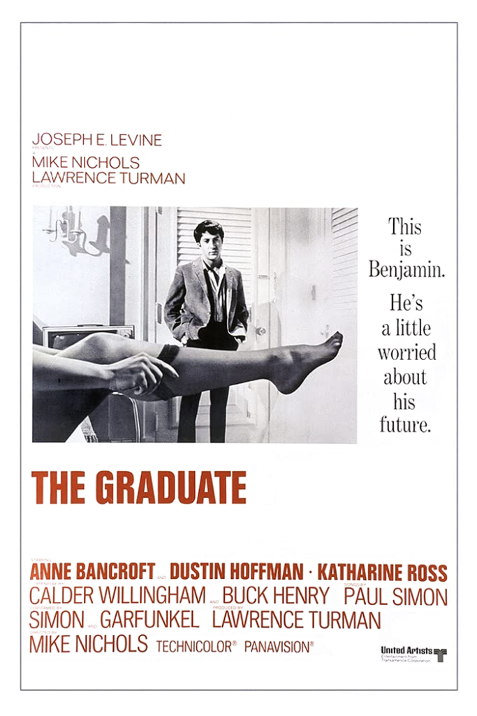
Review: The Graduate

The Graduate (1967)

review | The Graduate

Is it possible to strip away all the nostalgia and see Mike Nichols’ generation-defining film for what it is?

by Michael Gaughn
April 27, 2023

It’s pure luck that I stumbled upon Mike Nichols’ The Graduate on Prime after having reviewed his Carnal Knowledge last week. One is a masterpiece, one of the greatest films of its era; the other is a hopeless jumble, triaged in post—and all the stitches still show. And what applies to which is probably the exact opposite of what you’d expect, given the consensus of the mass-mind.

What follows is going to be a little more abstract and analytical than usual. But when you’re dealing with a movie whose reputation stems mainly from people’s identification with a character and an era, you have to cut through all the sentimental attachments to have any hope of judging the film itself. Much like Breakfast at Tiffany’s, The Graduate has been embraced by successive generations out of nostalgia and because it can be so easily reinterpreted to fit the preoccupations and prejudices of the present. But being a convenient and malleable receptacle for blind emotion is usually antithetical to what ought to define a good movie.

The Graduate is known as being one of the more radical mainstream films of the late ’60s, one of the first to portray the extreme alienation of youth within the Establishment, to show what was once called the Generation Gap as anything other than a punchline, to assimilate disruptive techniques from foreign films, and to use rock-inflected songs in a non-jukebox way. One of the main reasons it’s still embraced is that, like almost every film made today, it’s filled with superficial gestures of rebellion—or at least acting out—but is at heart conformist. Which points to the bigger reason for its continued popularity—

In college, during the Post-Structuralist era, interested in seeing if mainstream movies actually can be radical, I did a Proppian analysis of The Graduate. (For those unfamiliar with Vladimir Propp, his Morphology of the Folktale is an incisive, elegant, and beautifully written analysis of the structure of fables.) I expected The Graduate, given its reputation, to present a challenge, and was surprised—shocked, actually—to find that not only didn’t its bones lead it in any new directions but that it’s a textbook example of a classic fairy tale—not only in the obvious way of Ben as knight, Elaine as princess, and Mrs. Robinson as wicked queen, with Benjamin going off on an archetypal quest/rescue, but down to the micro level of how these tales traditionally play out.

In other words, we continue to watch The Graduate mainly because it provides the emotional satisfaction of Snow White and Sleeping Beauty—both the originary tales and their Disneyfied reinterpretations. Nobody at the time of its release realized that all this lay at its core, and I’ve seen little evidence that many have realized it since. But once you connect the dots, it all makes sense.

And, given what a disjointed patchwork the film is, it turns out that underlying structure is the only thing holding it together in any meaningful way. There are at least four distinctly different shooting styles—not as any deliberate strategy but from an inability to figure out how to convey the material. It doesn’t know when it’s hitting the comedy too hard (Mrs. Robinson’s famous pursuit of Benjamin feels painfully long now, and Hoffman’s reactions to her advances feel forced and sitcomy), and it transitions into drama with a heavy lurch—which once seemed innovative but, in retrospect, could have been handled much more deftly.

I could continue to cite examples, but you get the idea. The only other thing I’ll point to is the ending, which is poorly motivated, ineptly executed, and ultimately the kind of kitchen-sink pile-on you’d expect to see at the end of a Beach Blanket movie. The only reason we buy into it is because the knight is rescuing the princess from her captors. And the only reason we buy into that is because the entire film has been (probably without being aware of it) preparing us for that moment. And the point I ultimately want to make from all that is that, with very few exceptions, radical art—whether we’re talking pop culture or more serious art—feeds from deeply conservative roots that determine it far more completely than most people would be willing to admit.

The other point worth making, because it’s the other reason for the film’s longevity, is that the worst thing you can do is forge any kind of emotional identification with the characters in a movie. At that point, you’re no longer experiencing the film on its own terms but selfishly using it to bolster your own ego (even if you’re not aware that’s what you’re doing). So there’s no way your impressions of it can be even remotely objective—which has been the case with the vast majority of people who’ve seen The Graduate in the 56 years since its release.

If you decide to give The Graduate a gander, nothing about its presentation on Prime should dissuade you. I have to emphasize yet again how good movies can look on the service and how that’s happening more and more often, making the fingerprints of streaming harder and harder to detect.

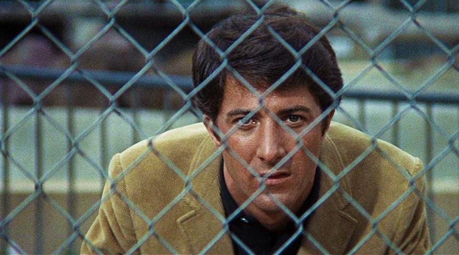
The iconic image early on of Ben with his head resting against an aquarium is both solid and beautiful. The “Ben at the pool” montage, accompanied by “The Sounds of Silence” and “April Come She Will,” is similarly solid despite reflections, hot spots, and frequent sparkles. There is a decent number of soft frames but they can all be attributed to the film itself, as can all the mismatched and overexposed shots, the inconsistent tonal range, and some scenes exhibiting far more contrast than others. The earlier eras of home video helped smooth over many of these flaws, but streaming is reaching the point of consistently offering up transfers exactly as they are, warts and all.

“Warts and all” pretty much describes the soundtrack as well. It’s not terrible and a little bit of basic cleanup would make a huge difference, but it’s sad to hear so much distortion on the Simon & Garfunkel tracks. That said, the solution isn’t to splice in pristine, digitized mixes that feel alien to the era and violate the spirit of the film.

That people find it acceptable—and are encouraged—to impose their subjective biases on movies might be the biggest argument against granting most films any real stature. If the audience is responsible for creating at least half the experience of a “great” film, what exactly is making it great? Once fads die down and the audience moves on and no longer feels the need to pump a movie up, it’s as if it never existed—which is when marketing steps in to push the nostalgia angle hard to try to inflate it all over again. All this is undeniably part of the life cycle of any film, and something studios and filmmakers have gotten increasingly adept at cultivating and exploiting. It seems all but inevitable we’ll soon reach the point where it will become impossible to judge any film on its own merits because, very much intentionally, there’s no there there.

Michael Gaughn—The Absolute Sound, The Perfect Vision, Wideband, Stereo Review, Sound & Vision, The Rayva Roundtablemarketing, product design, some theater designs, a couple TV shows, some commercials, and now this.

PICTURE | Nothing about The Graduate‘s presentation on Prime should dissuade you from giving it a gander. The reproduction is solid throughout with any warts solely attributable to the original film.

SOUND | The sound’s not terrible and a little bit of basic cleanup would make a huge difference, but it’s sad to hear so much distortion on the Simon & Garfunkel tracks

Generic selectors
Exact matches only
Search in title
Search in content
Post Type Selectors

© 2023 Cineluxe LLC
Review: The Pink Panther (1963)

The Pink Panther (1963)

review | The Pink Panther (1963)

The only Panther film worth watching, with Clouseau as a fully realized character instead of a one-joke cartoon

by Michael Gaughn
April 24, 2023

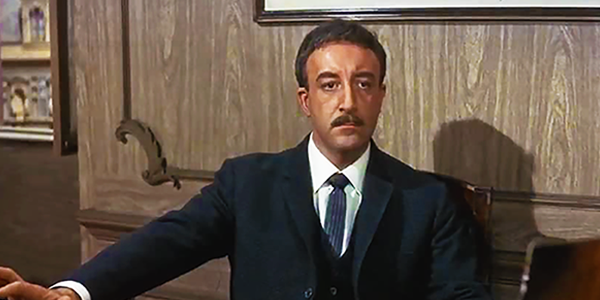
There is only one Pink Panther movie. Blake Edwards managed to create an almost perfect modern-day farce with the original, 1963 film. All the various sequels were just cynical attempts to exploit a brilliantly conceived comic character, reducing Clouseau to an increasingly repugnant cartoon and trotting out Peter Sellers like he was some kind of circus freak. The greatest sin of all is none of the sequels are even remotely funny. The only upside is that the massive revenue they generated allowed Edwards to make films like Victor/Victoria and 10.

Edwards had a weakness for sight gags, an itch he was able to scratch with varying degrees of success throughout his career. He used them to liven up early, fluffy efforts like Operation Petticoat and The Perfect Furlough but failed to show the necessary restraint in Breakfast at Tiffany’s, where they often feel like they were spliced in from another movie. The relentlessness of the gags chokes The Great Race, inducing fatigue by the end of the first reel when there’s still more than two hours of movie to go. On the other hand, he turned that relentlessness to his advantage with The Party, a successful modern attempt, with a nod to Tati, at a silent film.

The only time he achieved an ideal balance between story and gags was The Pink Panther, which works because he was able to use the conventions of classic stage farce without making the film look stagey—and because he came up with Clouseau. And because Peter Sellers played the character when he was at the absolute height of his powers. Sellers did The Pink Panther and Dr. Strangelove pretty much back to back—two of the supreme examples of comic acting on film and, considered together, an unsurpassed feat.

Peter Ustinov was originally supposed to play Clouseau, which would have guaranteed that the film would be nothing more than a pleasant temporary diversion fated to sink beneath the waves of time. The rest of the ensemble is solid enough but in no way exceptional, which allows Sellers to exist within it as an independent force of nature, but without the obligation to have him in every scene—one of the reasons the original film wears so well and the sequels seem so  ponderous and one-note now.

But for everything Edwards does well here, even he can’t sustain his well-modulated conception for the duration, and the whole thing starts to sag badly after the transition from Cortina d’Ampezzo to Rome, where the need to stage a “wild” party and a jewel heist simultaneously, followed by a “wild” chase scene—all of them forced exercises that feel more obligatory than inspired—threatens to sink the whole enterprise. (Richard Lester’s A Funny Thing Happened on the Way to the Forum, made two years later, suffers from the same flaw, only worse.) The ending almost works and almost reestablishes some kind of equilibrium, but you’re basically left with a warm memory of what transpired during the earlier parts of the film, once you repress the egregious missteps.

The transfer on Prime bears all the earmarks of being the same Blu-ray-quality transfer available on Kaleidescape—which means it’s pleasant enough to watch with no significant distractions, but a movie of this popularity and stature deserves better. The famous opening titles look dirty and even a little murky, and some wear and tear with the elements is apparent throughout the film. That said, the colors are for the most part vivid, and streaming is able to handle things like the blinding white slopes of Cortina without a hiccup—something that would have been unthinkable a couple of years ago.

The audio could use some work. The mix from the time probably wasn’t great but I find it hard to believe it sounded this bad. This is probably Henry Mancini’s best score, which, aside from a few too-obvious “joke” cues is mainly wall-to-wall mood music—which is more than fine because it’s exactly what the material called for and a merciful break from the pretentious Post Romantic drivel that drips off most movies like syrup. But it’s painful to hear Mancini’s tasteful arrangements sounding like AM radio. On the other hand, it would be a disaster to give them a latter-day goosing—the Living Stereo treatment that make his cues on the most recent release of Breakfast at Tiffany’s sound like they existed in a parallel universe from the dialogue tracks.

It’s a shame Blake Edwards got lazy. Clouseau, married but as a perpetual cuckold, as lost running the gauntlet of domestic life as he is the one of crime and the police, and unburdened by the comic relief of a manservant, the Little Tramp removed from the Victorian era and saddled with the pathetic delusions and neuroses of the present, would have been a much richer character than the merely convenient and monotonous figure of the sequels. But at least we have the original Panther film to appreciate on its own terms and as a glimpse of what could have been.

Michael Gaughn—The Absolute Sound, The Perfect Vision, Wideband, Stereo Review, Sound & Vision, The Rayva Roundtablemarketing, product design, some theater designs, a couple TV shows, some commercials, and now this.

PICTURE | The transfer on Prime bears all the earmarks of being the same Blu-ray-quality transfer available on Kaleidescape—which means it’s pleasant enough to watch, with no significant distractions, but with enough evidence of worn elements to cry out for a restoration

SOUND | The audio could use some beefing up so Henry Mancini’s tasteful arrangements don’t end up sounding like AM radio

Generic selectors
Exact matches only
Search in title
Search in content
Post Type Selectors

© 2023 Cineluxe LLC
Review: Carnal Knowledge

Carnal Knowledge (1971)

review | Carnal Knowledge

also on Cineluxe

Sign up for our monthly newsletter
to stay up to date on Cineluxe

Its deceptively small scale and stripped-down style have led to this still vibrant Mike Nichols’ satire on fractured mores never getting the recognition it deserves

by Michael Gaughn
April 20, 2023

Not having seen Carnal Knowledge in a while, and not exactly sure what my impression was of it the last time around, this recent viewing was something of a revelation. Mike Nichols’ deeply quirky, deeply sardonic big-name, big-budget miniature is one of those one-off, completely sui generis films that pop up from time to time that really shouldn’t work yet somehow manage to coalesce and succeed. For something so deeply rooted in its extremely unstable era, it holds together amazingly well and seems even more expressive and potent now, probably both because it taps into timeless constants of behavior and is such a spot-on portrait of that time.

Nichols was once considered a genius filmmaker, but that was mainly hype. He’s now known, when he’s known at all, as the guy who did The Graduate—a film, like Breakfast at Tiffany’s, that recent generations have willfully misconstrued to help bolster and justify their preoccupations and prejudices. His movie career began with Who’s Afraid of Virginia Woolf?, an overly long adaptation of Albee’s play made watchable by unexpectedly powerful performances from Richard Burton and Elizabeth Taylor. Then came The Graduate, a bit of a mess of a movie that awkwardly tossed together attempts at late ’60s social consciousness with European art-film pretentiousness and a lot of TV comedy schtick, thanks mainly to Buck Henry. Again, it was the performances that made it work. Next was Catch-22, which was—from conception to production to final release—a mess on a monumentally larger scale. (Sensing an opportunity, Robert Altman created M*A*S*H as a pared-down, knowing, and kind of nasty retort to Nichols’ disaster. Altman was then able to use the huge box-office generated by his low-budget farce as the springboard for his career.)

While this is a somewhat simplistic tack, it’s hard not to see Carnal Knowledge as a reaction—possibly traumatic—to the overweening nightmare of Catch-22. Instead of a cast of thousands, the ensemble of players is so small it fits on two title cards with plenty of room to spare. Instead of staging a vast, coffer-draining military operation, the action plays out, in highly stylized form, on a series of modest, even spare, sets. Instead of epic spectacle, there’s people, just a few, and most often shown in medium shot or closeup, sometimes speaking directly to the camera.

And, as with Woolf and The Graduate, Knowledge is very much an actors’ showcase. It’s not that Nichols is shy about deploying his filmic technique or afraid to experiment stylistically, but for the only time in his career, that technique is a completely organic extension of the material, expressive and reinforcing and consistent.

Jack Nicholson’s performance is from start-to-finish astonishing, running the gamut from charming to insecure to cooly detached to terrifying—probably his best work. Anyone who hasn’t seen him in Knowledge has only been exposed to a fraction of what he’s capable of. Still a relative newcomer who’d only recently gotten his first serious attention in Easy Rider and Five Easy Pieces, you can sense Nicholson relishing the chance to finally work with a sophisticated script and a first-rank director.

What I’m going to write next might be even more astonishing, because the rest of the ensemble—Art Garfunkel, Candice Bergen, and Ann-Margret—none of them blessed with acting chops within spitting distance of Nicholson’s—all rise to the occasion, turning in nuanced, daring, exceptional performances. None of them had done work this good before; none would ever do anything better.

It’s too easy to lean on the saw that what’s best about the best films often has more to do with the cinematographer than the director, even though that’s often true. The meaning of “best” is so multivalent and slippery, and so many factors can contribute to what does and doesn’t work in a movie, that it’s rarely useful to ride that thought too hard. (And, to utter the ultimate heresy, producers probably have more to do with a film’s creative success than either the director or the cinematographer—especially since the turn of the millennium.)

That said, Giuseppe Rotunno’s considered but spellbinding photography undeniably gives Carnal Knowledge a consistency, solidity, mordancy, wit, and grace it would have lacked otherwise. It and the acting are equally stunning, but Rotunno’s work is what holds the production together, what makes it sing.

The late ’60s and early ’70s were not kind to cinematography. Film stocks tended to be too slow to keep up with what filmmakers were trying to achieve, and post production was a shambles in the wake of the collapse of the studio system, so nobody seemed to know how to properly put a film together anymore. And yet Rotunno’s work here—a European working in the wreckage of the old Hollywood—is brilliant and unassailable. Any contemporary director could glean volumes by going back to Knowledge for a refresher course in the rudiments of post-Studio Era film grammar. Rotunno shows how to be experimental without being pretentious, theatrical without looking stagebound, virtuosic without being smart-ass.

But some of the credit also goes to production designer Dick Sylbert, his sister-in-law Anthea as costume designer, and editor Sam O’Steen—the same team that had worked on Polanski’s Rosemary’s Baby three years earlier and would work on Chinatown three years on, able to achieve the craftsmanship of Paramount in its heyday at a time when that kind of resourcefulness and finesse had fallen out of favor.

The elements for the transfer streaming on Prime are a little beat up but not unacceptably so, nothing that will take you out of the experience once you get beyond the random scratches and dirt during the red-on-black opening credits. All in all, this is a damn fine presentation that’s remarkably true to the film. The color levels seem accurate, blacks—which are crucial to the look—are solid and deep, and whites are similarly solid, only exhibiting noise in some tiles on a bathroom wall during a tracking shot.

Since Knowledge isn’t considered a “big” movie, who knows if it will ever receive the restoration or 4K bump-up it more than deserves. But there are classics of the marketing-driven, “I loved that when I was a kid” kind, and then there are true classics, as in legitimate works of cinematic art. Carnal Knowledge falls solidly in the latter camp and ought to be on the short list of films worth seeking out for anyone who hasn’t yet encountered it.

The soundtrack, like the visuals, is deceptively simple—clean and dynamic and surprisingly satisfying for mono. Yes, mono.

Michael Gaughn—The Absolute Sound, The Perfect Vision, Wideband, Stereo Review, Sound & Vision, The Rayva Roundtablemarketing, product design, some theater designs, a couple TV shows, some commercials, and now this.

PICTURE | A damn fine presentation that’s remarkably true to the film. The color levels seem accurate, blacks—which are crucial to the look—are solid and deep, and whites are similarly solid, only exhibiting noise in some tiles on a bathroom wall during a tracking shot.

SOUND | The soundtrack is deceptively simple—clean and dynamic and surprisingly satisfying for mono

Generic selectors
Exact matches only
Search in title
Search in content
Post Type Selectors

© 2023 Cineluxe LLC
Scroll to top

sign up for our newsletter

receive a monthly recap of everything that’s new on Cineluxe