Music for Art’s Sake
The desire to have an expansive art collection on display made filling this Manhattan apartment with sumptuous sound a challenge
by Michael Gaughn
July 13, 2022
The one inescapable truth of Manhattan real estate is that, no matter how prodigious the space or the wealth of resources at hand, getting what you want requires being a master of the art of compromise. The trick is making it all happen without feeling squeezed—space-wise, convenience-wise, performance-wise, pleasure-wise.
Everything about Hudson Yards would be considered generous, even by Manhattan standards. A gleaming-new city within the city resting above the railroad yards in midtown, its opulent living spaces offer heart-of-the-island convenience, killer views, and, when it comes to square footage, a decent amount of room to roam. But there are limits.
Paint Me a Picture
Consider this scenario: You have an extensive collection of paintings and sculpture you want to have on display to both ponder and savor. The collection will fill virtually all of the walls and much of the floor. But you also want to fill your space with music, which you’re used to experiencing at a level of quality on par with your other art. So where do the speakers go?
That was the challenge facing Anthony Chrisostomo of Home Theater of Long Island who, along with co-owner Nick Tzortzatos, had worked with the client for years, having provided the
entertainment and smart-home amenities for her residences in Morristown and Stone Harbor, New Jersey. They’d been able to easily meet her needs before—but they’d also had a lot more room to work with.
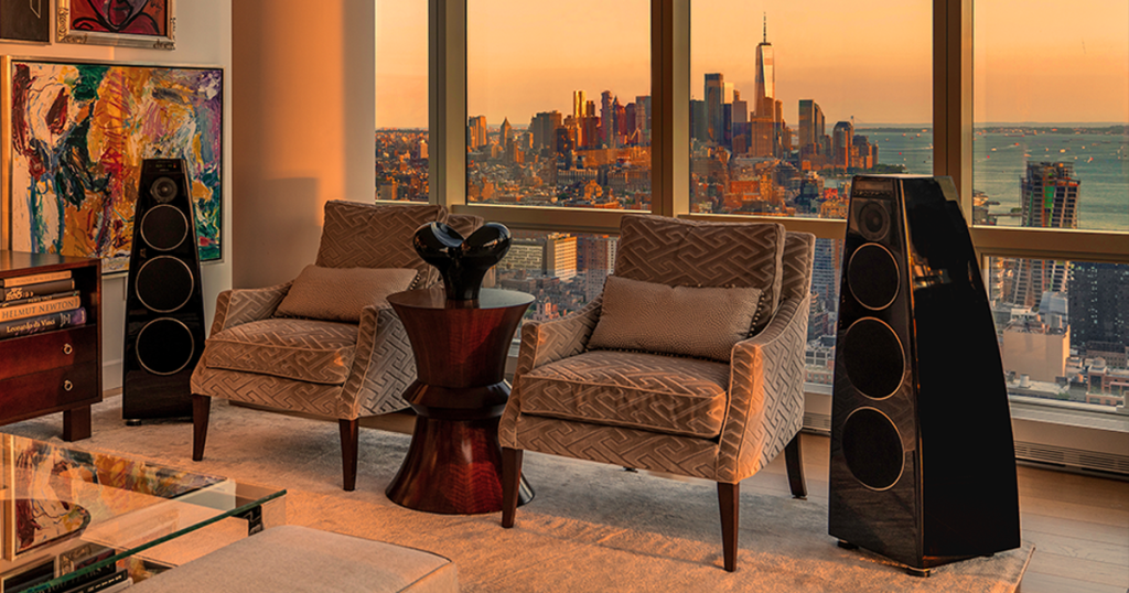
The client didn’t want any speakers on the walls at Hudson Yards—but even if she’d been willing to consider it, building policy frowns heavily on breaching anything in the apartments. As Chrisostomo explained, “This building has more requirements than any other one we’ve worked in because it’s above the rail yards, so there’s heightened security.” Also, two of the walls in the main living area are filled with floor-to-ceiling windows offering views of downtown from Chelsea to Battery Park and up and down the Hudson River. So placement options were limited—beyond limited.
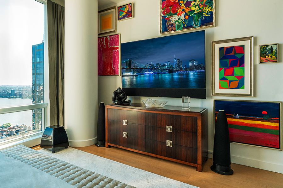
the minimalist sculptural form of Meridian’s 7200SE speakers proved the ideal complement to the client’s extensive collection of art
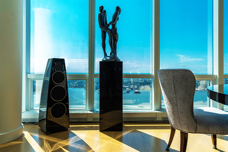
the minimalist sculptural form of Meridian’s 7200SE speakers proved the ideal complement to the client’s extensive collection of art
Then there was the Meridian factor. The client already has speakers from that high-performance audio brand throughout her two main residences and very much wanted them in her pied-à-terre as well. But Meridian’s offerings are known as much for being bold statements in design as for their sound and engineering. They’re not bland little boxes you tuck discretely away in a cubby or corner—you put them proudly on display.
That proved to be both a plus and a minus. The top-tier 7200SE models in the main living area can be appropriately described as sculptural, and their clean modernist lines dovetail nicely with the other art in the room—so, that problem solved. But having freestanding speakers means having cables, and cables have to run somewhere, and cables are, at best, unsightly. But since the Meridians have the necessary electronics built in, they require just a single wire carrying the music source. Chrisostomo was able to use the standard networking lines already threaded throughout the building to send sound to the speakers, which meant only having to have one thin strand of cable running from the wall.
A naive bystander might wonder “Why not go wireless?” And Chrisostomo acknowledges that would have been an option. “But that would have detracted from the aesthetics of the space because we would have had to place equipment within the room to feed and power the speakers.”
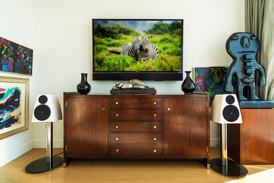
The master and guest bedrooms weren’t as daunting because they’re smaller spaces where sound is needed mainly for TV viewing. And both placement and wiring were much simpler since less imposing speakers could be clustered around the screens. The master bedroom has the demure for Meridian M6 speakers wedded to a Leon soundbar placed beneath the screen, while the
soundbar in the guest bedroom is joined with a pair of Meridian DSP3200s, which are decidedly compact but clearly born from the same design lineage as the statement speakers in the main living area.
A Place in the Sun
Though not as big a challenge as the speakers, the “art everywhere” and “no breaching” edicts made implementing lighting and shading control a little more interesting than it would usually be. Art and sunlight are mortal enemies but, thanks to the western-facing curtain wall, the sun blasts into the apartment for hours leading up to twilight. Just sealing out the light—and thus the views—wasn’t an option, though.
But because the tech involved is far more discreet than it would have been for the speakers, wireless was an option here, with Chrisostomo able to deploy a Lutron Homeworks QS system that automatically adjusts the raising and lowering of the shades for the time of day. Paired with semi-transparent shading material that sufficiently dims the room without entombing it, warm evening light still suffuses the space but without threatening the art.
It’s probably not surprising to learn that the quality of light, in all its many forms, was
especially important to the client—which led to her getting fairly heavily involved with setting up the automation. “She’s very particular about the different moods she wants to set,” said Chrisostomo, “so she got really granular when it came to each button and what it was going to do.”
And the Lutron system treats the apartment with the proper respect, with the minimalist controls able to be mounted on the walls while looking like they’re integrated into the walls. The combination of wall keypads and desktop controllers placed within easy reach give the client complete but unobtrusive control over the many moods of her space.
It’s hard to emphasize just how flexible and responsive technology—and the designers and integrators who deploy it—have become within the past few years. Just about everything involving high-end home entertainment used to be a major bait & switch, promising effortless comfort and infinite pleasure and delivering something that not only didn’t live up to the promise but was frustrating, even maddening, to use. Not just the tech but the design mindset of the recent past wouldn’t have been able to make something like this Hudson Yards dwelling happen, instead forcing the homeowner to settle for a series of unacceptable compromises that would have seriously detracted from the quality of her life. But the fetters are now off, and the evidence of the new paradigm is abundant. The trick, of course, is hooking up with a design team that’s attuned to your desires but once you’ve cleared that hurdle, the course is clear and the finish line now easily with reach.
Michael Gaughn—The Absolute Sound, The Perfect Vision, Wideband, Stereo Review, Sound & Vision, The Rayva Roundtable, marketing, product design, some theater designs, a couple TV shows, some commercials, and now this.
© 2025 Cineluxe LLC


