spanish treasure
An intense collaboration between the homeowners and their designer resulted in a cutting-edge Old World private cinema
by Michael Gaughn photos | Eric Figge Photography
November 30, 2022
This is the story of a unique theater and of a unique collaboration—about how an all-star team had to muster all its expertise to get the square peg of a room to fit into the round hole of the area they had to work with without having any of the seams show. And about how they were able to turn a daunting number of liabilities into virtues, letting those challenges serve as inspiration to whip up a private cinema that dovetails neatly with the look of the rest of the home while exhibiting an appropriately theatrical flair that makes it a singular and dashing design statement of its own.
This story is also unusual because the client, a Los Angeles attorney with extensive real-estate experience, was not only willing but eager to share his experiences. He and his wife, a well-known Broadway producer, brought an exceptionally broad knowledge of design, movies, theater, and technology to the endeavor, and were happy to roll up their sleeves and pitch in for the project’s three-year duration.
The client—let’s call him “Tony R.”—wasn’t new to private cinemas, having had a succession of them in his Mandeville Canyon home. His most recent one had been a smallish room off the pool house, meant mainly for use by his children. But as they grew up and moved out, Tony and his wife decided to do a far more ambitious theater that was not only spacious—able to accommodate 16—but a true digital cinema that could show first-run movies via the Bel-Air Circuit.
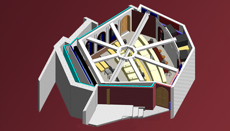
One of Tony’s main requirements was that he didn’t want the usual home theater shoebox. But once the area of the existing theater was excavated to make room for the larger space, it turned out a traditional rectangle probably wouldn’t have worked anyway. After digging down 35 feet, they arrived at an area that was, to put it kindly, not only unusually shaped but literally etched in stone since excavating further would have compromised the foundation of the home. The result mandated a hexagonal, somewhat wedge-shaped room that had to fight to achieve any kind of symmetry.
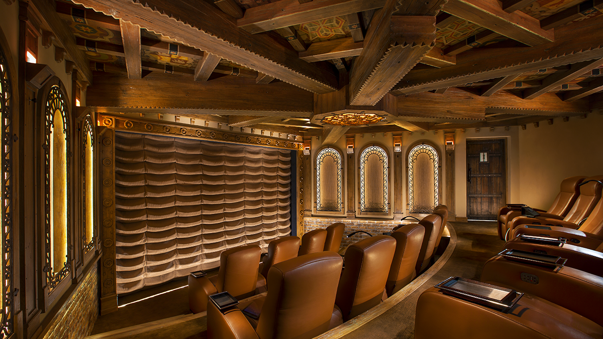
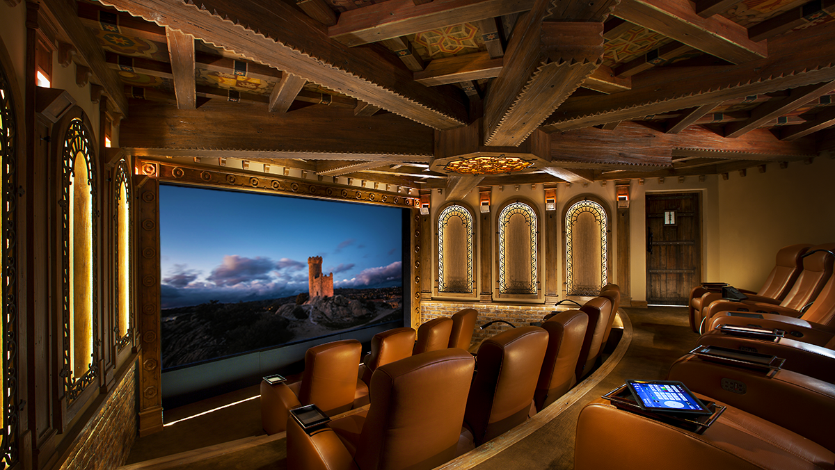
This theater room carries over the Moorish design style of the rest of the home while adding an abundance of appropriately theatrical touches
cineluxe showcase
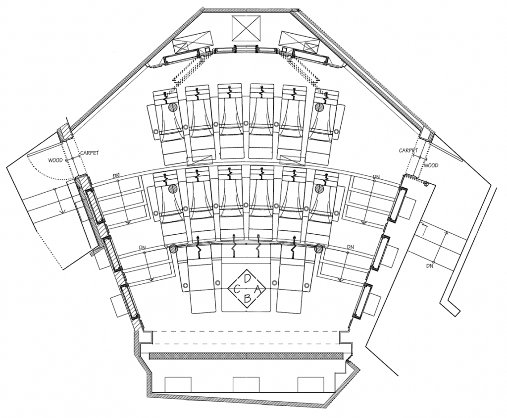
Excavating as far as possible beneath the three-story home resulted in what the owner describes as “a really weird-shaped room” that created significant design and acoustical challenges
click on the image to enlarge
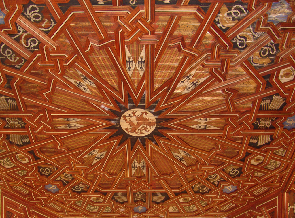
the ceiling of the Monasterio de San Juan de los Reyes, Toldeo Spain
Mudéjar, Briefly
Cribbing from Wikipedia and elsewhere, I can tell you that “Mudéjar” refers to a Late Medieval style of art produced by Muslims who stayed after the Iberian kingdoms had been reclaimed by the Christians but who didn’t convert to Christianity. The term is somewhat derogatory, derived from an Arabic word for “tamed” and was meant to refer to the Christians allowing the Muslims to remain in their lands.
The Mudéjar style is mainly defined by the incorporation of Islamic elements into Christian architecture and art. The style can also involve using building materials like wood not only structurally but decoratively.
Mudéjar was brought to Spanish regions in the Americas during the 16th century by Christian craftsmen and can be found throughout the former Spanish empire
—M.G.
“If you can start from scratch, you can really pin down what you want the room to be, both design-wise and with the technology for the sound and video,” Tony said. “This room was totally the opposite. There are no parallel walls. The ceiling and floor height needed attention, for lack of a better word. It was just a really weird-shaped room.”
Confronted with this jigsaw-puzzle space, he retained designer Lisa Slayman (ASID, IIDA) who has a storied reputation for creating sumptuous but not garish private cinemas. The room presented Lisa with some formidable challenges, but the biggest, literally, was a 30-foot-long 18-inch-wide I-beam that, supporting a wall above the space, ran right through the middle of the proposed area. Rather than try to minimize the beam’s presence, she decided to embrace it and make it the inspiration for her design.
The “A-ha!” moment was when Lisa realized that, by referencing Mudéjar art—an ornate style that emerged in the late Middle Ages in Spain as Islamic influences began to permeate Christian culture—she could both integrate the beam and stay true to the Moorish look of the rest of the home. Creating the kind of intricate decorative ceiling Mudéjar is known for would allow for the introduction of a series of faux beams spoking away from the boxed-in I-beam. And it would allow her to apply crest-like graphics that would not only tie the room in with the style of the home but allow her to personalize the design.
Lisa then sought out Ojai-based artist Robert Walker to paint all the various symbols, which were chosen in collaboration with the clients, who used them as an opportunity to express their heritage. “He actually hand-painted every panel,” Lisa said. “When you look up at the ceiling, they’re all a tiny bit different. So they really do look authentic.” Everyone was impressed with the result—even the artist. “I said to the gentleman, ‘You have to sign this,’” remembered Tony. “And he said, ‘What are you nuts? Of course I’m going to sign it. I’m not going to let someone else steal my work.’”
The ceiling design also served to conceal the height speakers for the Dolby Atmos surround system. The usual solution would have been to place the speakers in can-type fixtures or hide them behind neutral pieces of cloth, but Lisa took it in a more innovative direction, silk-screening some of the symbols onto fabric that was then integrated into the ceiling in a kind of trompe l’oeil effect. Tony said, “I tell guests, ‘Yeah, there’s speakers in the ceiling. Show me where they are.’ Nine out of 10 can’t find them.”
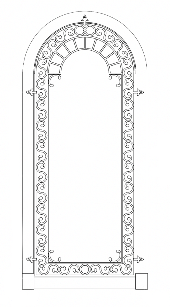
It’s easy to become fixated on the ceiling—which guests to the theater inevitably do—but the room is brimming with other design elements that exhibit just as much inventiveness and discreet panache—like the arched alcoves on the side and back walls that conceal the surround speakers. Rather than go with the usual acoustically transparent fabric, Lisa proposed woven horsehair, a much more expensive solution but one that melded better with the color and texture of the room. And then there are the wrought-iron grilles—another design element carried over from elsewhere in the home, but something you rarely—or never—come across in a private theater.
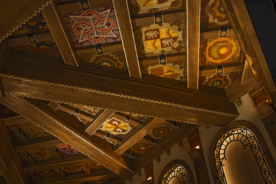
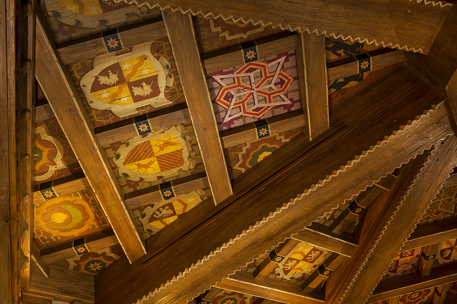
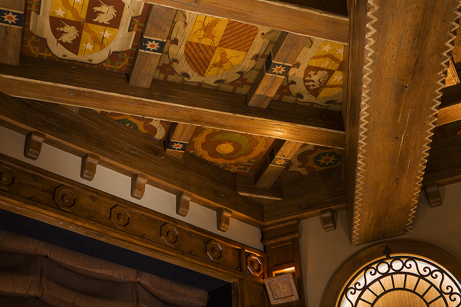
Making a dynamic statement out of a necessity, the theater’s ceiling uses sleight of hand to obscure the presence of a 30-foot structural steel beam, with the ceiling area between the various beams, faux and real, filled with custom, hand-painted emblems inspired by Late Medieval Mudéjar art
Introducing as much texture as possible was key to creating the desired Old World feel, and you can also see it in things like the ledged brick beneath the alcoves; the distressed thick-plank theater doors with their flat-iron straps; the scalloped Austrian-shade-style silk curtain for the 16-foot projection screen; and the hand-troweled acoustical plaster. “I didn’t want to do a covering all over the walls or a stretching fabric system, like most theaters,” Lisa said. “I wanted the Spanish look of the hard-surface stucco material. The troweled-on plaster gave us that look.”
Because she was proposing so many unusual design solutions, Lisa did mockups so the clients wouldn’t be surprised once everything was in place. “I had them made for everything I picked for that room. But they weren’t tiny little samples—you know, 6 inches big. We would do a wall section or whatever it was, so they could get a feel of seeing it in the space and on the area.”
Having appropriate lighting was also key to maintaining that “maybe we’re in a castle in Spain” effect. “It was really important for me not to have harsh, cold LED lighting because it wouldn’t give it that feeling like you’re in an old space,” Lisa said. “The lighting dials down to 1,200 Kelvin, which is candlelight.” She wanted to keep the fixtures not just unobtrusive but all but invisible. ”If you look in that room, you really don’t see lights because there’s a lot of indirect lighting hidden behind the arches or behind different places. I didn’t want to walk in and see sconces on the wall or downlights—things like that.” The one truly distinctive, but still restrained, lighting touch is the ceiling fixture at the intersection of the beams, with its wrought-iron grille over backlit leaded glass.
Executing a theater this elaborate and intricate inevitably led to tradeoffs between the room’s design and the performance of its audio video system. “Compromises between design and technology almost always favor design,” Tony said, “because to make even an incremental leap in the performance of something like the sound is so expensive. No one other than a seasoned professional is going to notice that tiny improvement. So we always opted in favor of the design as long as the sound achieved an acceptable level, because if we had opted for the sound instead, the design would have taken a major hit, and we weren’t willing to do that.” But he and his wife have no regrets. “Is it the perfect room in terms of design? Yes. Is it perfect in terms of everything? No. But we’re OK with that.”
With a private cinema like this one at his disposal, Tony doesn’t see any reason to patronize commercial theaters. “Certainly the sound is not going to be any better. The comfort is not going to be any better. And the bar’s not going to be any closer.” But he does make one exception. “I’d carve out IMAX because that’s a unique experience.”
Many people would consider having a certified digital cinema with its entrée to the Bel-Air Circuit the ultimate way to watch movies at home, so it was surprising to hear that Tony has become disenchanted with what the Circuit has to offer. “I thought that would be of huge importance to us but in the end it wasn’t. We just don’t need that anymore.” His next big project is to optimize the theater for playback from sources like streaming and Kaleidescape.
Other than that, Tony and his wife couldn’t be happier with what Lisa created for them. “The conclusion of your article should say, under no circumstances should you hire any designer other than Lisa Slayman to do your project.”
Michael Gaughn—The Absolute Sound, The Perfect Vision, Wideband, Stereo Review, Sound & Vision, The Rayva Roundtable, marketing, product design, some theater designs, a couple TV shows, some commercials, and now this.
theater designer
Lisa Slayman ASID, IIDA
© 2025 Cineluxe LLC


