What’s So Great About Color?
The unthinking, market-driven prejudice against black & white is destroying some of the greatest works of pop culture
by Michael Gaughn
July 9, 2020
A few days ago, we ran Dennis Burger’s interview with Ray Harryhausen, where the justly revered special-effects genius talked about how happy he was with the colorized version of his 20 Million Miles to Earth. I know this is a touchy subject I can’t possibly begin to do justice to in the space allotted here, but colorization is bad—it has always been bad and always will be. The fact that we’ve gotten better at it—like getting better at covering your tracks after a murder—only compounds the crime.
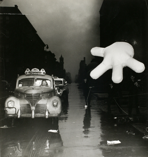
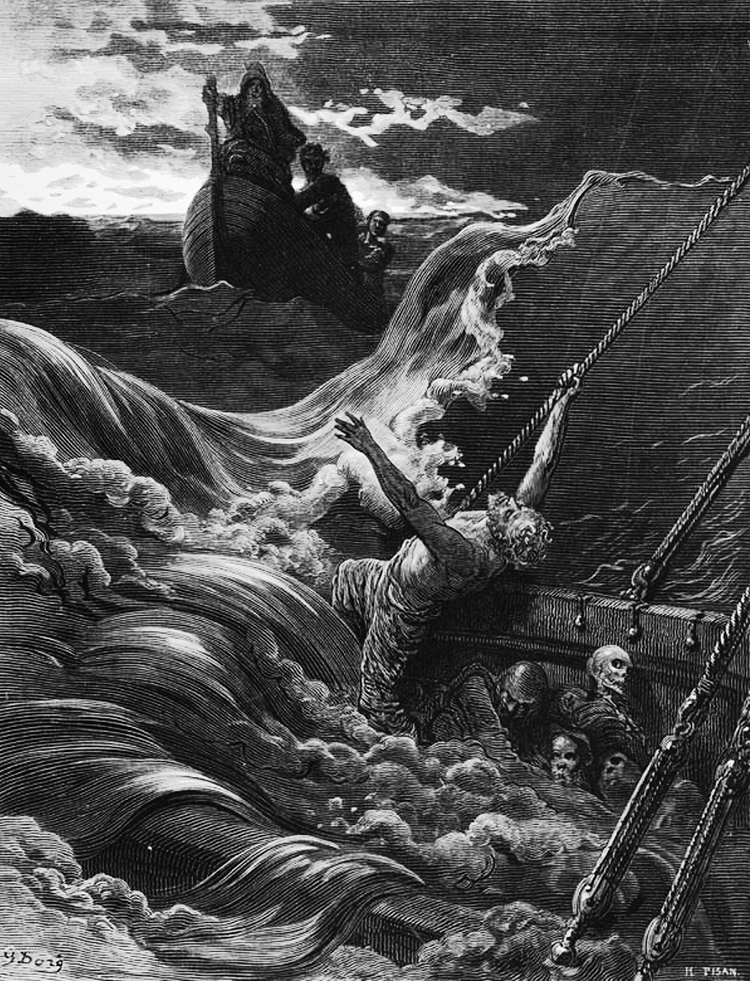
There are so many ways to approach this, but let’s start with this: Why do we need everything to be in color? Why did the idea take root that black & white is somehow inferior? Are Dürer’s or Doré’s engravings or Ernst’s collages in any way inferior to their work in color—or any other artist’s work in color? How about Steiglitz’ or Walker Evans’ or Weegee’s photos? Does the fact that Chaplin’s and Keaton’s films—and Murnau’s and Eisenstein’s and Griffith’s—were shot in black & white make them inherently inferior to later, color films?
Then there’s the notion that color films are more realistic. Really? When was the last time you saw a movie where the color palette even came within striking distance of reality? Movies are so heavily manipulated in post now that they look like the colorist let his six-year-old daughter loose on the file with a set of neon Sharpies. Yes, 4K HDR is capable of more accurately reproducing reality but the sad truth is that our addiction to retreating into superficial fantasy means practically no one takes advantage of what the tools can actually do.
Another argument is that colorization is a way to get jaded people raised on color media (in other words, Millennials) to check out older material. Not only is that cynical pandering, it assumes that it’s the black & white that makes these older movies and shows somehow irrelevant.
The only self-consistent explanation is that the need to colorize is part of the current mania to obliterate the past and to desensitize ourselves into an oblivious stupor. Eradicating black & white via color is akin to filling every movie with more and more gunplay, grosser and grosser gags, bigger, louder, deeper explosions, and greater and greater levels of intolerance. Given that, of course we would want to annihilate anything more elegant and subtle because it would represent an annoying reminder that the present is rarely a significant improvement on the past.
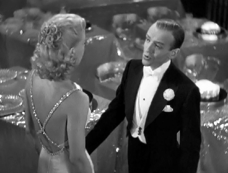
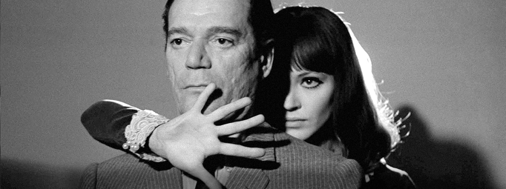
Black & white has become associated with things like sophistication (say Lubitsch comedies or Astaire/Rogers musicals) and noir (take your pick) because grayscale evokes both subtlety and ambiguity in ways color tends to obscure.
A colorization booster would say, “Why do you care what they do to some ‘50s monster flick—or some Shirley Temple movie, or some ‘50s sitcom?” But where do you draw the line—especially given how voracious and indiscriminate the people with their hands on the cultural levers have become?
The “Why do you care?” argument is inherently elitist—especially at a time when we like to pretend that all creative expression has been flattened to the level of pop culture (kind of like the apparatchiks using bureaucracy to enforce mediocrity during the Soviet era). I Love Lucy and the first season of Bewitched have been colorized, and that’s somehow OK because they’re “just” sitcoms (ignoring for the moment that Lucy was shot by Metropolis cinematographer Karl Freund).
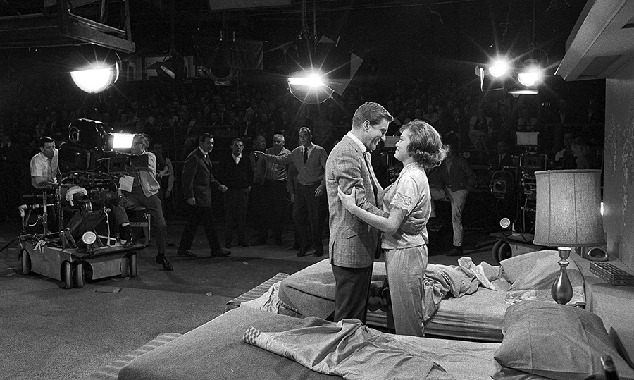
What about something like The Dick Van Dyke Show? That’s just some old black & white sitcom, right? Except that it was beautifully captured by veteran Studio Era DP Robert De Grasse, and that its black & white ethos is redolent of the best still photography of the time, of the most sophisticated films, of magazine layouts for Christian Dior and Yves St. Laurent. In other words, it’s the very essence and epitome of that too brief era of American Enlightenment. Dick Van Dyke in color is no longer Dick Van Dyke—which is one reason why Carl Reiner decided not to switch over to color halfway through the series’ run.
Colorizing it now would go directly against the creators’ intent—an always dubious notion that has become inherently hypocritical and virtually meaningless now—and couldn’t result in anything but a curiosity, at best, and a travesty at worst.*
The notion that the addiction to color could creep from the world of monster films and I Love Lucy to, say, classic noir or early Godard should scare the crap out of anyone. It’s a path we should have never begun to venture down and needs to be nipped in the bud. Just because we can do something doesn’t mean we should.
What would be the colorization equivalent of nuclear deterrence?
* While doing my due diligence before publication, I discovered that some war criminal has actually committed that atrocity. Hopefully there’s a circle in Hell—preferably right below Satan’s crotch—reserved just for colorists.
Michael Gaughn—The Absolute Sound, The Perfect Vision, Wideband, Stereo Review, Sound & Vision, The Rayva Roundtable, marketing, product design, some theater designs, a couple TV shows, some commercials, and now this.
© 2025 Cineluxe LLC


